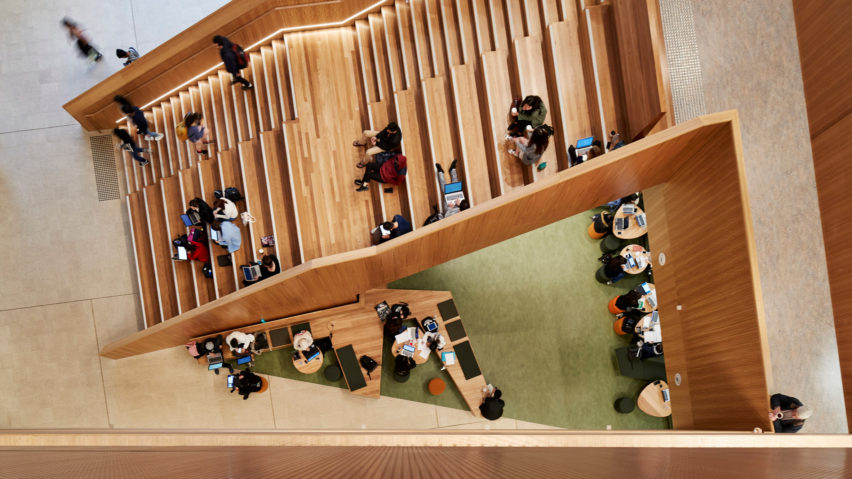
John Wardle Architects takes cues from natural landscape for Monash University building
John Wardle Architects imagined a landscape with ravines, clearings and escarpments when designing the spaces of the Learning & Teaching Building at Monash University's Clayton Campus in Melbourne, Australia.
Serving as a "new front door" to the university, the multi-faculty LTB building houses the institution's Office of Learning and Teaching as well as the Faculty of Education.
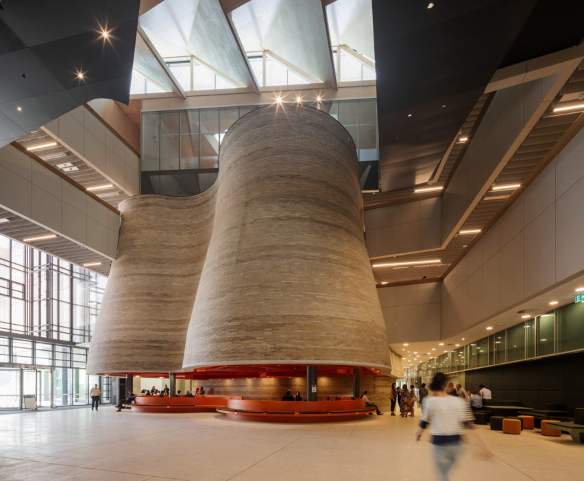
John Wardle Architects opted for a broad low-rise building, rather than a tower. This made it possible to create a horizontal field of spaces described by the firm as "an interior landscape".
The facility's interiors is a network of streets, courtyards, bridges, balconies and stairs. These are modelled on different elements of a natural landscape such as ravines, clearings, strands, perches, escarpments and amphitheatres.
"Landscape, and its change over time, has been a strong theme for the site of this campus," said the studio. "The learning activities are made visible and accessible to the wider campus and community, rather than removed from the ground in a vertical structure."
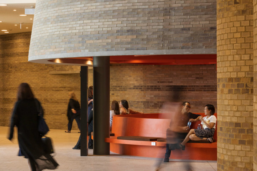
The architects said that the building's low-lying design was also informed by the site's history as a suburban quarter-acre block. Originally an area of unregulated bushland, the site was transformed into a one-mile grid of roads by surveyor Eugene Bellairs in 1853.
This rapid transition from bushland to imposed surveyor's grid and eventually suburban quarter is resonant in the building's horizontal patterns of occupation.
The existing Clayton campus that surrounds the new building was built in the 1960s, following a masterplan that proposed an expansive native landscape. This resulted in a series of modernist buildings designed as objects set within the landscape.
"The LTB takes a different typological approach, conceptually turning the modernist tower of the adjacent Menzies Building on its side to hug the ground akin to a mat-building," explained the firm.
"This leads to a sense of inhabiting a small city or township within a single building."
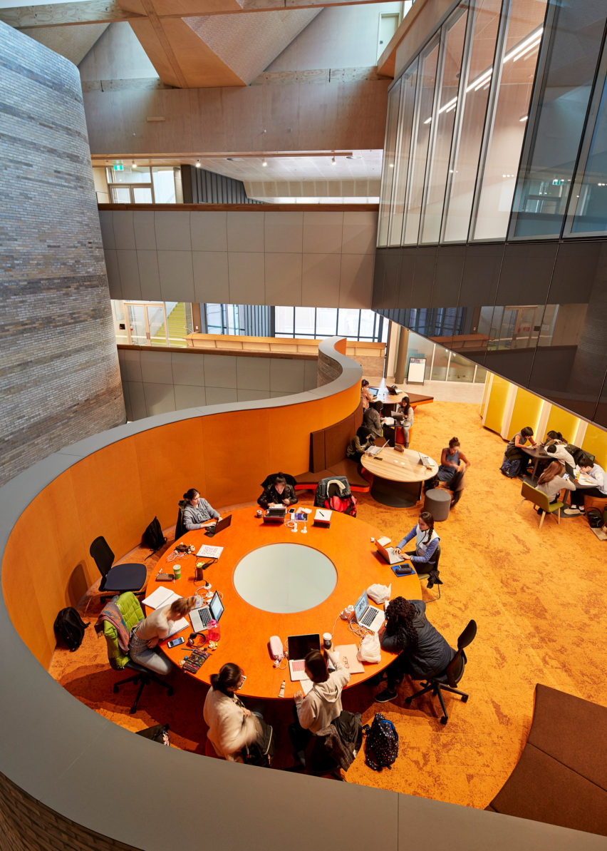
Wanting to blur the boundaries between the inside and outside, the architects used the same materials on the building's interior as were used on its exterior, such as brick and timber.
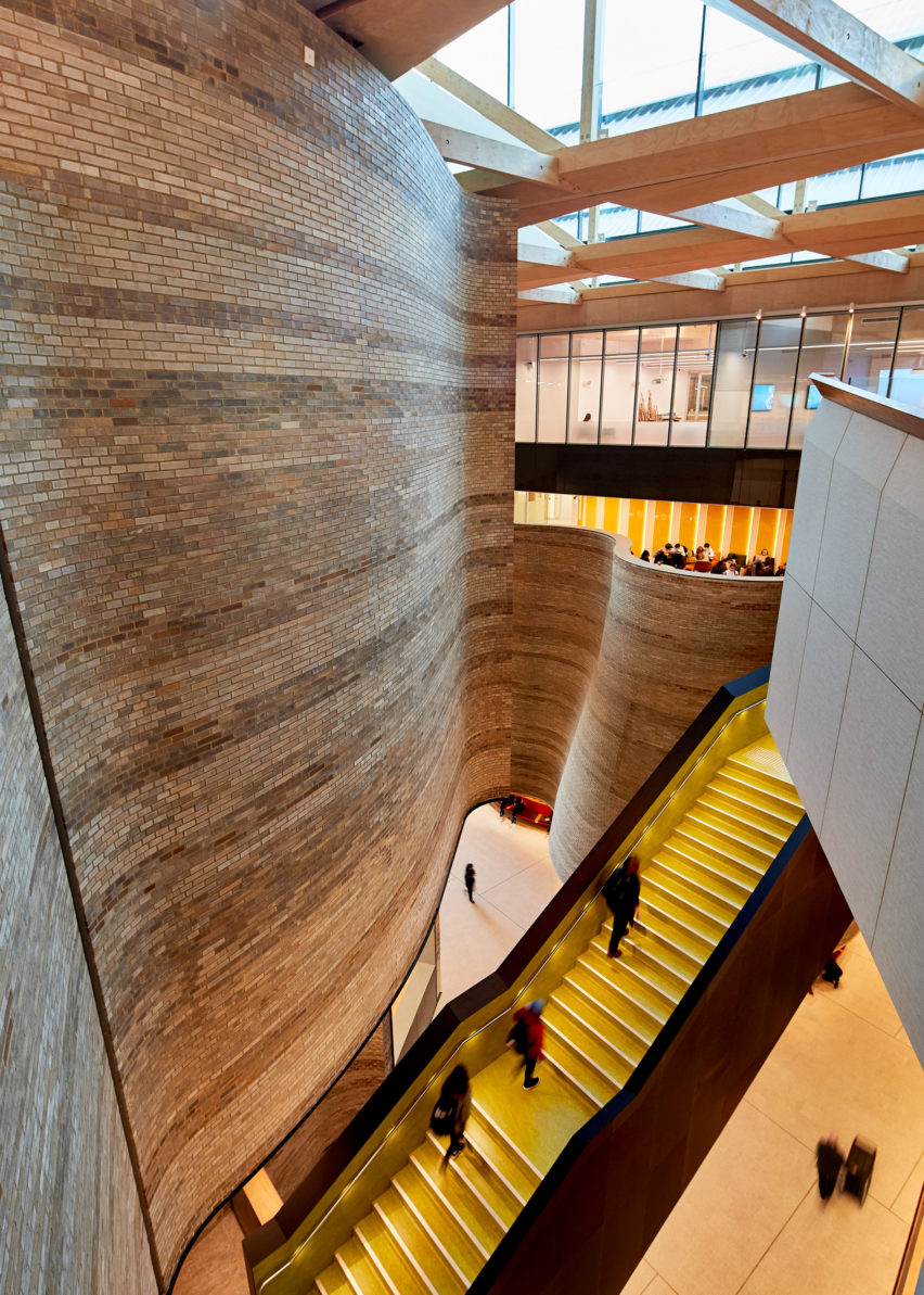
The road on which the building is located, Ancora Imparo Way, continues through the building and the facility's northern courtyard entry point. In its centre, a central spine staircase connects a series of atria to provide legibility and sight lines across all levels.
Above, a sawtooth roof draws diffused southern light into all levels of the interior through the atriums. A pattern of rhomboidal skylights connect and unite the public spaces of the building with natural light.
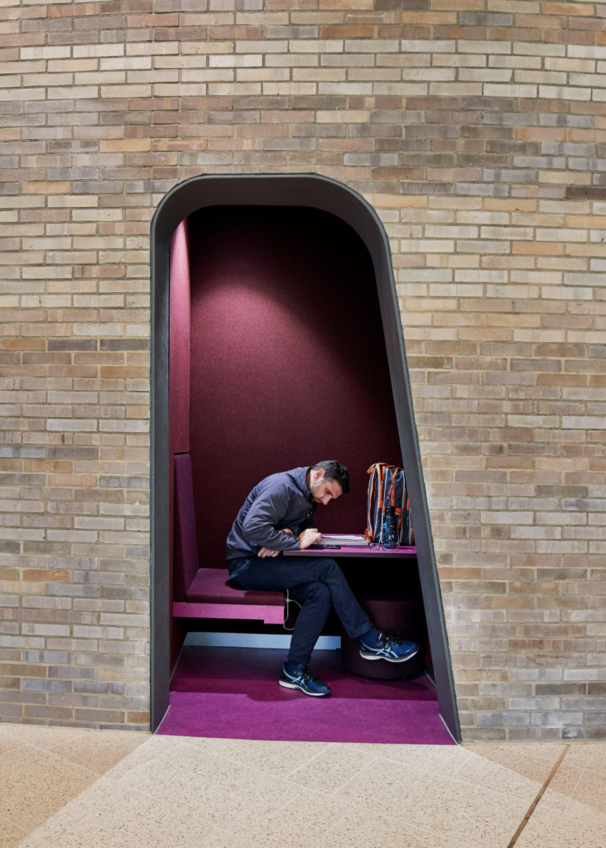
Learning spaces around the central spine are grouped in clusters and supported by informal "learning neighbourhoods" – an arrangement that the architects said helps to "break down the scale of the building into smaller, more intimate settings for students to inhabit".
"The major interior spaces have a specific character," explained the practice.
"Ancora Imparo Way is treated like a ravine that meanders through the building. The brick towers are reminiscent of pottery kilns at Stoke-on-Trent, England – a reference to the process of firing that starts with a malleable clay is abstractly akin to the process of learning."
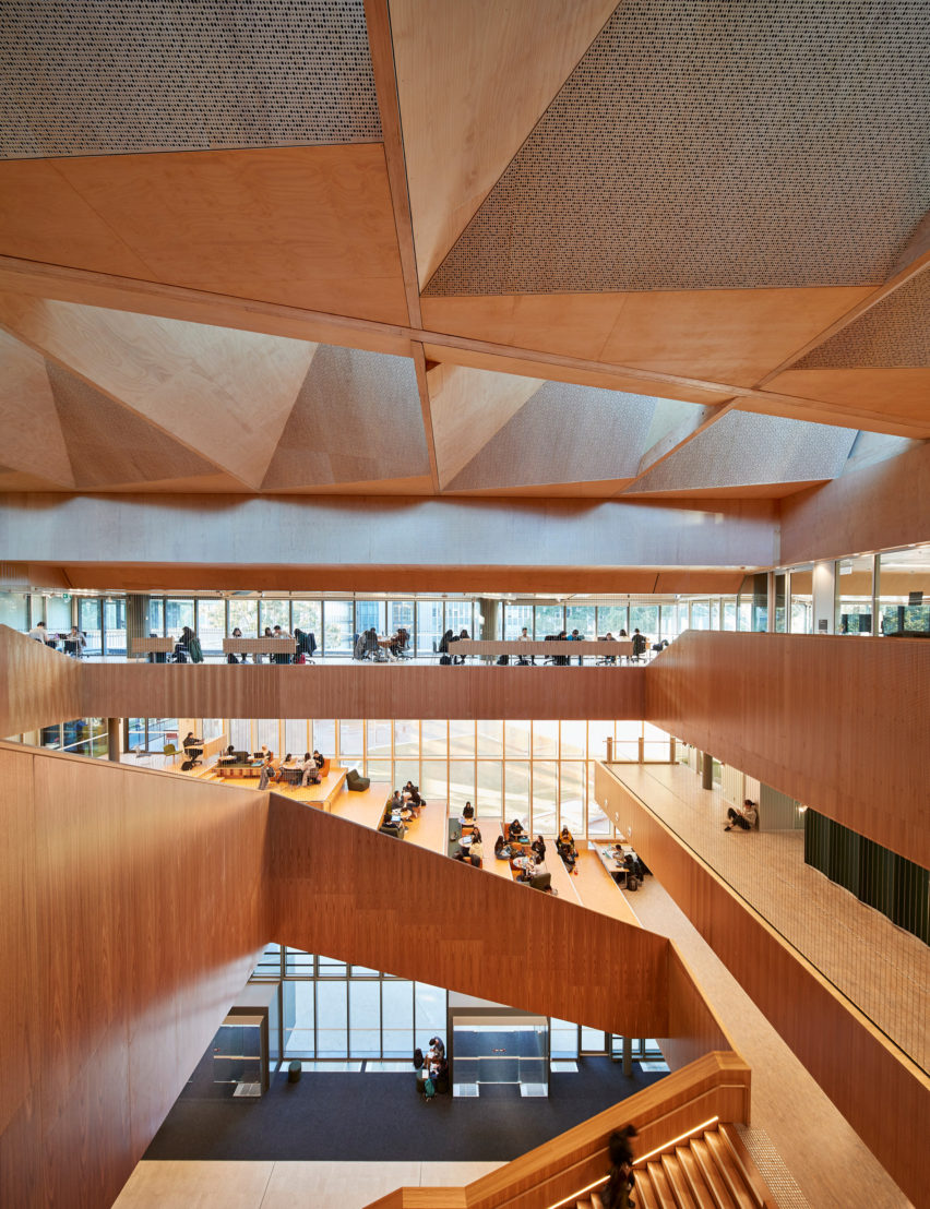
The building's perimeter roof is made up of a series of folded light monitors that encompass the uppermost floor while also concealing rooftop plant rooms. The geometry of the roof was designed to allow for varied qualities of natural light while also screening the glare of low-angle sunlight from the east and west.
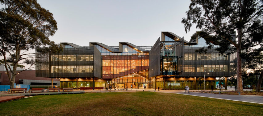
A profiled and scalloped screen made from perforated zinc wraps the perimeter of the building's second and third floors.
Intended to recall the texture of the Stringybark tree that Bellairs encountered on site in 1853, the screen's scalloped edges relate to the varying scale and contexts of the nearby bus interchange, pedestrian walk, landscape and northern courtyard, while its perforated pattern provides shade without obstructing views through the glazed facade.
The Learning & Teaching Building was shortlisted for a Dezeen Award in the Civic and Cultural Interior of the Year category, but lost out to the Lascaux International Centre for Cave Art by Casson Mann, which also took home the overall prize. It was also longlisted for the Civic and Cultural Building of the Year.
John Wardle Architects did however win another category – Captain Kelly's Cottage won House Interior of the Year.
Photography is by Peter Bennetts.
Project credits:
Architecture practice: John Wardle Architects
Client/owner: Monash University
Structural engineer: Irwin Consult
Building services engineer: NDY
Civil engineer: Irwin Consult
Geotechnical engineer: Douglas Partners
Sustainability (ESD) consultancy: NDY
Building surveyor: PLP
Accessibility consultant: du Chateau Chun
Acoustic consultant: Marshall Day
Landscape architect: McGregor Coxall & Realm Studios
Signage and wayfinding: Buro North
Traffic: GTA Consulting
Pedestrian modelling: Arup
Wind: MEL Consulting

