Trump's "beautiful" Steel Slat Barrier for Mexican border lampooned by designers
US president Donald Trump has tweeted details of the design for the proposed $5 billion wall along the Mexican border, prompting ridicule from designers.
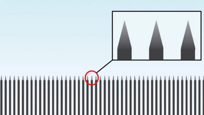
Trump posted a graphic of the barrier on 21 December 2018, along with the words: "A design of our Steel Slat Barrier which is totally effective while at the same time beautiful!"
In response, designers pointed out that the barrier is "technically not a wall" and that if to scale, it would be over 12 metres high and the gaps between the slats would be wide enough for people to squeeze through.
The image in Trump's tweet showed a row of tall columns with gaps between them and pointed tops. A car, identified by some as a Chevrolet Tahoe, featured in the drawing to illustrate the scale.
"Not to be a curmudgeon but technically this is not a wall," responded architect Cameron Sinclair, former head of social innovation at Airbnb.
Last week the US senate refused to fund the construction of the barrier, which Trump had previously stated he would force Mexico to pay for. In response, Trump ordered the partial shutdown of the government.
Wall design picked apart on Twitter
Alex Bozikovic, architecture critic at Canadian newspaper The Globe and Mail, described the design as "unfathomably stupid".
"What kind of foundations would this thing require?" he asked. "How many tons of concrete to keep each 'slat' vertical?"
PhD student Reyna Knight was one of several people who calculated the dimensions of the barrier by using the known measurements of the car.
"So if it's to scale, the slats are 190 millimetres (7.5 inches) with 316-millimetre (12.4-inch) spaces," she calculated, meaning people could slip between the gaps. "So just slide through sideways!" she wrote.
Retired police officer Mark West worked out the barrier would be 40 feet (12.2 metres) tall.
"There'd be a pretty high wind load on that thing," said architect Mark Hogan in response.
Other creatives attacked the barrier on aesthetic and moral grounds. "It is stunning in its vapidity, stupidity, disingenuousness and deliberate aesthetic confusion," tweeted architecture critic Paul Goldberger.
"Don't bring up design or beauty," wrote industrial designer Yves Behar. "Both are about intent, and yours is ugly."
"You really do love pointy things, don't you?" tweeted artist Alison Jackson, comparing the conical tips of the slats to Klu Klux Klan hats.
Graphic designer Michael Bierut added: "Now he's gone and ruined minimalism".
Ongoing saga over US-Mexico border control
The border wall was a key pledge during Trump's 2016 election campaign, and the controversial proposal has continued to make headlines ever since – due to spiralling cost estimates and attempts to fight it.
A call for design submissions, asking for 30-foot-tall concrete barriers, was first issued in early 2017.
Last Autumn, eight prototype designs were constructed near San Diego for testing, while Trump himself suggested that covering a barrier with solar panels could provide cheap energy and help foot the bill.
Since the wall was first proposed, architects and designers have suggested a variety of tongue-in-cheek alternatives. These range from a 1,954-mile-long dinner table to a flat-pack Ikea kit.