Zara logo gets controversial revamp by Baron & Baron
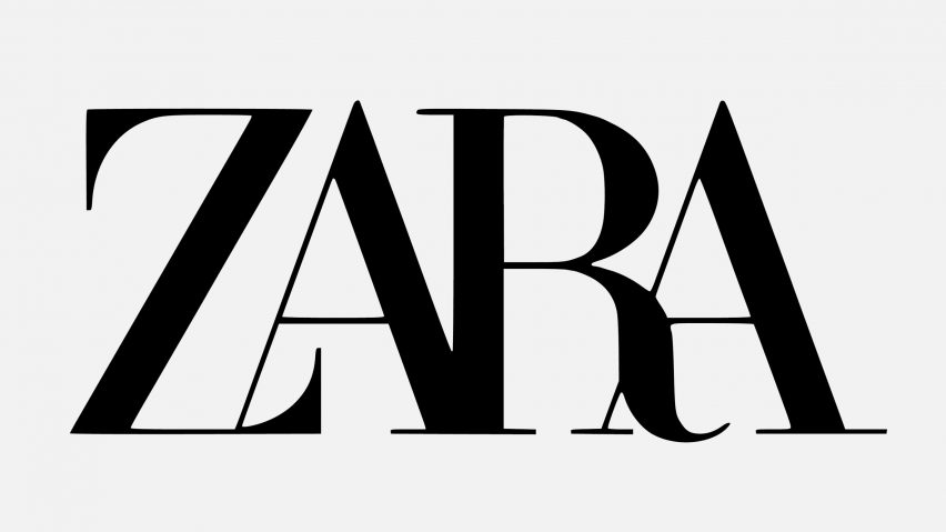
Letters overlap one another in the new logo for Spanish fashion retailer Zara, designed by French agency Baron & Baron, prompting criticism from fellow designers.
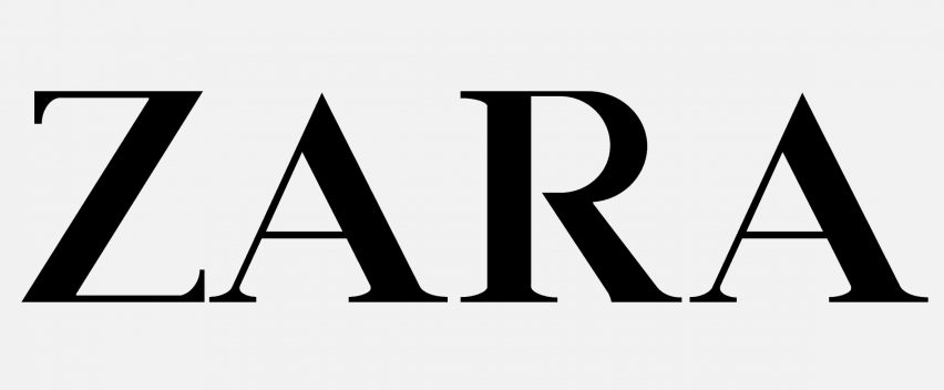
The rebranding features a minimal typeface, similar to the one used in the previous logo that was released in 2011, which saw the letters ZARA printed in block capital serif characters with large spacing in between.
But instead of generous gaps in between the letters, the text is pushed up closely together so that some parts overlap and others merge together. Details have also been exaggerated, so there are now curved accents on the Z and R letters.

The new font resembles the signature typography of Baron & Baron founder Fabien Baron, who is also Zara's artistic director, which he used to overhaul the visual identity of magazine Harper's Bazaar in the 1990s.
Baron is also responsible for the creative direction of luxury brands such as Dior and Maison Margiela – perhaps hinting towards Zara's intention to reestablish itself among high-end fashion houses such as these with the revamp.
The design has attracted criticism from fellow designers, particularly typographers, who have described the design as "claustrophobic".
German typographer Erik Spiekermann – who recently worked with Adobe on a project to transform unfinished Bauhaus designs into fonts – called it "the worst piece of type [he's] seen in years" in a Twitter post. He asked if it was designed by "one of those new robots that will replace humans".
Zara have updated their logo. pic.twitter.com/GhhQziNV1D
— Fabio ✌︎⁂ (@fffabs) January 26, 2019
Meanwhile Fabio Basile of British design studio Fortnight mocked the logo with a meme that envisions what it would be in another eight years, if the brand were to follow the same pattern.
The image shows spacing removed entirely, so each letter is directly overlaid on top of the other, making the logo incomprehensible.
Zara is not the only retailer to recently change up its brand identity.
Luxury fashion brand Céline removed the accent from its name in September 2018, to create a simplified and "more balanced" design that evokes the original, historical version of the logo that existed in the 1960s.
Pentagram also caused a stir recently with its redesign of the logo for workplace messaging system Slack, which now comprises a pattern of speech bubbles and lozenge shapes motifs.