Fiona Crombie reimagines historic Hatfield House in Oscar-winning film The Favourite
Production designer Fiona Crombie used secret passages and an enormous fake facade to transform a 17th-century English country house into the set for award-winning movie The Favourite.
Set in England during the reign of Queen Anne, the last of the Stuart monarchs, the film follows the power struggle between Lady Sarah Churchill (Rachel Weisz) and scullery maid Abigail Masham (Emma Stone) as they fight for the affections of Queen Anne (Olivia Colman).
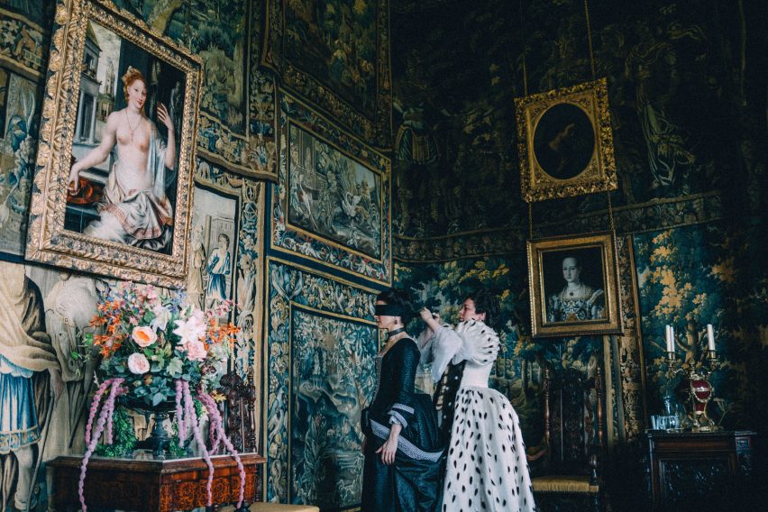
The film was nominated in 10 categories at this year's Academy Awards, including best production design, although it only won one – Olivia Colman picked up the Oscar for best actress. It also won eight BAFTAs earlier this month, including best production design and best costume design.
Speaking to Dezeen, production designer Crombie said she and director Yorgos Lanthimos wanted to create a "grand" yet "stripped-back" design for the film. It was mainly shot at Hatfield House, a Jacobean-style property in Hertfordshire, but the building was completely transformed.
"We found our own language"
Crombie told Dezeen that her focus was on expressing the "frivolity and whims of the court" rather than the accuracy of the period decor.
"The design is quite spare. We really invented our own version of a period film, so it's not historically accurate. We just found our own language for how to represent the story rather than necessarily representing accurate depictions of Queen Anne style," she said.
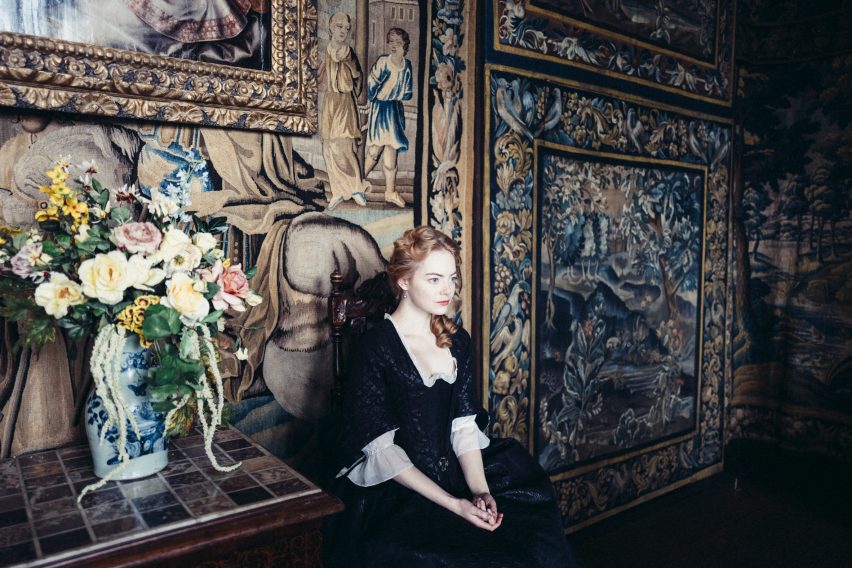
Whilst period dramas are more popular than ever, the reign of Queen Anne is often overlooked, leaving the designers with room to be playful with the sets.
"I just recognised that there was this really interesting period that hadn't quite found its feet, in terms of design," explained Crombie, who also worked on the recently released Mary Queen of Scots and upcoming film The King, an adaptation of several of Shakespeare's history plays.
"Hatfield House is a beautifully preserved building that's correct for our period even though we weren't designing with a specific year in mind," she continued.
Characterisation aided by production design
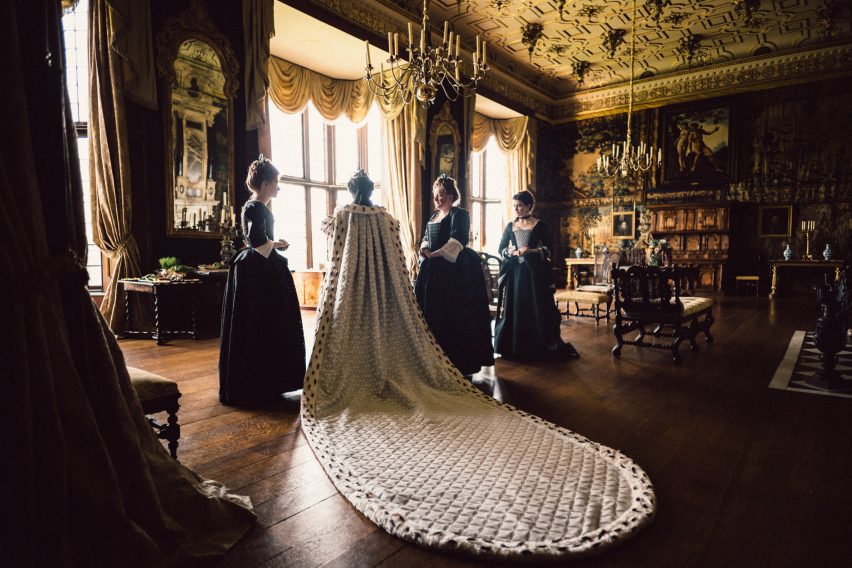
The production design plays a crucial part in building each character's role in the film by dwarfing some characters in large spaces or making them overshadow their surroundings in others.
"We tried to play with scale throughout the whole film," explained Crombie. "You go from the enormous scale of Queen Anne’s quarters to Abigail's tiny little bedroom. I love the idea of dwarfing people and having something looming in the space."
Crombie wanted the aesthetic of the palace's interior to mirror Queen Anne's shift in allegiances from Sarah to Abigail.
When Abigail is the Queen's favourite, there is a "frivolity" to the set arrangements: "the colour palette is lighter, there are more pinks and all the food that's on the side of the big table is filled with sugary treats of different colours," explains Crombie.
"At her dinner, everything is stripey and we did lots of jellies – shiny and stripey jellies and interesting food," she continues.
In contrast, when Sarah is in control, the table spreads consist of dried fruits and nuts.
Hatfield House's existing decor was starting point
Crombie and her crew spent five weeks adapting the Jacobean architecture of Hatfield House to suit the needs of the script. "We were taking advantage of the bones of the building and then fitting them into our story," she explained.
An important requirement for the location was that it had plenty of natural light and allowed the use of candle light. "Hatfield House allows open flames, and that was just such an essential component for us," said Crombie.
The team were operating on a shoestring budget so many aspects of the set were made using existing decor and infrastructure in the house. Crombie described the process as "working with what they've got and making up the rest".
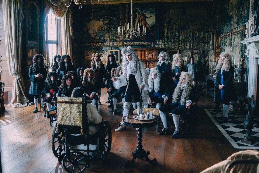
The tapestries that cover the walls of the palace, for instance, are a combination of pre-existing tapestries in the house and canvas paintings the crew made to emulate the patterns and textures of the textiles.
"We were basically looking at what we loved about the spaces and then building on them so they looked like a real detail," she said.
A secret passageway with entrances and exits was built between Queen Anne and Sarah's rooms. An enormous facade was also constructed to cover the entire front walls of the house to better resemble a royal palace.
The design plays with "opposing scale"
Having been given access to the V&A musuem archives, Crombie based much of the set's scale on her research into 18th-century decoration, which she found varied massively from "really big and chunky" to "really fine and tiny".
"Even just a table setting, you'd have really big elements next to really tiny pieces and it was an interesting tension. It made me really think about this kind of opposing scale throughout the whole of the film," she explained.
This play on scale can be observed in Queen Anne's bedroom, which features an enormous four-poster bed with ornate curtains and a staggering four mattresses, intended to "dwarf" the other actors.
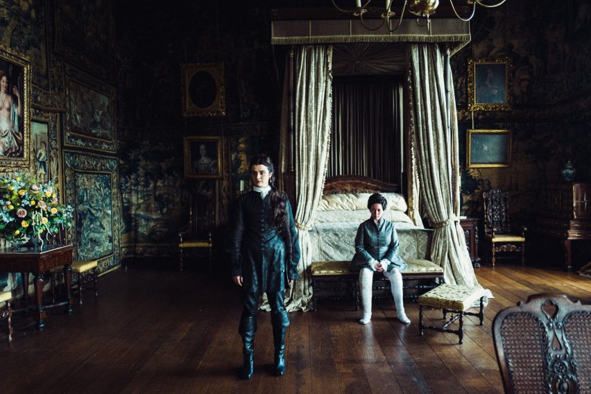
"The most brilliant piece we made was the bed. I just loved being able to make Queen Anne's bed, and we had that hand-carved and hand-painted in the north of England, it was just a really unique piece," explained Crombie.
"We took what is a fairly accurate representation of a queen's bed from that period, but we just pushed it that little bit taller to play on scale."
In contrast to the maximalist decor of Hatfield House, further interventions to the set are intentionally sparse in order to not overshadow the actors.
"There's a grandeur, obviously, and a scale to the film. I didn't want it to be that you lost the characters. I didn't want them to disappear into too much visual information," she said.