Google offers "scientific proof that design is important" with A Space for Being
Google has partnered with scientists on a Milan design week exhibition that shows how different aesthetic experiences can impact our health and wellbeing.
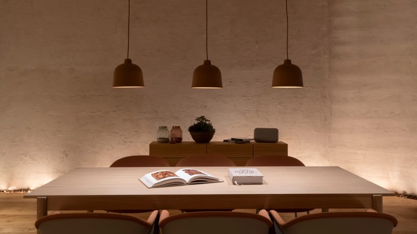
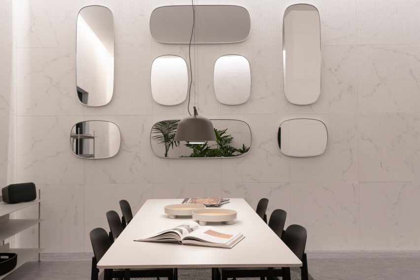
Developed with scientists from John Hopkins University in the USA, A Space for Being features three rooms with subtly contrasting interiors.
Each one has been designed using the principles of neuroaesthetics – a branch of science the explores how visual aesthetics can impact our brains and physiology.
With varying lighting, sounds, scents and textures, the rooms are intended to stimulate visitors' senses in different ways. The aim is to show how good design can have a positive or negative impact of mental wellbeing.
"Design affects everything," explained Ivy Ross, Google's vice president for hardware design.
"What you choose to surround yourself with affects your wellbeing and your body, and the fact that neuroscience is now proving that is thrilling to us," she told Dezeen.
"Being in Milan, there are a lot of designers here," she continued. "The installation is a nod saying 'what we do matters', showing to those who aren't designers that what designers do and the choices you make in your environments do affect you."
"It's scientific proof that design is important."
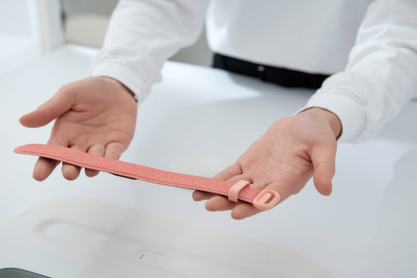
Before entering the interactive rooms, visitors are equipped with a specially made wristband, developed by Google in partnership with the International Arts + Mind Lab at Johns Hopkins University, led by Susan Magsamen.
This uses four sensors to measure specific physical and physiological responses, such as heart rate and skin conductivity.
After experiencing each of the three spaces, visitors are given a customised report informing them which space they felt "most comfortable" or "at ease" in, based on their real-time physiological responses.
Suchi Reddy, architect and founder of architecture studio Reddymade, designed the spaces, and they are furnished with products by Danish design brand Muuto.
This grants all three rooms with a common aesthetic, which helps to prevent personal taste influencing visitors' reactions, so that results come purely from the sensory triggers.
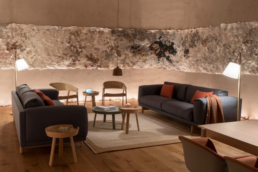
The first room, Essential, features warm, earthy tones with soft furniture and lighting. Reddy referenced the aesthetic of caves when designing this room, aiming to create a round, "womb-like" space.
Lining part of wall is a specially commissioned woollen tapestry by Dutch visual artist Claudy Jongstra, coloured using natural dyes made from flowers cultivated at the studio.
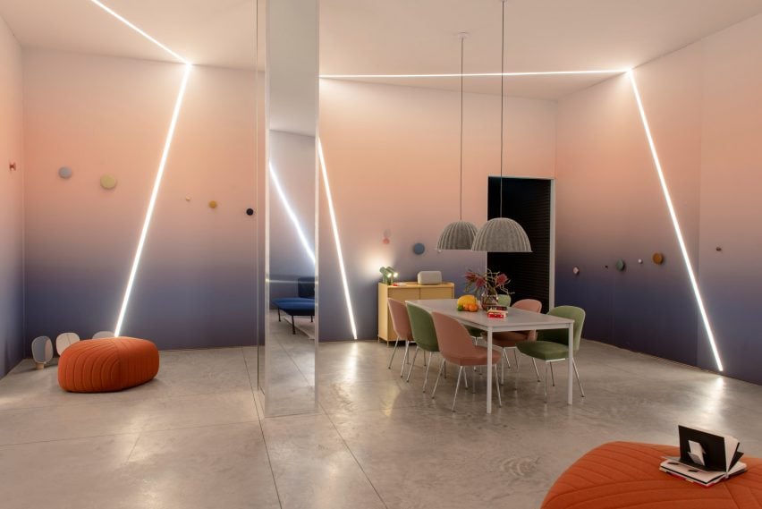
The second room, Vital, is designed to be more playful, boasting vibrant colours and beams of light that criss-cross the space.
Interactive pop-up books filled with 3D artworks are dotted around the room to spark visitors' interest.
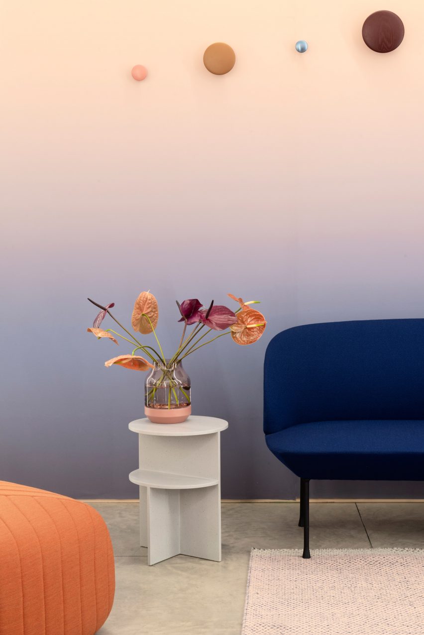
Reddy describes the final room, Transformative, as more "refined", characterised by muted tones of steel, wood and leather.
It is animated with a neon light by Dutch designer Sabine Marcelis.
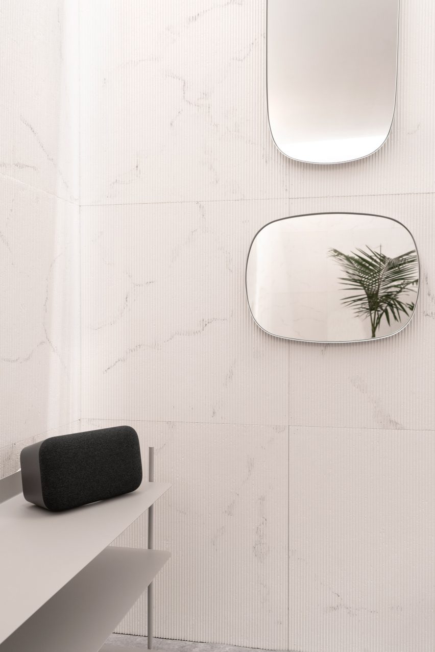
All three spaces are intended to reflect everyday living spaces, such as lounges and dining rooms, to help people realise they have the power to improve their own wellbeing with simple changes in the home.
"Once you can really understand what thoughtful design and architecture does to you, you can see that it's not just a status symbol of who you are in the world," Reddy told Dezeen.
"You can change your environment, and you can create spaces that suit your needs, and that's a conscious decision."
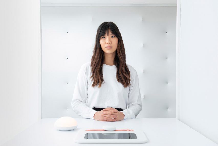
The unique report given to visitors at the end comes in the form of a circle painted in watercolours, with blue areas to show when the visitor was at ease, and splashes of pink for when the visitor was stimulated or excited by something.
"We worked hard to make sure that the visualisation was also beautiful, because technology doesn't have to be scary," said Ross. "The whole premise is that technology can be beautiful – it's not either, or. We need both in our lives."
The neuroaesthetic design installation is on view in Spazio Maiocchi in Milan until 14 April, as part of the city's annual design week.
It follows on some of the themes explored in Google's Softwear exhibition at last year's Milan design week, which looked at how electronic devices of the future could become more tactile in order to better integrate them into people's lives.
Photography is by Maremosso Studio.