Receipt redesign by BERG
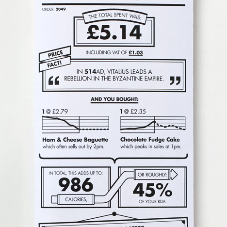
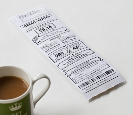
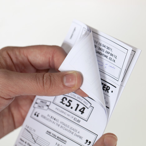
London design consultancy BERG have proposed a redesign of the standard till receipt, transforming the usually dull printout with infographics about purchases.
Data is extracted from cash registers to turn the receipt into a paper “app” that is informative and context specific.
The example pictured here shows a lunch receipt that displays total number of calories, percentage of RDA and other information relating to the food consumed.
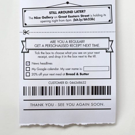
Tick boxes give returning customers the ability to customise their next receipt.
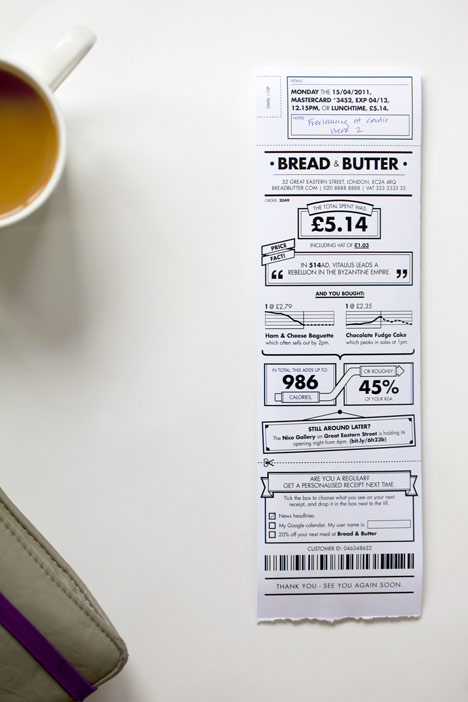
BERG were asked to rethink the receipt for a feature in the July 2011 issue of Icon magazine and developed the idea from an earlier collaborative project with creative agency Dentsu London.
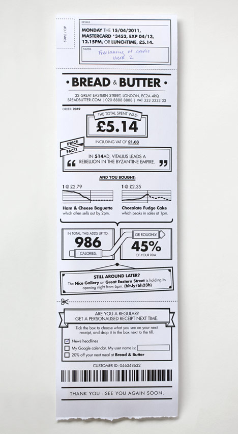
Here are some more details from BERG:
Icon magazine asked us to contribute to their monthly “Rethink” feature, where current and commonplace objects are re-imagined.
We continued some of the thinking from our “Media Surfaces” work with Dentsu, around how retail receipts could make the most of the information systems that modern point-of-sales machines are plugged into…
We’ve added semi-useful info-visualisation of the foods ordered based on “what the till knows” – sparklines, trends – and low-tech personalisation of information that might be useful to regulars. Customers can select events or news stories they are interested in by ticking a check box.
We think the humble receipt could be something like a paper “app” and be valuable in small and playful ways.