"He changed the rules, whether you like him or not"
In this week's comments update, readers disagree with Bjarke Ingels' claim that BIG buildings don't have a recognisable style.
Mistaken identity: in the latest episode of podcast Time Sensitive, BIG founder Ingels says he is proud that his studios building's don't have an identifiable style, but not everyone agrees they don't.
"This young man is deluded," said EMO Paul, "BIG buildings are immediately recognisable and constantly re-hash ideas they have used before. How many more twisting boxes, upturned corners or elevations formed of staggered blocks are we going to see before they formulate an original idea?"
Heywood Floyd agreed: "No identifiable style? What a preposterous joke and an insult to the intelligence of anyone who knows anything at all about architecture."
"BIG churns out junk. I guess that junk could be described as a style," added Alfred Hitchcock.
Matteo Raspagni was more complimentary: "He changed the rules, whether you like him or not. Created a bridge between the untouchable Olympus of archi-stars and us."
On a different note, Ingels reminded this reader of a famous actor:
Do you think BIG buildings have an identifiable stye? Join the discussion ›

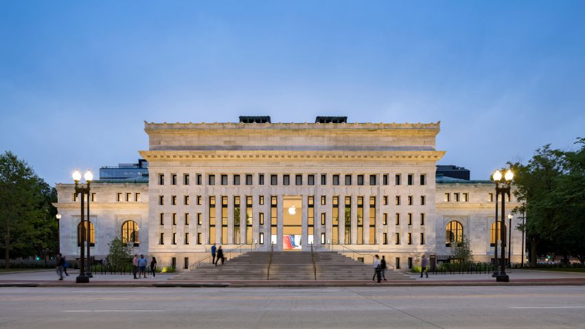
New chapter: readers are disheartened to learn that Foster + Partners has transformed a former public library in Washington DC into a sleek retail space for Apple.
"From library to Apple Store. Yep. This is where we are heading," opened The Nicolas.
"Granted, the building was disused for a while," continued Jon, "but as a national landmark that was the capital's 'first public library', I do feel that a retail experience, no matter how well-designed, simply cheapens that heritage and sends the wrong message."
This commenter felt similarly:
Dipanjan Das agreed: "Another landmark, history and heritage consumed by consumerism. The sentiment behind the library is lost."
Heywood Floyd had different thoughts, asking: "What percentage of the crybabies on here complaining about corporate greed are typing on an Apple product? An unused historic building was tastefully renovated and restored. Get on with your day already."
What do you think of the renovation? Join the discussion ›

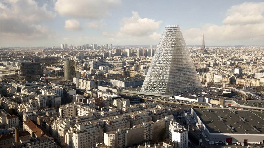
Cheesed off: news that the Herzog & de Meuron-designed Tour Triangle will be built after it passed its last legal hurdle, has upset some commenters.
"Absolute disaster," said Sultony in dismay, "a moronic design with no integrity but seemingly modelled on a child's brick or a cheese slice."
This commenter agreed:
"What a shame," continued Yoram Maron. "Awful building for Paris which is now trying to get out from the ashes of Notre-Dame. All against the rules of sustainability and green environment building."
"In Egypt it would be beautiful, but here in Paris it's nonsense. This kind of architecture could be anywhere, it has absolutely no link with the history and culture of this ground," added Pierre.
Catherine Hammond concluded: "If you love your city the way it is, make sure it never hosts the Olympic Games."
Do you like the building's design? Join the discussion ›

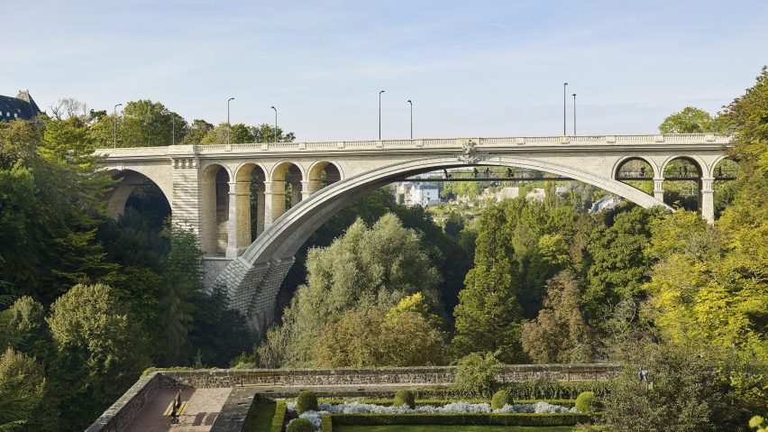
Bridging the gap: the addition of a four-metre-wide path beneath the Pont Adolphe bridge in Luxembourg has delighted readers.
"This is fantastic!" exclaimed Jenna McKnight. "Simple, beautiful solution that is sensitive to the context. Would love to ride my bike here."
"An elegant insertion and understated detailing," praised Benny.
"Congratulations!" added Oscar Vidal Quist. "This is the kind of work that recovers trust in architecture. It takes the strength of the legacy and adds value without taking advantage of it. It is balanced, pure poetry. I love the lighting, materials and proportions."
"Simply elegant design and solution. Especially when lit at night," said James Beckett.
One word summed up this commenter's thoughts:
Do you agree with these readers? Join the discussion ›