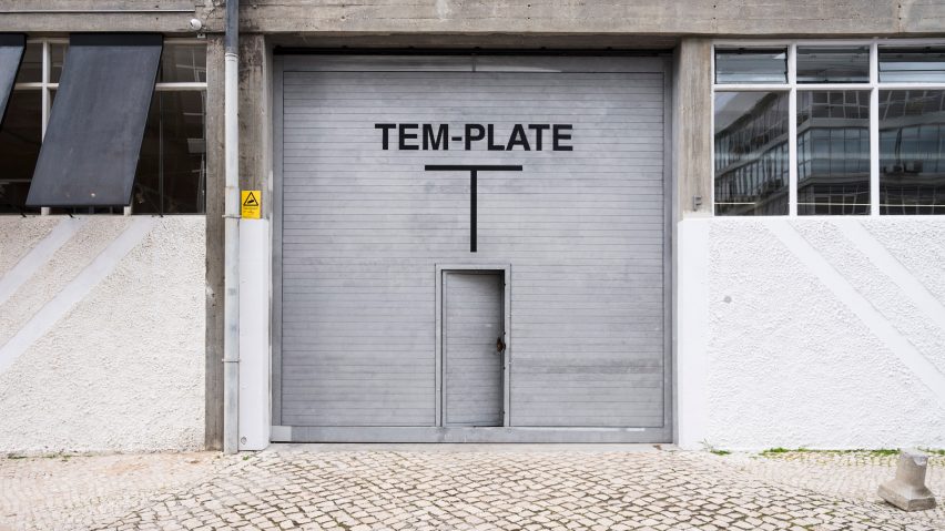
Gonzalez Haase AAS creates pared-back interiors for Lisbon concept store Tem-plate
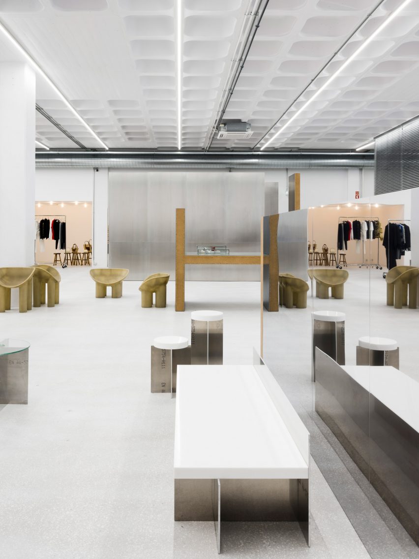
White walls, concrete floors and a metallic display fixtures provide a neutral backdrop to the ever-changing fashion collections on show in new Lisbon concept store Tem-plate.
Concealed behind an unassuming metal shutter door, the sparsely-furnished Tem-plate store is re-decorated once a month to present different ranges of high-end and limited-edition clothing.
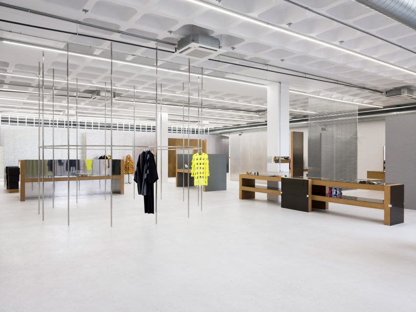
"The project represents an interplay between sleek and raw, between the simple and the extraordinary," said Berlin-based architecture studio Gonzalez Haase AAS, which designed the interiors.
"At the same time, the overall feel of the space remains concentrated and prosaic, leaving space for dramatic presentation of the high-end showpieces."
The 800 square-metre retail space occupies a disused warehouse in Marvila – an up-and-coming neighbourhood in Lisbon populated by art galleries, concert halls, artisanal breweries and restaurants.
Keen to create a timeless design, rather than channel a particular aesthetic, the studio avoided references when developing the design.
"We avoid too many visuals, instead we refer to a process to come to an unexpected result," explained Pierre Jorge Gonzalez, co-founder of the studio.
"The process is built according to several elements resulting from the existing space, the budget, the timing and the needs," he told Dezeen.
"The final design is based around simple forms and authentic surfaces that play with the raw framework of the old warehouse."
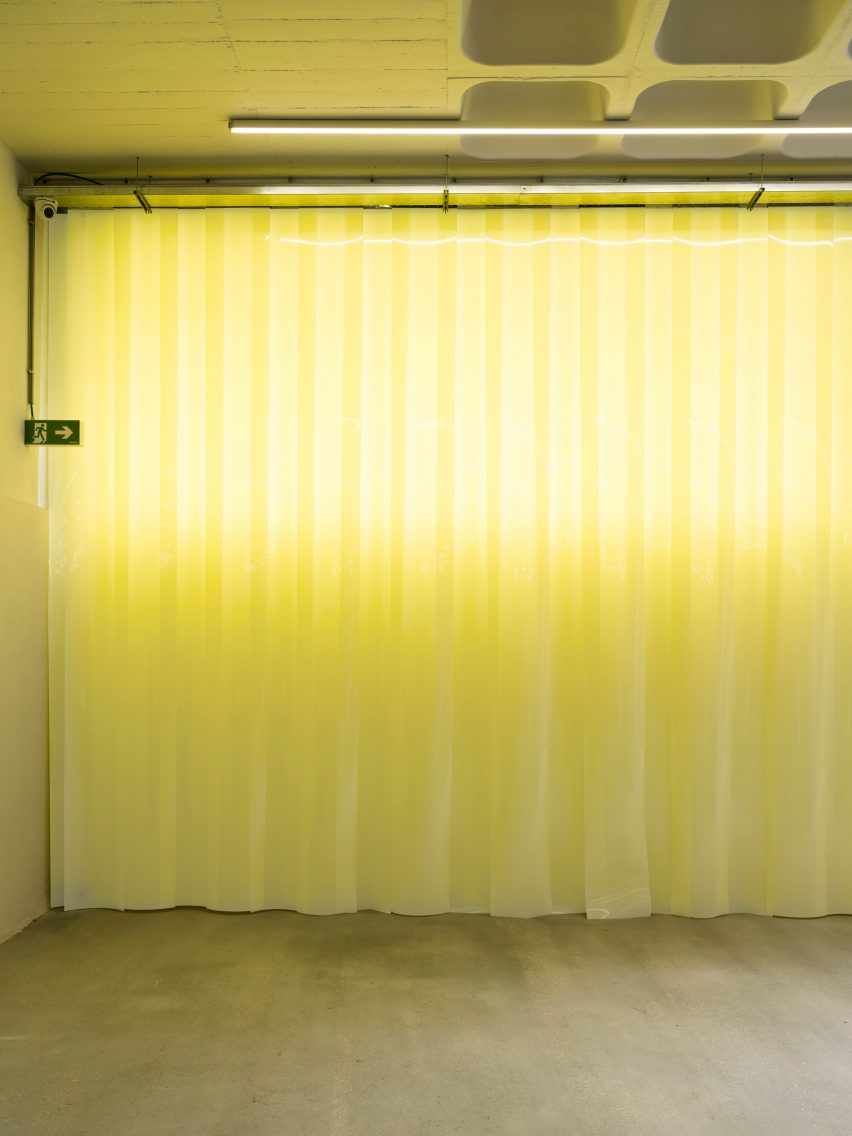
Visitors enter through a yellow PVC curtain that runs directly behind the front facade. Intended to mark the start of the shopping experience, the curtain also helps cool the store down in the summer months, and retain heat during the winter.
The main room is kept simple, with white-painted walls, concrete floors and strip lights across the ceiling that create what the studio describes as a "cool, homogenous illumination".
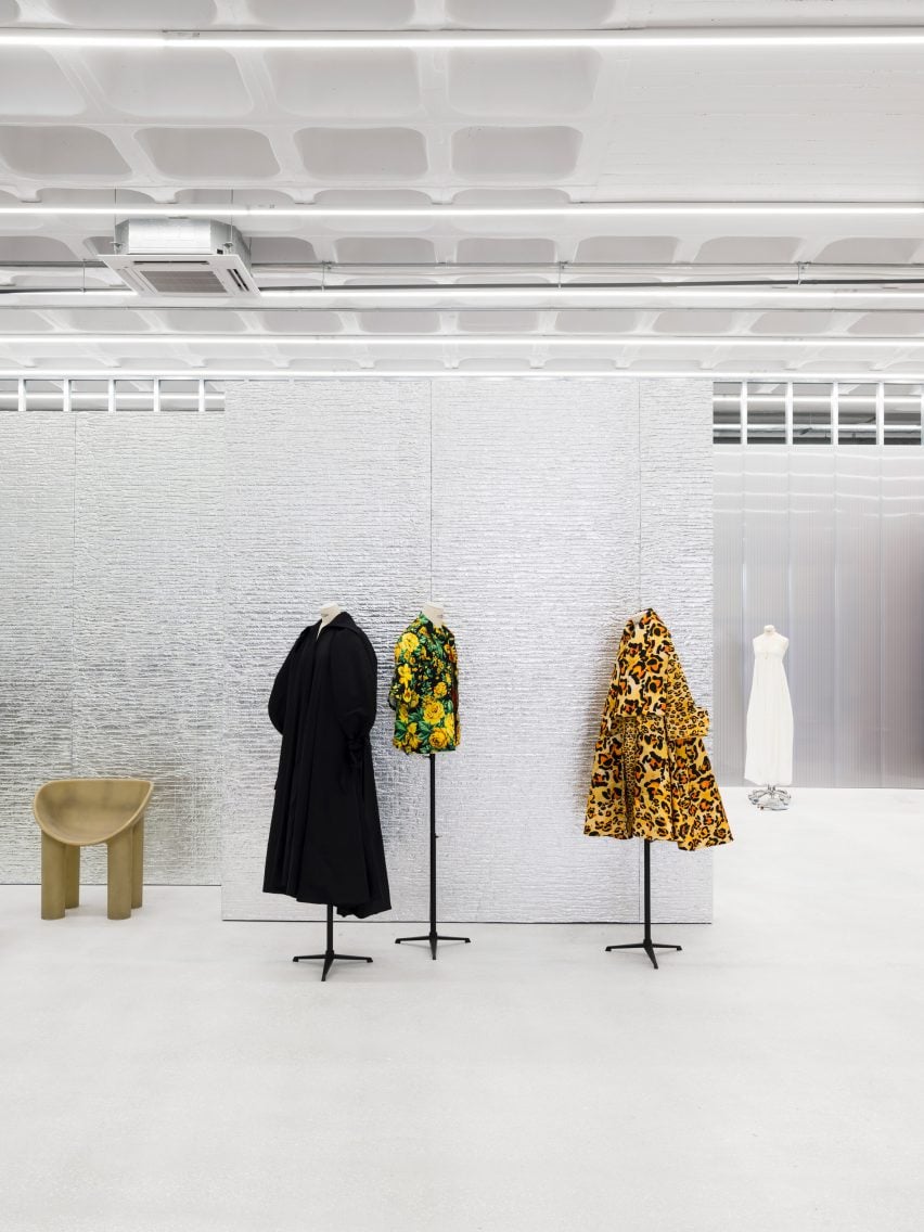
Partition walls with brushed metal or crinkled, foil-like surface cladding have been dotted throughout, serving as backdrops to styled mannequins.
"Seen in profile, these pieces deliberately reveal their innards, which are often composed of simple chipboard that stands in contrast to the high-quality materials used on the surface," added the studio.
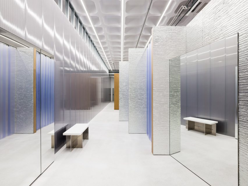
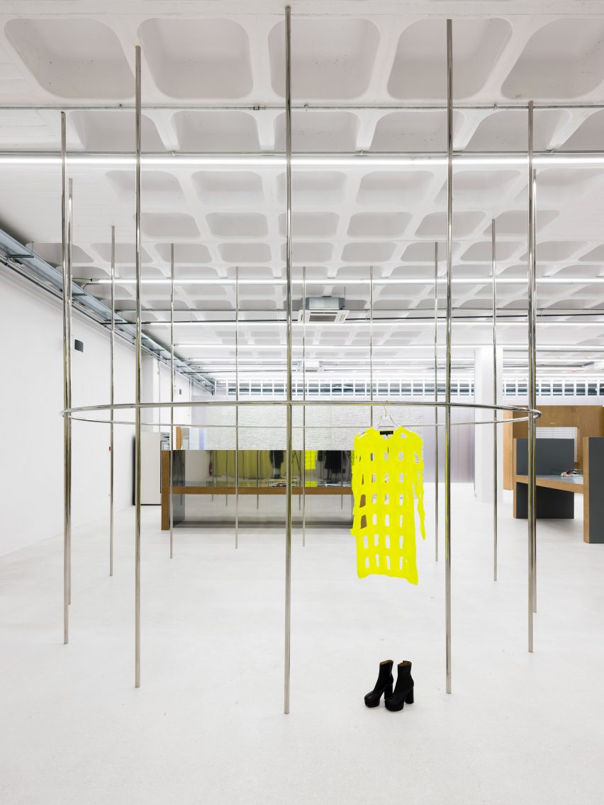
Some products are hung from a circular group of metal poles, while others presented on chunky mirrored display tables. The Faye Toogood-designed Assemblage stools, with their distinctive chunky legs, provide seating.
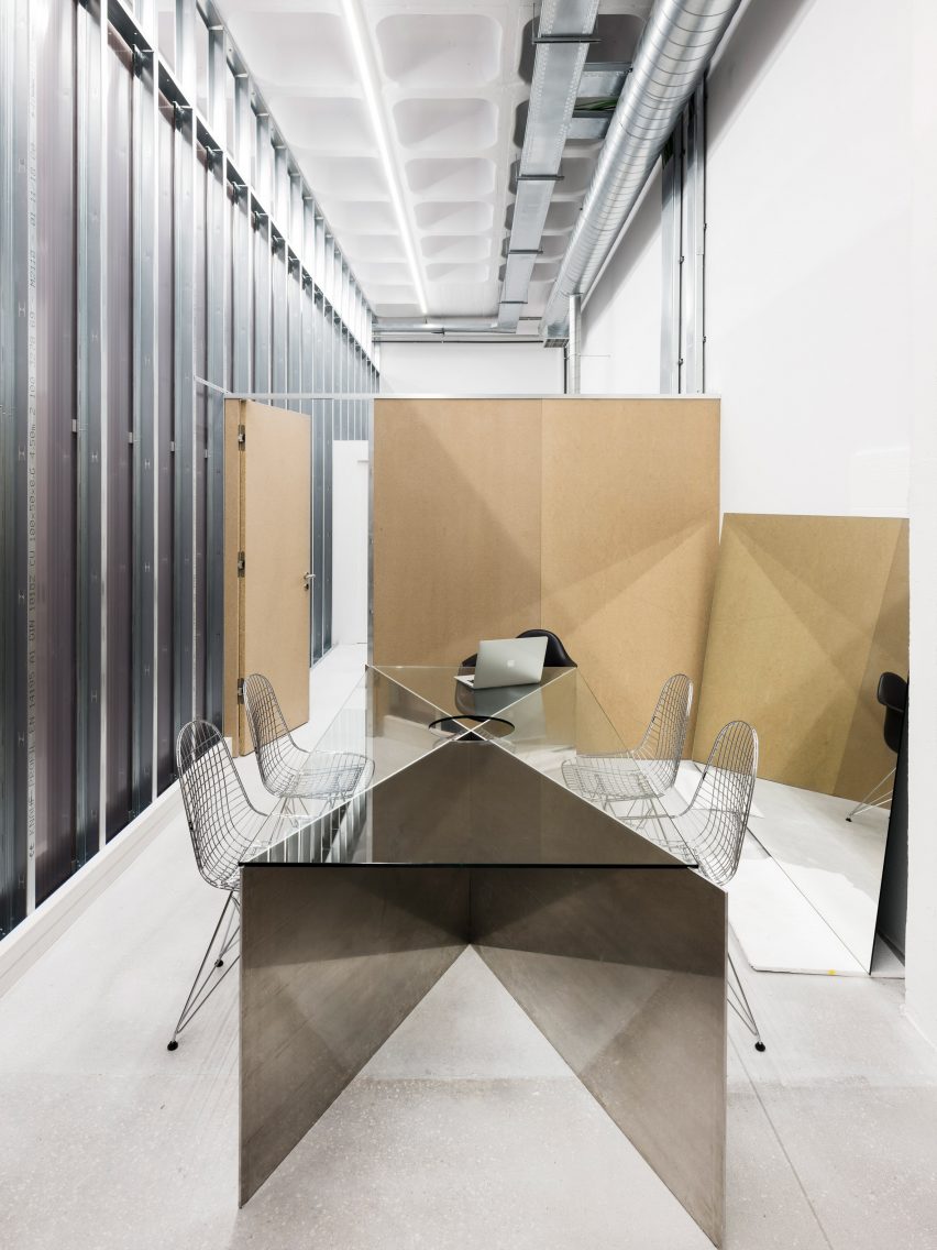
A rear wall composed of panels of polycarbonate closes off a small office area for staff, which is centred by a sculptural work table and wire-frame chairs.
Tem-plate is one of several new fashion stores boasting a minimalist interior.
Other examples include Loreak in San Sebastian, which features blue glass screens and offcuts of marble, and Mark Kenly Domino Tan in Copenhagen, which boasts glass and birch surfaces.
Photography is by Thomas Meyer.