Twitter redesigns website for first time in seven years
Twitter has launched its first major website redesign in seven years – a subtly streamlined experience that is more in line with the company's app.
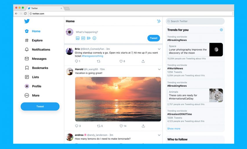
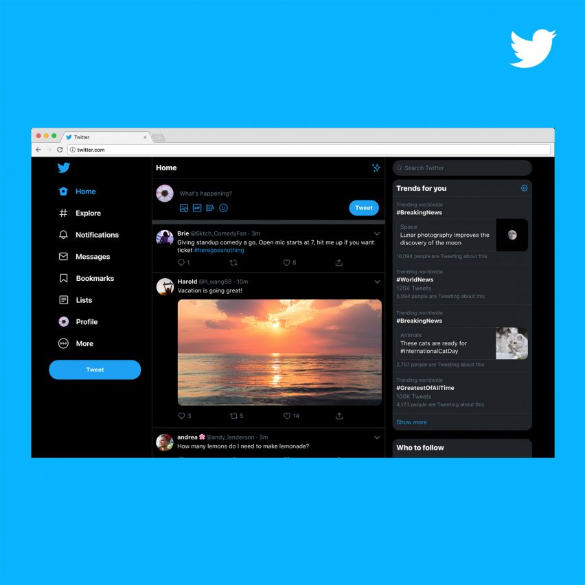
As of today, the desktop site for all users features a responsive design that can shrink down to a simple tweet stream, a rejigged side navigation that integrates bookmarks and lists, and more options for its popular "dark mode" display, which replaces white as the dominant background colour with a darker tone.
The primary goal behind the changes is consistency — the social networking platform's website has long looked outdated next to its native iOS and Android apps.
And while the new layout and functionality is not insignificant, Twitter's designers told Dezeen that the true extent of the changes is hidden under the hood. As part of the project, they moved to a new technical stack, meaning the underlying frameworks and programming languages are more suited to the demands of contemporary web design.
"This was built from the ground up," said Twitter's lead designer on the project, Ashlie Ford. "And it's something that is going to be much easier for us to build new features on, experiment with new features on, and it will get them out to our customers much quicker."
Website the product of a "smarter" company
Twitter's head of design and research, Mike Kruzeniski, described the redesign as the company's "worst-kept secret". Where once they might have tried to keep the news under wraps, they now value a slow rollout with extensive testing, meaning many users are aware of what's coming.
He also says that thanks to investment in research and data science, their designers can feel more confident in their choices.
"As a company, I think we've gotten a lot smarter over the years," he said. "When we make these changes, we know much more about the way people are using the product, what changes make sense, and which changes work."

There are a few key differences in the redesigned Twitter website. The top navigation bar is gone, so the entire menu is now stacked in the left-hand column — including bookmarks and lists, two useful curation functions that were previously either hidden or unavailable on the website.
Trending hashtags now top the right-hand column, providing a glimpse at the day's biggest discussion points. Both direct messages and expanded single tweets now have their own dedicated pages, meaning there are fewer overlays around the site.
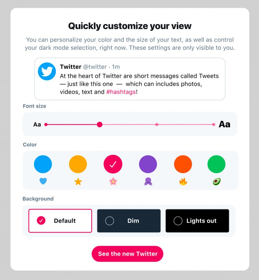
One of Ford's favourite features is personalisation, which allows different font sizes and colours — although not the infinite range offered by the previous site, which she admits led to some low-contrast, barely legible user-created interfaces.
The overall impression is of less clutter and more white space. Some users might prefer to think of it as dark space, if they use the Lights Out or Dim display modes, which turn the site predominantly black or dark blue-grey, respectively.
While the experience is now much more consistent with the apps, this is also a responsive, desktop-specific design, with three full columns of information if the user expands the browser window to fill their screen.
Health initiatives not included in redesign
This redesign comes with the promise of faster innovation in the future — something that might give hope to the large segment of Twitter's user base which has clamoured for better protection from abuse and harassment.
The last couple of years has also seen the idea of "Time Well Spent" entering into the conversation around technology, which has seen some social networking sites launch measures to temper their addictive qualities.
The same concerns have led some designers to experiment with minimal smartphone designs such as the Light Phone, Jasper Morrison's Punkt phone and Morrama's wellbeing-enhancing concepts.

It is possible to interpret features of Twitter's redesign in light of these trends – follower counts and user analytics are both less visible in the new layout, for instance.
But Twitter's designers deny that health and safety concerns influenced the new website. They see it as a technical project almost wholly geared around consistency with the app and efficiency for future iteration.
Kruzeniski insists there are many such initiatives at Twitter, however, and that they are a priority for the company rather than a threat to the business model.
"If people are not having a good experience through having good conversations and good interactions, they're not going to use the platform," said Kruzeniski. "So I do think it's not only possible [to both grow the business and promote wellbeing], I think that it is the future for products like Twitter."
Author moderated replies set to be tested
Kruzeniski gave a sneak peek of one such potential feature: author-moderated replies. Set to launch for testing to users in Canada in the coming weeks, it will allow the person who posted the first tweet in a conversation to hide replies that they don't like or don't want to engage with.
The replier does not need to have said anything against Twitter policy necessarily. Kruzeniski likens it to handing control over the room to the host of a party.
"In the same way if someone comes to your party and they're being disruptive, what they're doing is maybe not illegal, but you just don't want them to be at your party," he says.
Twitter is the 11th most visited website in the world, according to online traffic analysis company Alexa. In terms of how many people use the site daily, however, it is a fraction of the amount of its competitor Facebook. Twitter has around 126 million daily users, while Facebook has 1.2 billion. Snapchat also has more, at 186 million.
However, Twitter has grown its daily active users by nine percent compared with the same period last year. It also has huge cultural and political influence relative to its size, especially since becoming the go-to platform for unfiltered pronouncements from the president of the United States.