AIM Architecture creates apothecary-style beauty store in Hong Kong
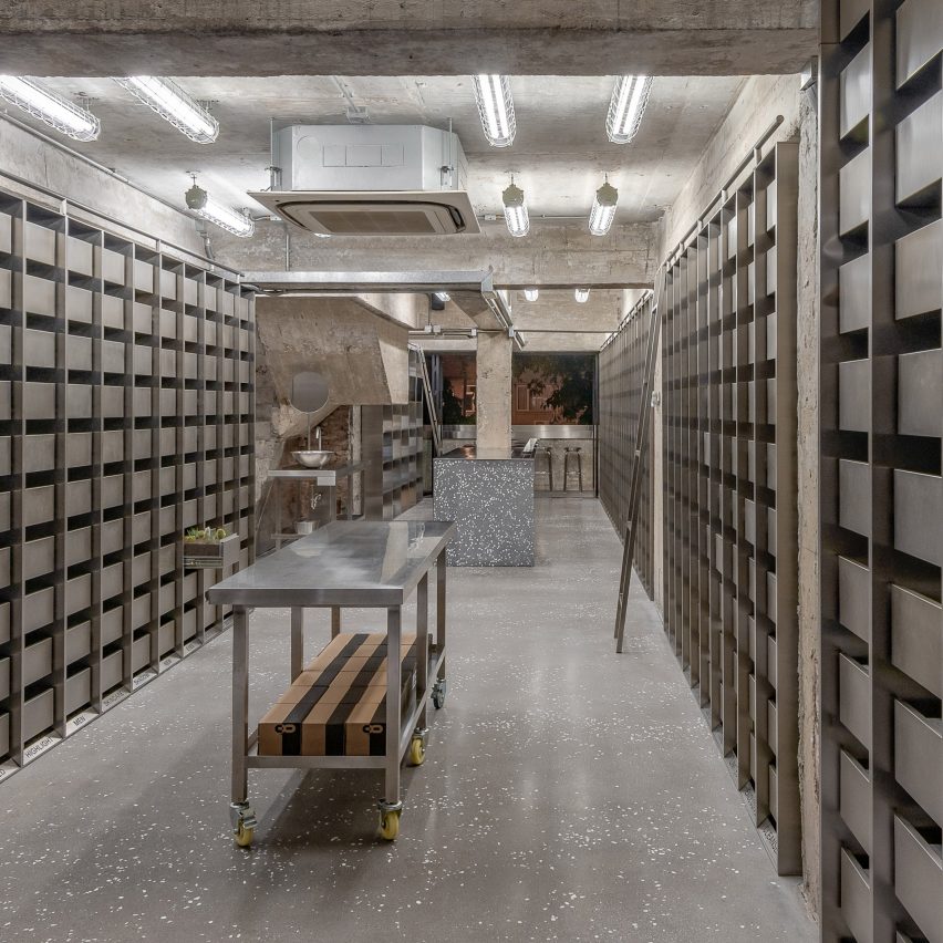
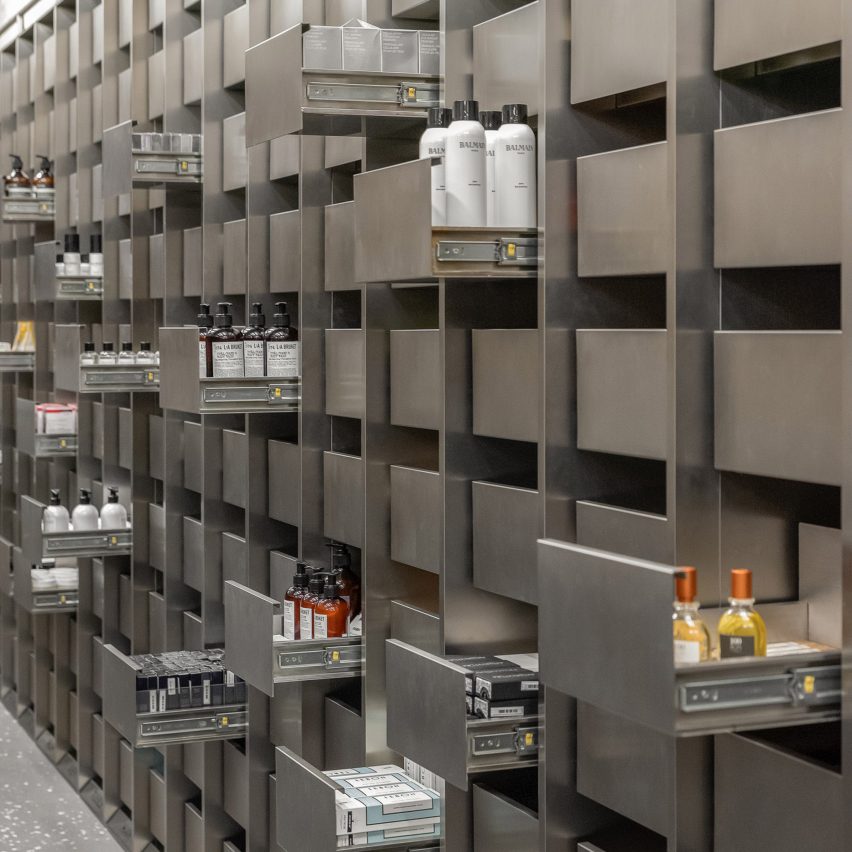
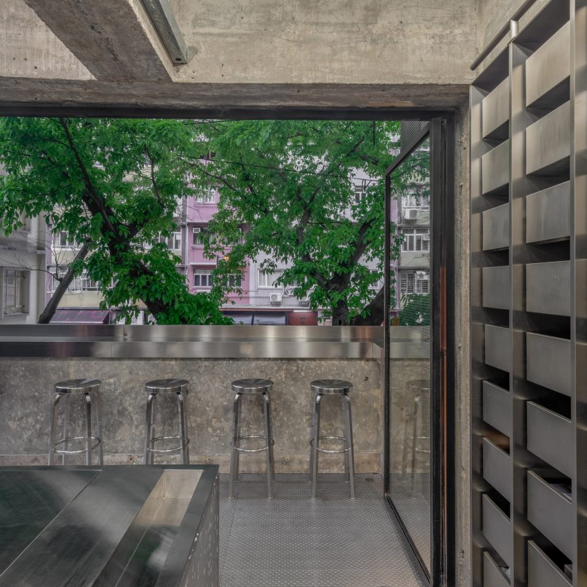
Hundreds of stainless steel drawers line the walls of this cosmetics store in Hong Kong, which has been designed by AIM Architecture to emulate a traditional apothecary.
Taking cues from traditional chemists – where medicines were stored in apothecary cabinets made up of small drawers – the store is designed to be a space for exploring and discovering.
The beauty store, which focuses on offering the customer a sensory experience, has been shortlisted for a Dezeen Award in the Retail interior category.
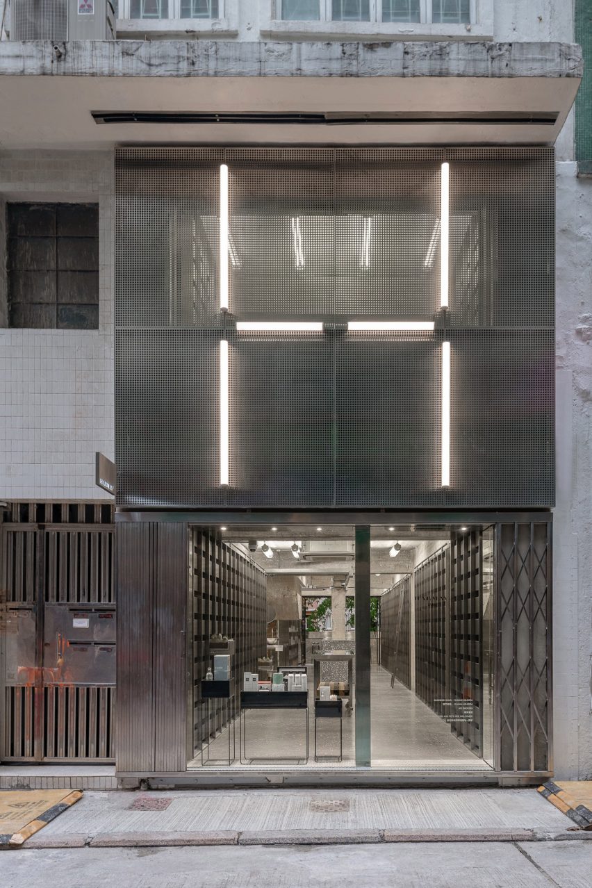
Spread across two floors, the store is located on a winding and narrow Hong Kong street packed with shops, restaurants, and food stalls.
The facade is clad with perforated steel lit by LED tube lighting arranged into an H shape.
The austere stainless steel drawers that line most of the walls were designed to give the space an uncluttered, ordered and calm feel. Subtle signage guides customers to open the drawers, revealing the products inside.
Rough exposed brick walls and concrete ceilings are used throughout the store to create a visual cohesiveness across the two floors.
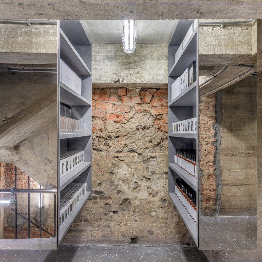
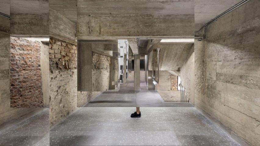
On the store's first floor, products are lined up on rubber shelves within stainless steel mirrored cabinets that are suspended from the ceiling.
The mirrored surfaces that reflect the surrounding rough brick walls are intended to make the cabinets almost "disappear" within the space – a trick that the studio said represents how conventional shopping is vanishing from everyday life.
The studio also hopes that the cabinets will create "an intimacy" with the products, placing them straight into the hands of shoppers.
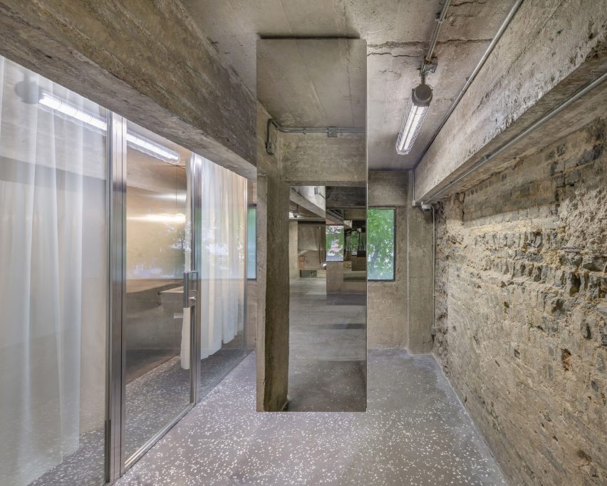
A stainless steel powder room is hidden from view by another mirrored panel. Suspended from the ceiling, the panel leaves just the shoppers' feet exposed.
AIM architecture, who previously designed the brand's first bricks and mortar store in Shanghai, said it wanted the store to offer a tangible experience to customers who would ordinarily only experience the brand digitally.
"With this newly opened Hong Kong location, we explored this online/offline duality of the brand even further," explained the Chinese firm.
"In this era of moments, stories and Taobao sales, culturally, we are at an intersection. Consumers want convenience but crave experience. Online shopping will never lose its allure, but there's a real challenge for brands to experiment with the dynamics of modern consumption."
"It's not even about shopping – because these days, shopping merely is scrolling and clicking, anyway. Instead it's about discovery," the studio continued.
"Harmay's new Hong Kong space is designed for the curious and engaged consumer, and the casual passerby who walks in expecting one thing and finds the unexpected."
Other projects by AIM Architecture include a spa resort in rural China with a geothermal pool wrapped by a glass walkway, and an office interior in Shanghai with mirrored walls and glass ceilings.