
Michael and Patty Hopkins took high-tech architecture to historical settings
We continue our high-tech architecture series with a profile of Michael and Patty Hopkins, who designed one of the movement's most pragmatic buildings – Hopkins House – and went on to develop historicist high-tech architecture.
High-tech architecture, a style that emerged in the UK in the late 1960s and saw the expression of structural elements, had many contradictions.
It often merged structural rationally with exaggerated details or combined the bespoke with mass-produced societal solutions. However, it found some of its most paradoxical manifestations in the later work of Hopkins Architects, the creators of what some termed "historicist high-tech", or "high-tech brick and stone".
Before creating the work that made them something of the misfits of the movement, Michael and Patty Hopkins (née Wainwright) followed a textbook British high-tech trajectory.
Both studied at London's Architectural Association, considered the birthplace of the style along with Regent Street Polytechnic, with tutors such as Cedric Price, Bob Maxwell and Peter Smithson and heavyweights of industrial design such as Buckminster Fuller and Charles and Ray Eames looming large.
Both, once they had graduated, spent time working in the offices of what was then Foster Associates (now Foster + Partners): Michael Hopkins as project architect on the Willis Building in Ipswich, and Patty Hopkins on the Pond House extension in Hampstead.
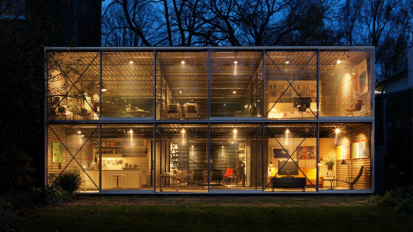
So when it came to establishing their own office in 1976 Patty and Michael Hopkins were well-versed in this new style and ready to take it in their own direction. They did soto dramatic effect in their first project for their own home and studio: Hopkins House in Hampstead.
Reminiscent both of the Eames House in Santa Monica and the Pond House that Patty had worked on nearby, the Hopkins House was a translation of the industrial lessons that the duo had learnt while working Foster into the world of the domestic. It demonstrated that high-tech was far more than just the architecture of workplaces and industry.
Collaborating with engineer Antony Hunt – a key figure in establishing the reputations of many high-tech architects – the structure is an incredibly stripped-back, modular framework of mass-produced components. The minimal and open living spaces, enlivened with pops of blue colour, are completely exposed to the outside save for sets of slim Venetian blinds.
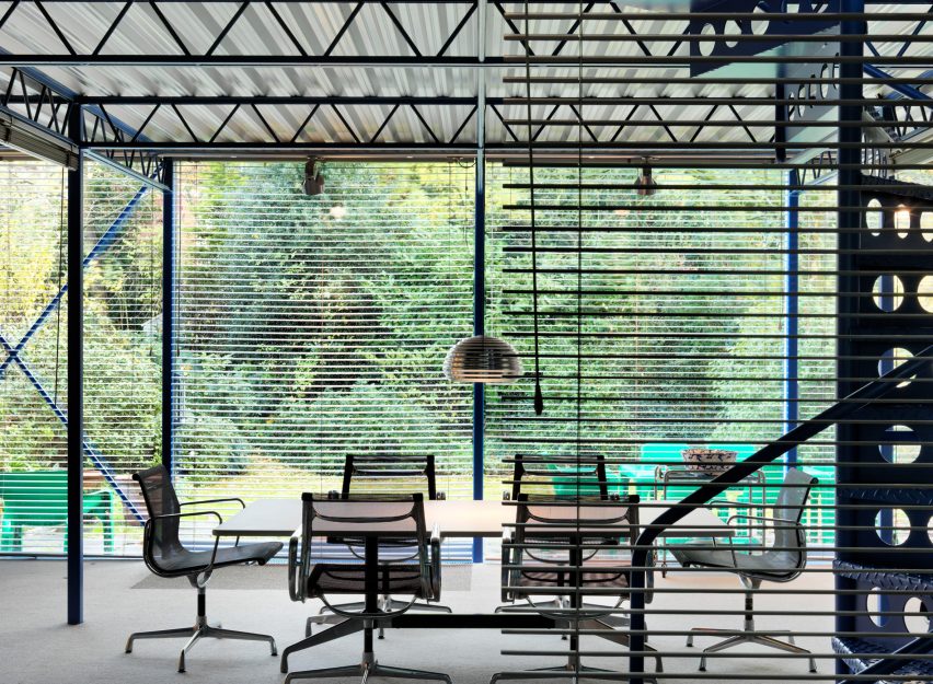
So pragmatic was its approach that critic Colin Davis described how the project virtually "designed itself", and Fuller was suitably impressed when he visited – allegedly asking his trademark question of how much it weighed.
Another deft demonstration of the Hopkins' grasp of high-tech came shortly after at the Greene King Brewery. This time the project that was entirely about industry, creating an expressive shed of steel and glass. With these strong statements of the Hopkins Architects' architectural approach, clients soon took notice, and true to high-tech's preoccupation with standardisation and industrial process, a commission soon came for not only a building, but an entire building system.
Nigel Dale, a former architecture student who had moved into industrial production, had seen the architectural style emerging in Britain and noted its practical, and economically attractive, "new factory style". Dale saw an opportunity to revive Britain's aesthetically bereft industrial estates.
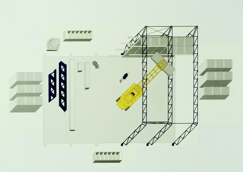
His solution was the Patera Building System, commissioned in 1980 with Hopkins Associates as the architect collaborating once more with Hunt as engineer. It was a high-tech dream commission – a refined, glass and steel system that would be developed as a prototype and subsequently rolled out for large-scale manufacture.
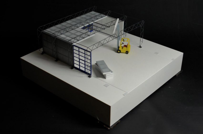
The visual similarities to Foster's Sainsbury Centre for the Visual Arts (also engineered by Hunt some two years earlier), are worth noting – with an exterior metal truss supporting a lightweight shell of cladding incorporating all of the necessary services. These sheds were to be immediately identifiable, possessing design individuality and an architectural signature and yet still being mass-produced and eventually ubiquitous.
In many ways, Patera was as high-tech as the Hopkins would ever get – architecture as product rather than a construction of constituent parts. As historian Angus Macdonald puts it, "[Patera] was an industrial product rather than an assembly of the product of industry".
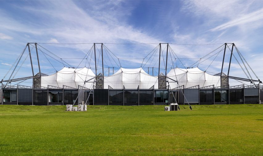
But beyond a prototype, only six Patera structure were ever built – two for the practice's own office and others for a project for BT in London's Docklands. Dale dropped the idea, and without the backing of an ambitious developer the system could never be rolled out in the numbers required to make it economical to clients. This was after all, a highly bespoke system that would be too expensive to design on a one-off basis.
Patera's ideas, however, were not abandoned – Hopkins Architects acquired the patents to the system (Hunt was still certain of its potential). Many of its lessons worked their way into the firm's next key project for the high-tech style – the Schlumberger Research Centre in Cambridge, the first phase of which was completed in 1985.
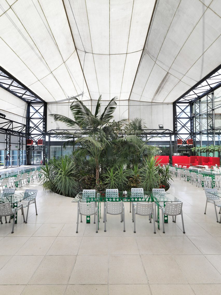
Schlumberger is notable for its inclusion of what would become something of a Hopkins trademark – a row of three lantern-like tensile membrane roofs designed by Ove Arup, supported by heroic masts and cables engineered once again by Hunt. This was no longer the high-tech of refined but demure industrial sheds, but something more flamboyant.
Beneath these big-top roof elements is a simple structure of triangular trusses supported by hollow steel columns and infilled with glazing. It is very similar to Patera but dispensing with its more complex joints, harking back instead to the straightforward Hopkins House or Greene King shed. Schlumberger marked a departure from a more purist, radical high-tech and a movement towards a new language.
This shift became starker in 1984 with the commission for the Mound Stand at Lord's Cricket ground in London – the first project by the practice to deal with a historic urban context. Many of Hopkins Architects projects up to this point had dealt with the contexts of rural areas, industrial estates or leafy London suburbs: here, the project was to be centred around Frank Verity's original cricket stand, built in the 1890s.
Michael Hopkins was aware of this odd match, referring to the Mound Stand project as his "reconciliation with history". The lightweight steel members and tensile fabric canopy familiar to high-tech are all there, but sitting above and drawing their geometrical arrangement from an arched brick base that was also extended.
Some ten years into their practice and these doyens of British high-tech were building with load-bearing brick – had Hopkins Architects simply been pigeon-holed too early? After this "reconciliation with history", there was a marked change in the firm's work as it attempted to reflect the urban and material complexity of the city while remaining true to its radical high-tech roots.
It was an approach neatly surmised by the title of a lecture Michael Hopkins delivered a lecture to London's Royal Society of Arts in 1992: "Technology Comes to Town".
Bracken House in 1992, Glydenbourne Opera House in 1994 and Nottingham's Inland Revenue Centre in 1995 were all notable examples of this new high-tech with brick and stone, often combining heavy, load bearing bases with lighter steel roof structures.
This is not to say that the practice abandoned a more conventional high-tech aesthetic entirely: New Square in 1992 drew on Mies van Der Rohe in the creation of an exposed steel frame infilled with aluminium panels. the Saga Group Headquarters in 1998 drew on some of the ideas of Schlumberger for the creation of a vast hangar-like pavilion space.
In 1994, the year Glyndenbourne completed, both Michael and Patty were jointly awarded the RIBA Royal Gold Medal – only the third time in its history it has been awarded to a male-female partnership.
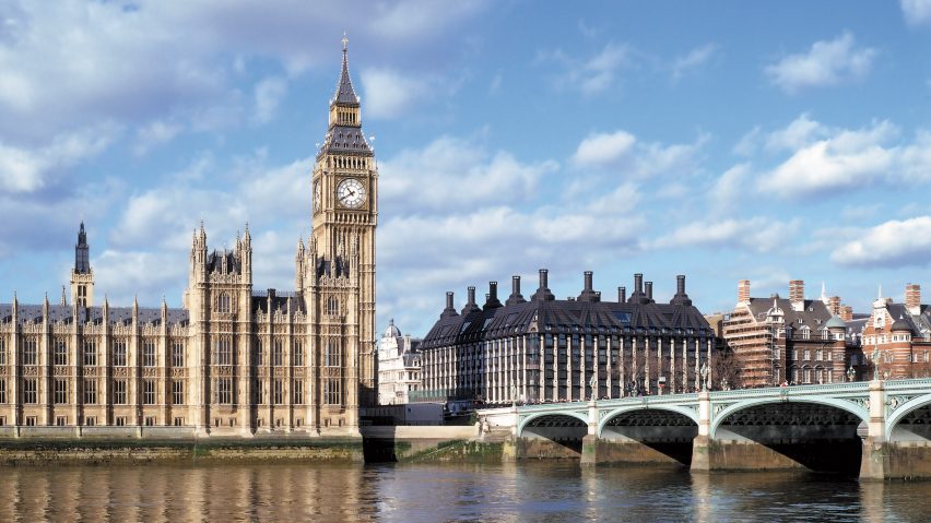
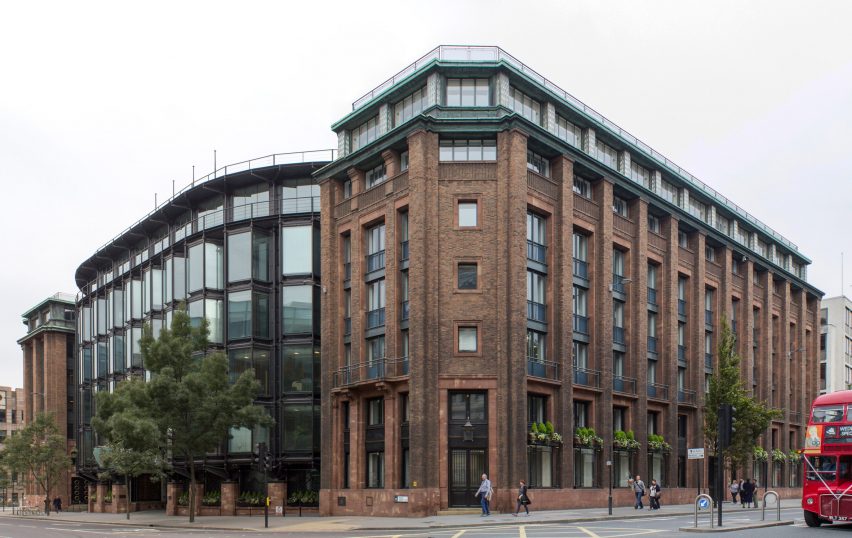
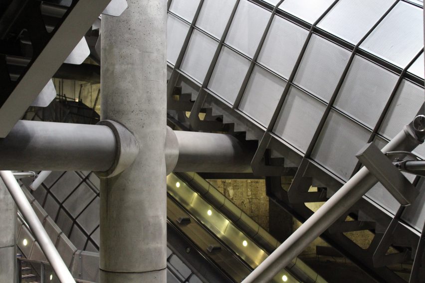
The peak of these attempts to create a kind of high-tech classicism came with the commission for Westminster Underground Station in 1999 and Portcullis House in 2002. This was a case of taking high-tech roots – in this instance quite literally the structure's support in the form of Westminster Underground Station's colossal steel tubes – and attempting above ground to develop a sort of classical high-tech that would be in dialogue with the neighbouring Houses of Parliament without sliding into historicism.
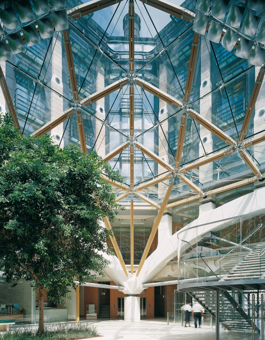
This was quite the stylistic juggling-act. The result is a combination of prestressed sandstone pillars from which protrude steel canopies and window boxes, the whole straddled by "spider-leg" girders supporting a roof dotted with fourteen ventilation chimneys (designed to echo the adjacent Norman Shaw Buildings). Inside, gull-wing concrete arches support the floors and a large central courtyard sits beneath an oak-beam canopy in the centre of the inner stone piers which transfer loads to the underground station below.
The project was nominated for the Stirling Prize in 2001 and remains a contentious scheme. Shortly after the designs were published, architectural critic Jonathan Glancey claimed it had been conceived in the "Gormenghast school of architecture: a night-marish, castelline device…".
"At best", he wrote "it has a kind of cartoon-like character".
Hopkins Architects' later work never quite returned to these stylistic extremes – nor had to deal with such impressive contexts – but nonetheless oscillates between the two poles of Schlumberger and Portcullis House, maintaining an equal interest in both.
High-tech brick proved popular with schools, universities and offices, with projects at the University of Nottingham, the Pilkington Laboratories at Sherborne School in 2000, a scheme for Northern Arizona University in 2007, Abingdon School in 2015 and the Evelina Children's Hospital in 2005.
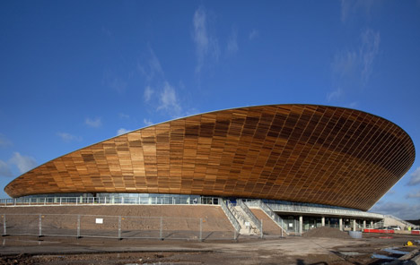
Trademark Hopkins fabric canopies popped up above many pavilions or open spaces, such as the Buckingham Palace Ticket Office in 1995, Goodwood Racecourse in 2001 and Hampshire County Cricket Club in 2001. And of course, the concept of a lightweight, shed-like structure proved effective for the cedar-clad "bowl" of the London 2012 Olympic Velodrome.
Much like high-tech itself, the more "sensitive" style that Hopkins are seen as having pioneered has never really left us – even Foster + Partner's Stirling-prize winning Bloomberg Headquarters appears to owe something to the Hopkins' particular brand of high-tech. In many ways, it is the essence of British high-tech: radical technological beginnings wrapped up in ideas of tradition, the civic and sustainability.
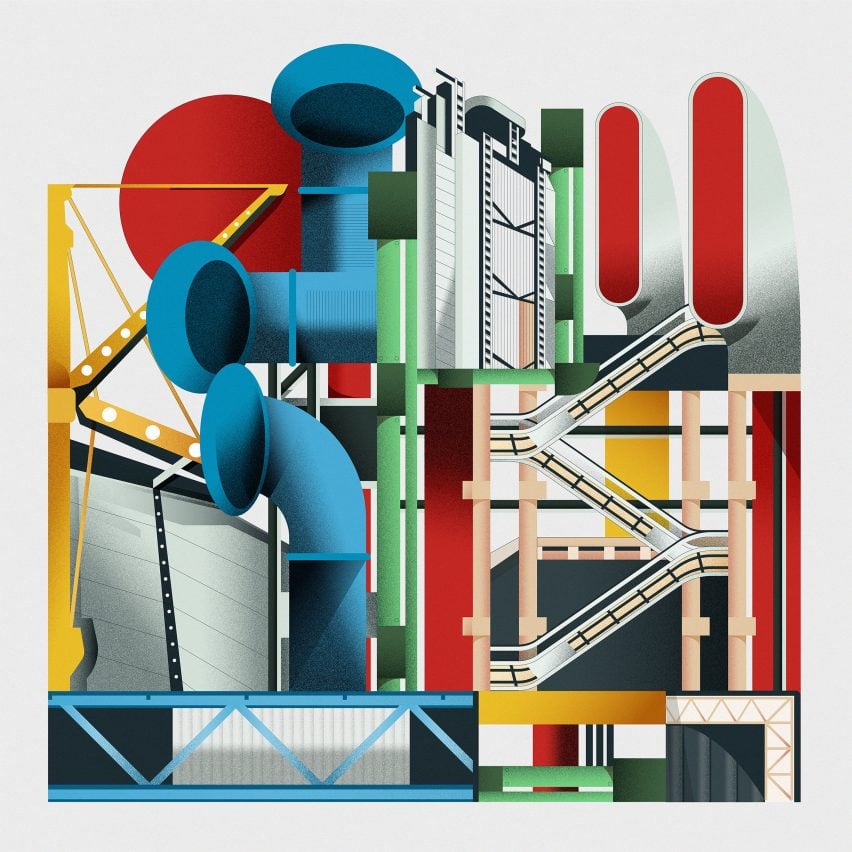
Led by architects Foster, Rogers, Nicholas Grimshaw, Michael and Patty Hopkins and Renzo Piano, high-tech architecture was the last major style of the 20th century and one of its most influential.
Our high-tech series celebrates its architects and buildings ›
Photography is courtesy of Hopkins Architects unless stated.