Centre Pompidou is high-tech architecture's inside-out landmark
Next up in our high-tech architecture series we look at the Centre Pompidou in Paris by Richard Rogers and Renzo Piano, the inside-out landmark that drew global attention to the movement.
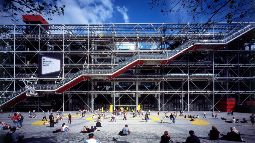
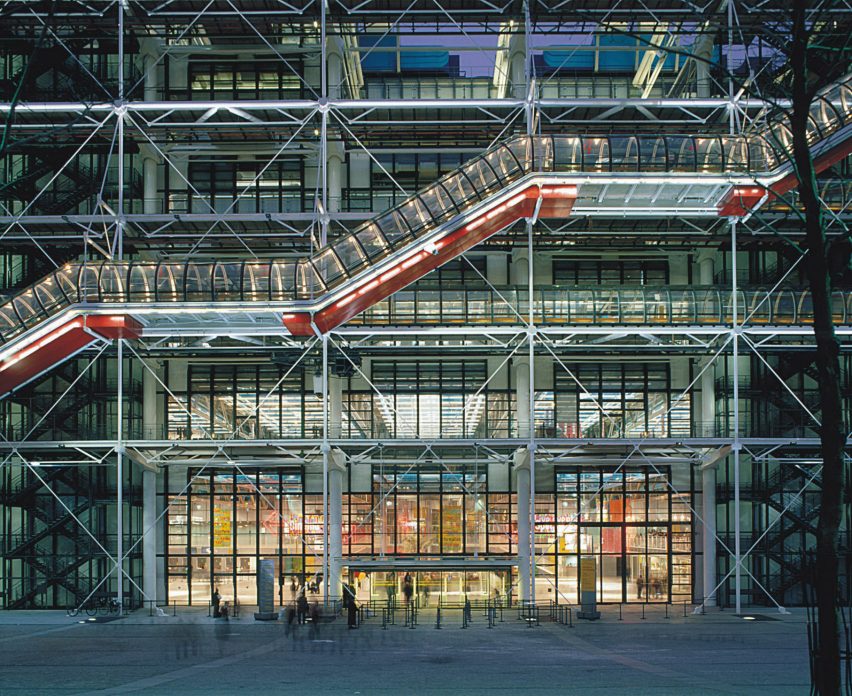
Known locally as the Beaubourg, after the area of Paris in which it is located, the Centre Pompidou is a cultural landmark that has its structure and mechanical services visible on the exterior of the building.
The highly-flexible container for art was completed in 1977 by British architect Rogers and Italian architect Piano, who were then collaborating together at their studio named Rogers + Piano.
"The centre is like a huge spaceship made of glass, steel and coloured tubing that landed unexpectedly in the heart of the Paris, and where it would very quickly set deep roots," Piano said of the building.
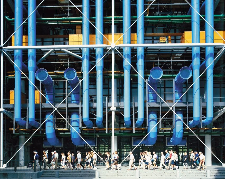
Described by Piano as a "big urban toy", Centre Pompidou contains six-storeys of large column-free spaces. It is the largest museum for modern art in Europe and also contains a vast public library and a centre for music and acoustic research.
The building is designed so that the internal spaces can be easily rearranged – made possible by placing the building services, corridors, elevators and structural members on its exterior.
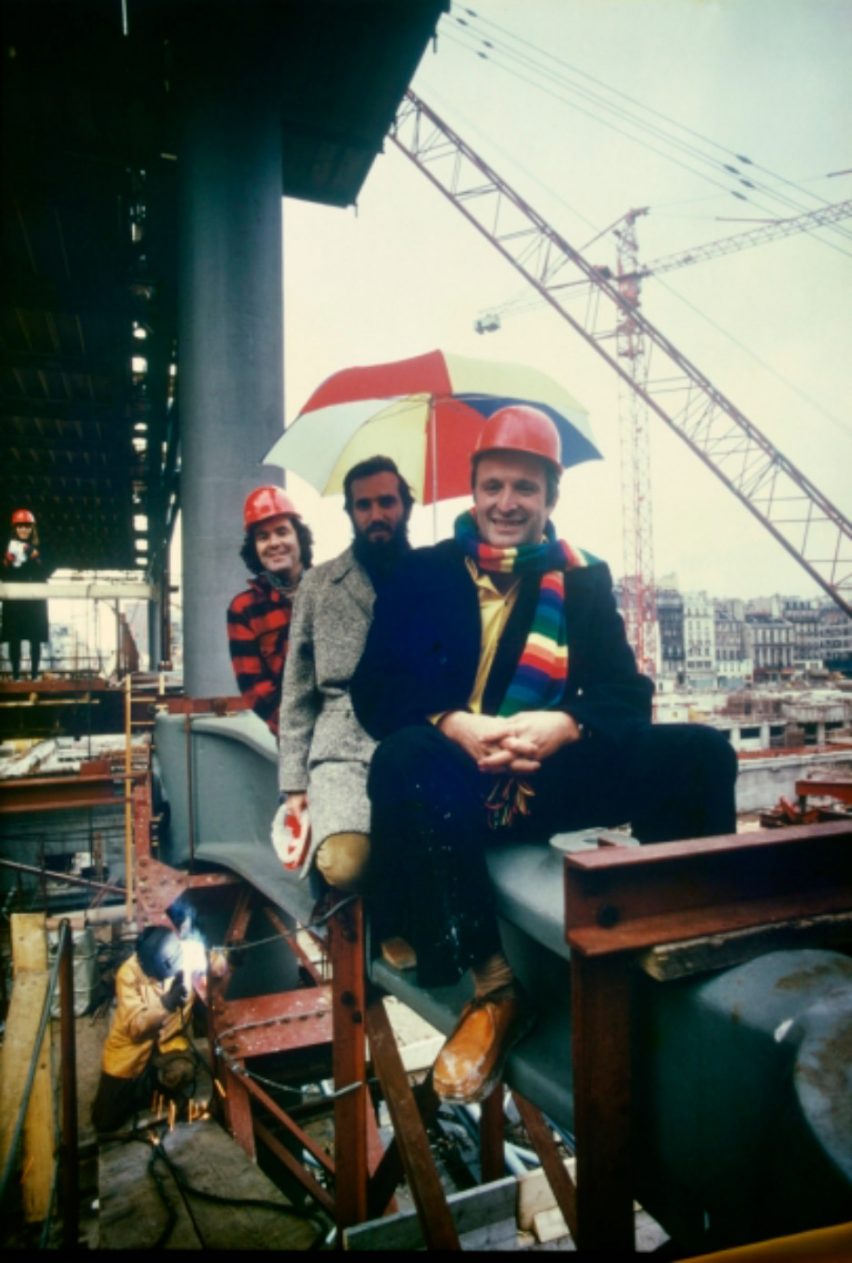
Rogers + Piano's design for the Centre Pompidou was the winner of an international competition for a large art gallery held by French president George Pompidou in 1971.
Despite Rogers + Piano having only designed 14 projects, their concept was selected from 681 entries by a jury that included acclaimed modernist architects Oscar Niemeyer, Jean Prouvé and Philip Johnson.
Reflecting on the win at the time, Piano referred to himself and Rogers merely as "teenagers, young boys" whose proposal was just "an exercise in freedom, not guided by any desire to win or compromise".
A key component of Rogers and Piano's proposal was that the building would only occupy half of the site with the other half of the site becoming a public square.
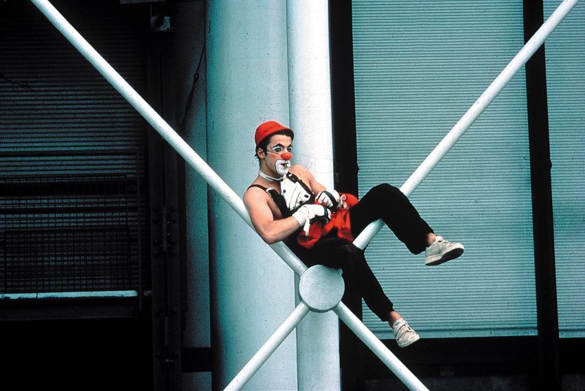
The building's exposed superstructure, which was developed in collaboration with Peter Rice and Edmund "Ted" Happold of Ove Arup and Partners, is constructed from more than 16,000 tonnes of prefabricated steel parts.
Some of the structure's prefabricated components are of a scale rarely seen in the construction industry. One particularly unique element is its 10-tonne gerberettes.
Positioned on both sides of the building, these gerberettes connect large trusses supporting the floors to the columns, helping to create the large internal spans.
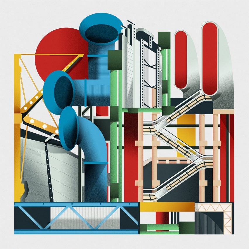
Alongside the exposed structure, Centre Pompidou's facades are covered with colour-coded building services: blue marking its air-conditioning, yellow is for electrics, green denotes water pipes, and red highlights tubular escalators and elevators.
These stand out from a minimal curtain wall backdrop made from steel and a mix of glazed and solid metal panels that were designed to create the feeling of a transparent building envelope.
"The one thing we knew about this age is it's all about change, if there's one constant, it's change," Rogers told Dezeen in an exclusive interview in 2013.
"So we said that we'd make massive floors, which were the size of two football pitches with no vertical interruptions, structure on the outside, mechanical service on the outside, people's movement on the outside and theoretically you can do anything you want on those floors," he added.
"We didn't say where the museum should go, where the library should go, and of course, the library changed radically because when we started there were books and by the time we finished it books were almost finished because of IT."
At ground level the Centre Pompidou has a double-height space that contains all the large publicly-accessible areas.
Visitors travel from the ground level up a giant diagonal escalator, on the facade facing the square, to external corridors and viewing platforms. These walkways and escalators are designed to create a dynamic ever-changing facade.
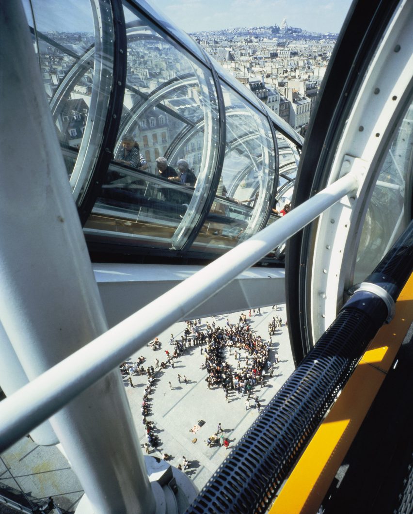
"We said that we will put the building not in the middle of the piazza, but actually on one side because that will give people a place to meet," said Rogers.
"The idea was that you had a public space, and you'd go up the facade of the building in streets in the air with escalators floating across it, so the whole thing became very dynamic," he continued. "People come to see people as well as to see art; people come to meet people. So we wanted to practice that as theatre."
Since it was complete the Centre Pompidou has had more than 150 million visitors and it is now celebrated as one of Paris' more important cultural landmarks.
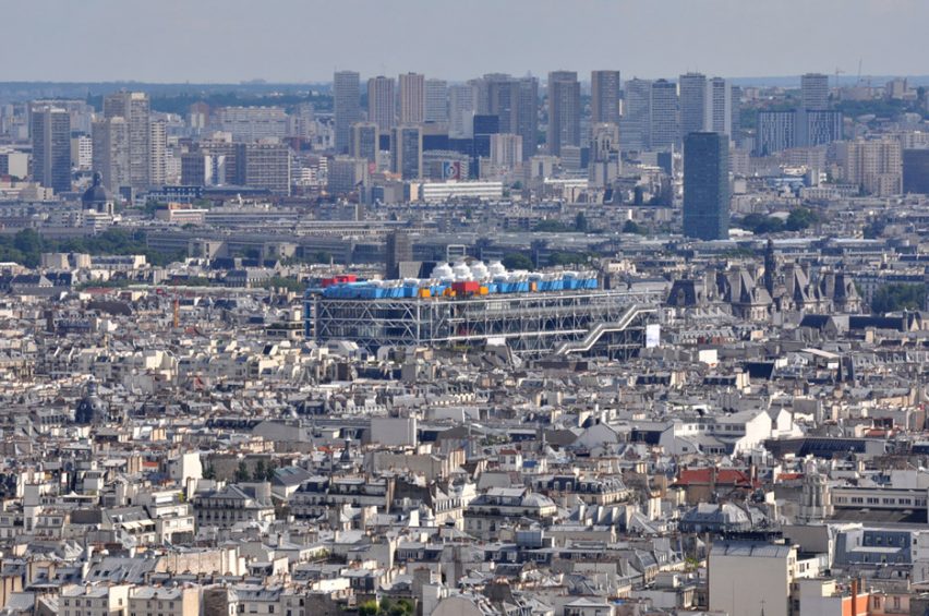
However, the radical design of the building has not always been as popular, and was initially met with hostility – described by French newspaper Le Monde as "an architectural King Kong". Rogers has even recalled how one passerby struck him with her umbrella when he revealed himself as the designer.
"The shock of the new is always really rather difficult to get over," Rogers has said, though he is adamant that this shock-factor is a sign of good architecture.
"All good architecture is modern in its time," he explained. "Gothic was a fantastic shock; the Renaissance was another shock to all the little medieval buildings. The shock of the new is always rather difficult to get over."
Led by architects Norman Foster, Rogers, Nicholas Grimshaw, Michael and Patty Hopkins and Piano, high-tech architecture was the last major style of the 20th century and one of its most influential.
Our high-tech series celebrates its architects and buildings ›
Illustration is by Jack Bedford.