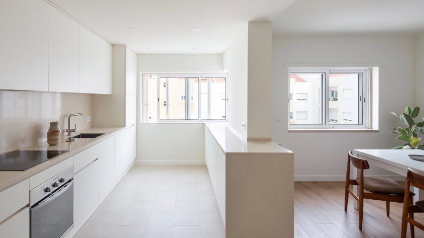
Lisbon's Carnide Apartment is a "pristine haven" for its physician owners
Locally-based Lola Cwikowski Studio has overhauled this Lisbon apartment to feature calming minimalist interiors that offset the hectic lifestyles of its owners.
Situated on the outskirts of Lisbon, Carnide Apartment has been stripped of its "jarring" mix of colours and finishes to form a calmer environment where its owners – a pair of physicians – can unwind at the end of their long workdays.
"The original interior was conscientiously updated to serve as a pristine haven for the pair of professionals with busy schedules," said Lola Cwikowski Studio, which was tasked with the overhaul.
"They are both doctors and wanted their home to be uncluttered and relaxing."
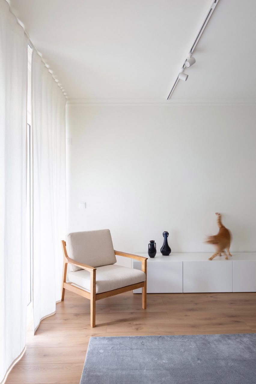
Walls throughout have simply been freshened up with a coat of white paint.
Decorative elements like paintings or picture frames have then been largely omitted to allow for an "interplay of light and shadow" across the apartment's bare surfaces as the sun moves throughout the day.
"Since moving to Portugal, I have been inspired by the work of Aires Mateus and Álvaro Siza — especially the play of contrasts, textures, forms and voids, light and shadow" explained the studio's eponymous founder, who originally hails from Belgium.
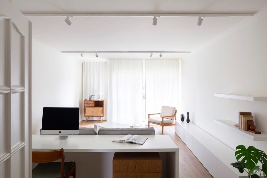
Even in the living room, the only features are a pair of shelves, a long, white sideboard and a pale-grey sofa that backs onto a computer desk.
"A vintage wooden sideboard and finishing touches from Portuguese flea markets also imbue the space with local soul," added the studio.
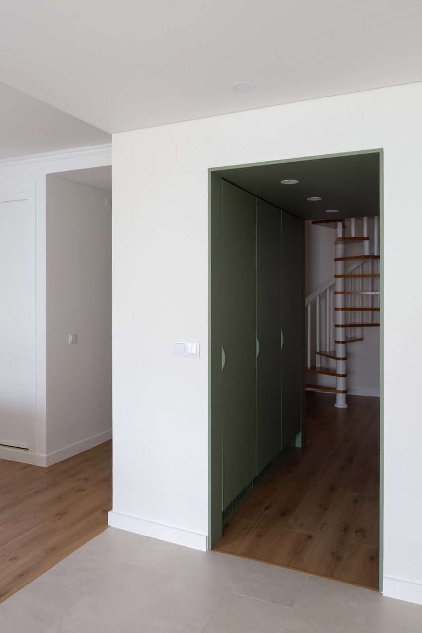
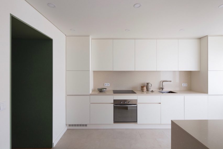
A flash of colour is provided by the pantry, which has been integrated into the short corridor that leads through to the open-plan cooking and dining area.
Its full-height cupboards doors and ceiling have been covered in sage-green laminate panels in a subtle nod to the owners' joint penchant for outdoor activities.
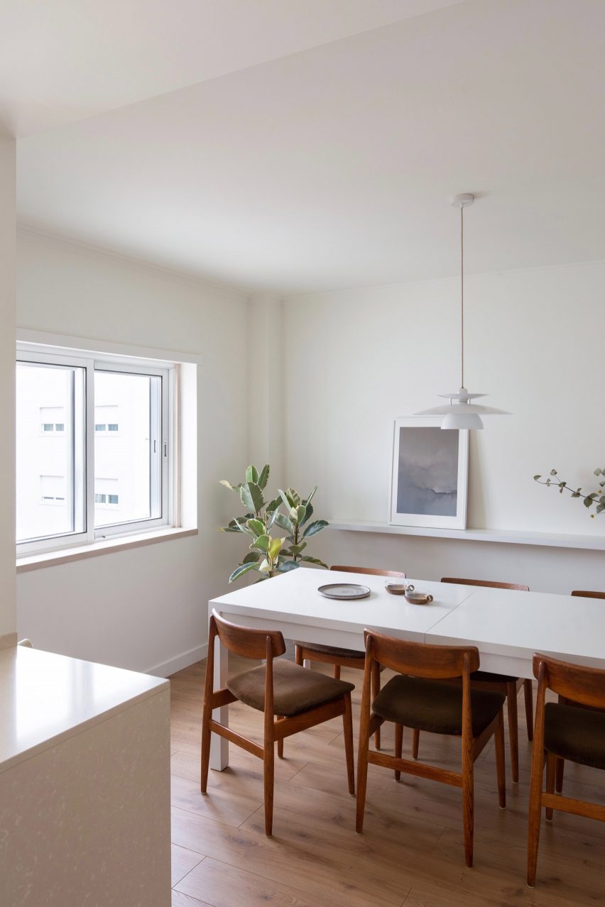
The restrained colour scheme resumes in the kitchen, which has been completed with pale cabinetry and light-beige composite countertops that the studio selected to match the existing stone window sills.
Warm timber-framed chairs then surround the central table in the adjacent dining room.
This isn't the only home that's been designed in line with its owners' profession. Architecture for London recently completed a London house extension for a stationer and graphic designer that was meant to appear like a neatly ruled notebook.
Details inside included a gridded splashback in the kitchen and stark black fixtures in the bathroom.
Lim + Lu also applied bright colours throughout a flat in Hong Kong to suit a young fashion designer.
Photography is by Alexander Bogorodskiy.