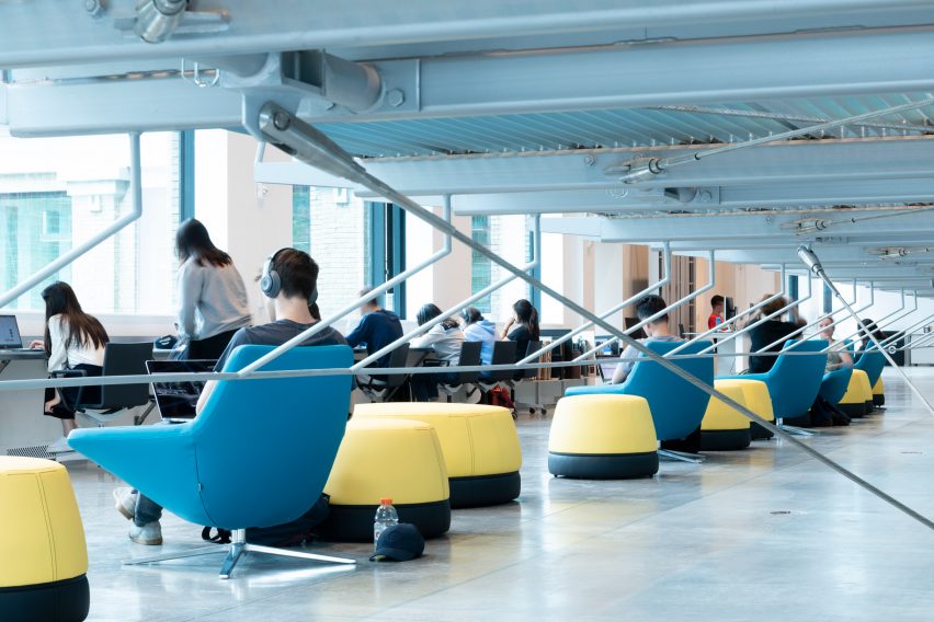
Wolfgang Tschapeller adds suspended bookshelves to Cornell University library
Architecture firm Wolfgang Tschapeller has renovated a library at Cornell University and added suspended shelving, which prompted criticisms about the potential for upskirting when it opened in earlier this year.
Wolfgang Tschapeller designed the addition for Mui Ho Fine Arts Library located in Cornell University's Rand Hall, which is connected to Milstein Hall – the university's school of architecture designed by OMA.
Completed in 1911, the library houses the College of Architecture, Art and Planning's collection of fine art and design materials.

The Austrian architecture studio removed a floor from the building to create room for a massive shelving structure that now stands within building's open-plan reading room.
The floors of the lifted structure are made from grated steel, with walkways connecting the aisles of books and also connecting the library to seminar rooms and offices. The shelving units do not have walls to create "transparency" within the structure.
"The entire volume of more than 125,000 books is constructed as one floating volume hanging from the roof beams, not to ground and not to floor, but four feet 10 inches above the floor, leaving a free space, a void," the firm said.
"Free of walls, the transparency across and between levels provides visitors multiple overlapping views across interior spaces and outward to the natural surroundings."

"With semi-transparent floors made of steel grating and an absence of walls within the stacks, full sight lines are created from one end of the atrium to the other," added David Ziskind, chief architect at consultancy STV, which also worked on the project.
"These new, expansive views of the building's interior become integrated into the facade, creating a transparency that serves as a beacon and invitation on campus."

Wolfgang Tschapeller, founder of the eponymous studio, graduated from Cornell's Master's programme in 1987. He conceived the shelving volume as an "inverted ziggurat".
"The stacks accommodate approximately 100,000 volumes in a configuration forming an inventive inverted ziggurat of books," explained the studio.
Bookshelves and walkways occupy 17 horizontal platforms that extend three stories high. Each array is supported by a horizontal beam that connects it to the wall, rectangular poles that attach to the ceiling and series of metal cords and columns support and lift the structure approximately 1.47 metres off the ground.
The design was criticised when it opened for the fall semester this year because the three floors of the stacked volumes are formed from metal grating that allows people on lower levels to see up the skirts of those standing above.
"Multiple women I spoke with for this article have noticed the space's upskirt potential and are adjusting their library use accordingly", wrote author Audrey Wachs in Metropolitan Mag, which was among the first to report on the issue.
"Architects! If you are currently designing a library you need to think hard about all your users including those with wheels and skirts and canes," tweeted architecture critic Alexandra Lange.

Austrian architect Tschapeller has defended the design.
"The design decisions made for the Mui Ho Fine Arts Library stem from a curiosity around how otherwise tight spaces might be made more open and generous," he told Dezeen.
"The use of floor grating was discussed from various perspectives throughout the project and selected as a result of a careful architectural investigation."
J Meejin Yoon, Gale and Ira Drukier dean of the College of Architecture, Art, and Planning, added that the school was listening to the criticisms of the scheme.
"Public discussion of the fine arts library is evolving, and we're taking it in," said Yoon.
"Each point raised is an opportunity to think through the design and function of the library and its overall mission," she continued. "The building is fully ADA compliant, and time and use will allow us to explore options that ensure that the space is inclusive, welcoming, and inspiring to all."

The renovation also involved adding wood, metal and digital fabrication shops, a makerspace, research lab and small-tool repository to the building's ground floor.
"Thus, we have two factories in one building," said Tschapeller. "One is the factory for the material, and one is the factory for thought and concepts — both wrapped by Rand Hall to one interacting volume."
On the exterior, a rooftop deck was installed to the top of the former industrial building to provide space for hosting temporary experimental structures created by students and faculty. A mirrored cornice was also installed along the perimeter of the building, below the roofline.

Mui Ho Fine Arts Library is currently undergoing review to be LEED-certified. Upgrades, including rigid foam insulation, double-glazed windows and replacement of all mechanical systems, were completed and are estimated to cut the library's energy use by 70 percent.
Wolfgang Tschapeller is based in Vienna, Austria, and was founded in 2007. In 2012 the studio won a competition to design a facade for the University of Applied Arts Vienna, with a proposal featuring winding staircases and giant balloons.
Other recently completed library projects in the United States include a library by Steven Holl Architects in Queens, which features several sculptural cutouts that form windows. The building was criticised for its lack of accessibility, and has since been hit with a class-action lawsuit.
Photography is by Lukas Schaller.
Read the full statements from Tschapeller and Yoon: