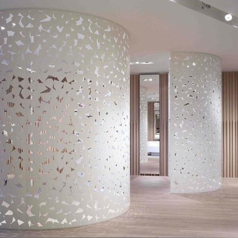
Max & Co by Duccio Grassi Architects
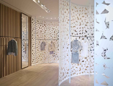
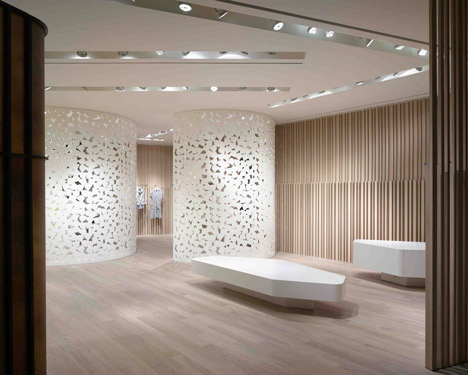
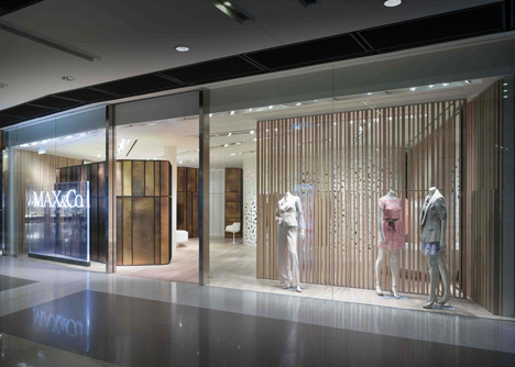
Garments hidden behind semi-circular screens in a Hong Kong outlet can be glimpsed through jagged perforations.
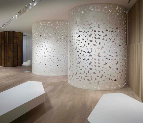
Retail specialists Duccio Grassi Architects, who are based in Italy, designed the flagship store for clothing retailer Max & Co.
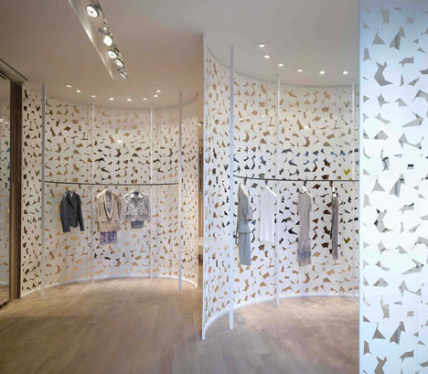
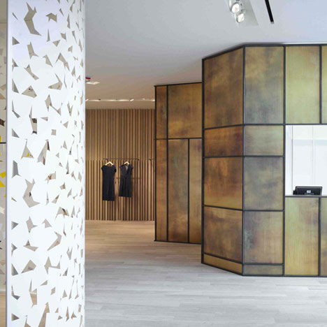
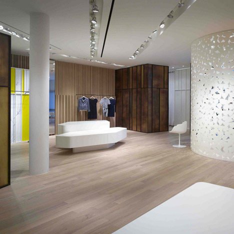
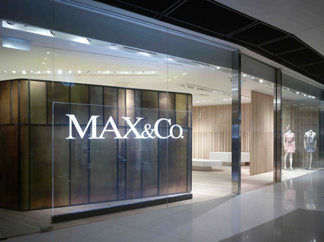
Brass frames infilled with yellow, white or amber-coloured panels screen more clothes rails and a checkout.
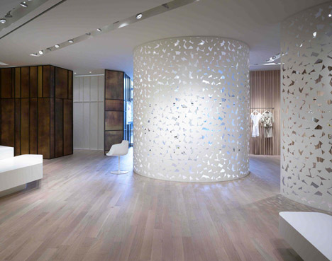
The walls of the shop are lined with vertical timber beams.
We've featured a few clothes stores on Dezeen lately, including one with a mobile photography studio and another with naked mannequins on the walls and ceiling - see all our retail interiors here.
Photography is by Virgile Simon Bertrand.
Here are some more details from Duccio Grassi Architects:
Max & Co
"The product has to be the protagonist of the shop" is the utterance most frequently repeated to me by my clients. In this case the product should be the main object of the design thoughts and "how" it is displayed is the final goal of the design. An exposing place - I think - instead of being composed only by the space and the product displayed, is also composed by the human beings who relate themselves with that very space and see that specific product. An exposing place without visitors or clients has no meaning. I believe that the major thoughts on design have to address to people.
Following this concept we designed a space where the product is not visible from the outside but people is attracted by visual stimuluses and suggestions.
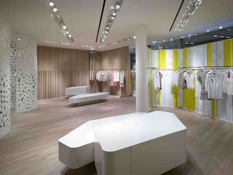
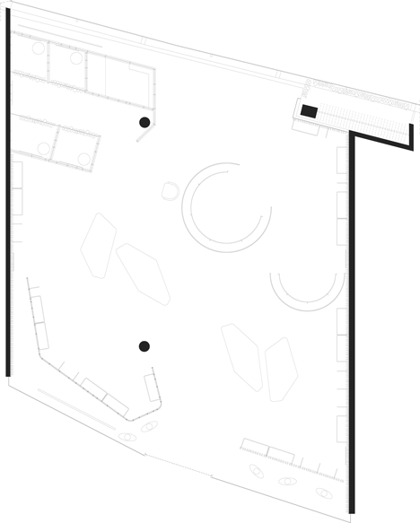
The space is prepared with volumes that are pure geometrical shapes, cylindrical with casual textures but also apparently casual shapes closed with geometric severity.
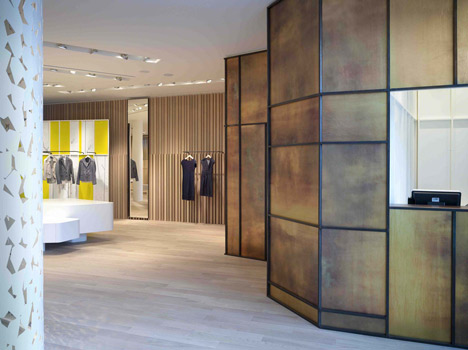
We designed big metal volumes resembling a white a light embroiderer and volumes following the concept of shell with the exterior made of burnished brass and the inside painted white.
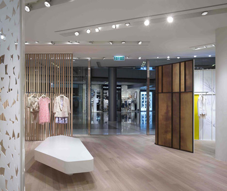
This space, furnished with volumes, creates a fluid ambiance which allows the flow of both light and people, in dialogue with both the inside and the outside of the mall, towards the city.
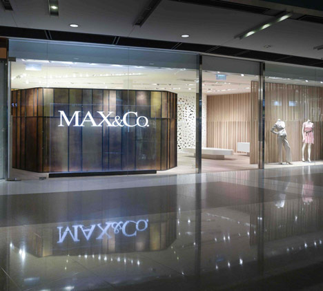
On the walls the wood covering repeats itself invertical lines and shadows that we can think as infinitive.
Only people can active this space following fluid paths which foresee pauses in limited areas dedicated to the dream, which is the cloth.
Project Name: MAX & Co
Location: IFC – Hong Kong
Completion Date: April 2011
Total Area: 157 sqm
Sale area: 150 sqm + 7 sqm stock
Client: Max Mara Fashion Group
Architects: Duccio Grassi Architects
Suppliers:
Wood walls, Hanging, Tables, Plexi sign, Metal structures, Burnished iron, Perforated metal sheet: Fazzuoli Guido & Figli s.n.c
Lighting: Viabizzuno
Burnished brass: De Castelli
Textiles: Dominique Kieffer
Local general contractor: East Joint Design Limited
Armchair: Lavenham Executive, design Patricia Urquiola, De Padova
Armchair: Flow Armchair, design J.M. Massaud, MDF Italia
Stool: Tokyo-Pop, design Tokujin Yoshioka, Driade