Sainsbury Centre had its "crisis" moments says Norman Foster
British architect Norman Foster recalls the challenges of designing the UK's pioneering high-tech art gallery, in this exclusive video interview filmed by Dezeen as part of our high-tech architecture series.
Located on the campus of the University of East Anglia in Norfolk, UK, the Sainsbury Centre for the Visual Arts is a 135-metre-long lattice steel structure with glazing at each end.
Completed in 1978, it was the first public building designed by Foster Associates – the architecture practice founded by Foster and his wife Wendy, which is now called Foster + Partners.
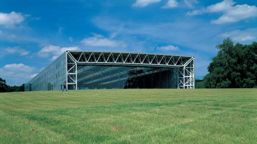
The gallery takes its name from the supermarket owners Robert and Lisa Sainsbury, who commissioned the building to house their extensive art collection alongside the University of East Anglia's art faculty.
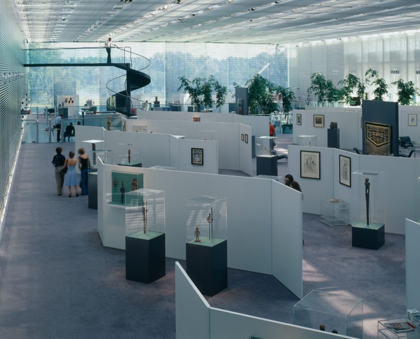
With works spanning 5,000 years of creative history and ranging from Henry Moore sculptures to cultural artefacts from Asia and Africa, the collection operates as both an ancillary to the art school and a public exhibition space.
"Originally, that building was conceived as being two or three buildings and it ends up as one," Foster told Dezeen in an exclusive interview at his offices in London.
"We were able to demonstrate that it will be socially, academically, intellectually, [and] visually more important to bring together everybody under one roof," he continued.
Beneath the elongated, shell-like roof is an expansive double-height space that runs the length of the building, with low-rising moveable partitions that divide the open plan into a series of flexible enclosures.
"It's almost like a train if you think about it because you can isolate carriages along the way and you can enter them separately," explained Foster.
"They have their own identity, but they can all work together," he added.
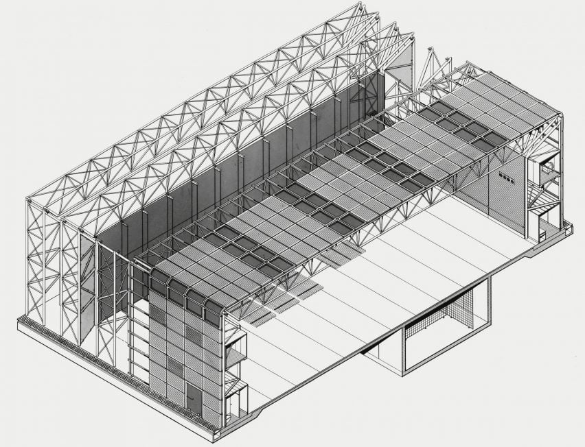
This continuous internal space was made possible by concealing the bathrooms, kitchens and mechanical equipment within the frame of the building – a latticed tubular steel truss designed by engineer Anthony Hunt.
The interior and exterior surfaces of the truss frame are enveloped in a steel and glass skin, creating a double layer between which the secondary services are hidden.
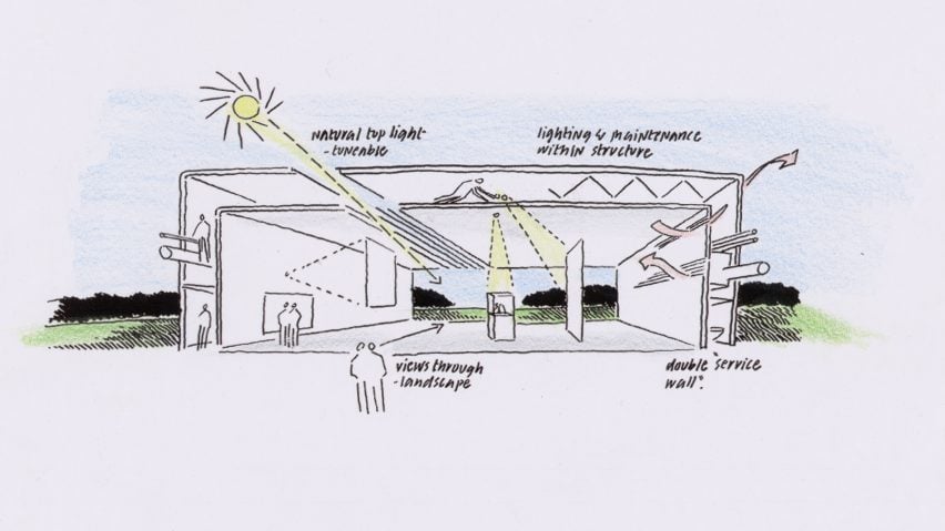
In addition to decluttering the interior, the double membrane also helps to maintains the internal climate of the Sainsbury Centre, which makes the building more sustainable according to Foster.
"It wasn't a hermetically sealed box with pulsing air and refrigeration," he said. "It was truly the first breathing, naturally ventilated building with filtered air, working with the climate, reducing energy. It was a very early exercise in sustainability in the 1970s."
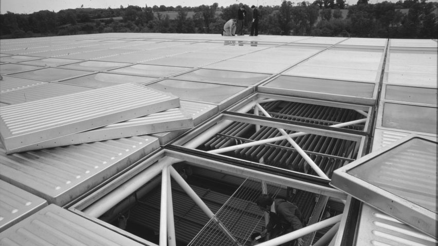
While this truss frame created design and engineering opportunities, it also gave rise to what Foster describes as a "crisis" in the project as the decision to enlarge the size of the frame happened late in the design process.
"I remember, we had all these beautiful models of a portal frame," said Foster. "At that point, realising that if that portal frame became a big truss that you could walk through, it would embrace all those embarrassing secondary spaces."
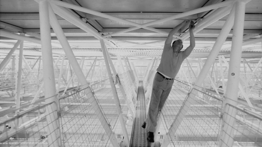
"Tony Hunt, the structural engineer, had advanced on all the production drawings for the portable frame," continued Foster. "I remember Tony saying, 'Norman, you can't do it. That's going to be our next building.' And I said, 'Tony, they may not be another building!'"
This movie was produced by Dezeen as part of our high-tech architecture series, and is the second in our series of video interviews with notable high-tech architects. In the first Foster spoke about the Reliance Controls factory, which was completed as part of Team 4 in 1967.
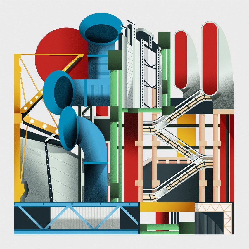
Emerging in Britain during the late 1960s, high-tech architecture was the last major style of the 20th century and one of its most influential. Characterised by buildings that combined the potential of structure and industrial technology, the movement was pioneered by architects Foster, Richard Rogers, Nicholas Grimshaw, Michael and Patty Hopkins and Renzo Piano.
Photographs are by Foster + Partners, Ken Kirkwood and Nigel Young. Drawings are by Foster + Partners. Images courtesy of Foster + Partners and the Norman Foster Foundation. Illustration is by Jack Bedford.