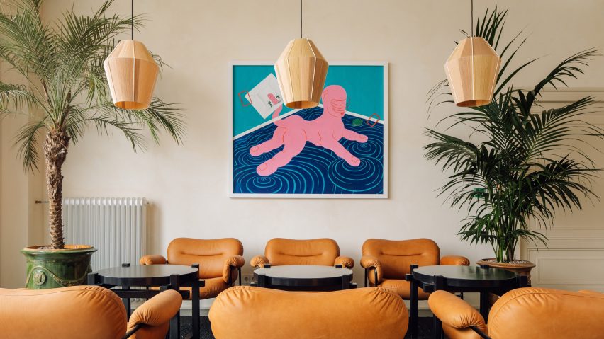
Fosbury & Sons sets up Amsterdam co-working space inside 19th-century hospital
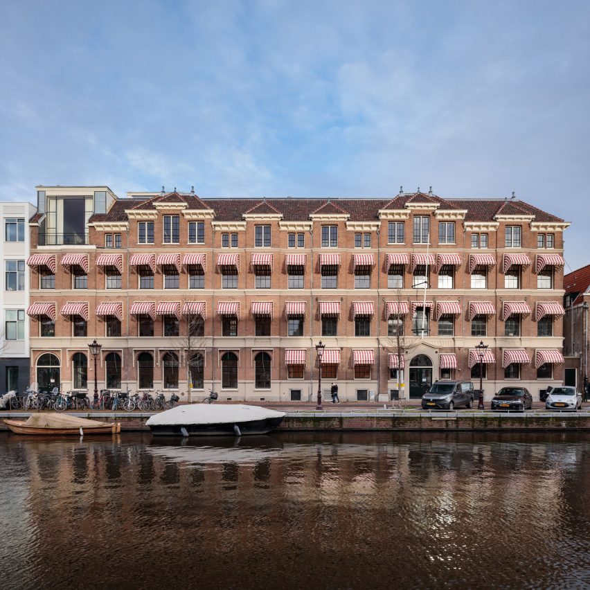
A Dutch hospital that dates back to 1845 is the unconventional setting for co-working company Fosbury & Sons' first international branch, which features interiors by Going East.
Spanning 6,000 square-metres, Fosbury & Sons' Amsterdam space borders the waters of the city's Prinsengracht canal. Until now the co-working company had exclusively operated out of Belgium, with existing branches in Antwerp and Brussels.
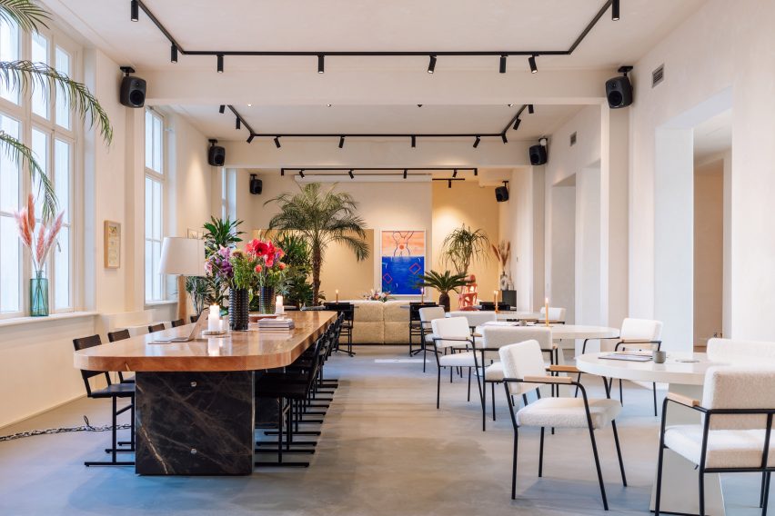
The latest location takes over a 19th-century hospital called Prinsengrachtziekenhuis that only closed its doors to patients in 2014.
Local practice MVSA Architects has been renovating the building over the past five years, but Belgian studio Going East were bought on board to make its interiors co-working ready.
Claiming that it was "too easy" to go with the classic office aesthetic, the studio set out to create a more upscale ambience for the companies and young professionals using the space.
"It was one of our first feelings when we entered the building – to break the connection with the hospital and to bring a new, grandeur luxury to it," the Going East founders, Anais Torfs and Michiel Mertens, told Dezeen.
The ground floor now accommodates an expansive lobby where members can lounge and mingle throughout the day.
Plush sectional sofas upholstered in thick boucle fabric have been used to dress the space, as well as a selection of contemporary artworks that were specially curated by local galleries.
Stairways topped by the hospital's original stained-glass skylights lead to the upper floors, which offer an assortment of workspaces.
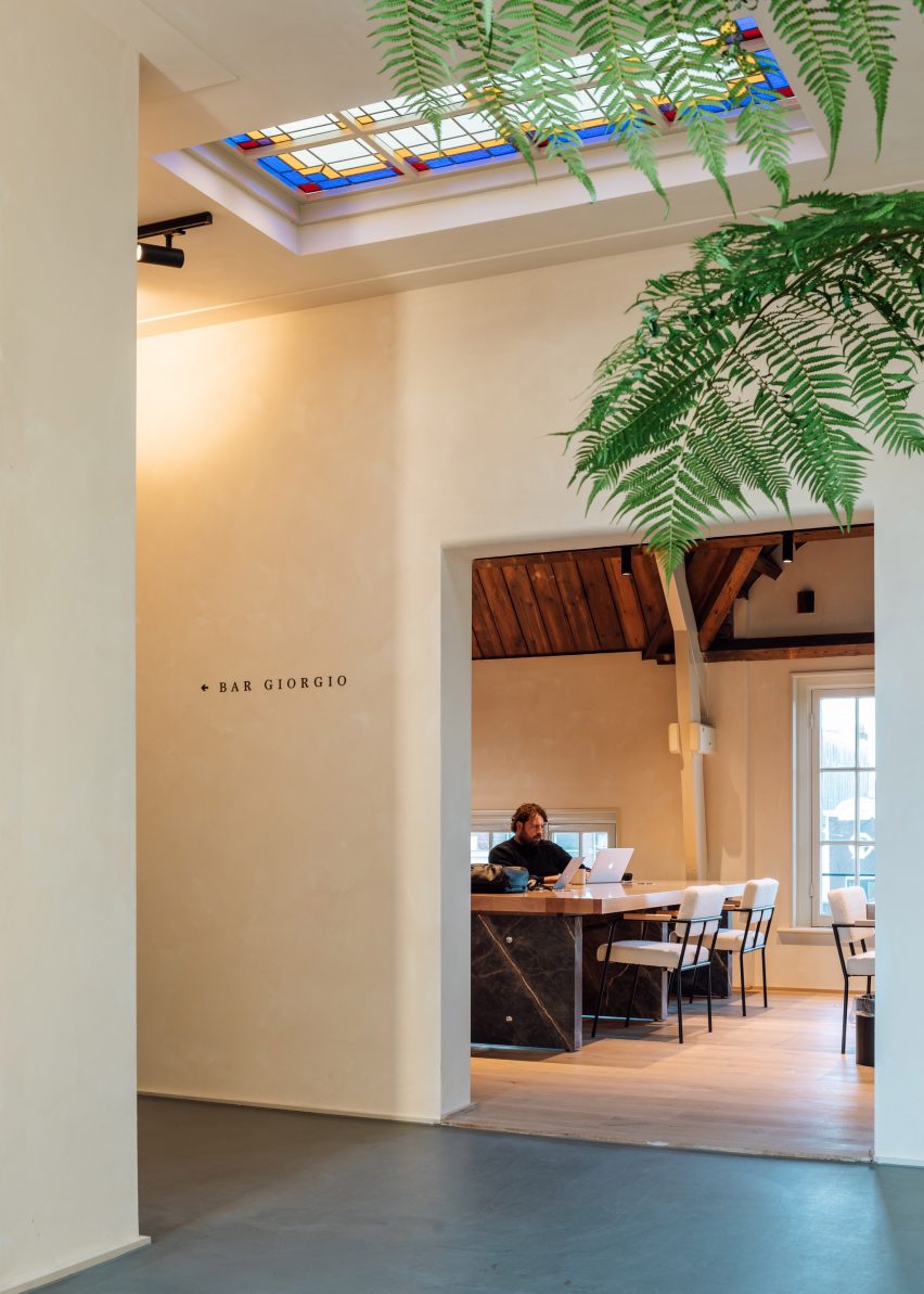
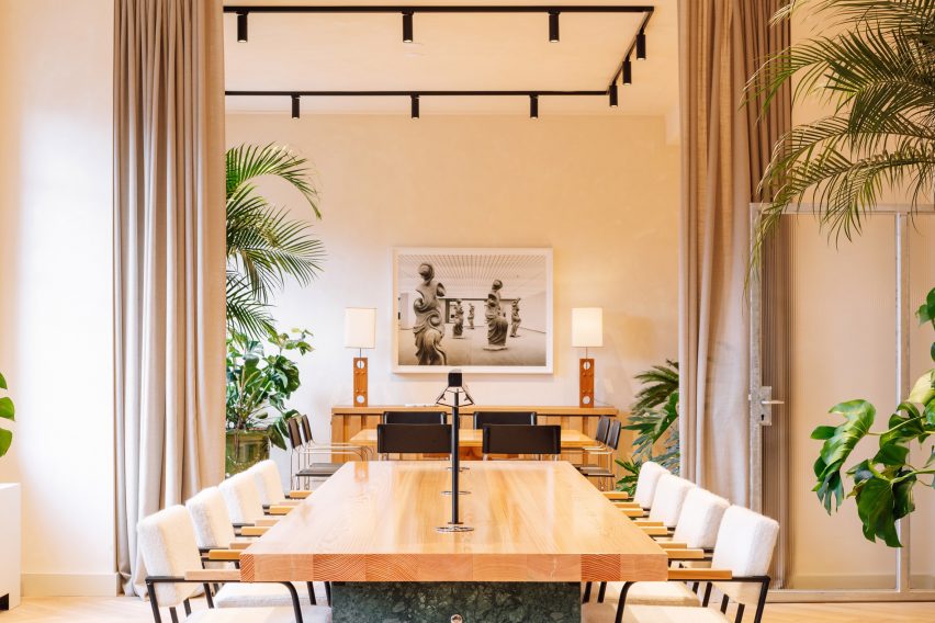
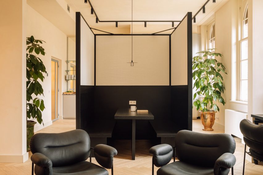
As well as a number of communal areas where guests can sit and work amongst the general hubbub, there are also several meeting rooms that can be closed off by floor-to-ceiling linen curtains and more intimate high-backed booths.
Leather chairs and wooden desks with flecked-stone bases appear throughout, a tactile contrast to the steel-framed doors and sleek metal cabinetry which feature in the kitchens.
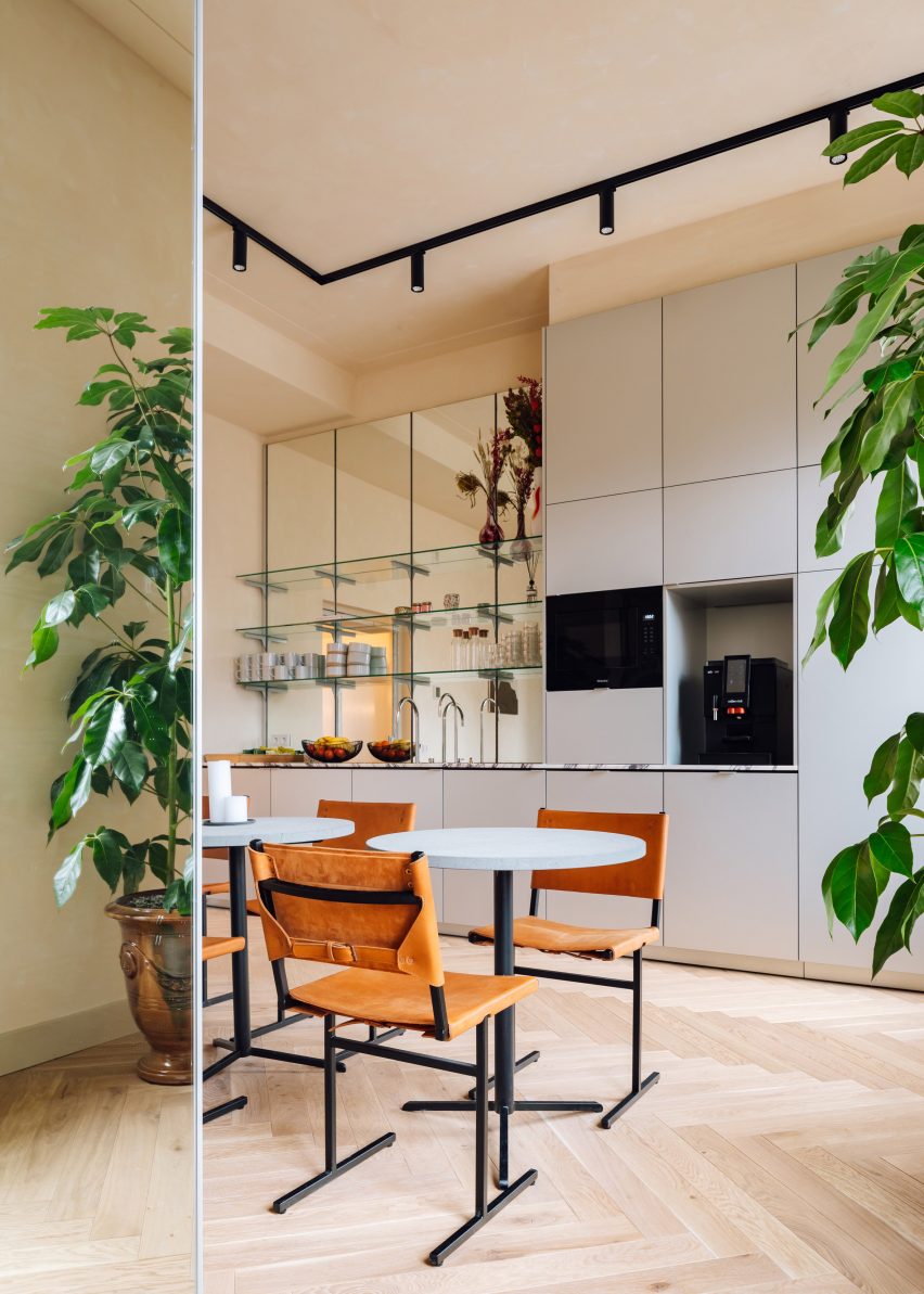
"It's an important mix for us as a design studio: custom, hand-made versus classics and unknown designers," explained the studio, "the most important thing was contrast."
"I love it when I find the most beautiful piece with a little mark on the back. It fills me with great joy to give them a centrepiece role," continued Torfs.
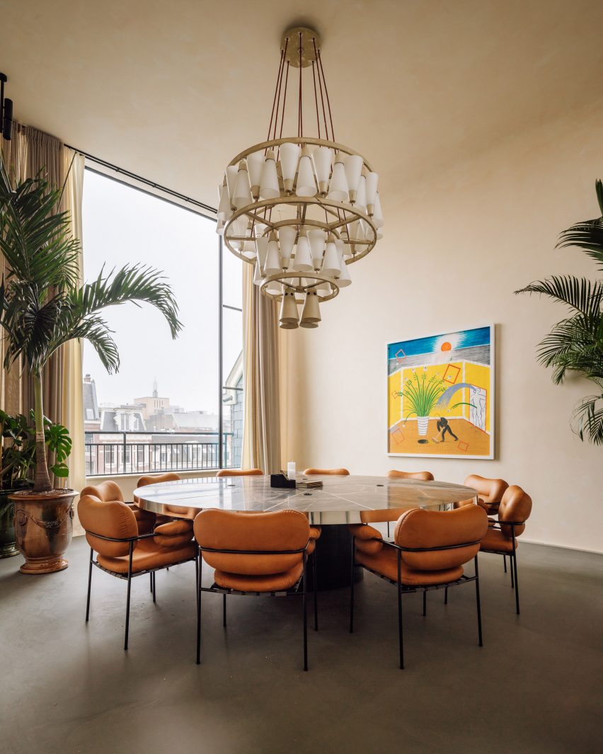
One of the building's former operating theatres has been transformed into a dramatic boardroom, at the centre of which is a marble-topped table surrounded by puffy, tan-coloured chairs.
The room's window has also been expanded to offer sweeping views across the rooftops of Amsterdam's townhouses.
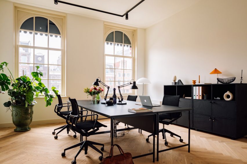
A quiet corridor that once contained the nurses' sleeping quarters now plays host to a sequence of private offices. Each one boasts new herringbone parquet floors, a decor detail the studio reinstated after seeing the same style of flooring feature in vintage photographs of the hospital.
There is also a healthy cafe, drinks bar and a library-style space that overlooks the building's central garden.
Fosbury & Son's Amsterdam space is meant to slightly differ in style from the company's Belgium branches, which were also designed by Going East.
The Antwerp location has a relaxed layout inspired by The High Line in New York, where guests are encouraged to amble through workrooms and "discover something new each time".
Meanwhile, the Brussels office contains a series of homely work areas that juxtapose its host building's concrete shell.
"The great thing about working more than once with a client is that they start to trust you more and more," Torfs and Mertens explained.
"The fun is in the difference and trying to develop new things of course – otherwise there would be no adventure anymore for us as designers."
Photography is by Francisco Noguiera.