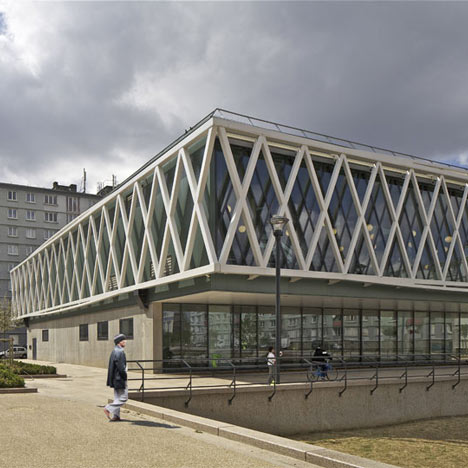
Médiathèque Romain Rolland by Philippe Gazeau
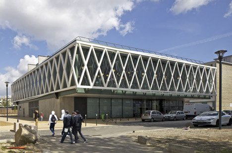
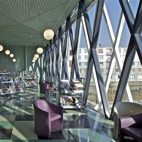
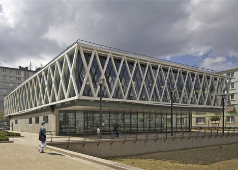
Criss-crossing metal beams surround a first floor reading room at a multimedia library near Paris.
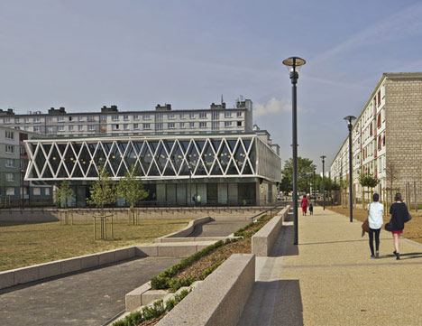
Designed by French architect Philippe Gazeau, the Médiathèque Romain Rolland is situated within a residential neighbourhood and overlooks a community park.
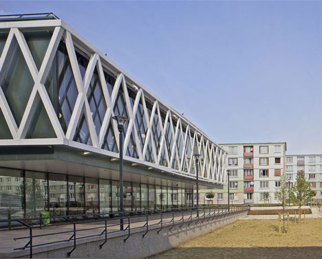
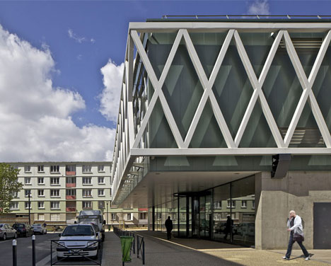
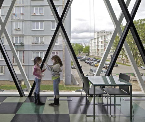
Offset behind the white lattice exterior and glazing is a second layer of criss-crossing beams, finished in black, that could be mistaken for shadows.
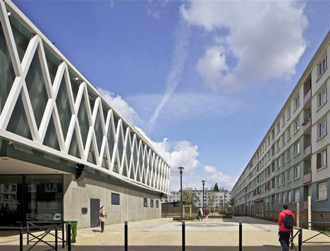
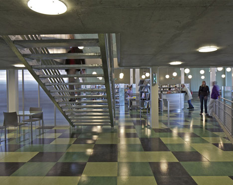
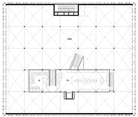
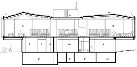
The reading room occupies the entire first floor of the building and surrounds an enclosed second floor mezzanine where multimedia facilities are located.
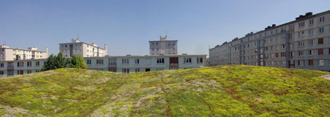
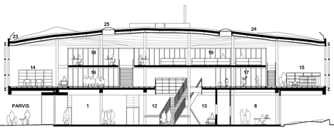
The ceiling of this room subtly undulates to create natural drainage slopes on the grass-covered roof above.
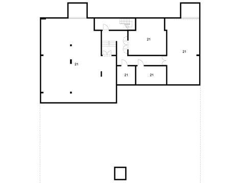
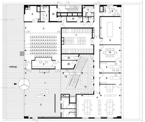
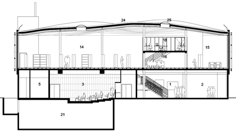
Offices, meeting rooms, toilets and an auditorium are located on the ground floor of the library.
Another recently featured building that employs metal latticework is a design institute in Hong Kong - see our earlier story here.
More stories about libraries on Dezeen »
Photography is by Philippe Ruault.
Here are some more details from Philippe Gazeau:
Media Library Romain Rolland
Rue Albert Giry, quartier Cité Cachin, 93230 Romainville
The Romainville multimedia library is located in the heart of a dormitory town that is being completely renovated. The town planners wanted to open up the district by fragmenting the housing blocks, creating a central plain to provide a large park and two facilities, including the multimedia library which is intended to act as an attractive magnet on a neighbourhood level.
The new building floats between two flying carpets. Following a continuous movement, the multimedia library’s volume sweeps over the level of the street and the public garden to slide under the gentle slopes of its planted roof.
It is the project’s roof that gives the initial driving force. The roof’s hills and valleys transmit the sweeping movement through to the level of the central plain, crossing through the large reading room on the upper floor.
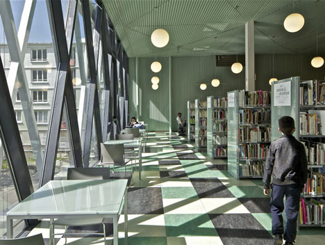
This is achieved by the negative curves reflecting the undulating movements of the roof through to the ceiling. As well as traversing, the oriented interior space of the reading room overlooking the street and garden is also traversed and suspended by the landscape as it rises up to become the ceiling.
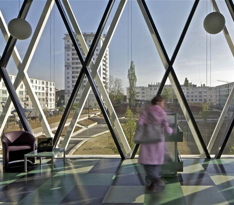
The new media library at Romainville can be seen as a building with simple architectural forms, but with great power and expressive richness. It is a building ‘oriented’ between the new street and the large redesigned garden.
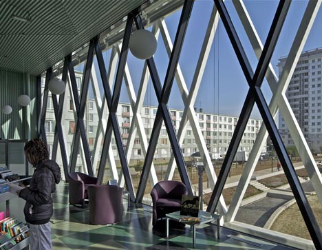
It is a building ‘hierarchized’ on the basis of 3 superimposed horizontal sequences: a base on the ground floor, a large metal covered hall on the first floor cantilevered on both the street side and the garden side, lastly a topographically undulating vegetated roof. These three main elements structure and bring together the building’s architectural and functional image.
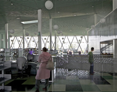
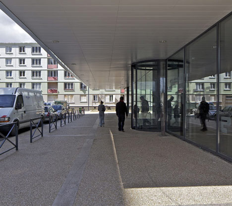
The project is no more extensive than the surface area of the plot proposed in the overall development plan, thereby freeing up the largest possible area for the future garden. The main volume is aligned with the new street, but the ground floor recess under the first floor cantilever is an opportunity to lay out a vast covered, sheltered passage between the public roadway and the media library.
The building takes its characteristic appearance from the first floor metal structure’s extensive columnless overhang. On the street, the monumental awning opening onto this big covered area naturally signals the entrance to the building.
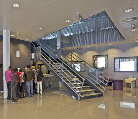
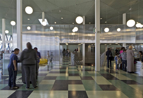
Some powerful architectural sequences accompany the user or visitor from the outside right into the heart of the media library: the parvis under the awning, the exhibition hall, the vertical link space with the grand staircase, from where you come to the main reading room.
Finding one’s way around is facilitated by the large north-east and south-west windows facing each other like a pair of indoor-outdoor bookends.
Another powerful feature of the reading room is its ceiling, which follows the underside of the undulating vegetated roof. The very fluid crossing space is also set in movement through the random shapes of the ceiling, contrasting with the straight frontage walls.
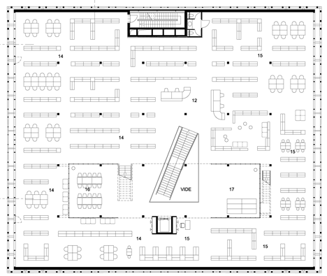
A second mezzanine floor houses the multimedia area: on the ‘Russian doll’ principle, this area readily accessible from the adult and children’s sections hovers slightly above the rest of the browsing areas for reasons of soundproofing, while remaining highly visible and attractive from the central area.
The two glass frontages are picture windows looking onto the city or the garden through the filter of the exterior metal structure A maintenance area midway between the glazed façade and the structure gives depth to the casing. This depth is used to install the outer blinds protecting the reading areas in conditions made to last.
Click above for larger image
Circular translucent skylights nested in the roof bring extra light to the central area, while providing smoke ejection from the interior volume.
Click above for larger image
The green roof is treated as a natural but hanging extension of the future garden. Its topography lends it a different status from the ordinary vegetated terrace roof. This roof can be seen from neighbouring buildings, and we feel it is very important that it blends in with the future landscaped area.
Click above for larger image
The inverted impact of its undulations is a key element in characterizing the atmosphere in the large reading room, and evidences the determination for this project to be highly consistent, with continuity between the work on the interior spaces and the handling of the exterior architecture. The metal structure featuring like a grid around the first floor, and the cantilevering over the ground floor areas are the other main examples of this.
Client : Mairie de Romainville
Architect : Philippe Gazeau
Project manager : Lorraine Pele, Benjamin Clarens
Engineers : SLH
Area : 2085 m² SHON
Cost : 3 730 000 € HT
2004-2011