SODA creates contemporary MYO offices inside 1970s London building
The gridded facade of this office in central London informed the arrangement of its interiors, where SODA has built a series of flexible workspaces that can be adjusted to suit different occupants.
The 3,716-square-metre MYO offices take over the second and third floors of 123 Victoria Street, a mixed-use building that lies just a short walk from the major transport hub of Victoria station.
Originally constructed in 1977 by EPR Architects, the building features rows of windows that angle outwards to form transparent, box-like forms across the facade.
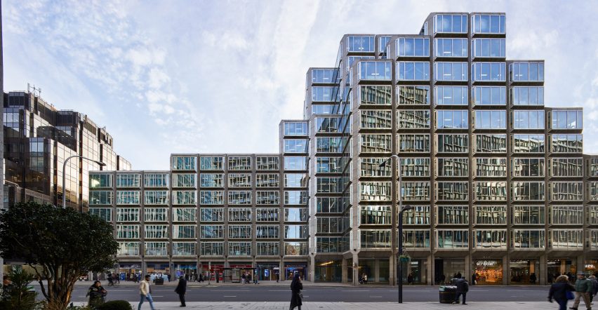
This became a key point of reference for architecture studio SODA, which was tasked with developing the interiors of MYO.
The studio wanted to mimic the "cellular language" of the building's exterior by creating an internal grid of workspaces that can be subtly reconfigured or opened up to suit companies of different sizes.
"We wanted to push back against the idea of private, shut-off office units," Eleni Karabouikis, senior architect at the studio, told Dezeen.
"The client wanted an open and friendly environment, with each company having their own 'shop front' that addresses the communal spaces and draws people out of their own plot," she continued.
"The new workspaces offer an adaptable framework for tenants rather than a prescriptive layout, which has become commonplace in contemporary office design," added the studio.
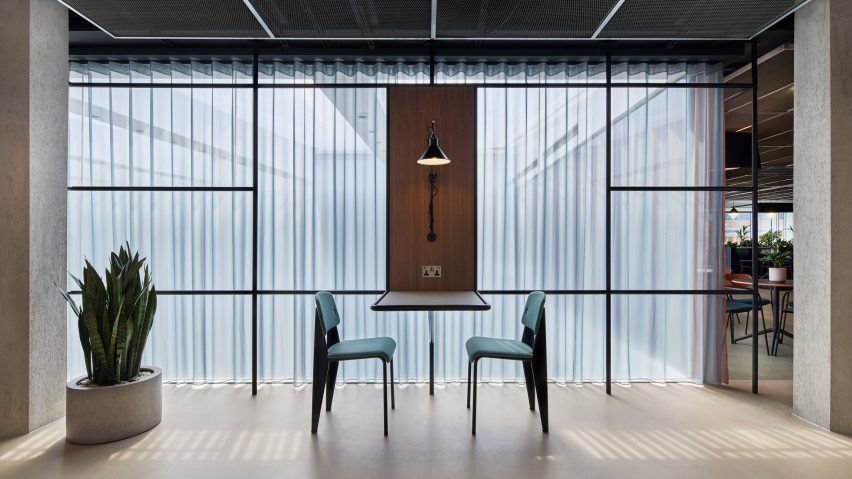
MYO has been completed with a series of meeting rooms that can accommodate anywhere between two and 22 people, each with adjustable tables and blinds that can be drawn across for privacy.
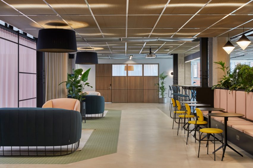
Bigger rooms can be subdivided by temporary partitions or pastel-hued curtains by Danish brand Kvadrat that have been set on tracks on the ceiling.
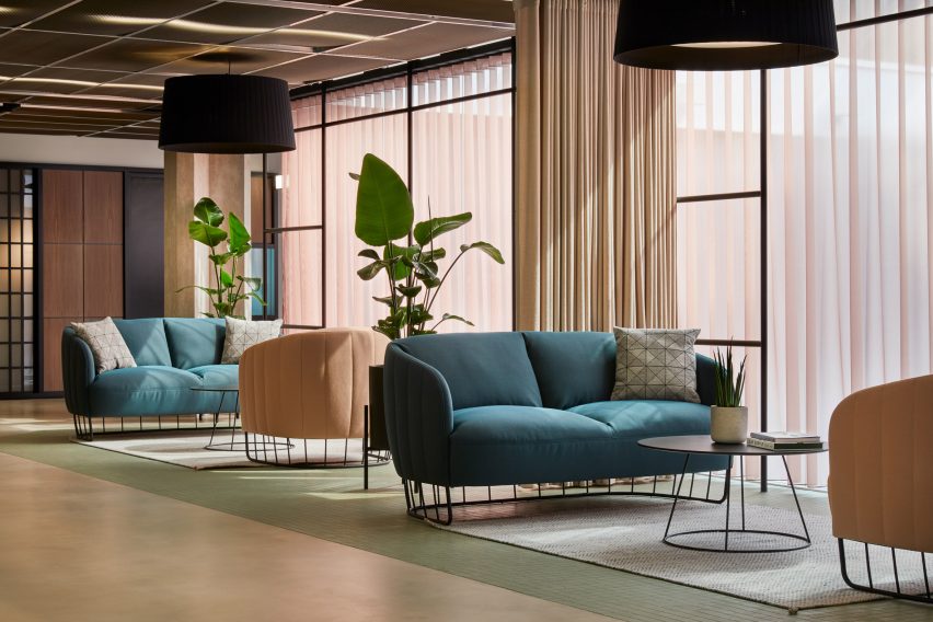
Soft furnishings that dress the rest of the space are in complementary shades of teal blue, baby pink and mustard yellow.
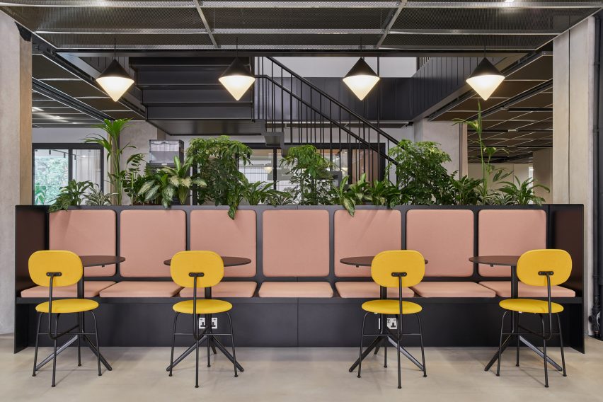
"We tried to anticipate a variety of different tenants occupying the building which meant that we needed to keep the base palette as neutral as possible," Karabouikis explained.
"But that doesn't mean that such fit-outs shouldn't be warm and inviting."
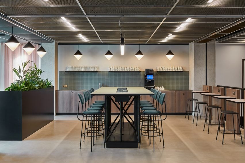
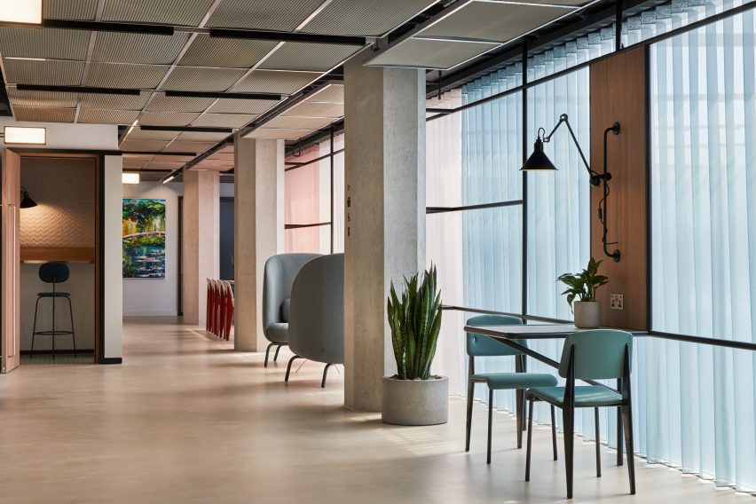
Outside of the meeting rooms there are also a number of group tables, as well as booths and window-side armchairs where visitors can work on their own.
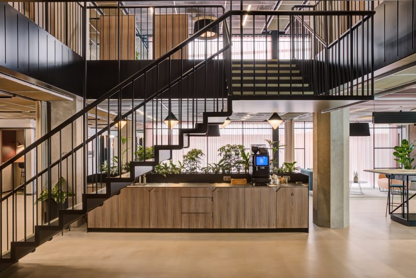
At the centre of the plan is an atrium that can serve as a lounge or a large-scale event space. The kitchen here can also be turned into a drinks bar.
Upper floors of the office are accessed via a suspended staircase that has slim black treads and a wire balustrade.
"This lightweight, sculptural object hangs amidst more solid exposed concrete columns and creates a clearly defined contrast between new and original architectural elements," said the studio.
Just a stone's throw from the MYO offices is Thomas House, a co-working space that SODA designed back in 2018.
The venue includes a roof terrace, gym and bar, as well as a number of workrooms decked out in period colours inspired by the Regency era.
Photography is by Ed Reeve.