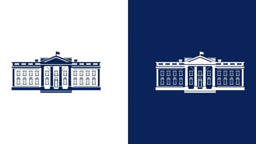
Wide Eye creates "dynamic and architectural" White House logo
Creative agency Wide Eye has redesigned the White House logo to symbolise US president Joe Biden's "desire to bring the country together" after Donald Trump.
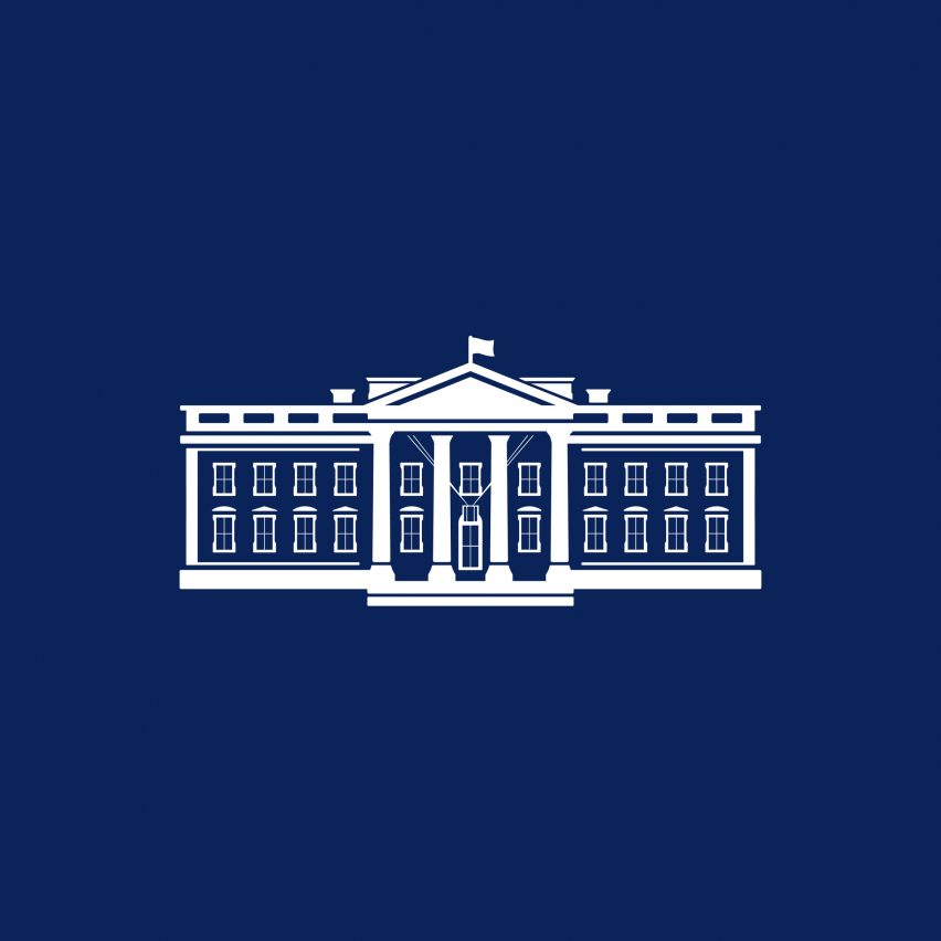
The updated design is a slightly more detailed and architectural version of the flat logo introduced during the Trump administration.
"Following the tradition and the legacy of past White House brands, we depicted the north facade, symbolising that the White House is the People's House and accessible," Wide Eye told Dezeen.
"This is symbolic of the president's desire to bring the country together: conveying a sense of openness, warmth, inclusion, and humanity."
Biden came to power on a promise of unity, after his divisive predecessor pulled out of UNESCO, withdrew from the Paris Agreement, and tried to build a border wall with Mexico.
This continuation is intended to symbolise a more traditional style of leadership, while the minimal lines face a digitally forward future. Paired-back versions of the logo have been developed for digital use.
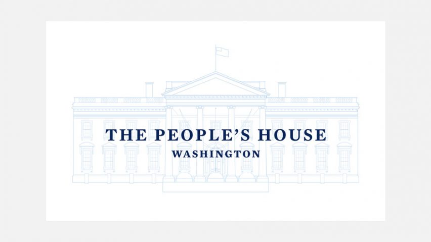
"The new illustration is more open and fluid, dynamic and architectural than previous White House logos," explained Wide Eye.
"We also introduced a blueprint-style line drawing motif that evokes the architectural space of the White House; reminding us that America is always a work in progress being rebuilt and renewed."
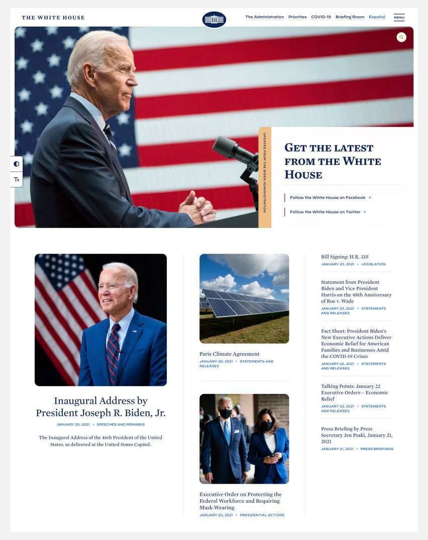
The revamped White House website was launched after president Biden's inauguration on 20 January 2021.
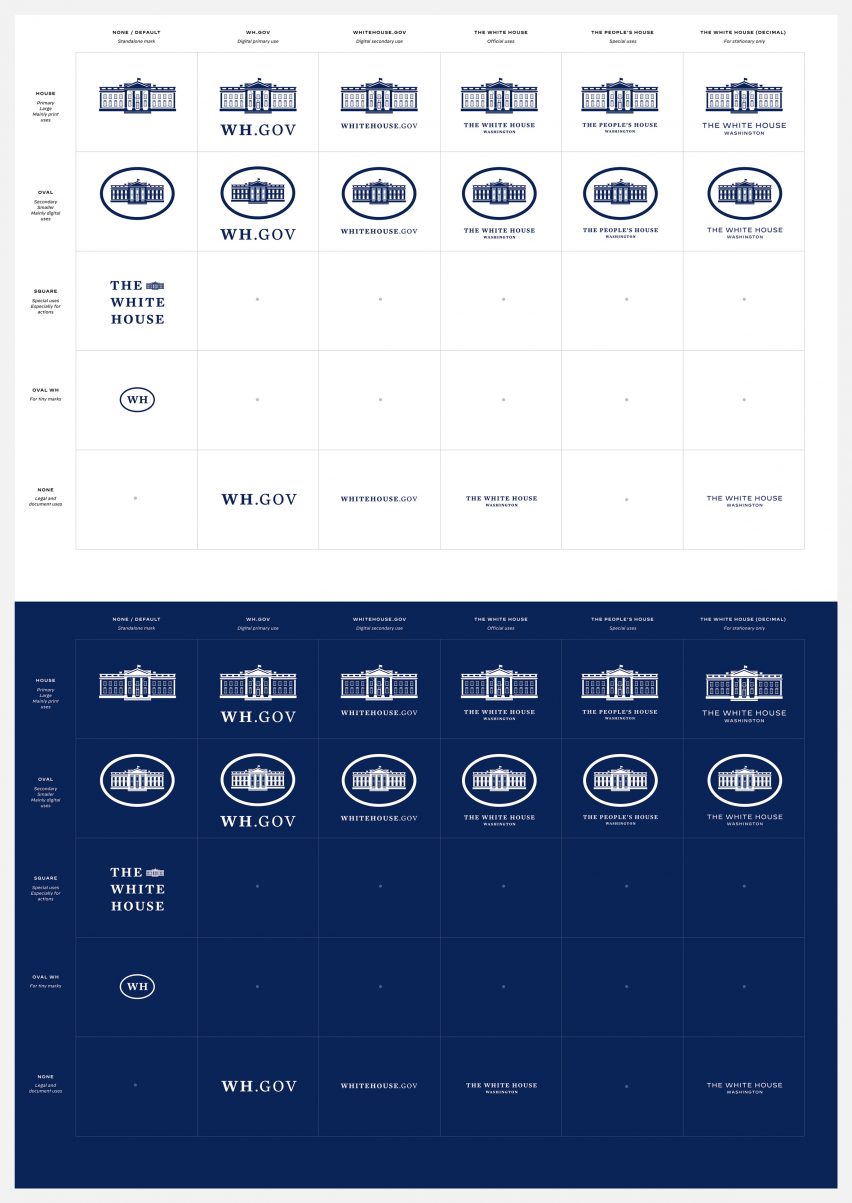
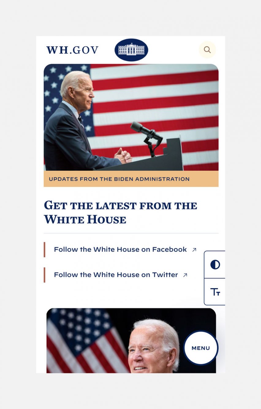
Wide Eye created multiple versions of the logo for different settings. Digital communications such as Whitehouse.gov feature the oval version of the logo, where the line drawing of the building is ringed by a thick oval line.
This drawing is simplified, rendering it more legible on a computer or mobile screen.
This is a nod to the Oval Office where the US president has traditionally had their desk since 1909 when the architect Nathan C Wyeth added an extension to the James Hoban-designed office.
For situations such as press releases, stationery and documents for the briefing room, a slightly different version of the White House logo appears without the oval.
There's also a square iteration with three lines of text and a small picture of the north facade, and a stripped-back miniature logo with just the initials WH enclosed by an oval.
Wide Eye worked closely with the White House on the logo redesign, a process that also included carefully selecting the fonts to match. Both typefaces are by New York City type foundry Hoefler & Co.
The fonts, Mecury and Decimal, have been carried over from Biden's campaign.
Decimal, a sans serif typeface, was originally the main font, but for the White House brand this was flipped to make serif font Mecury the main font – to signify "a governing tone".
Biden's logo redesign has proved less controversial than logos from the previous administration. When Trump revealed the logo for new military branch US Space Force on Twitter it was mocked for its similarities with the Star Trek logo.
America's intelligence agency the CIA also rebranded this year, although the famously secretive organisation refused to reveal the identity of its designer.
Images courtesy of Wide Eye.
Project credits:
Design: Wide Eye
Creative director: Ben Ostrower
Associate creative director: Ida Woldemichael
Illustrator: John Mata
White House digital director: Rob Flaherty
White House creative director: Carahna Magwood