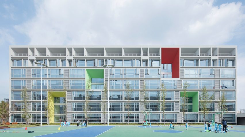
Monoarchi designs gridded facade with colourful accents for school in China
Monoarchi has designed a campus building with a geometric facade wrapped around a number of small courtyards for an experimental school in Hangzhou, China.
The 64,000 square-metre campus was designed for the Hangzhou Chovan Experimental School, which teaches children from ages three to 10-years-old using a teaching method from the Ming Dynasty that emphasises closeness to nature.
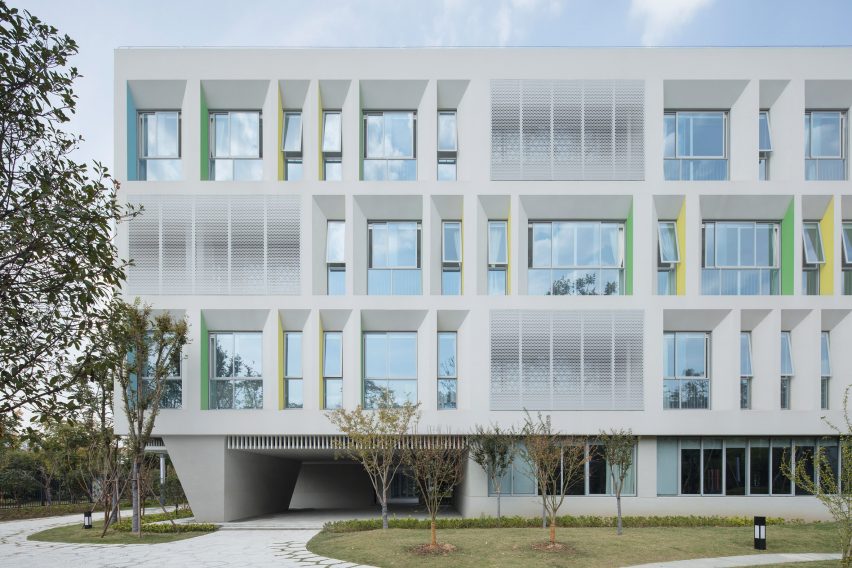
This concept influenced Monoarchi's design for the campus, which contains 36 primary classrooms and 12 kindergarten rooms as well as a concert hall, libraries and facilities for music art, science and outdoor learning.
"Our goal is to make such learning easier in the campus," Monoarchi explained. "Therefore, we abandoned the intensified linear space in a traditional school. Instead, we established a more complicated space with rich layers and structure."

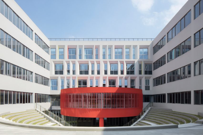
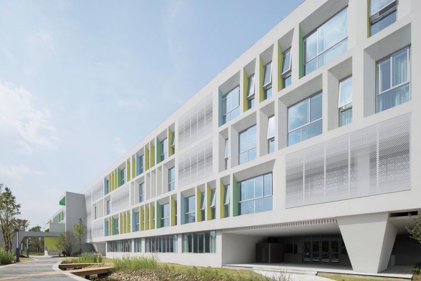
The facade employs a grid-like geometric arrangement in which some windows follow a regular and uniform design, while others are angled, irregular in shape, and set within skewed alcoves.
This structure is wrapped around five small courtyards, three of which were sunk below ground to create quieter spaces.
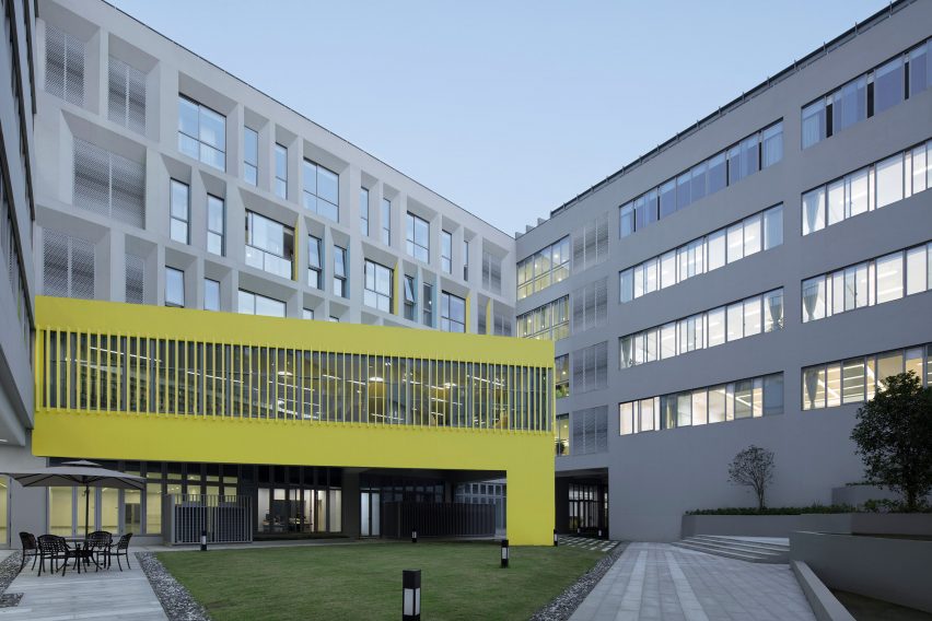
A number of skewed, brightly-coloured alcove walls next to some of the windows add a playful element to the facade while reflecting the interior colour scheme.
Perforated aluminium shade screens were also added to give texture and subtle gradients to the stark white facade.
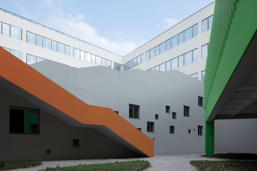
The three sunken courtyards are located within the primary school. Here, brightly coloured library buildings shaped like a circle, triangle and a square are cantilevered over the outdoor areas to create a peaceful reading area.
"Different from the linear layout in traditional planning, the courtyard plan offers a sense of centricity to the space, which brings calmness and concentration to our mind," the studio explained.
Inside, the studio designed a collection of yellow and orange staircases that fold and turn through a central atrium.
The architects fitted the atrium with a glass ceiling that allows light to flood the yellow space to add brightness and warmth.
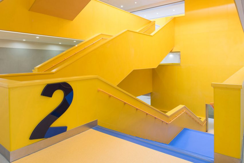
Staircases are staggered at different heights and lengths, meaning users can glimpse gallery spaces, performance stages and different activities taking place while moving between levels.
"By weaving the space in a three-dimensional manner, we created a lot more spots for physical and visual contact, which brings a lot more opportunities for the children to see and to learn," said the studio.
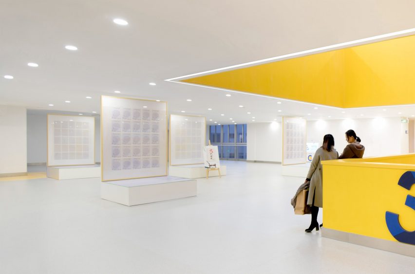
Open-plan flexible areas have been layered between formal classrooms and can be used for informal learning, as small theatres, or by children for self-study and socialising.
"The students need quietness to think and reflect in this communal area, in addition, to communicate and play, a space that allows the switch between the public and the private," the studio said.
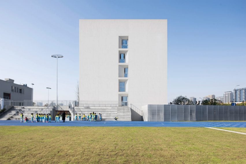
A four-lane running track circles a large grassy area, while a cross-country track wraps around the perimeter of the site and extends under and through raised parts of the building.
Plants from various environments including grasslands, wetlands, desert and forested areas, were added around the site to simulate different habitats.
The rooftop was designed to function as a green roof and a small vegetable farm, allowing children to plant grains, fruits and vegetables.
Monoarchi is an architecture studio working out of Shanghai and Rotterdam. The studio focuses on public realm and urban design.
Public Atelier and FUUZE also used brightly coloured forms when converting this old church building into a modern primary school while X3M painted public squares bright yellow at this school in Croatia.
Photography is by Xhi Zia unless otherwise stated.
Project credits:
Designer: Monoarchi, in collaboration with DOT.INT
Design principal: Xiaochao Song, Keming Wang
Design team: Tianyu Xiong, Pengfei Gao, Yan Mo, Fuming Tang, Hao Zhang, Yiliang Sha