Wooden partitions add flexibility to Fruit Box house extension in London
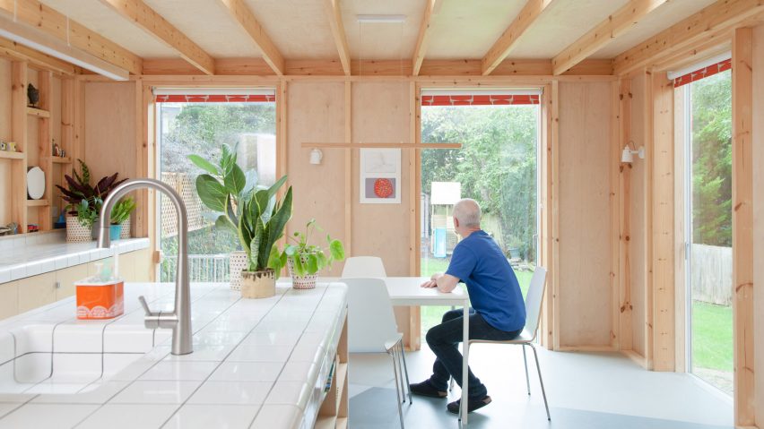
Nimtim Architects has added an extension called Fruit Box to a 1970s townhouse in Forest Hill, London, which is loosely divided by adaptable, semi-open partitions.
Fruit Box was commissioned by a growing family that required more space and wanted to relocate their first-floor living spaces to ground level to establish a link with the garden.
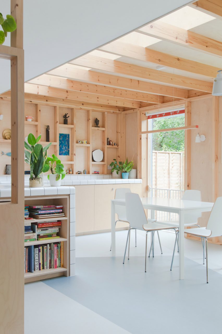
Local studio Nimtim Architects designed a ground floor extension with a kitchen, dining and living area, which are defined by semi-open partitions made from plywood and planed softwood.
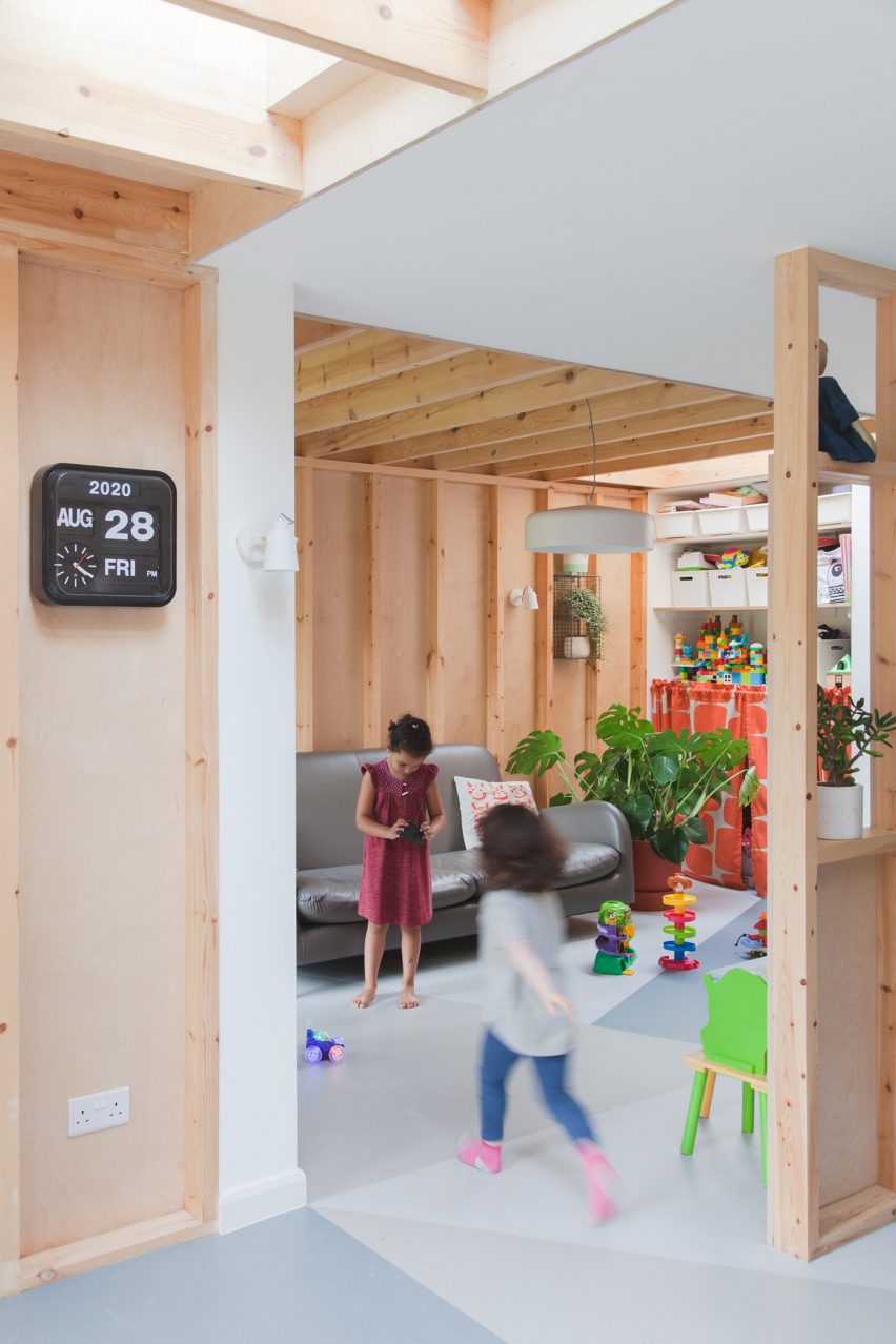
These partitions are non-structural and are designed to be filled in to increase privacy or easily removed to maximise open space, depending on the family's future needs.
"Our clients came to us wanting to extend their new home for their expanding family, they were already expecting their first child and they later welcomed their second child during the build," said Nimtim Architects' director, Tim O'Callaghan.
"We proposed open timber partitions which loosely define the space into different areas. These could be filled in to create more solid separation, increasing the privacy, or taken down to create a more open space," he told Dezeen.
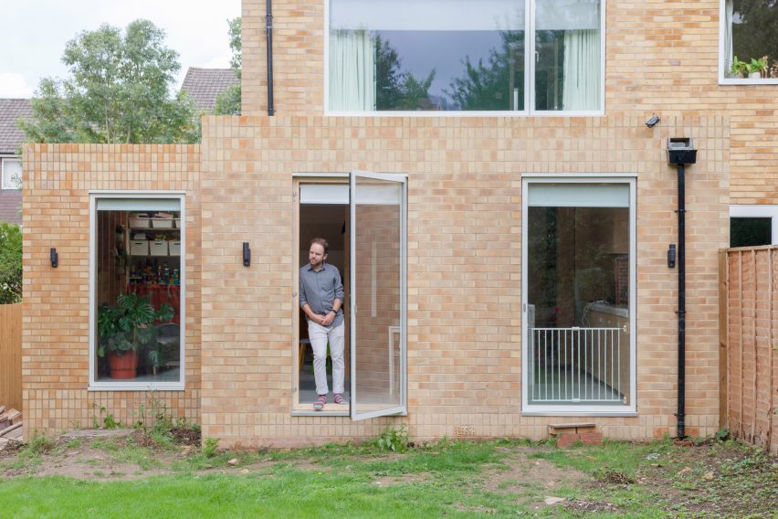
Fruit Box is composed of two volumes, one added to the side of the house and one positioned to the rear, both finished with the same pared-back, yellow brick facades.
Yellow stock bricks were chosen to mirror the existing house in order to meet planning requirements. However, to add visual interest, the studio alternated the direction of the brickwork above and below the windows.
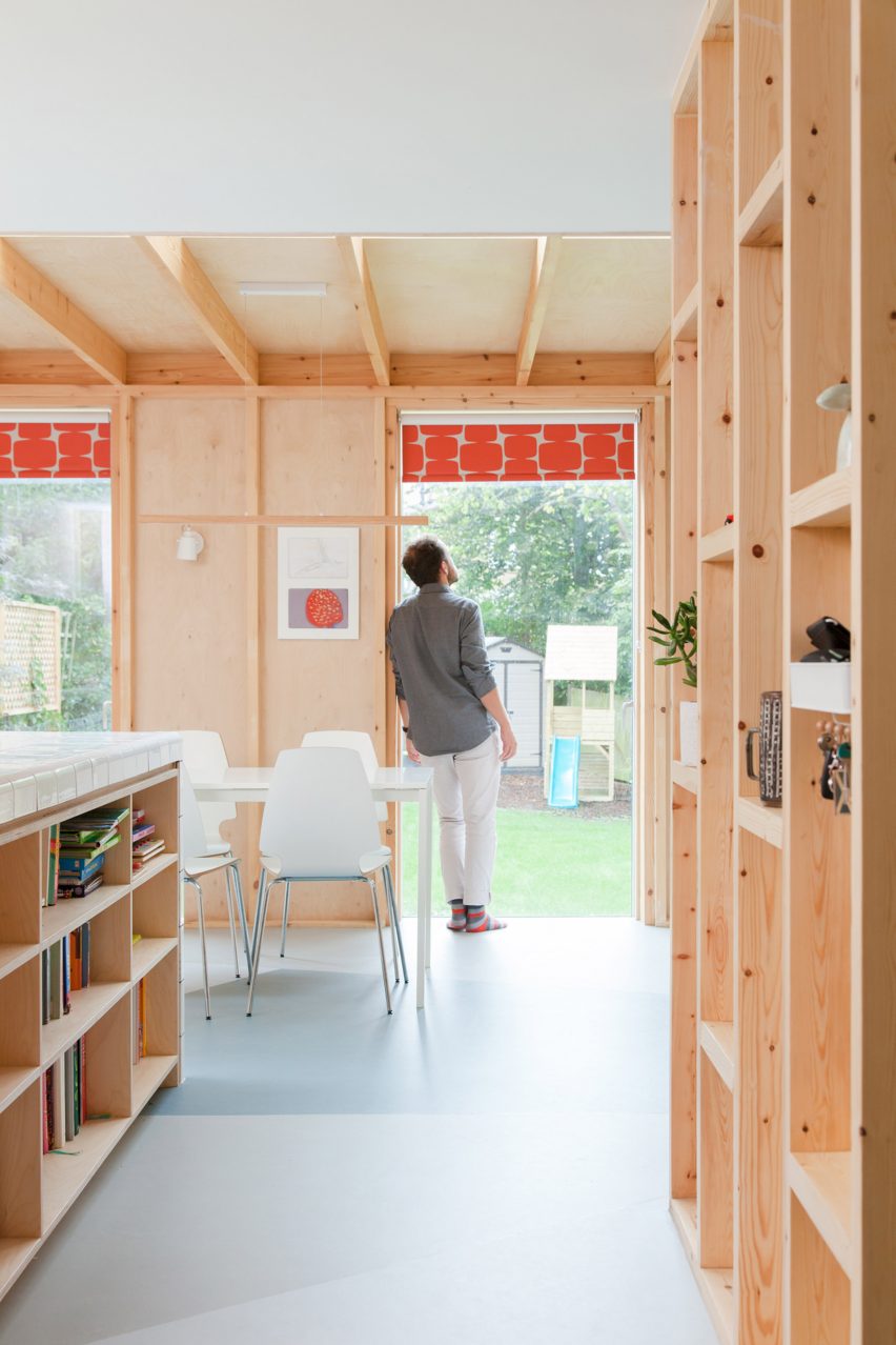
Floor-to-ceiling windows and skylights have been incorporated to help connect the space to the garden, which is set among a former orchard.
According to the studio, this offers the family a "sense of living amongst fruit trees and below the canopy of the larger trees beyond".
Inside, the semi-open partitions are complemented by the exposure of the extension's wooden structure, which helps create a "visually and acoustically warm" finish.
Both the exposed structure and partitions also provide small nooks that the family can use as shelving and homes for decorative possessions.
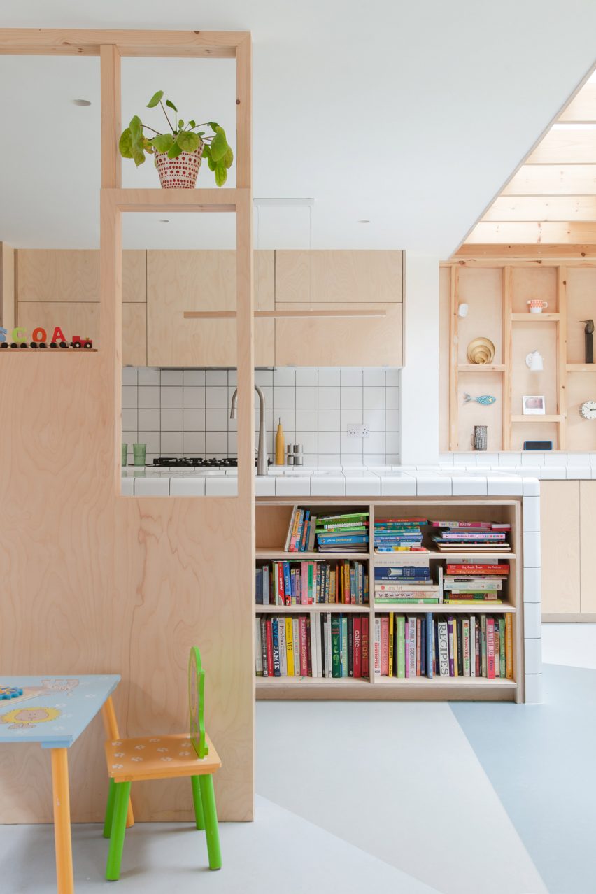
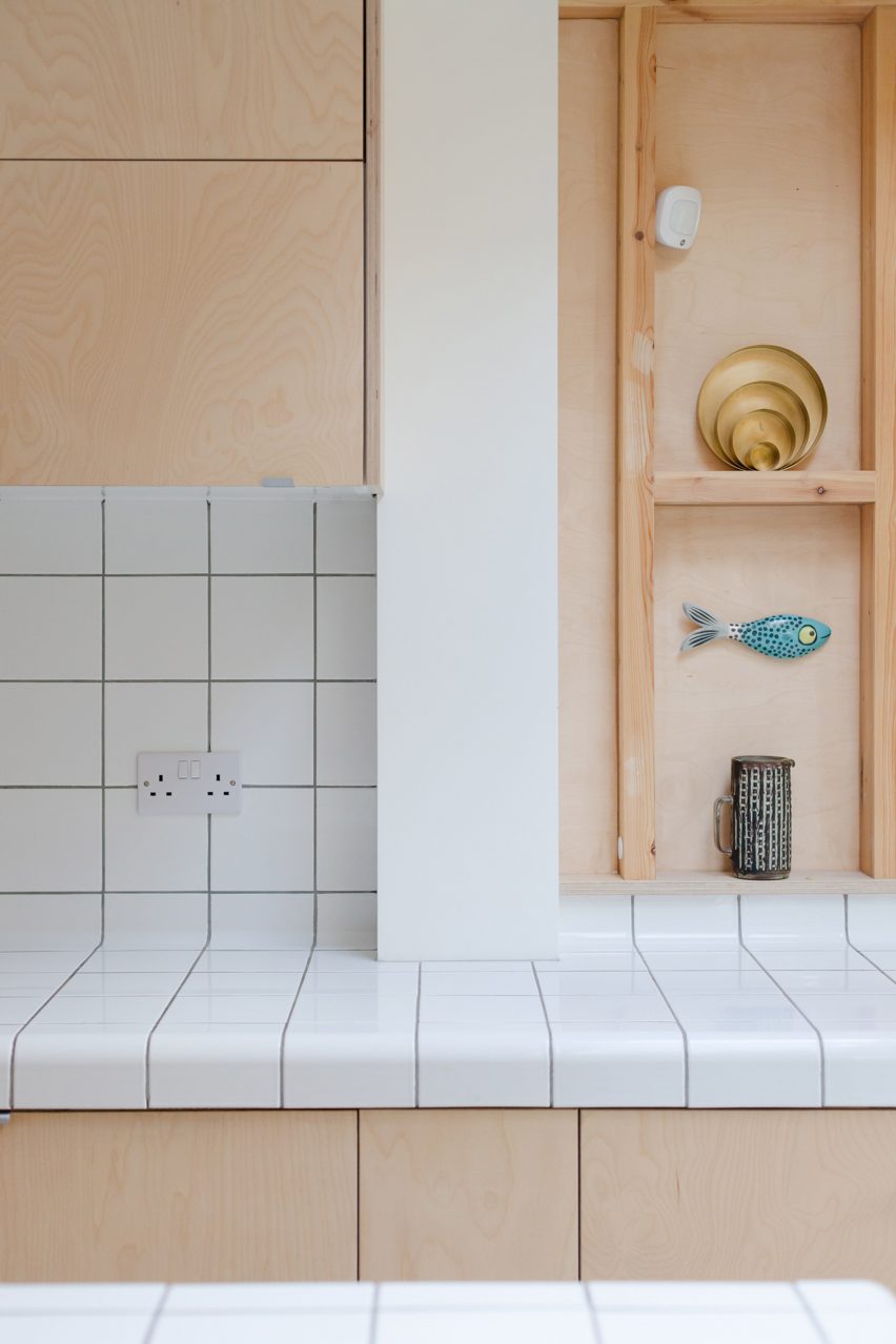
In the kitchen, the island and worktop are finished in traditional white tiles chosen for a deliberately simple look.
Some tiles have curved edges, which enabled the studio to cover the island in one material, while also making the space safer for the children to run around.
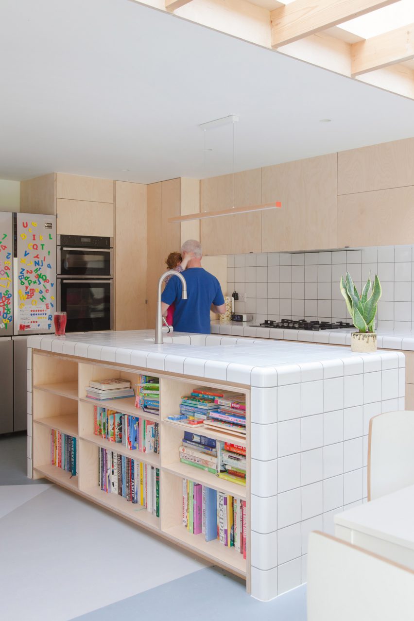
The rectilinear forms of the Fruit Box extension are contrasted with a grey and blue linoleum floor, which is laid in a triangular pattern.
This flooring nods to the awkward shape of the garden and will eventually inform its landscaping, according to the studio.
The project is complete with a new main bedroom and bathroom on the first floor, made possible by relocating the living spaces to ground level.
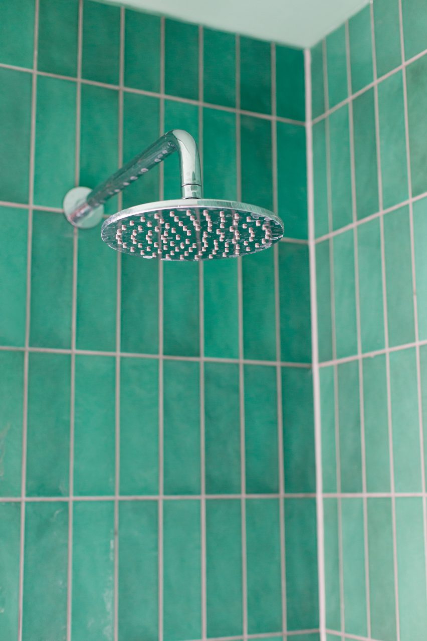
The bedroom was opened up to provide outward views, while the new bathroom was lined with green tiles to maximise a connection to the garden.
Nimtim Architects was founded in 2014 by O'Callaghan and Nimi Attanayake. Its Fruit Box extension is one of 22 projects to have been shortlisted for this year's Don't Move, Improve! contest.
Other projects vying to win the competition include a colourful remodel of a Georgian townhouse and a mountain-like addition to an Edwardian residence.
Photography is by Megan Taylor.
Project credits:
Architects: Nimtim Architects
Structural engineers: Blue Engineering
Main contractor: Magic Projects
Flooring: Forbo
Kitchen doors: EasySpray
Worktop and wall tiles: Dtile
Windows and doors: A J&D Chapelhow
Rooflights: Glazing Vision