CUT Architectures designs sunset-hued interior for Parisian burger joint in ode to California
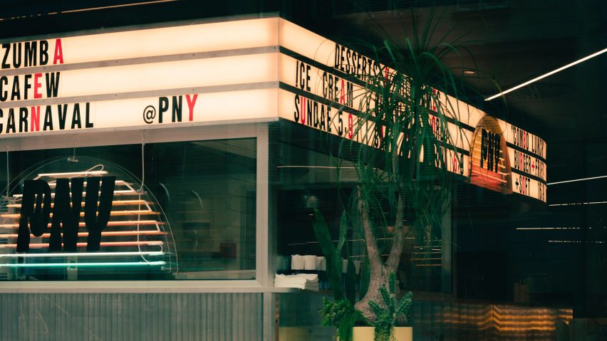
The mid-century architecture and roadside diners of the American west informed the interior of this nostalgic hamburger restaurant in Paris designed by CUT Architectures.
Located in Paris's Citadium – a multi-brand department store on Boulevard Hausmann that is focused on lifestyle, streetwear, and sneaker culture – PNY Citadium is the hamburger chain's seventh opening in the city.
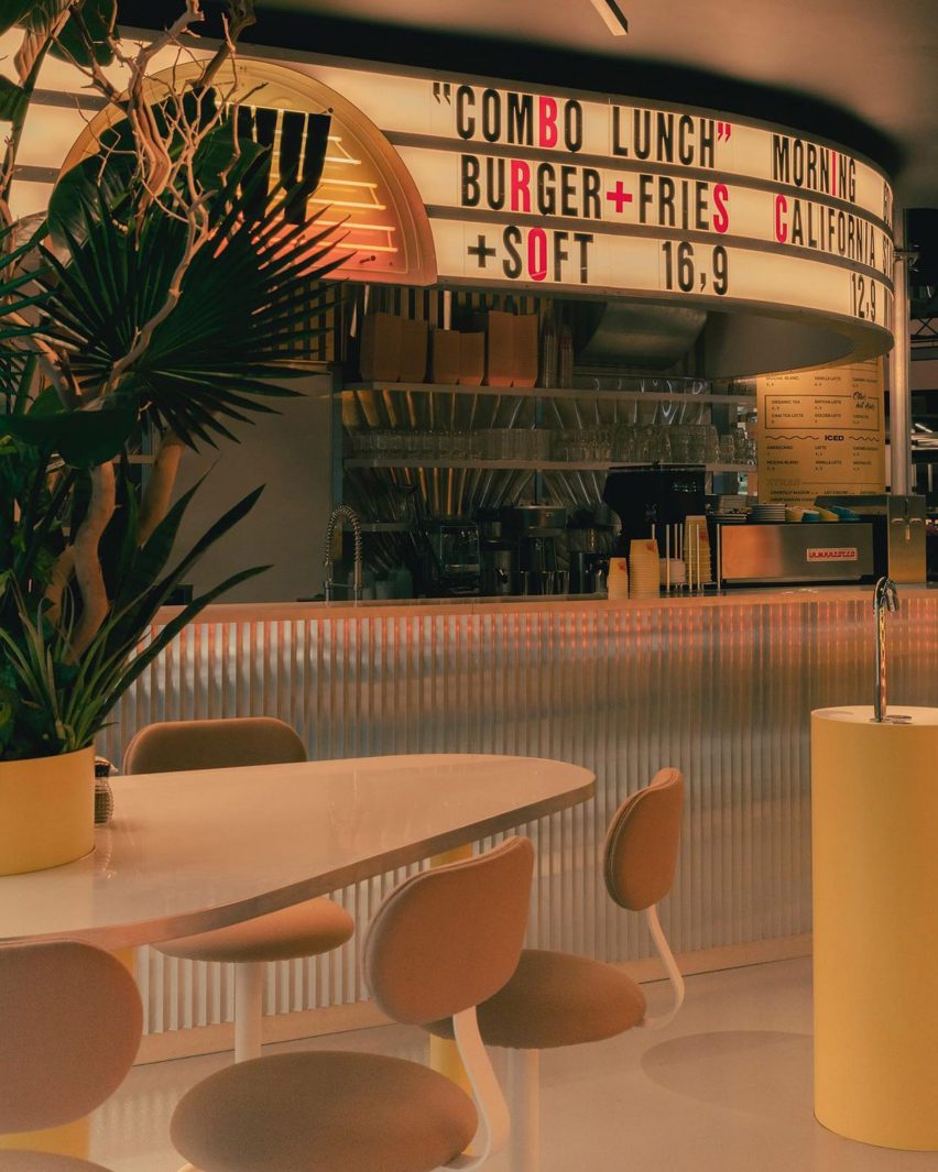
Paris studio CUT Architectures – which previously designed PNY's first, second, third and fourth outposts – was invited back to create this location around the theme "electric tropical diner".
The interior, which features neon tube lighting, aluminium walls and embossed stainless steel, seeks to capture the "vivid and unique" energy of America's West Coast.
In particular, the architects looked to the mid-century architecture of Venice Beach in Los Angeles, the Palm Springs' houses of Albert Frey, and Palm Desert sunsets.
Set out over 75 square metres, the 51-seat restaurant is headed up by a curved crenellated aluminium bar that lines the back wall.
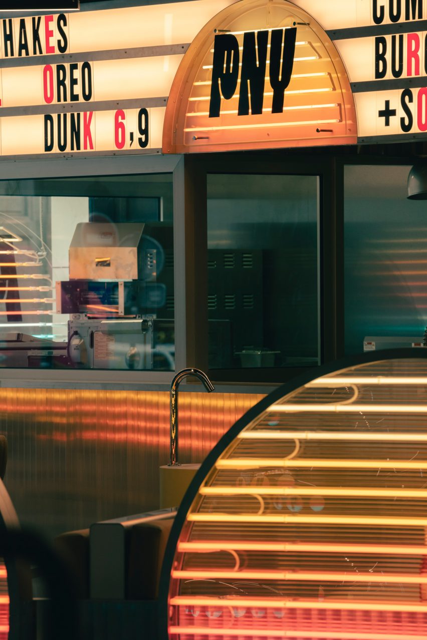
The back of the bar is clad in aluminium while overhead a retro lightbox sign that displays the menu wraps around the top.
"The place is conceived as an architectural parenthesis set in the Citadium; a roadside diner whose bar is clad in crenellated aluminium like a longhaul truck crossing the United States," said CUT Architectures.
"The back bar is dressed in embossed stainless steel with a radiant pattern that increases the reflections."
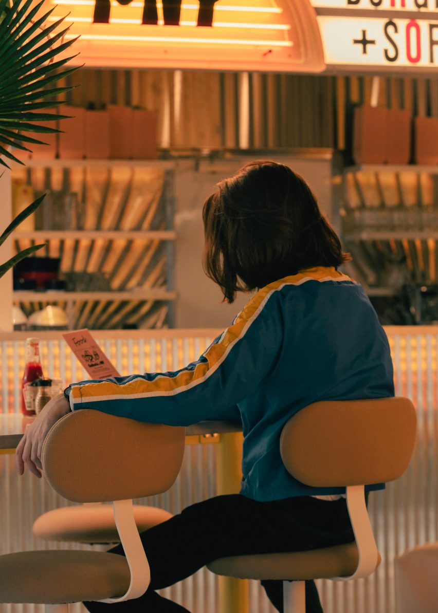
Seating is laid out over a series of classic diner booths with banquette seating, as well as a series of tall bar tables and stools.
The booths are positioned along the entrance to the department store and lined with large circular glass panels, lit by rows of warm neon tubes that fade from yellow to orange and pink.
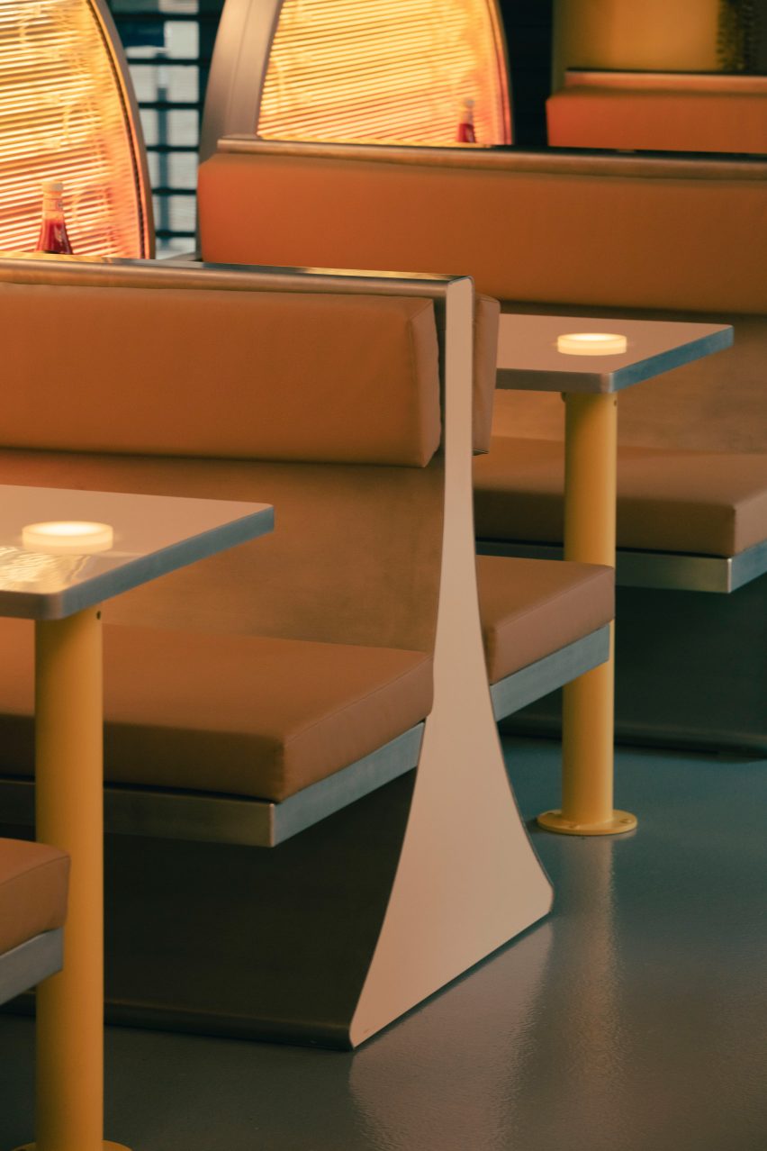
Designed to recall the setting sun on the Pacific Ocean, the panels provide privacy for diners and create a visual boundary between the restaurant and the rest of the department store.
"To achieve the specific hues and quality of light we wanted we used old school signage neon tubes instead of LED lights," the studio told Dezeen.
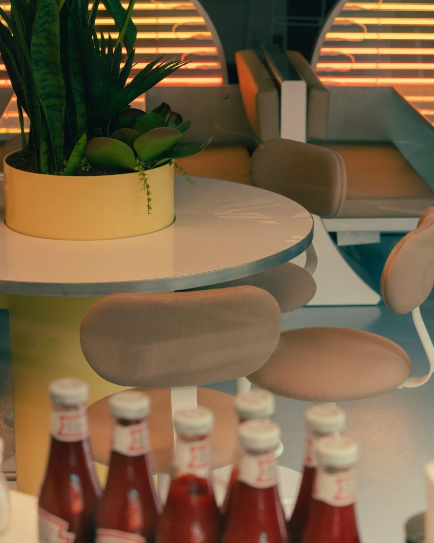
The bases of the taller tables are made from large steel cylinders lacquered in a faded yellow hue.
The cylinders pierce through glossy white circular tabletops to create planter centrepieces that are filled with arid vegetation native to the Californian desert.
Other sunset-informed eatery designs include designer Yota Kakuda's sunset-hued counter installed within a Tokyo cheese tart shop.
While in a Hong Kong cafe, architecture firms Studio Etain Ho and Absence from Island pay homage to Australia's spectacular sunsets with a terracotta colour scheme and semi-circular forms.
Photography is by Romain Laprade.