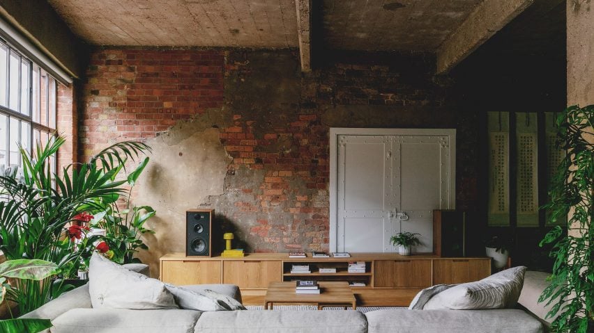
Emil Eve Architects brings warmth and colour to London warehouse apartment
The owners of a converted warehouse apartment in London's Clerkenwell have swapped open-plan living for a more functional room layout, following a redesign by Emil Eve Architects.
The project, called St John Street, sees the previously stark and industrial space transformed into a practical two-bedroom home for clients Mike and Jen.
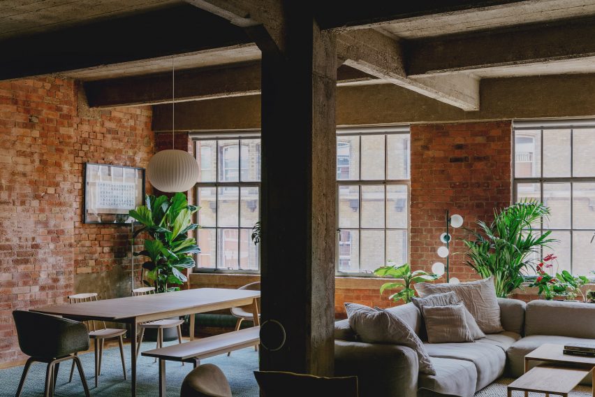
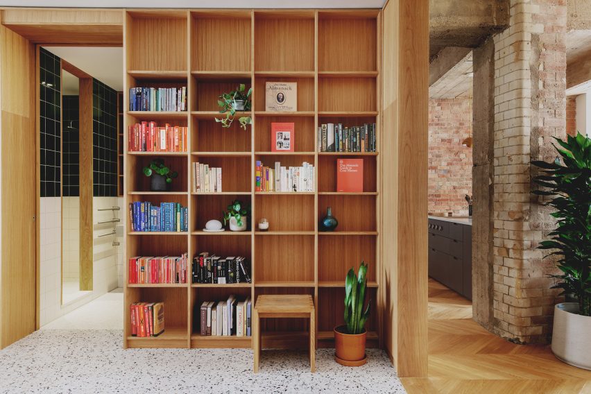
Along with the new layout, Emil Eve introduced oak joinery, glazed tiles and terrazzo flooring to bring more warmth and colour into the renovated living spaces.
The aim was to make the former warehouse space feel more comfortable, but without losing the industrial character that gives the space its identity.
"When our clients acquired the apartment it was a large empty shell, with exposed brickwork walls and columns, and a board-marked concrete ceiling slab," said Emma Perkin, who founded Emil Eve with partner Ross Perkin.
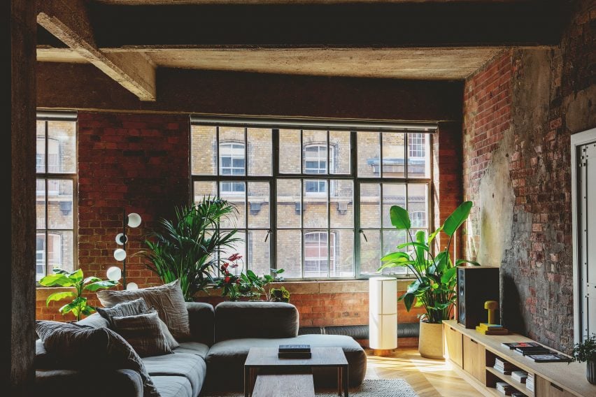
"Although an industrial palette can feel quite raw and harsh, the materials here had such a beautiful range of tones and textures that we knew we wanted to retain them," she told Dezeen.
"Our approach was to contrast these rougher historic surfaces with contemporary interventions in a carefully considered palette of materials to complement the existing tones and create a warm and inviting home."
The biggest task of the project was planning a new layout that would suit the client's lifestyle and daily habits, but which also work with the existing windows and structural columns.
Emil Eve's approach was to organise the main living spaces at one end of the floor plan and the bedrooms at the other, so that both could benefit from the natural light. Ancillary functions, such as bathrooms, were then slotted into the centre, behind a spacious library-style entrance lobby.
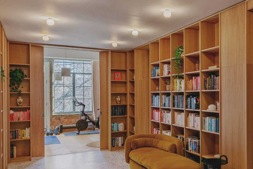
"The space is long and thin, with windows at each end, so we needed to consider how to maximise natural light in the areas where our clients would spend most of their time," said Ross Perkin.
"We developed the idea for a library space, which would form the entrance to the apartment, which linked all the other rooms and enabled views from one end of the apartment to the other through large sliding pocket doors," he explained.
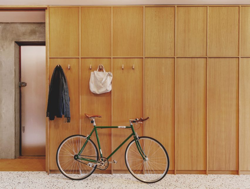
Almost all of the new partition walls integrate built-in shelving and cupboards, giving them a feeling of solidity while also creating much-needed storage space.
As a result, these elements have a high-quality finish level, allowing them to contrast with the raw surfaces of the original outer walls.
"We wanted to retain as much of the historic fabric and the sense of openness as possible," said Ross.
"So these internal spaces are conceived as independent elements, each lined with bespoke timber joinery and ceramic tiling to create a distinctive atmosphere and identity."
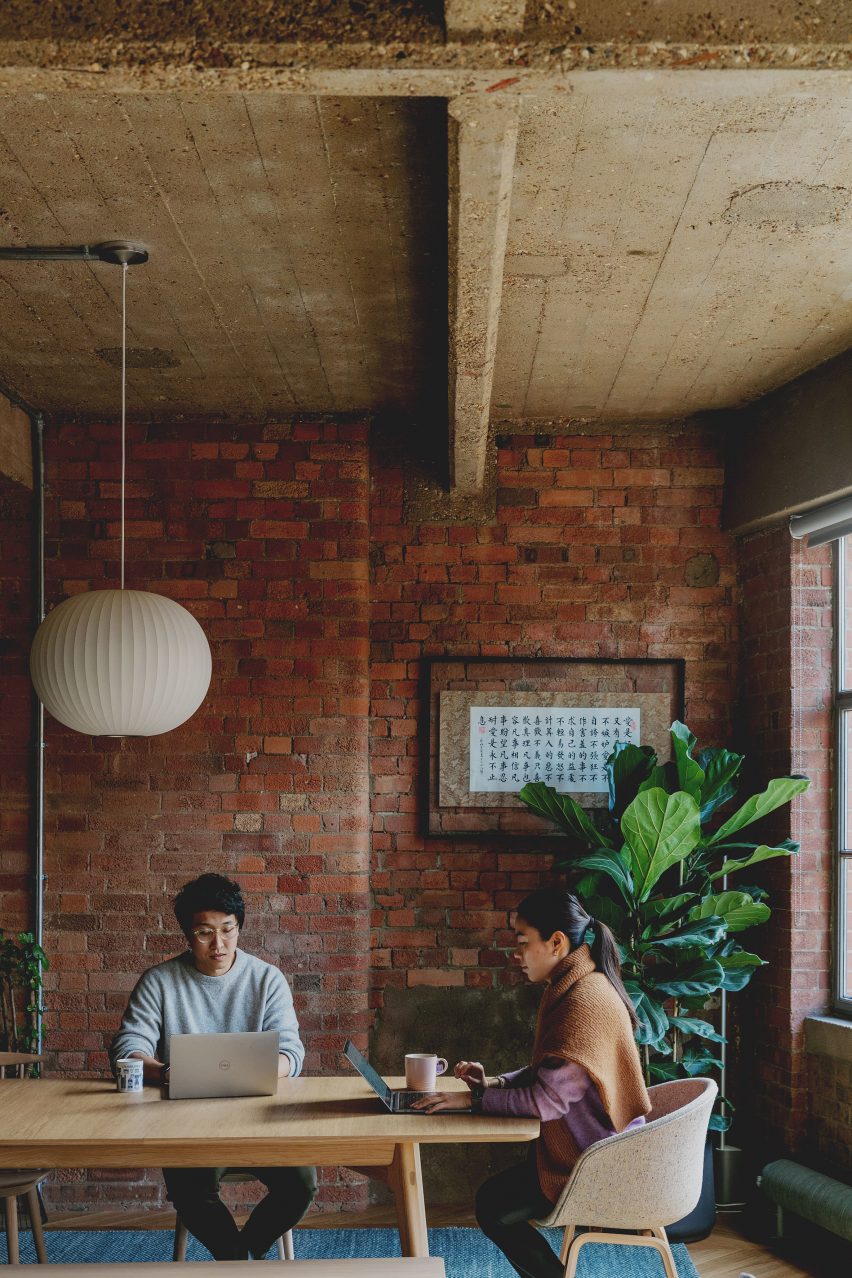
The living area is now the largest space in the home.
Two concrete columns, as well as large furniture pieces, help to divide the space into three different zones – a lounge space, a dining area that doubles as a workspace, and a kitchen and breakfast bar. This makes it easier for multiple activities to be going on at once.
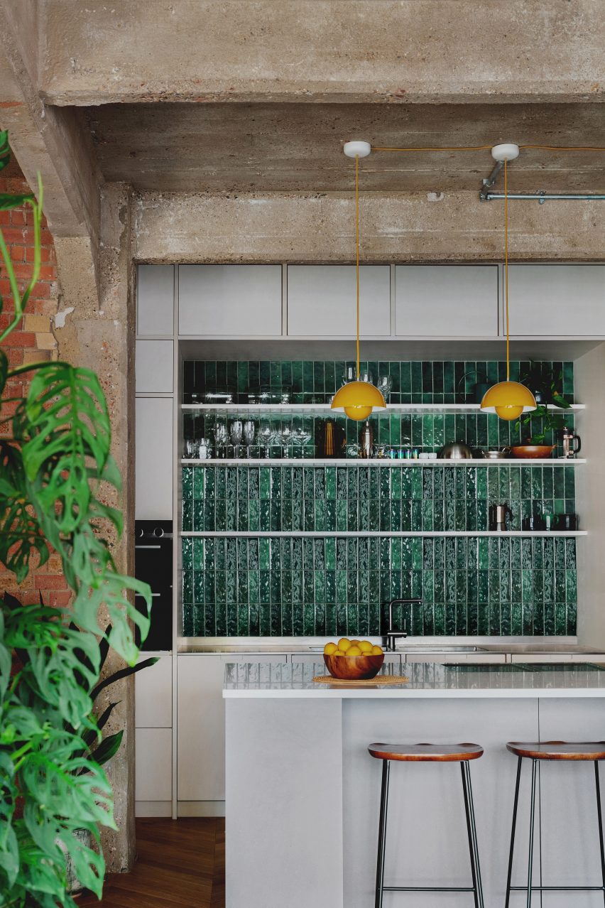
The kitchen is the most distinctive element in this room, combining lime-washed birch plywood units, dark green tiles, yellow pendant lights and an island with an integrated teriyaki hotplate.
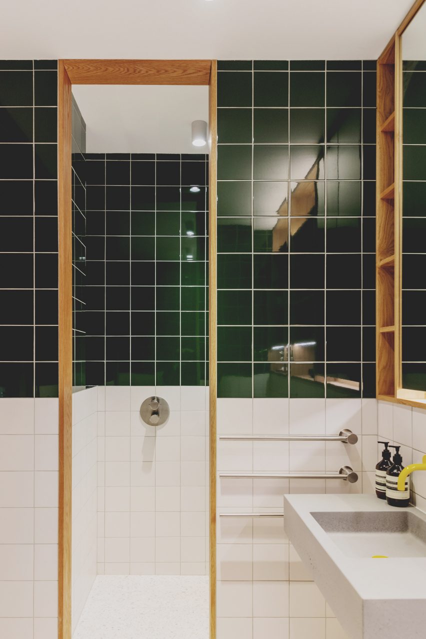
A similar green tile features in the main bathroom – the idea was to reference the Victorian glazed tiles that are common in the area.
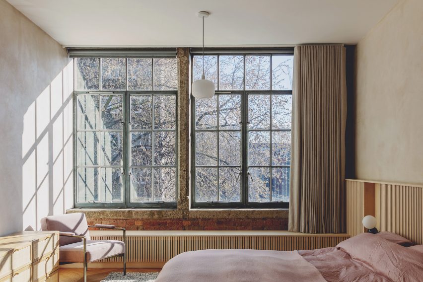
A more serene approach was adopted for the bedrooms, where the brick walls have been finished with a natural clay plaster.
As well as a walk-in-wardrobe and en-suite, the main bedroom also features a custom-made slatted bedhead and window seat, with interacted bedside shelving.
The other bedroom is a guest room, so most of the time it functions as a gym.
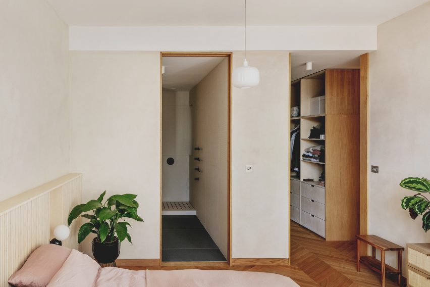
Parquet flooring features in both the bedrooms and living spaces, while the rest of the apartment features terrazzo flooring, which helps to create subtle transitions between different areas.
Emil Eve worked with Harbour Joinery Workshop to design and build all of the new joinery elements, as well as some of the furniture pieces.
It is an approach the architects are familiar with, having designed in-built furniture for previous projects, including their own former home, Gibson Gardens.
The standout elements here include the floor-to-ceiling shelves and closets in the library, the neatly organised walk-in-wardrobe in the main bedroom, and the custom low sideboard in the living room.
"We love joinery and always design our own pieces to suit each project," said Emma. "Here, we conceived a family of joinery elements for the different spaces, but with common characteristics."
"We used oak for the library space, which is a really warm timber and a traditional material for libraries, to give the atmosphere of a book-lined sanctuary at the heart of the home. The dressing room, kitchen, pantry and ensuite echo the language, but in lighter plywood to delineate these spaces."
Photography is by Mariell Lind Hansen.