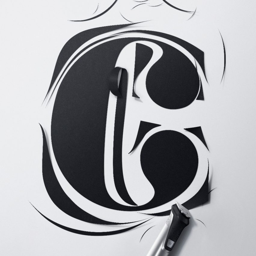
Ogilvy Istanbul has used the amazing visual language of typography to demonstrate how people can change styles while staying true to their character.
The outer character is a slab-serif type and we illustrated that by changing the rectangular terminal to a "ball terminal". Plus the arc of stems is made much thinner to underline the change.
Tracking the results of traditional poster work is virtually impossible but the research shows that the category grew 39% in only one year and Philips' sales grew by a whopping 22%. This is of course supported by various marketing collateral.
This project has been longlisted in the graphic design category of Dezeen Awards 2021.
Designer: Ogilvy Istanbul
Project: Trim Type


