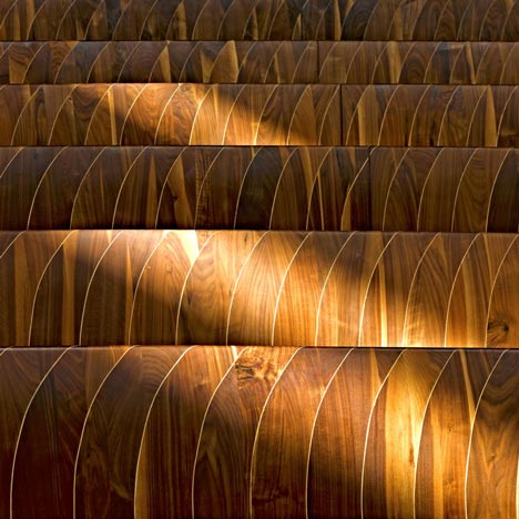
Worth Abbey by Heatherwick Studio
London designer Thomas Heatherwick has embedded curved threads of ash into dark walnut pews for an abbey in England’s South Downs.
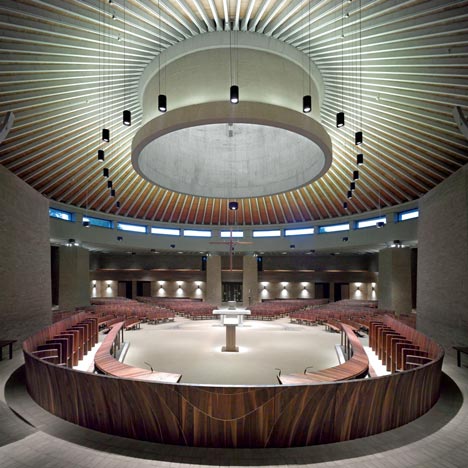
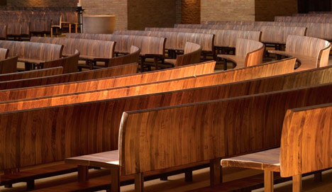
Located beneath the vaulted dome of Worth Abbey, the wooden benches fan around a stone altar to provide more than enough seating for the 700-strong congregation.
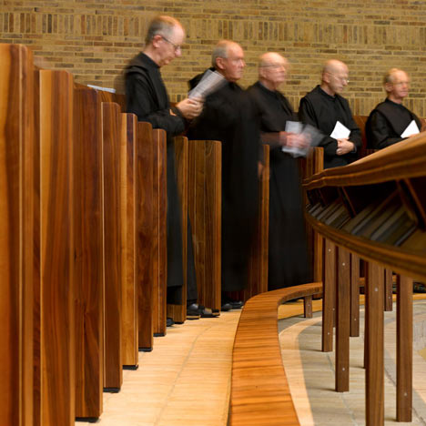
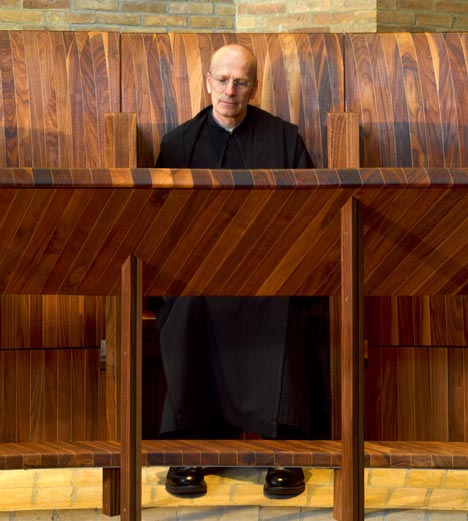
The new furniture also includes choir stalls, monastery seats, desks and confession rooms, all of which were fabricated from the solid hardwood.
Thomas Heatherwick received a lot of press last year when his UK pavilion opened in Shanghai and he redesigned London’s iconic Routemaster bus, but he's also designed furniture including a metal chair shaped like a spinning top - see more projects by Heatherwick Studio here.
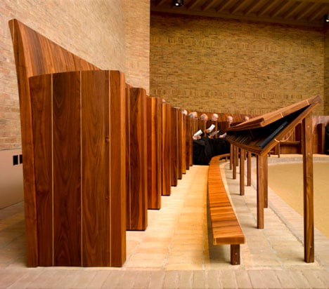
Photography is by Edmund Sumner.
Here's some text about the project from the American Hardwood Export Council:
Heatherwick Brings New Life in Black Walnut to Worth Abbey
Nestled on a crest overlooking the South Downs, Worth Abbey Church has a striking aspect. Its remarkable conical sloping roof sets off the extensive, peaceful grounds and the rolling landscape below. The 25 English Benedictine monks who reside at the Abbey run a school, a parish and a place of retreat.
The Abbey Church was designed by the architect Francis Pollen, and is considered by many to be the best example of his style. Since its opening in 1974, the Abbey’s furniture comprised freestanding chairs which impinged on the ambiance, creating a cluttered, temporary feel. The Monks decided that it was time to undertake some refurbishment work and took the opportunity to have a more cohesive, relevant and purposefully designed congregational and clergy furniture. They commissioned Heatherwick Studio to design and develop a furniture strategy as part of wider renovations to the Abbey Church. The furniture package included pew benches, choir stalls with misericord seats and desks, benches, credence tables, server seats and reconciliation (confessional) rooms.
Heatherwick Studio is headed by Thomas Heatherwick who trained at Manchester Polytechnic and the RCA. Since its founding in 1994, the studio has earned a reputation for coming up with artistically exciting solutions to clients’ design briefs ranging from product design to major architectural and large scale design projects. The studio consists of team with a wide range of disciplines including architecture, product design, model making, fabrication, landscape design, fine art and curation, and they are used to working in a sensitive historic context, which was vital for the refurbishment work undertaken at Worth Abbey. They also have a very strong making ethos, and a workshop within the practice allows them to make prototypes and models, giving them a very valuable ‘makers eye view’ of all the commissions they undertake.
The original auditorium space of the Abbey has a tangible spiritual feel to it; a difficult thing to achieve with modern materials without the obvious historical and religious architectural references. Natural stone and neutral colouring make the space light and airy. Heatherwick wanted to complement the materials used by Pollen and decided to use solid wood throughout for the new furniture. In a space that uses natural and neutral tones, a more traditional choice might have been oak or a more modern option could have been a pale species like maple. Heatherwick took a braver move and chose American black walnut to give a colourful aspect to the chapel, the darker heartwood creating a distinctive, defined line to the design, and the creamy sapwood adding a touch of warmth without over powering the celebrants and congregation who are the main focus of any service. According to Thomas Heatherwick, “Walnut was chosen for its darkness and subtlety and for the way that when it would be used in quantity on our project, its dusky colour would not become overbearing.”
As you enter the main nave you are struck by the presence of the furniture but it does not overwhelm the space, nor is it too small in scale. It is a big area serving congregations of 700 people, and with capacity for double that number. The design approach has kept the circular nature of the space with a stone altar in the middle. The original furniture did not have kneelers for the congregation so these were designed as an integral part of the seating.
Furniture fabrication was undertaken by Artezan, a specialist joinery division within Swift Horsman, a UK-based company chosen for their flexible and experienced approach to the complex method of construction. Swift were up for the challenge and have delivered it successfully. Thomas Heatherwick said he was “immensely impressed with the quality of the work of the craftsmen and the phenomenal determination and commitment of the firm to a very challenging commission.”
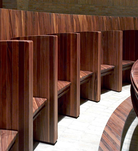
The way the furniture is constructed is central to the whole theme of the Heatherwick design. Having decided on solid wood and a clean lined approach, Thomas and the team at Heatherwick came up with a striking laminated design which complements the square walls of the church and the radial nature of its layout.
Due to movement issues inherent in working with all-solid wood construction, an interior metal frame allows the natural characteristics of the timber to come through and be strong enough to easily manage everyday use. This frame links the kneelers to the seating, making each pew a standalone piece. Working with the team at Swift Horsman, complex jigs were designed and developed to cope with the complicated glue-ups that were part and parcel of the design.
The most intriguing and subtle aspect is a 0.6mm line of ash which is laminated into the layers of black walnut. This adds a sense of detail that gives it an historical link to the traditions of inlay within the craft but with a very contemporary and sculptural feel. At a distance it is barely there, but the closer you get to the furniture the more apparent and thus more effective it becomes, giving a gentle element of understated surprise to the overall effect. This is the most artistic aspect of the whole concept and it runs throughout the whole collection of furniture; the central monks seat shows it most dramatically, where the angle of the laminating meets the curve of the back, creating a wave effect in the ash veneer. This helps give a central focus to the lead preacher of the day.
The overall impression is that the furniture definitely adds a cohesive feel to Pollen’s concept while allowing the practical considerations of running and attending a service to actually work. Thomas Heatherwick, his team and Swift Horsman are to be congratulated on a distinctive and extremely high quality solution both in terms of its ideas and its craftsmanship.