Ten functional Shaker-style interiors with a focus on craftsmanship
For our latest lookbook, we've collected ten interiors that reference the style of the Shakers, a Christian sect that believed in simplicity and utility.
The Shakers, a mid-18th century religious sect, believed it was possible to "form a more perfect society on Earth". Followers practised communal living and shared all property.
Shaker-style interiors and furniture have since become known for their very simple, unadorned design, which lets the qualities of the materials – mainly wood – shine through. The style is still popular today, especially in kitchen settings.
Here, we have gathered ten examples of interiors that showcase the allure of this simple functional design.
This is the latest roundup in our Dezeen Lookbooks series that provide visual inspiration for designers and design enthusiasts. Previous lookbooks include home libraries, minimalist bedrooms and concrete living rooms.
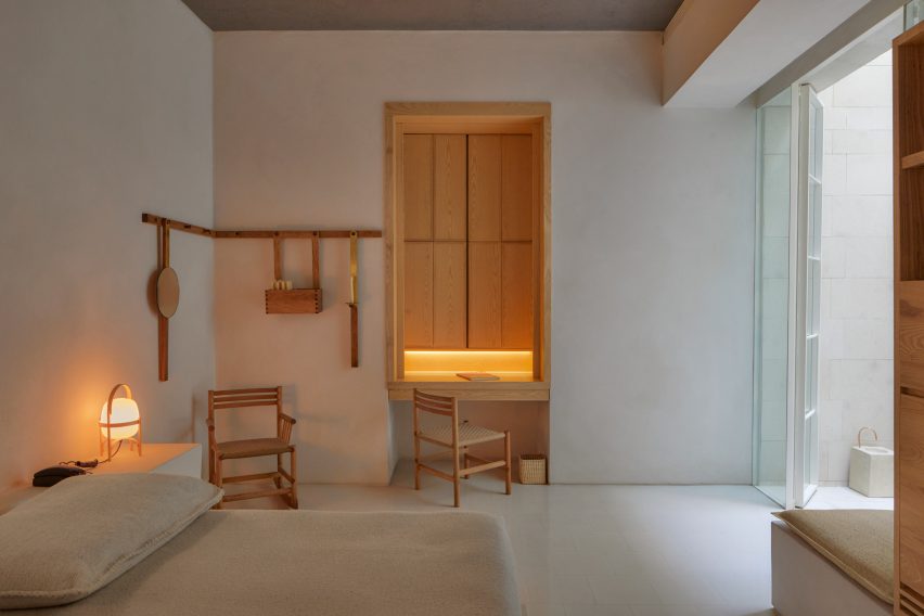
Círculo Mexicano, Mexico, by Ambrosi Etchegaray
The bedroom of this Mexico City hotel has a quiet, yet welcoming feel. Warm wood creates a striking contrast against plain, white walls, and is complemented by beige linen fabrics. A peg rail, commonly used by Shakers to hang hats, clothes and light pieces of furniture, decorates the wall.
"We imagined an architecture free of ornament, where the correct use of simple materials enhances the quality of the space," architect Ambrosi Etchegaray told Dezeen.
Find out more about Círculo Mexicano ›
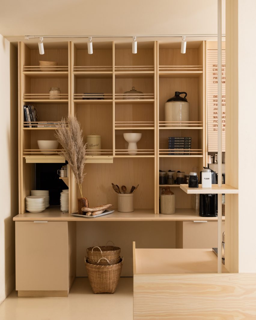
Flourist bakery, Canada, by Ste Marie
This artisanal bakery in Vancouver, Canada, was designed by Ste Marie using Shaker-informed furniture to have a "mix of farmhouse sensibility and Scandinavian design principles".
Built-in wooden shelving holds cookbooks, cooking utensils and decorative ceramics. It has been left in its natural colour to underline the traditional, handmade feel of the space.
Find out more about Flourist bakery ›
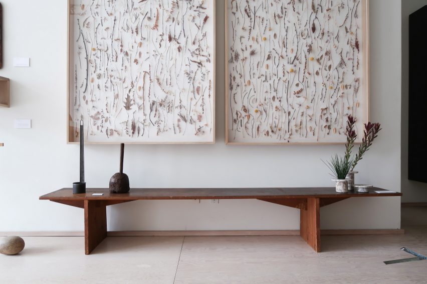
That Is Best Which Works Best, Canada, by Mjölk
A display of original furniture made by the Shakers was combined with contemporary interpretations of the sect's designs in an exhibition at Toronto design store Mjölk.
Here, the juxtaposition of a classic dark-wood bench and contemporary ceramic vases creates a modern interior that still clearly nods to historic homes. Framed pressed flowers evoke the Shakers' way of life, in close connection to nature.
Find out more about That Is Best Which Works Best ›
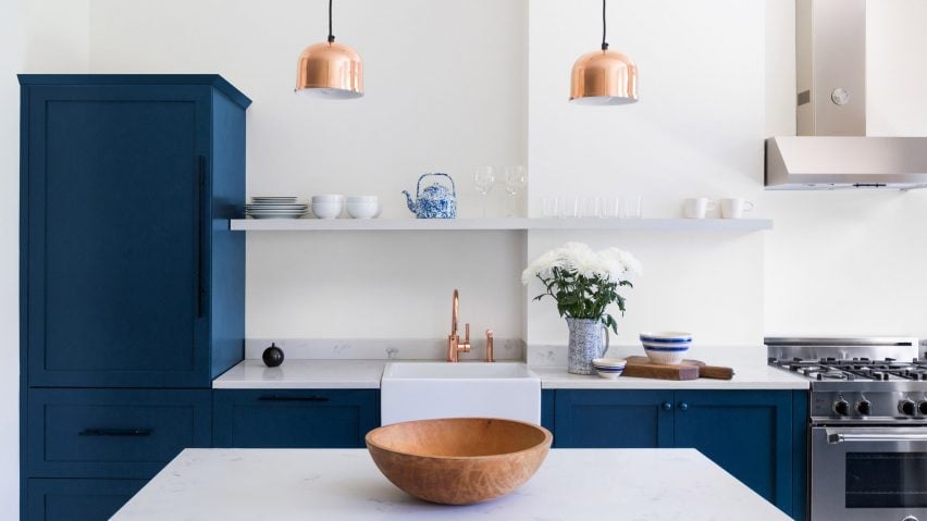
Queens rowhouse, US, by White Arrow
New York design studio White Arrow added dark-blue cabinetry to the kitchen of this rowhouse in Queens, New York. Despite being more colourful than designs normally associated with Shaker-style interiors, the cabinets feature the clean lines and inset panels widely used by the sect.
The dark blue colour of the kitchen cabinets is especially striking against the room's white walls and copper lighting. A floating shelf holds crockery and glassware, while a marble backdrop adds to the quiet luxury of this kitchen design.
Find out more about Queens rowhouse ›
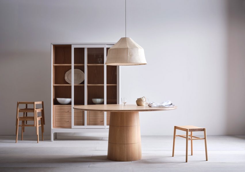
Kitchen interior, UK, by Pinch
These wooden furniture pieces by London design studio Pinch were created to express a "restrained interpretation of luxury" and shown in a simple, yet elegant setting. The gleaming natural wood colours are contrasted with white detailing, and set against white walls and a white-tinted wooden floor.
The studio's circular Rodan dining table was designed to reference the round or oval bentwood boxes that were historically used by the Shakers to store kitchen ingredients.
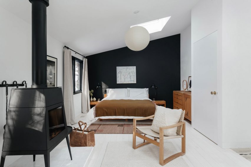
Clover Hill Residence, US, by Ravi Raj Architect
This black stove by Wittus is designed to look like traditional angular Shaker stoves. It warms the bedroom of Clover Hill Residence in upstate New York and nods to the history of the house, which began its life as an iron foundry in the 1890s.
Wooden furniture, a woven rug and a colour palette of just browns, whites and dark blues create a soothing, peaceful bedroom.
Find out more about Clover Hill Residence ›
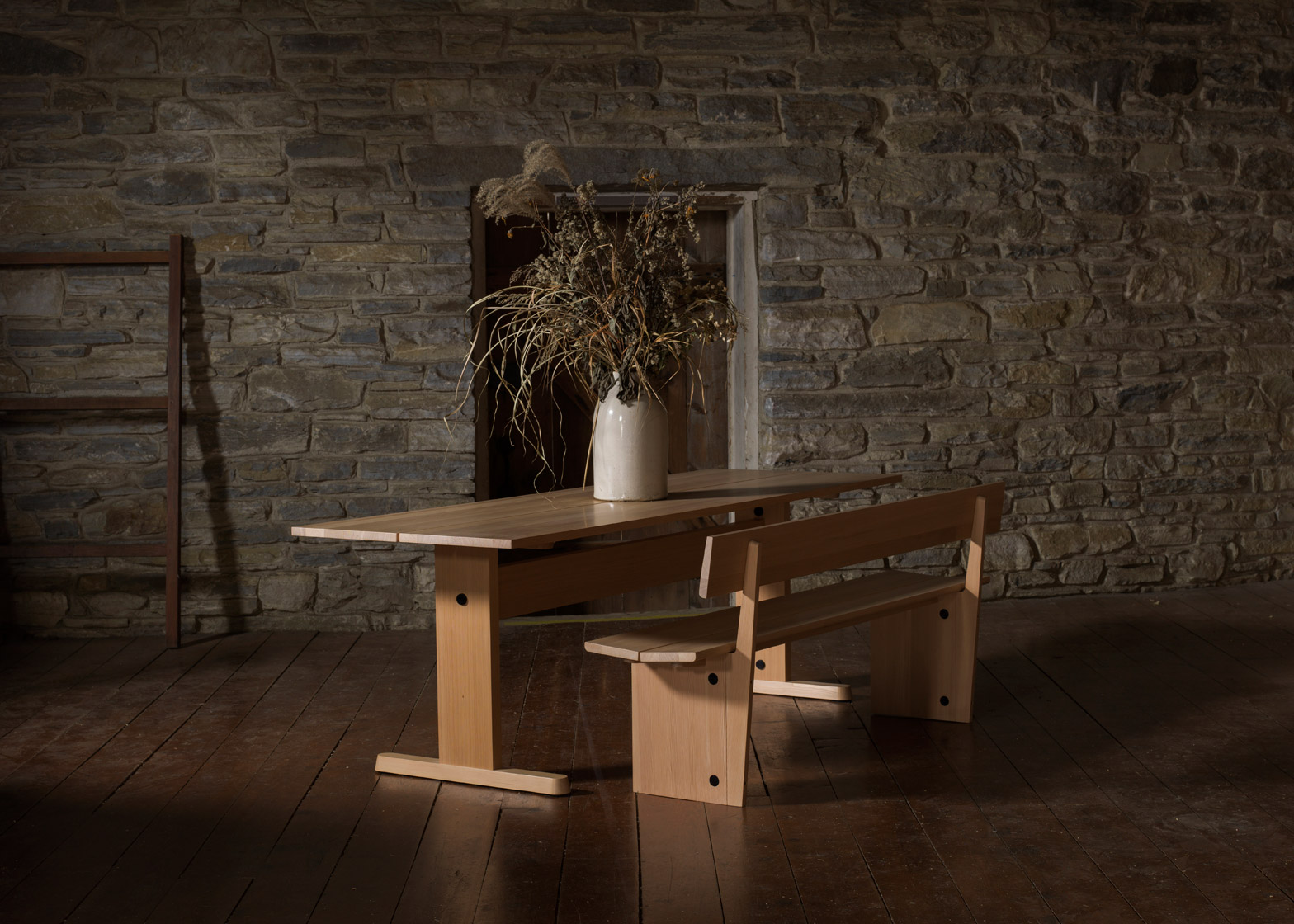
Furnishing Utopia, US, by various designers
This wooden bench with a matching table was designed for the Furnishing Utopia exhibition, which showed Shaker-style interiors and design. Shown in a traditional setting, the bench is a modern take on the pared-down designs that gave the sect the moniker "the first minimalists".
The 11 designers taking part in the show visited preserved Shaker sites at Hancock Shaker Village and the Mount Lebanon Shaker Museum to find inspiration for the furniture.
Find out more about Furnishing Utopia ›
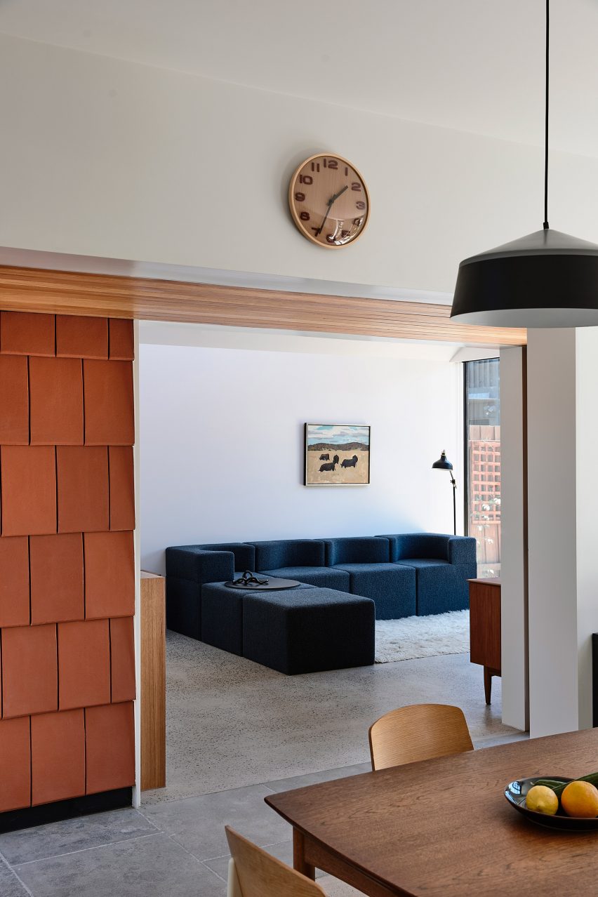
Terracotta House, Australia, by Austin Maynard Architects
Austin Maynard Architects designed Terracotta House for a keen gardener. It was created as a communal-living family "compound' – akin to a village square – similar to the Shakers ' practice of communal living.
Wooden furniture was used for the interior of the house, a timber-clad Victorian workers' cottage that has been renovated and modernised.
Find out more about Terracotta House ›

Historic Schoolhouse, US, by White Arrow
The classic Shaker-style kitchen in this US home was painted all-white, creating a light-filled, bright interior. Gold detailing on the handles, plug sockets and lighting create an elegant contrast to the cream-coloured cabinets.
A herringbone-patterned parquet floor adds a more rustic feel to the kitchen, which has floor-to-ceiling storage spaces and marble countertops.
Find out more Historic Schoolhouse ›
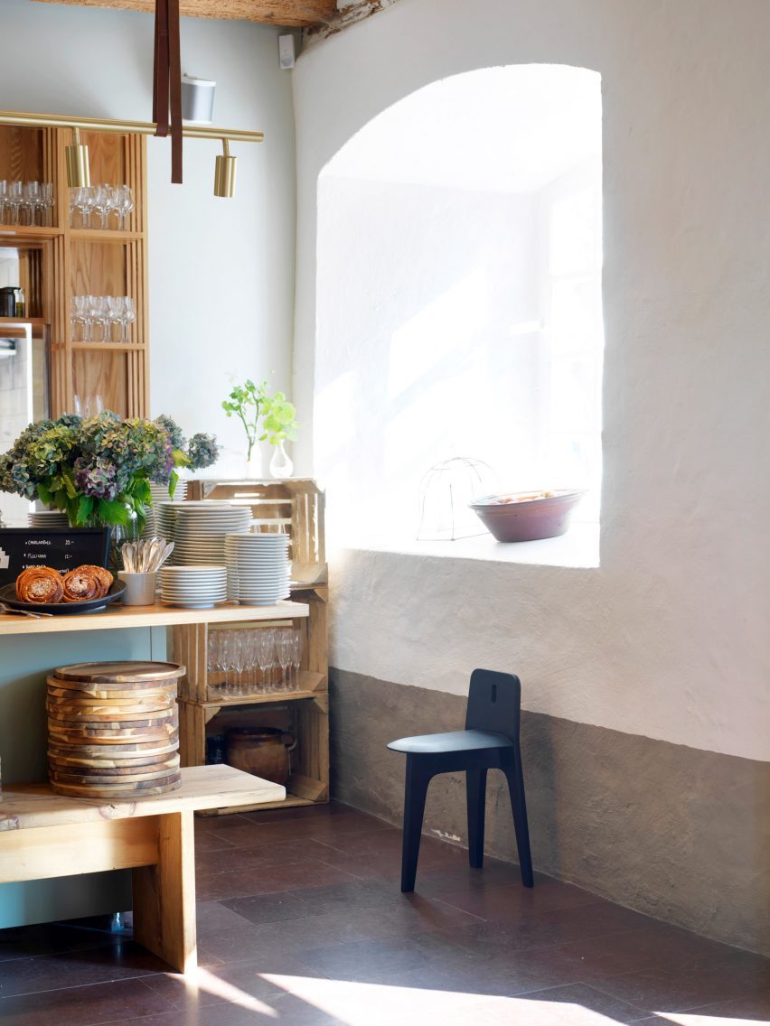
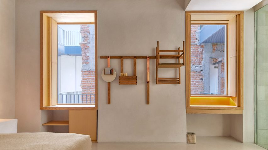
This sunlit kitchen features simple wooden furniture, including designer Gabriel Tan's Shaker-inspired stool. It can be hung on a peg on a wall – a traditional way for the Shakers to store their goods and furniture.
"The chair is really about two things I love the most about the Shakers," the designer said. "One, that they hung their furniture and stuff on the wall when they don't use it, and two – the unusual shape of the wood-fire Shaker stove."
Find out more about this design ›
This is the latest in our series of lookbooks providing curated visual inspiration from Dezeen's image archive. For more inspiration see previous lookbooks showcasing home libraries, minimalist bedrooms and concrete living rooms.