Hooba Design Group wraps Tehran office building in a brick-clad "second skin"
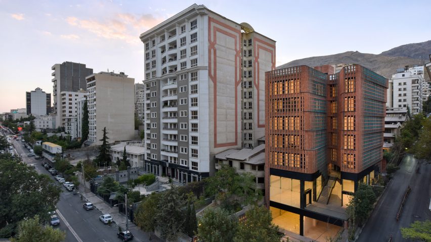
Architecture studio Hooba Design Group has completed a brick-clad office building in Tehran, with a scooped-out central void to bring natural light deep into the building.
The Hitra Office and Commercial Building is located at a road intersection of the Valenjak neighbourhood of Iran's capital, and combines two floors of glazed commercial space with five red brick-clad office storeys.
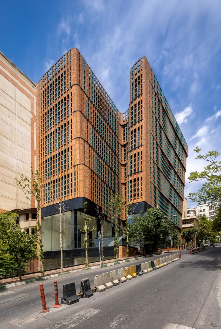
For the local practice, two of the key aims of the project were to bring as much light as possible into the building and offer a public space back to the city.
Instead of taking the typical approach of filling the site and placing a light well in the building's centre, the Hitra Building's "void" has been moved to its southern edge, creating a scoop in the building that draws in light and overlooks a new public square.
"Based on the built-up regulations and municipal laws of Tehran, each building has turned into a passive member in the city," Hooba Design Group founder Hooman Balazadeh told Dezeen.
"The main criteria of this project was to reevaluate the morphology of a typical office building to improve the quality of natural light and views without altering the optimum built area," he continued.
"The Hitra Building's morphology increases the surface area of the building in contact with the city and connects people to the office zone through the welcoming entrance."
The paved public square in front of the building negotiates its sloping site with a series of stepped areas, with a staircase ascending to the commercial units and a ramp leading around to the office entrance in one side of the building.
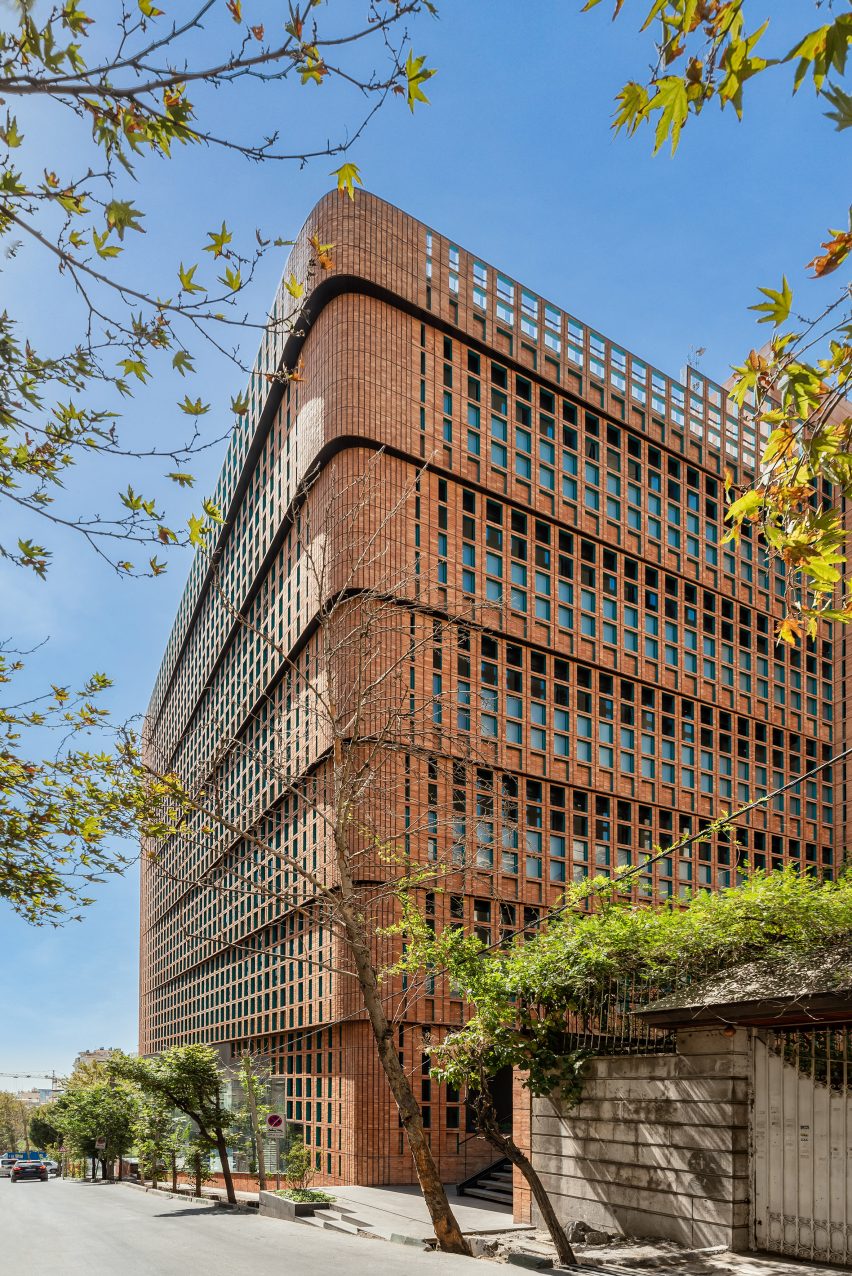
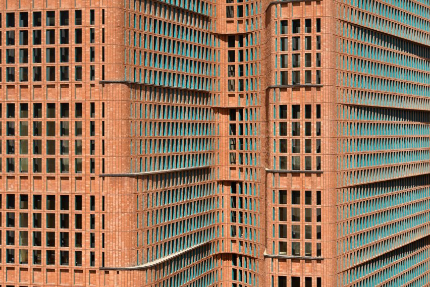
The distinctive "second skin" of the building, created using a brick-clad steel frame, was designed to allow the glazed area of the building to be maximised while preventing overheating.
"The brick layer is designed as an attempt to not only include but also camouflage various elements within and behind," Balazadeh told Dezeen.
"The Hitra Building tries to have the minimum expression of different elements and materials in their surrounding environment and on a larger scale, the city," he continued.
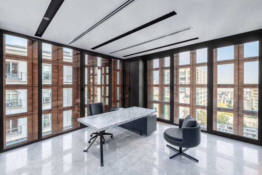
This brick skin gently steps outwards as it rises up the building, helping to break up its scale with a series of lintels indicating the floor plates.
Inside the offices, circulation is housed in the north-eastern corner, with larger meeting spaces placed close to the scoop in the facade to take advantage of the additional light and views it creates.
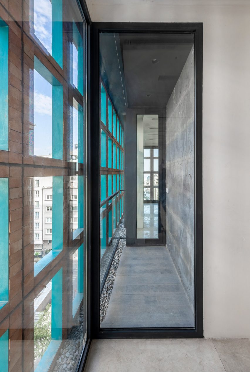
A similar strategy of using a double skin of glass and brick was used in another recent project by Hooba Design Group: an office building for the Sharif University of Technology in Tehran.
Elsewhere in the city, the studio also built an office building that used brick combined with glass inserts.
Photography is by Parham Taghioff unless stated otherwise. The top image is by Deed Studio.