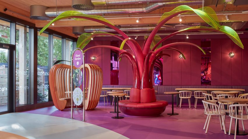
Mizzi Studio draws on Charlie and the Chocolate Factory for Kew Gardens restaurant
Design practice Mizzi Studio has completed the interiors of Family Kitchen, a kids' restaurant in Kew Gardens that combines the aesthetics of the film Charlie and the Chocolate Factory with a "botanical science laboratory."
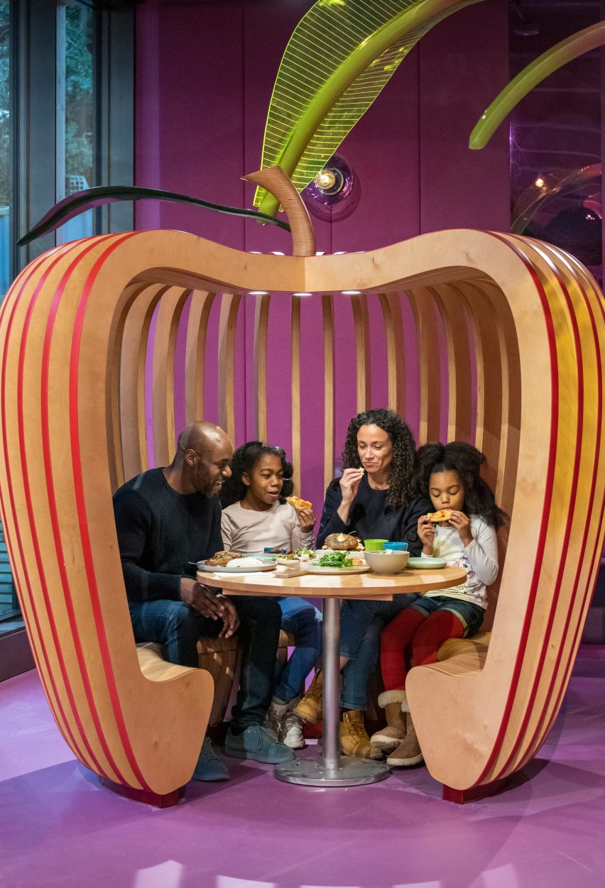
Located in the families area of the Royal Botanic Gardens in Kew, southwest London, the restaurant features whimsical designs such as an apple-shaped seat, giant timber-weaved fungi sculptures and a magenta-coloured Ethiopian Enset tree.
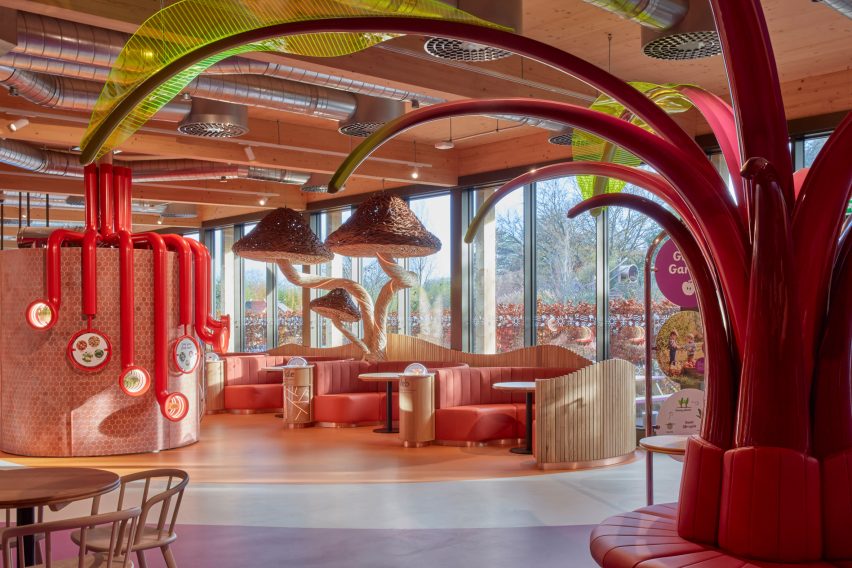
The fantastical restaurant has a colour palette of bright pinks, mushroom brown and leafy greens, deliberately chosen to evoke the plants and foods found in nature. Its interior is "a magical world," said Jonathan Mizzi, director of Mizzi Studio.
"We designed a magical world of gardens forests and woodlands, where human beings appear to have been shrunk to the size of small creatures living with nature, in what can be described as Charlie and the Chocolate Factory meets botanical science laboratory," he said.
Architecture firm HOK was responsible for the building that holds the Family Kitchen and paid special attention to incorporating it seamlessly into its surroundings in Kew Gardens, a UNESCO World Heritage Site.
To do so, the firm used exposed timber both inside and out. According to Stuart Ward, architect at HOK, this sustainable material creates a connection to the natural world outside the eatery.
"As an extension of the Gardens, the restaurant houses interactive and educational installations which promote the research and work of the Royal Botanic Gardens," Ward told Dezeen.
"The timber frame provides a tactile connection with a natural material abundant in the surrounding gardens, allowing children to identify the connection in a simple and obvious way," he explained.
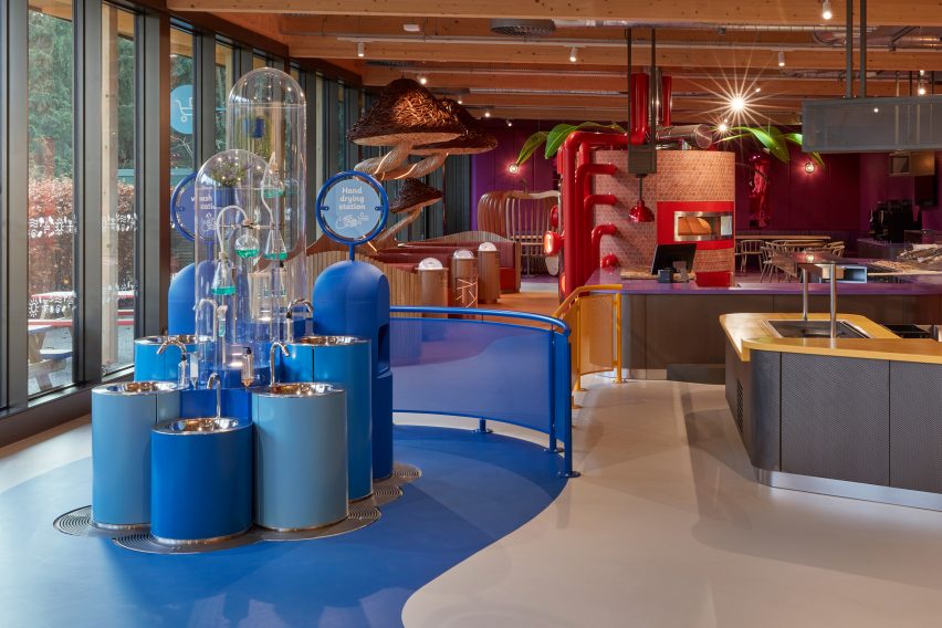
The architects also drew on the designs of nearby glasshouses, opting for a transparent front-of-house space with a fully glazed east-facing facade.
This provides customers with panoramic views onto the adjacent Childrens' Garden outside the restaurant.
"The practicality and beauty of the glasshouses have been borrowed by the design team to encourage natural light into the restaurant while maximising the visual connection to the gardens," Ward said.
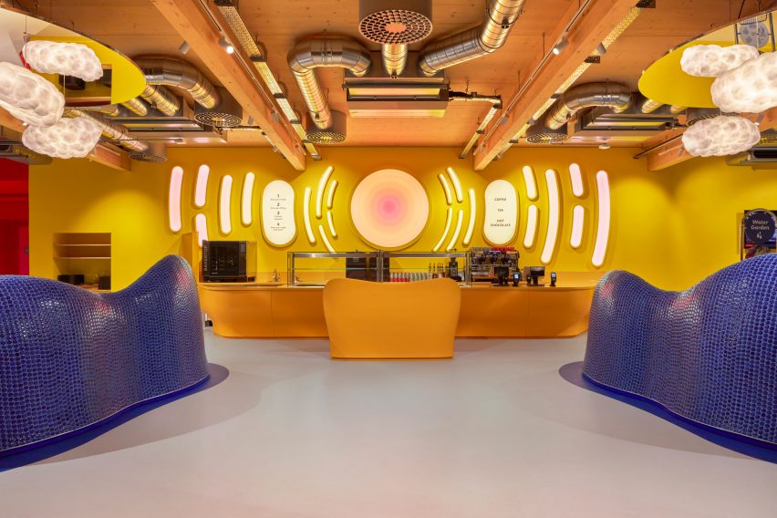
Inside, the connection to the Children's Garden is continued. Here, the interior design encourages children to engage in the natural world and learn more about where food comes from, just as they would outdoors.
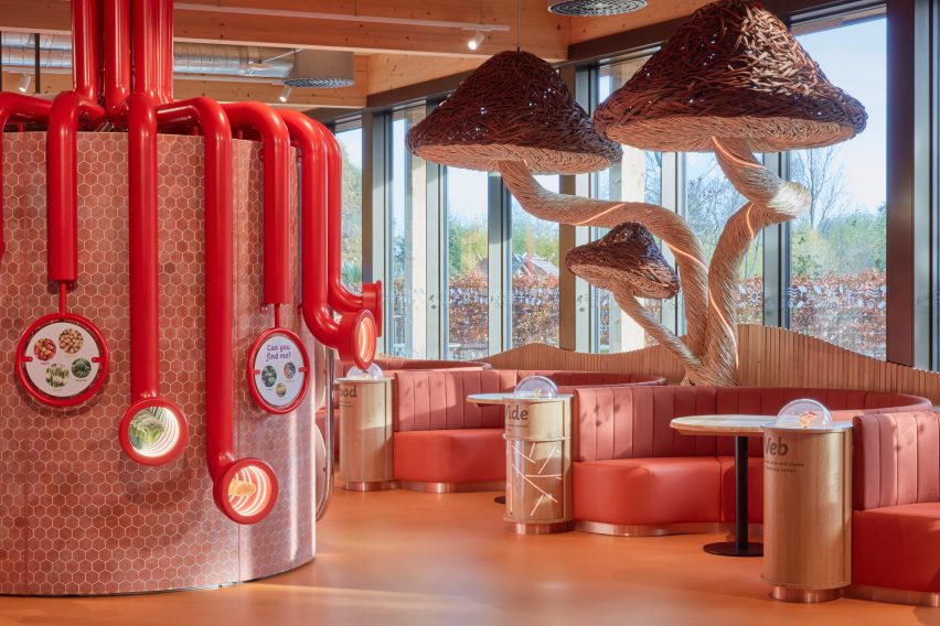
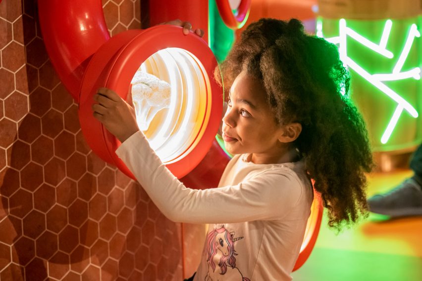
For example, the open-plan kitchen and pizza-topping station children where children can select their own ingredients aims to educate young diners on the process of food-making. They can even peek through red periscopes around the oven and look at a range of harvested vegetables inside.
Mizzi divided the restaurant into four colour-coded zones that each correspond to a season, a natural element or a field of scientific research undertaken by Kew Gardens.
In each zone, colour-coded signage and exhibits give families insight into plants, produce, farming techniques and meal preparation.
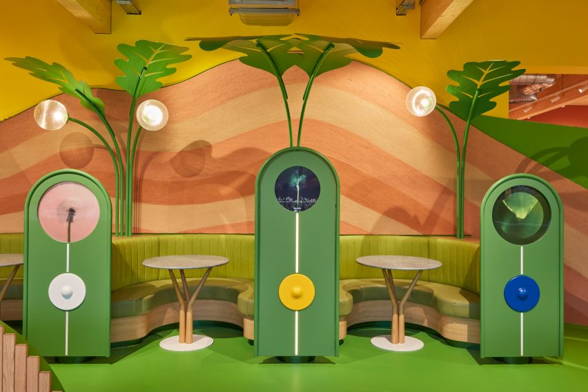
"The Kew Family Kitchen is a place where the entire family can learn about our ecosystem – how the sun works, how plants work, and how food is grown," Mizzi said.
"Distinguished by bright colours and magical installations, each zone seeks to educate children and to inspire them to investigate the natural world, organic produce and healthy food preparation," he continued.
The spring section is typified by a green grassy zone with a multi-coloured wall finish that looks similar to rammed earth. The seating areas are enveloped by giant sprouting plants and interactive displays that show the growth cycle of plants.
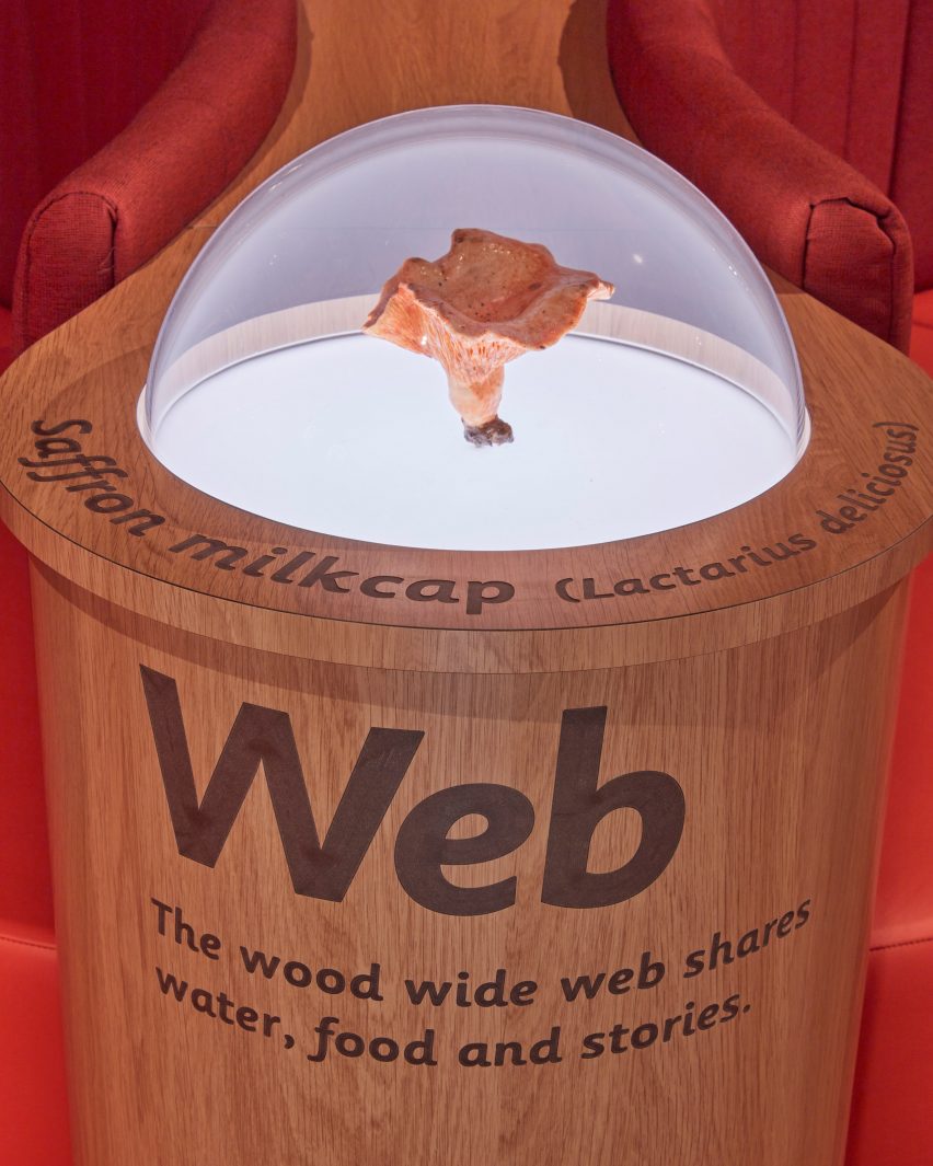
In the autumnal section, Mizzi collaborated with artist Tom Hare who created large-scale fungi sculptures in handwoven willow.
Another section is designed to look like a garden, with an oversized tree, bright foliage and colourful seating inspired by vibrant summer berry tones completing the look.
A final section has a sanitation station that helps children uncover the importance of hygiene, while also learning about the antibacterial properties of plants like lavender and rosemary.
Other projects by Mizzi Studio include a brass coffee kiosk next to Buckingham Palace and a stingray cafe alongside the Serpentine in Hyde Park.
Photography is by James McDonald unless otherwise stated.
Project credits:
Interior design: Mizzi Studio
Shop interiors: Lumsden Design
Architect: HOK
Delivery architect: Mulroy Architects
Project manager: Patrick Wynniatt-Husey (on behalf of Royal Botanic Gardens, Kew)
Main contractor: CityAxis
Interior fit out contractor: Firecracker Works Ltd