Sulkin Askenazi arranges yellow school interiors around wooden tree
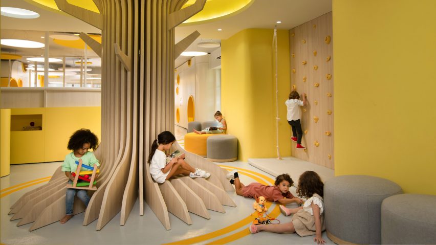
Splashes of bright yellow, round openings and a giant timber tree are among the playful touches Mexican design studio Sulkin Askenazi has included in Ikigai Sisu, a school in the Dominican Republic.
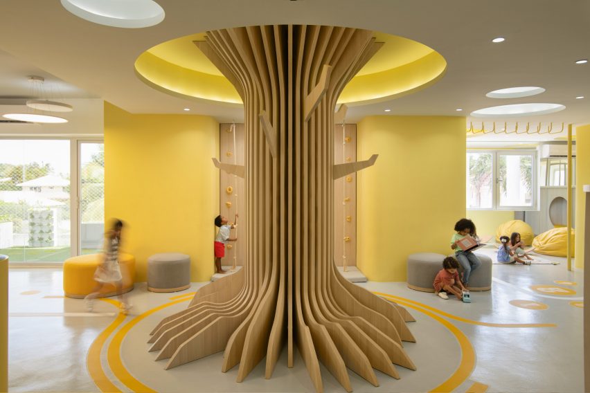
Sulkin Askenazi arranged the elementary school around a central wooden tree in the lobby, which provides a playful feature for the children to sit on when learning indoors.
Called Ikigai Sisu, the 500-square-metre school opened in September 2021 and is located in the town of Punta Cana on the eastern coast of Dominican Republic.
Sulkin Askenazi was informed by Finnish schools, where shared recreational areas are given par with traditional learning spaces such as classrooms. The school is designed to encourage learning through play and exploration.
"The origin of the project is aligned with the Finnish educational model, where recreational spaces play an important role in the development of children by providing a stimulating and inclusive place that fosters ties, curiosity and interaction," said Jack Sulkin, co-founder of Sulkin Askenazi.
"We wanted to design a school where the entire space felt connected and flexible and not too divided or fractioned into isolated spaces," he told Dezeen.
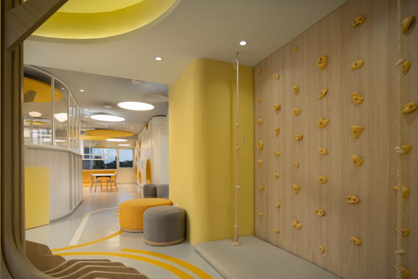
At the heart of Ikigai Sisu is a trunk made from locally sourced white oak slats that children can sit on. Also in the lobby is a reception desk, a climbing wall and soft stools clad in yellow and grey fabric.
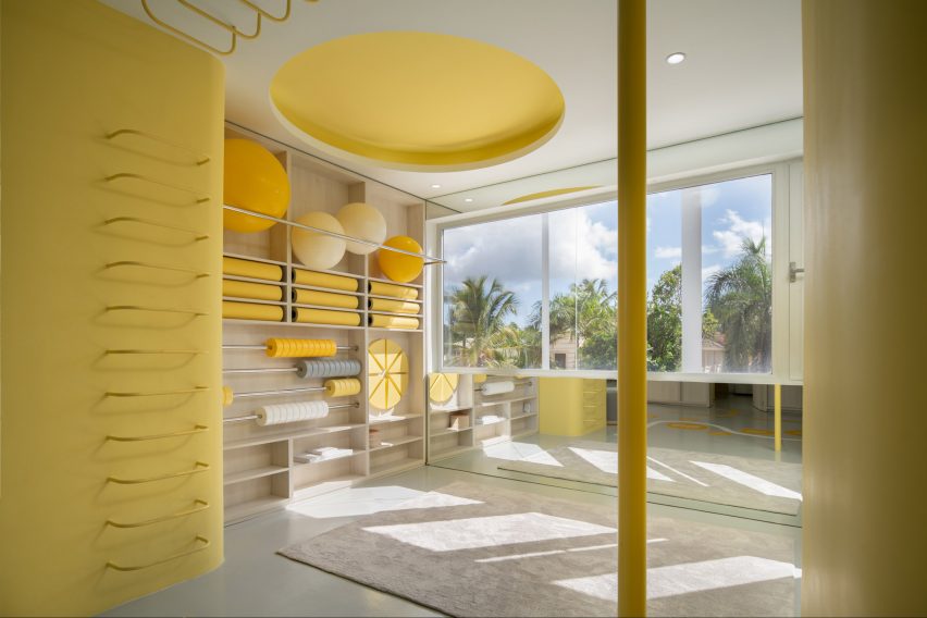
Classrooms with wooden tables and chairs line the front of the building while at the back there is a soft play area for physical exercise lessons. A kitchen can also be found in one of the main classrooms.
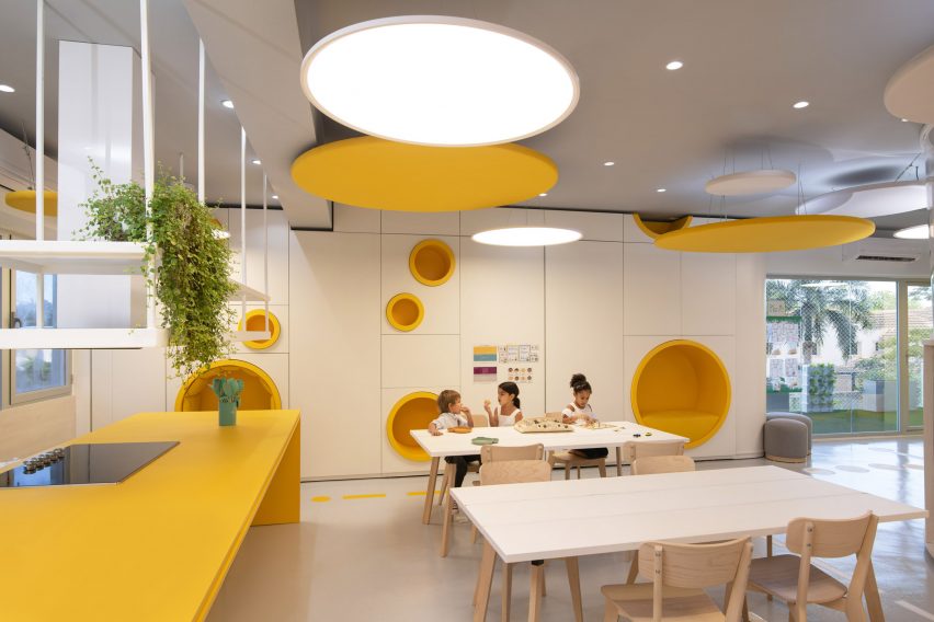
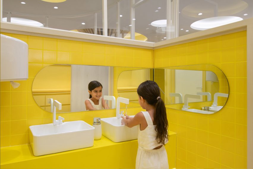
Sulkin wanted the colour yellow, which is the school's colour, to act as a sensory stimulus. Yellow tiles are found in the bathrooms while sunny hued paint continues the colour theme in the classrooms.
The yellow is countered with grey accents which appear on soft furnishings such as rugs, pouffes and activity mats.
"We wanted the project to have a more vibrant monochrome look and feel; an aesthetic that alludes to the school's philosophy," Sulkin explained.
"The vibrancy of yellow, applied to our ever-flowing spaces through the school design, unquestionably triggers imagination and the ever changing minds of young children who roam the space."
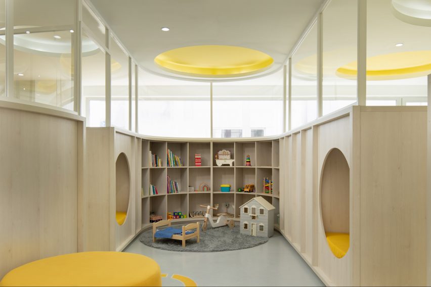
According to Sulkin, the other "main character" in the school is the use of wood.
"The project has two main characters, the first one is the colour yellow, and the second is the low thick wooden ribbon that organically flows throughout the project," Sulkin explained.
"We tried to instil a free-flowing, interactive, energy invigorating space with Ikigai," he added.
Dotted throughout the low slung school are little wooden cubby holes set at different heights and cushioned nooks that allow children to hide and peek through.
This same wood forms an array of shelving units to display learning material and cabinets for storage.
Bright colours are a popular feature in contemporary educational architecture around the world.
Dezeen rounded up 10 colourful kindergartens that encourage kids to crawl, jump and learn including a pastel coloured learning centre in Melbourne by Danielle Brustaman and a hot pink kindergarten in China by Crossboundaries
Photography is by Thiago da Cunha.