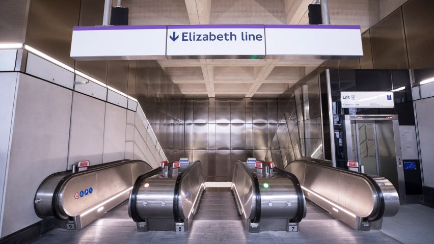
Dezeen's guide to the architecture of the Elizabeth Line
With the highly anticipated Elizabeth Line railway project opening in London on 24 May, Dezeen rounds up the 10 new central section stations, including designs by WilkinsonEyre and Hawkins\Brown.
Stations on the central section of the Elizabeth Line, which runs mainly underground through the British capital, will open next week.
The £18.8 billion infrastructure project, also known as Crossrail, has been decades in the making and subject to heavy delays and budget rises.
It will represent the biggest expansion to London's underground railway network for more than a century, with trains running 118 kilometres across the south of England from Reading to Shenfield.
Nine different architecture studios were appointed to design the various London stations, with a consortium led by Grimshaw Architects ensuring line-wide consistency.
In an interview with Dezeen, Julian Robinson, head of architecture for the Elizabeth Line, explained: "A lot of the inspiration really is looking back towards the heritage of design with regards to London transport."
"But because of the scale of what this is, it's relatively new in its approach, certainly for the UK," he added. "This is new generation, really."
Read on to find out more about the architecture of the ten central stations:
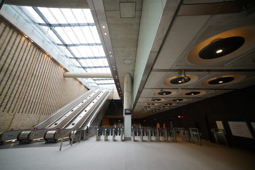
Paddington by Weston Williamson + Partners
Designed by Weston Williamson + Partners, the westernmost station on the Elizabeth Line's central section is Paddington. It was added on to the famous mainline terminus built in the 19th century by pioneering Victorian engineer Isambard Kingdom Brunel.
Despite descending 20 metres below ground, the new station still has natural light at platform level thanks to a 120-metre glass and steel canopy printed with an artwork by American artist Spencer Finch. Named Cloud Index, it presents a picture of the sky that appears to change throughout the day.
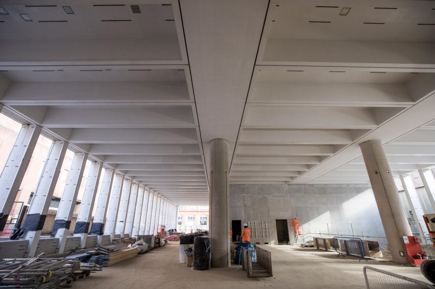
Bond Street by John McAslan + Partners
Bond Street station, in London's wealthy Mayfair neighbourhood, will not open this month, having been hit by a series of construction problems that have seen its budget increase from £111 million to £660 million.
John McAslan + Partners has designed two new street-level ticket halls for the station topped with large new mixed-use buildings. Both ticket halls will have grand colonnades at their entrances aligned with beams on the high, coffered ceilings inside.
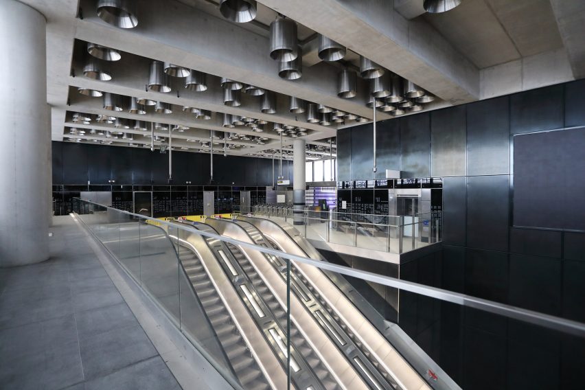
Tottenham Court Road by Hawkins\Brown
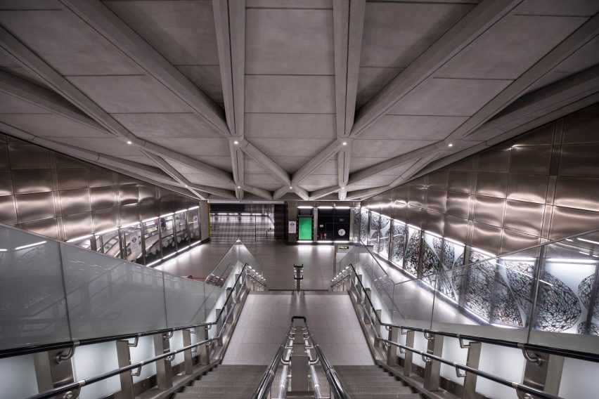
Architecture firm Hawkins\Brown wanted the station at Tottenham Court Road, a major gateway to London's West End, to cater for everyone from the regular commuters to the theatre-goers, the Oxford Street shoppers and those seeking the Soho nightlife.
At the Soho ticket hall, dark and theatrical details were used, such as black metal cladding and dramatic stainless steel downlighting. The opposite entrance at the foot of the 1960s Centre Point tower is bright and well lit with extensive white and red glass.
Farringdon by Aedas
The two new access points to the Elizabeth Line at Farringdon were designed by international architecture firm Aedas. At the western end, a concourse has been devised to encourage people to move through at pace, with an artwork depicting tumbling diamonds referencing the nearby Hatton Garden diamond quarter.
A new ticket hall at the other end is intended to feel like an extension of the street through large corner entrances and flooring made from distinctive City of London paving stones, and also nods to the iconic brutalist Barbican Estate a few hundred metres away.
Liverpool Street by WilkinsonEyre
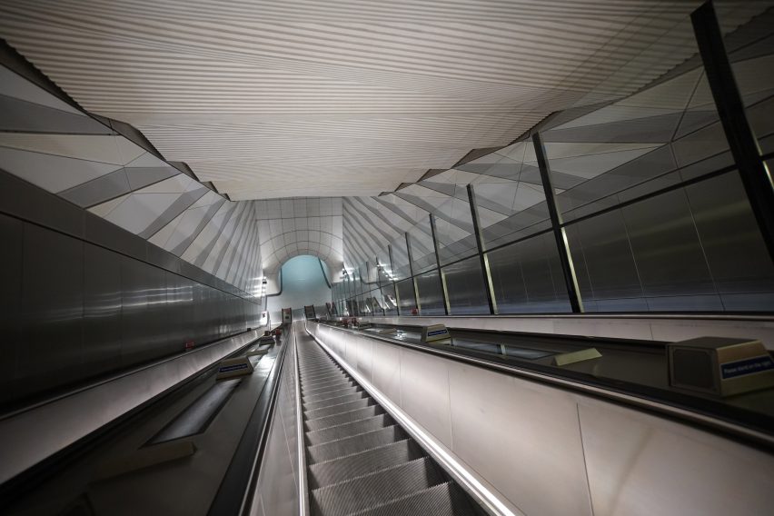
A folded concrete ceiling is the main architectural flourish by architecture firm WilkinsonEyre at Liverpool Street's Elizabeth Line station, squeezed into a tight space below the heart of London's financial district between sewers and existing rail tunnels.
The ceiling was designed to maximise the perception of height and create a feeling of scale and movement in the constrained spaces, with mica crystals mixed into the pre-cast white concrete to glow in the indirect lighting.
Whitechapel by BDP
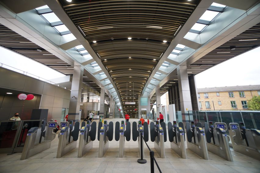
International studio BDP overhauled the existing Whitechapel station to accommodate the Elizabeth Line, adding a swooping raised concourse with a timber ceiling and a green roof that bridges across the tracks, designed to improve connectivity in the local area.
The concourse is mostly hidden from view on the street behind the original modest Victorian station frontage, which has been refurbished with a widened stone-paved forecourt.
Canary Wharf by Adamson Associates Architects and Foster + Partners
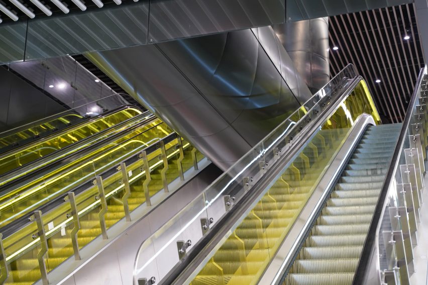
Yellow glass adds a rare splash of colour to the escalators down to the Elizabeth Line platform at Canary Wharf, a major business district in southeast London, designed by locally based firm Adamson Associates Architects.
The station sits below a five-storey mixed-use development called Crossrail Place, designed by British studio Foster + Partners, topped with a 310-metre timber lattice roof sheltering a large rooftop garden, all surrounded by the waters of West India Quay.
Custom House by Allies and Morrison
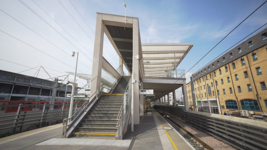
With its long row of columns and beams, the Elizabeth Line station at Custom House was informed by the architecture of Greek temples, according to London firm Allies and Morrison.
Thousands of pre-cast concrete segments were used to build the free-standing structure, which has an elevated concourse sheltered by a translucent canopy roof that provides a touch of delicacy.
Woolwich by Weston Williamson + Partners
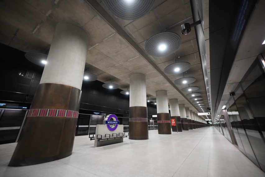
British firm Weston Williamson + Partners, which also designed the Elizabeth Line station at Paddington, has referenced Woolwich's strong military heritage by cladding a row of hefty columns on bronze plating with strips of regimental colours.
Elsewhere in the station, which is part of a major new masterplan for the site including 3,750 new homes, London brick features extensively alongside perforated steel cladding.
Abbey Wood by Fereday Pollard
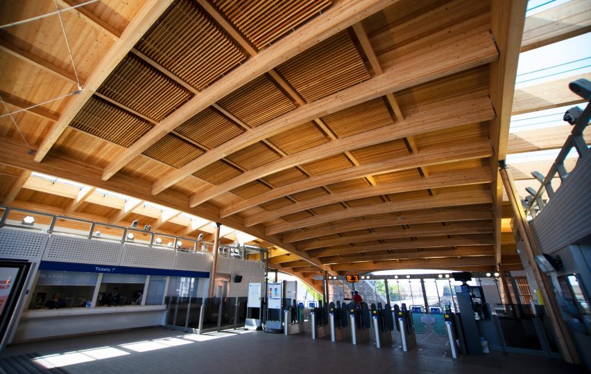
At the end of the Elizabeth Line in southeast London is Abbey Wood, designed by architecture firm Fereday Pollard. Journey times from here to central London will halve when Crossrail starts running on 24 May.
The station building, elevated above the railway in order to open onto a major flyover road, has been constructed using robust natural materials, with a granite-paved concourse and a sturdy timber roof. From above, the building is shaped like a manta ray, fanning out at either side into canopies sheltering staircases down to the platforms.
The images are courtesy of Crossrail/Transport for London.