Eleven supertall skyscrapers that demonstrate the "human aspiration to go higher"
Supertall skyscrapers have changed the way that we think about cities, says author of the book Supertall, Stefan Al. He highlights 11 tall buildings that have had a major impact over the past decade.
The tension surrounding tall buildings goes back as far as the Eiffel Tower and even back to the ancient Egyptians, explained Al author of Supertall.
"There's that contrast between this human aspiration to go higher and at the same time there's a rejection of novelty," he told Dezeen, referencing the history of tall buildings.
"When the Empire State Building was built in New York, also it kind of stood out like a sore thumb, and it wasn't all praise."
Supertalls "probably a good thing for the skyline"
Al believes that the intersection of changing zoning laws and ever-expanding populations make supertalls more likely and that they can potentially deal with growing populations.
The diversity of designs currently being created can also positively contribute to cities, he said.
"Because we can keep our cities more compact, we can reduce the amount of land that we consume, we can spend more resources on relatively smaller units of land," he said.
"It's not all just sleek glass towers anymore, right?" he continued. "We're seeing a lot more diversity and I think that's probably a good thing for the skyline."
"There's more diversity now than there was before"
In New York, Al is confident that regulations like Local Law 97, which penalizes buildings with high carbon emissions, and the re-cladding of older skyscrapers is contributing to changing building culture in the city.
Commenting on the recent superskinny skyscrapers in Manhattan, Al said that the right of use allows much of New York's skyline to be constructed without community input, making it different from many of the cities on the list.
"Should New York change that system?" he asked "That's a good question because it also has some benefits that it gives transparency to property owners and what they can build."
"But if you just look at the aesthetics of the towers, you can really see that there's more diversity now than there was before," Al continued.
However, Al did acknowledge that the supertall skyscrapers should be critiqued and that public debate is probably the best mechanism for managing the tension surrounding them.
"For some of those critics that recognize that [New York City] has a lot of issues and these towers represent inequities that exist," he said.
"If you look at London, for instance, because there's so much public debate around these buildings, and because the public actually has a say, this can really make or break the development or planning of a certain project."
"So it's interesting, as architects, to understand the culture of a place and the publicness of a particular building, and we need to make sure that people will also embrace the symbol that will represent," he continued.
Read on for Al's picks of 11 supertalls that have changed the way we think about skyscrapers.
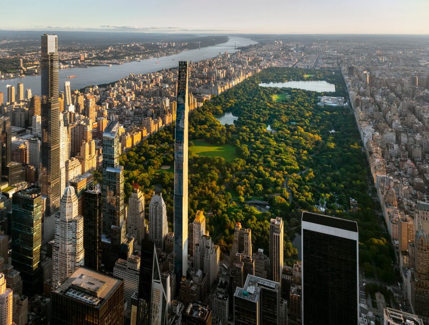
111 West 57th Street, New York, USA by SHoP Architects (2022)
"111 West 57th Street is interesting because it pushes the limits of skyscraper engineering, being the world's most slender skyscraper. Most structural engineers consider a building slender if it's at least seven times as tall as it is wide, with a so-called slenderness ratio of 1:7. 111 West 57th Street has an extreme slenderness ratio of 1:24.
"Emerging from a narrow 60-feet- wide, the 1,428-foot-tall (435-metre-tall) residential tower slowly steps back until it disappears into the sky, a throwback to New York's famous "wedding cake" skyscrapers from the Roaring Twenties, like the Empire State Building.
"Finally, the tower's glazed terra-cotta tiles is a nod to the city's historic buildings, while also pointing to the future of the skyscrapers in New York, which is trying to move away from all-glass towers."
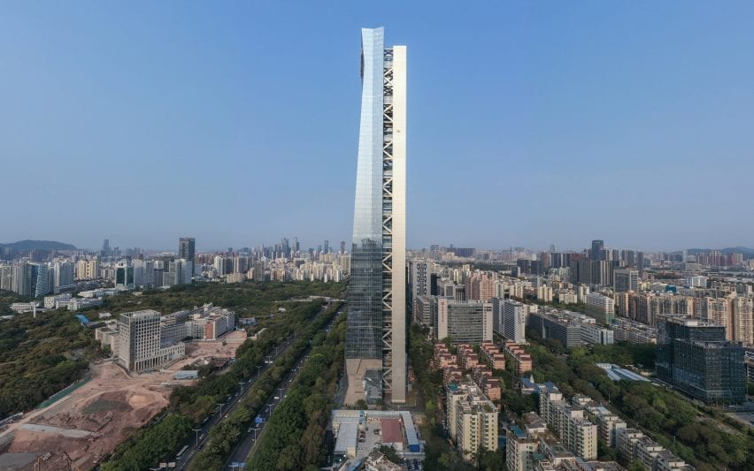
Hanking Center, Shenzhen, China by Morphosis Architects (2021)
"Thom Mayne and his firm innovated in this supertall by detaching the core, which houses the elevators and mechanical services, from the main office building.
"Pedestrian sky bridges connect the core with the office areas, giving people panoramic views of the city as they walk to their workplace. This provides for a more interesting experience than a typical central-core office, where people access upper stories through the core and corridors in the tower's dark interior.
"Meanwhile, the detached core allows for 270-degree views from the office floors. Finally, the gap in between the core and the main tower reveals the building's imposing megaframe structure, further dramatizing the split in the building."
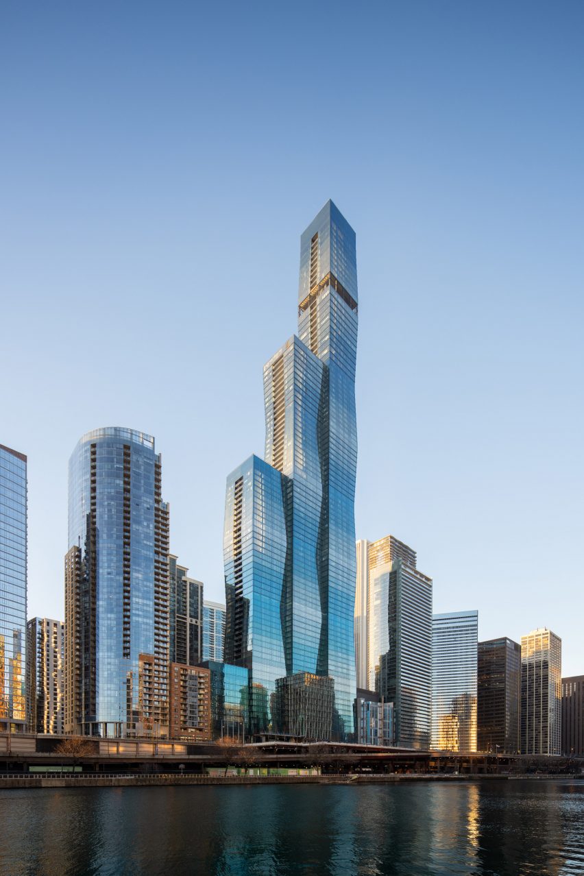
St. Regis Chicago, USA by Studio Gang (2020)
"St. Regis Chicago, the world's tallest building designed by a woman, brings intriguing surface qualities and an iconic shape to a residential skyscraper.
"The project consists of three interlocking towers each made of stacked truncated pyramids, making for undulating surfaces. Six different glass coatings enliven the aquamarine-colored facade.
"The different coats ensure that each level receives similar levels of sunlight, while also adding variety to the exterior. The varying height of the towers breaks up the mass of the overall project, while making it stand out in the Chicago skyline. The central volume is lifted from the ground, creating a pedestrian connection through the project to the Chicago Riverwalk."
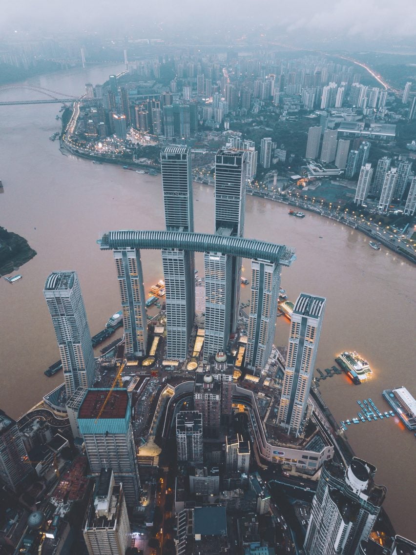
Raffles City, Chongqing, China by Moshe Safdie (2020)
"Mashe Safdie has pioneered the use of long, programmed skybridges in supertall towers. In Raffles City, he placed a 984-foot-long (300-metre-long) 'horizontal skyscraper' on top of four towers. Smaller skybridges connect the horizontal volume to the two taller towers.
"Inside, the skybridge houses an open-air park, infinity pool, bars, restaurants, and a hotel lobby. The project includes eight towers containing offices, apartments and a hotel, as well as a five-story shopping podium at the base. Overall, the multi-level and interconnected complex somehow nods to the vertical urbanism of Chongqing, a city known for its mountainous topography and rapidly rising skyline."
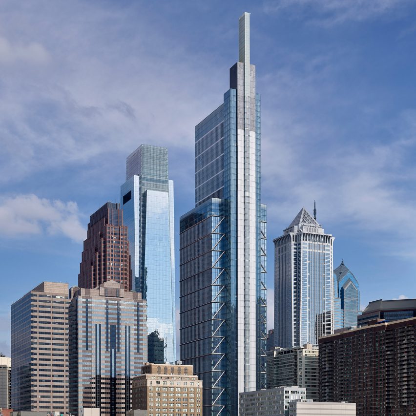
Comcast Technology Center, Philadelphia, USA by Foster + Partners (2019)
"Most office towers have centrally-located service cores, where the elevators are housed in dark interior spaces. In his design for the Comcast Technology Center, Norman Foster departed from this convention. He split the core and placed it on the building's west side. This helped allow for a spacious visual axis throughout all the office floors and the core.
"This central axis also extends vertically, up 125 feet (36 metres) from the roof, where it becomes an illuminated glass blade and adds to the Philadelphia skyline.
"At the same time, the side core allowed for three panoramic elevators, as well as for thirteen three-story sky gardens. Comcast Technology Center is the tallest tower in the US outside of New York and Chicago."
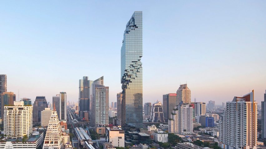
MahaNakhon, Bangkok, Thailand by OMA (2016)
"Several leading architects are challenging the monolithic, shaft-like appearance of skyscrapers, proposing towers that 'disintegrate'. German architect Ole Scheeren, in his design for the MahaNakhon in Bangkok, broke up a solid tower with a spiral-shaped 'erosion' of pixelated balconies and terraces.
"While this approach brings structural difficulties such as discontinuous columns and transfer beams, aesthetically it offers a sense of individuality and fragmentation that echoes the complexity of Bangkok city life. The dramatic gesture has made the project an instant landmark for the city."
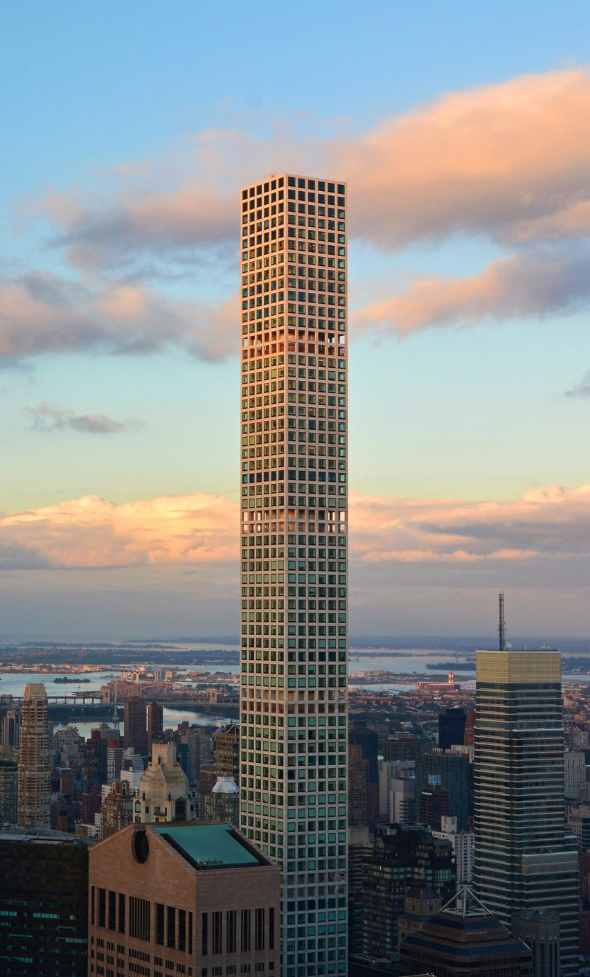
432 Park Avenue, New York, USA by Rafael Viñoly (2015)
"432 Park Avenue was one of the first super-skinny residential skyscrapers in Manhattan, with a slenderness ratio of 1:15 and a facade featuring a minimalist grid-like pattern. To reduce the wind load, engineers created five double-height openings with mechanical spaces, spaced every twelve floors so that currents could blow through.
"Nevertheless, even though this makes the building more stable, some supertall tenants complain that their apartment buildings sway so much, that they creak like the galleys of ships. The tower shows technology has not yet caught up to life in buildings as tall and thin as New York's super slenders."
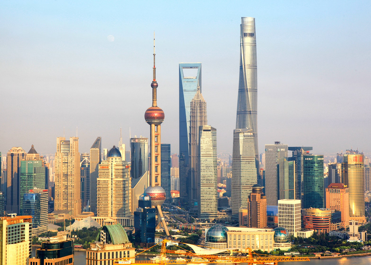
Shanghai Tower, Shanghai, China by Gensler (2015)
"A major challenge for architects and engineers of supertall towers is to overcome the substantial wind forces. One solution is to create tower geometries that 'confuse' the wind, and prevent the wind from getting organized into larger eddies behind. When done well, such a wind-optimized structure can have unique aesthetic appeal."
"The Shanghai Tower, China's tallest building, culminates a trend of twisted towers. Its aerodynamic shape helps disturb the formation of wind vortexes on the leeward side of the building. This reduces the wind force by up to a quarter, making for a substantially lighter structure and saving in materials costs.
"Another innovation is the tower's double skin-facade, which features soaring atriums in between the inner and outer layer, and acts as a climatic buffer zone. The tower's geometry and its double-skin facade help reduce its heavy environmental footprint."
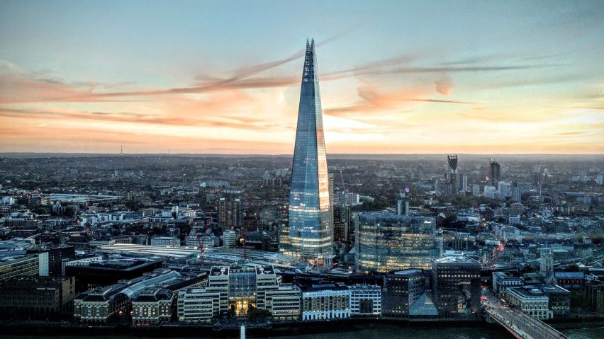
The Shard, London, UK by Renzo Piano (2012)
"During the last two decades, skyscrapers have been making their way into European cities traditionally known as low-rise cities. This brings difficult challenges to architects. Renzo Piano, in his design for the Shard in London, had to manage the difficult contradiction of making the massive structure seem less imposing. He angled the glass of the pyramid so it would reflect the sky instead of neighboring buildings.
"At the base of the building, he opened up the glass facade to mark the entrance, making his project blend better into the streets below. At the same time, the Shard is a striking example of a mixed-use skyscraper.
"Where twentieth-century supertalls used to be predominantly office towers, the majority of twenty-first- century supertall towers mix uses, such as offices, apartments, and hotels, all under one roof. Mixing these uses made sense with the Shard's tapering shape. The wider bottom floors are a good fit for the larger office spaces, with the narrow top floors more appropriate for residences."
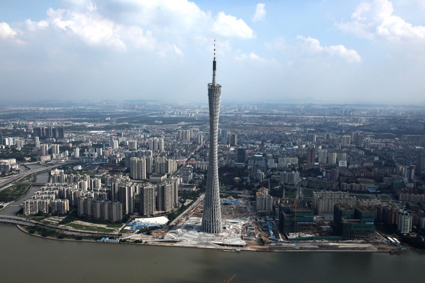
Canton Tower, Guangzhou, China by Information Based Architecture (2010)
"Television towers are often designed as large antennas with a protruding observation pod. The Canton Tower departs from this convention with a two-thousand feet tall hyperboloid structure.
"Briefly the world's tallest tower, the free-form shape is created by interconnecting two opposing ellipses on the top and bottom end of the building with long sloping columns. This creates a hollow tube with a curvilinear surface, making for a more sophisticated geometry than a typical TV tower.
"Meanwhile, by twisting the top ellipse from the bottom, the building was given a narrow waist, making for a more interesting profile that looks different from every angle, with a skinny side and a wide side. It made for a more recognizable icon— a shape that some people perceived to be distinctly feminine— and a welcome departure from the more phallic symbol type of tall structures."
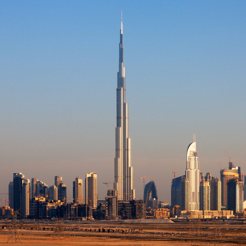
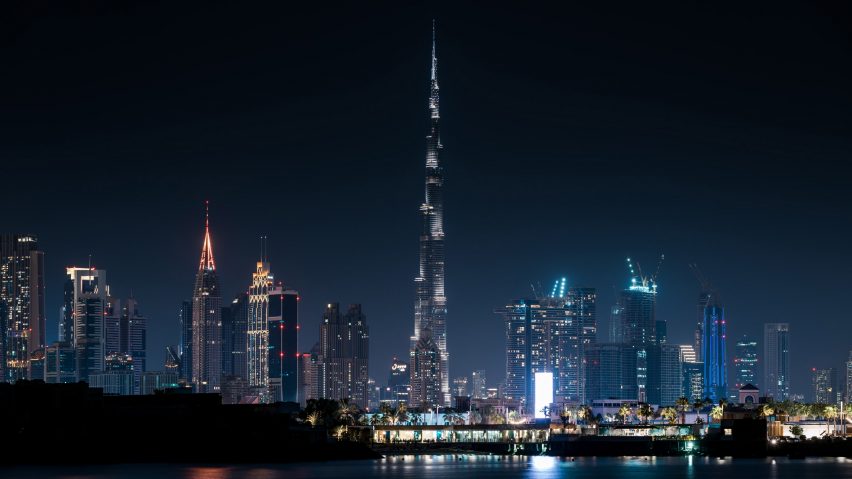
Burj Khalifa, Dubai, UAE, by SOM (2010)
"To get buildings to achieve taller heights, engineers had to invent new types of structures. The Burj Khalifa was the first skyscraper to implement a "buttressed core" design, with three triangular buttresses supporting a hexagonal core like an upright missile. This tripartite plan is more stable and led to significant gains in height.
"Upon completion in 2010, the Burj reached 2,722 feet (830 metres), exceeding the world's previous tallest building, the Taipei 101, by a whopping 63 per cent.
"Although the tri-winged structure is an elegant solution to achieving larger heights for residential uses, which can have shallower floor depths, it would not quite work for an office building, which require larger floor space and spacious ground-floor lobbies."
Dezeen is on WeChat!
Click here to read the Chinese version of this article on Dezeen's official WeChat account, where we publish daily architecture and design news and projects in Simplified Chinese.