Frederick Tang Architecture transforms New York loft into light-filled wellness studio
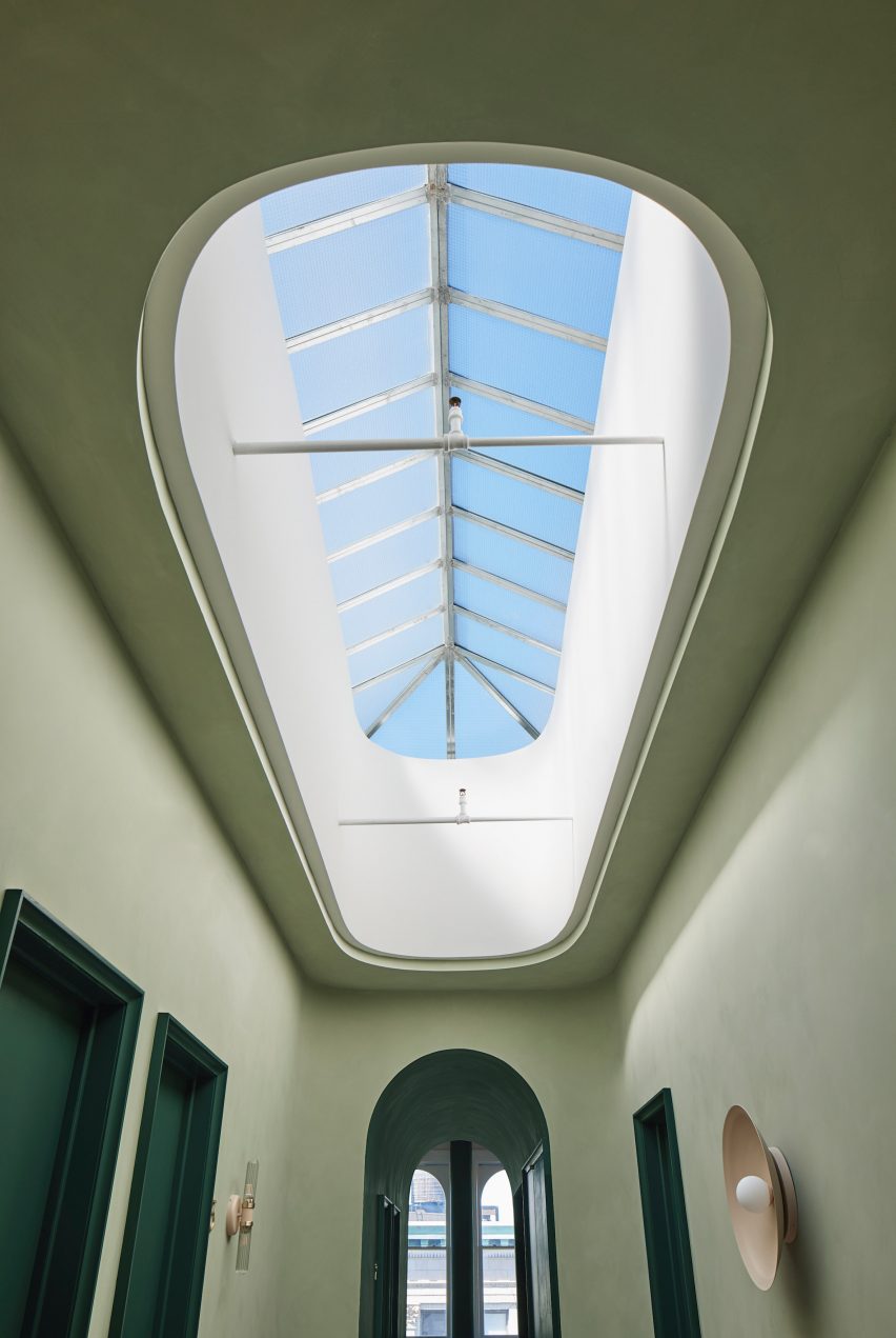
Architecture and interior design studio Frederick Tang Architecture (FTA) has updated Moxi, a wellness studio and acupuncture centre in Soho, New York by re-arranging its interiors around an expansive oval skylight.
Frederick Tang Architecture, based in Brooklyn, was tasked with reordering and redesigning the open-plan, top-floor studio into a space that accommodates a reception area, six treatment rooms, offices, bathrooms, herb dispensary and pantry.
The studio took the 1901 mercantile building's skylight as the starting point for the refurbishment of the rectangular-shaped space.
Its dense urban context required an innovative solution to increase the floor area while introducing natural light throughout.
"Architecturally we wanted to organise the many different components in a plan that felt logical and complete which was difficult with space constraints," said Frederick Tang, director of design and principal architect at Frederick Tang Architecture (FTA).
"We started by organizing the plan around the sources of natural light," he told Dezeen.
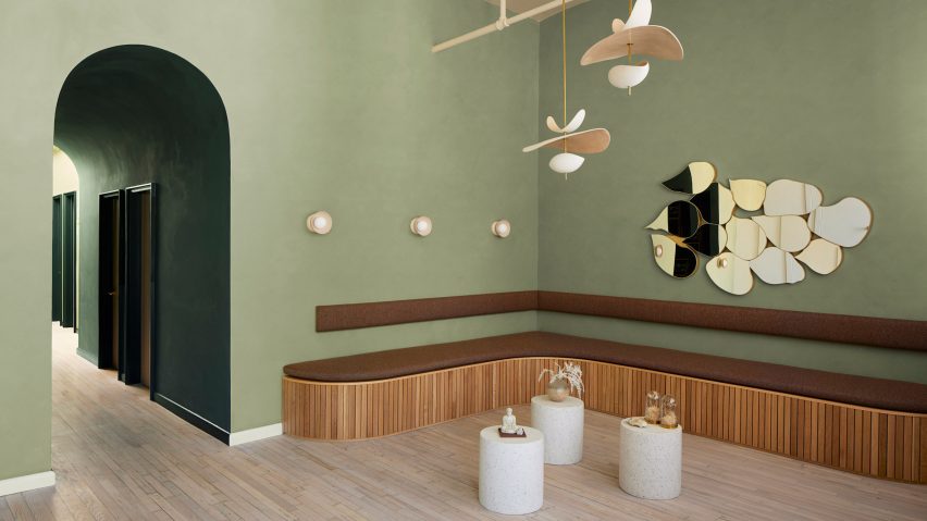
Visitors enter the wellness studio and arrive at a reception area framed by four arched windows overlooking Broadway.
Here, a custom bench crafted from white oak slats and copper detailing curves along two walls while sculptural pendant lights hang from the ceiling.
To maximise space and take full advantage of the natural light, this area doubles as a site for gatherings and classes.
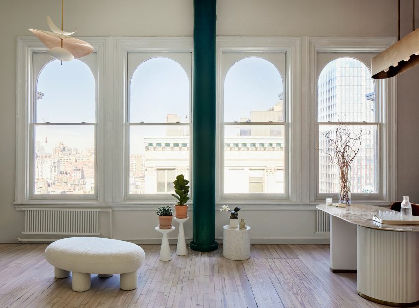
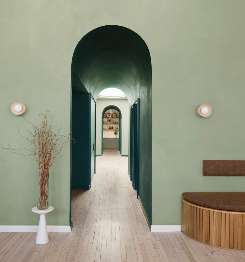
FTA reconfigured Moxi's rooms as well as softened corners and created arches that echo some of the existing architecture of the space for the client who wanted the interior to feel "holistic, natural, calm and inspiring".
A single corridor leads to all six treatment rooms, which were also coloured in shades of green.
The walls were lime-washed in a soft cypress green, with wainscotting wooden panels painted in a darker shade of the same hue.
FTA wanted the colour to contrast traditional wellness studios which are often white and feel more clinical.
"The predominant colour was green –lime washed in a cypress and deep forest – chosen for its property to heal, critical at the front where the patron first experiences the space," said Barbara Reyes, director of design for interiors at FTA.
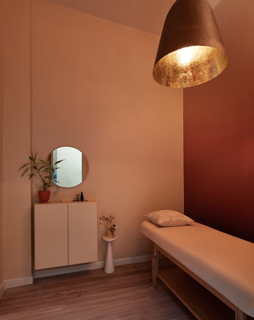
The treatment rooms, which are the most intimate sections in the studio, contain two bedrooms and a bathroom arranged around the lightwell.
The green was offset by hints of pale peach throughout the interior and natural finishes including terrazzo, concrete, boucle and ribbed glass add depth and texture.
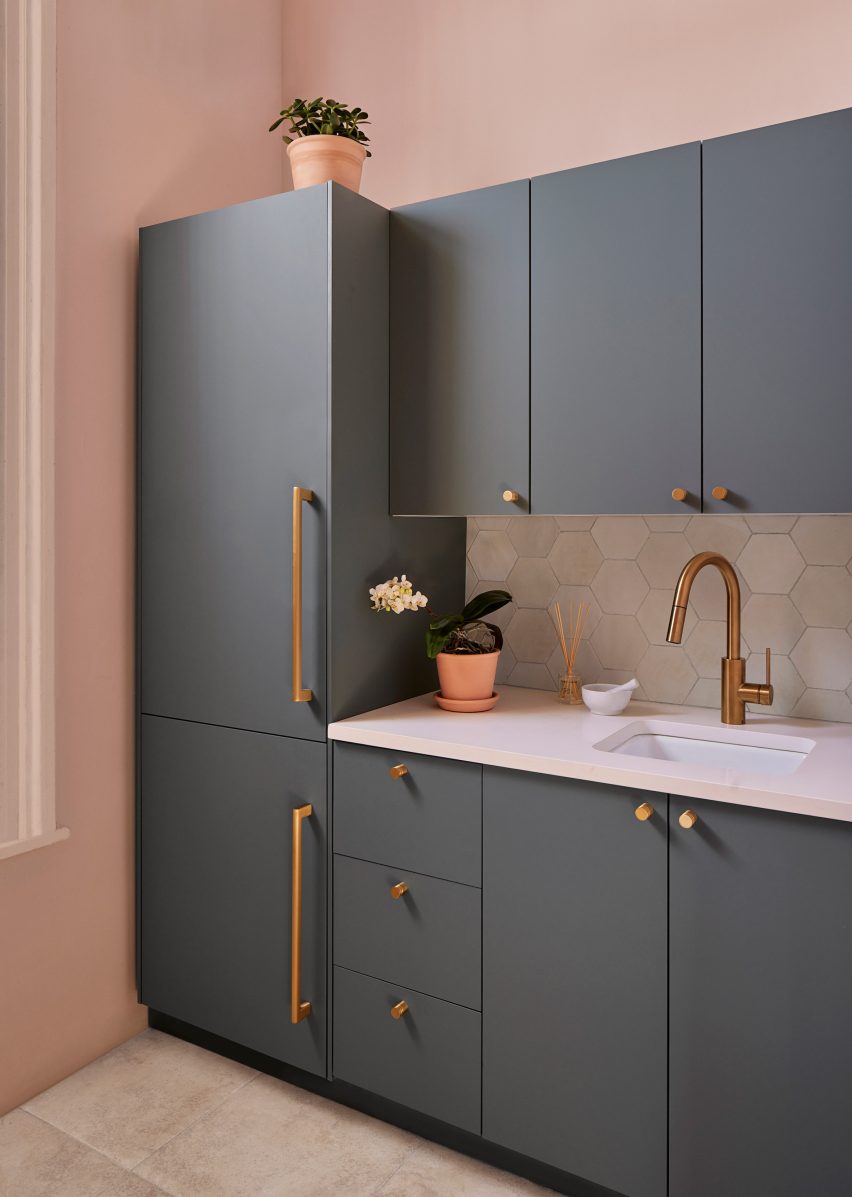
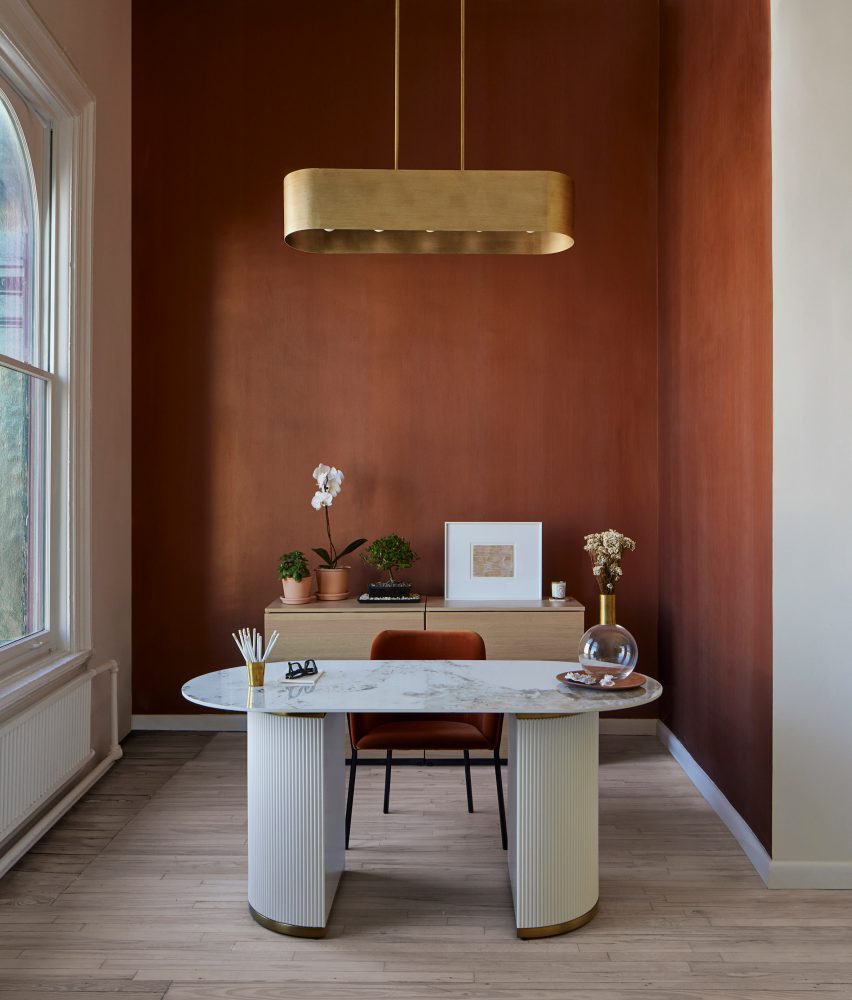
At the end of the corridor, a second archway opens into a back-of-house area, where FTA has inserted a new office, herb dispensary, staff pantry, and bath.
Other design-focused wellness spaces include the Shelter wellness centre in Sydney, which is located in a former restaurant and Yoko Kitahara spa in Israel, which was transformed from an Ottoman-era home.
The photography is by Gieves Anderson.