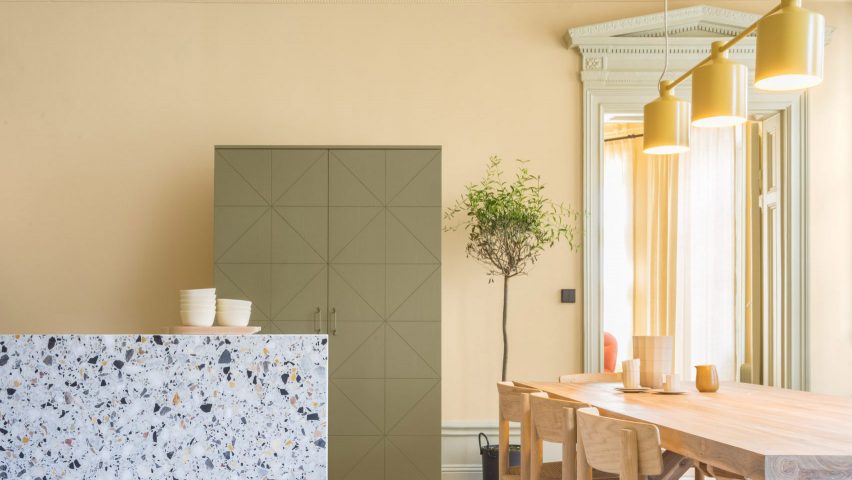
Ten sunny interiors that make use of the Colour of the Year 2023
For our latest lookbook, we've curated 10 interiors decked out in Wild Wonder after paint brand Dulux named the pale yellow hue as its Colour of the Year for 2023.
Dulux describes Wild Wonder as a "soft gold with hints of green" that speaks to people's desire for a closer connection to nature and better mental health in light of the recent period of upheaval.
"As people search for support, connection, inspiration and balance in the world today, they're diving into the wonders of the natural world to find it," the brand explained.
"Wild Wonder is a positive, natural tone that, by connecting us with the natural world, can help us feel better in our homes."
The optimistic hue, reminiscent of "fresh seed pods and harvest grain", is particularly suited to brightening up living spaces – as seen below in an all-yellow Barcelona duplex and a renovated 19th-century apartment in Stockholm by Note Design Studio.
But the colour can also be used to give a homely feel to commercial interiors, from a floating spa to a church-turned-coworking space, where it is often contrasted against shades of dusty pink or deep red.
This is the latest in our series of lookbooks providing curated visual inspiration from Dezeen's image archive. For more inspiration see previous lookbooks showcasing residential atriums, floating staircases and kitchens with polished granite surfaces.
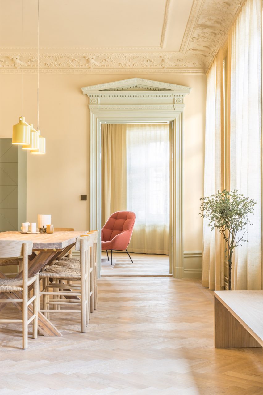
Hidden Tints, Sweden, by Note Design Studio
Set in a 19th-century building in Stockholm, this kitchen envisioned by Swedish practice Note Design Studio is entirely enveloped in buttery yellow paint – covering everything from the walls and mouldings to the window frames.
"Colour helps to emphasise the splendour in the detailing of the architecture," interior architect Sanna Wåhlin told Dezeen. "In fact, the approach to colour in architecture in the old days was much braver than we see today. It deserves its place again!"
Find out more about Hidden Tints ›
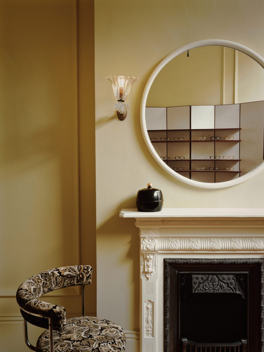
Cubitts Belgravia, UK, by Child Studio
Child Studio reinstated many of the Georgian design features found in this 19th-century Belgravian townhouse when turning it into a shop for eyewear brand Cubitts.
The London design firm painted its walls in a chalky yellow hue that was typical of the period and uncovered the original floorboards to create an "intimate and domestic atmosphere", complete with a cast iron fireplace installed in the front room.
Find out more about Cubitts Belgravia ›

Duplex in Sant Gervais, Spain, by Arquitectura-G
To make this duplex apartment in Barcelona with its convoluted floor plan and shadowy living spaces feel more bright and spacious, local practice Arquitectura-G introduced an all-yellow colour scheme that features throughout the home.
It was even chosen for the metal grating used to form shelving in the kitchen, which was designed to provide storage without obstructing sunlight from reaching every corner of the space.
Find out more about Duplex in Sant Gervais ›
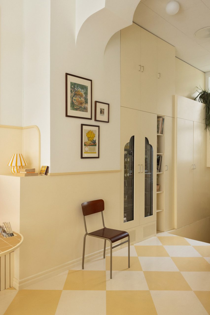
Cafe Banacado, Sweden, by ASKA
Swedish architecture firm ASKA aimed to create a warm and peaceful atmosphere inside this all-day breakfast cafe, using sunny hues across its nostalgic checkerboard floors, storage walls and custom-made tables with integrated cutlery holders.
"In order to create an environment that feels harmonious, we work with subtle layering and tone-in-tone methods," said ASKA co-founder Madeleine Klingspor. "The same yellow is used on the walls, lamps, tables and floor but in different scales and intensity."
Find out more about Cafe Banacado ›
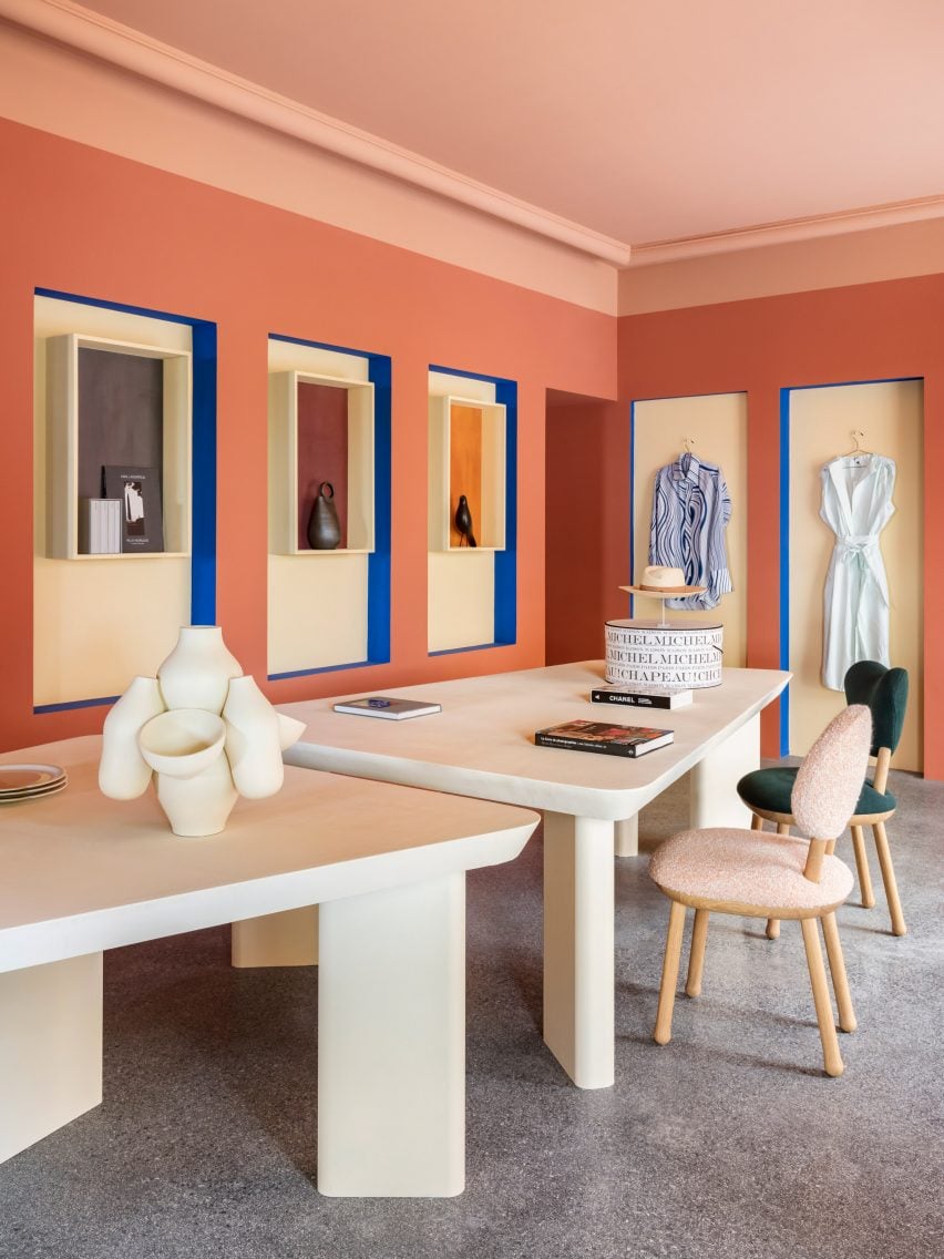
Villa Noailles gift shop, France, by Pierre Yovanovitch
When overhauling the gift shop of the Villa Noailles arts centre in Provence, French designer Pierre Yovanovitch created a series of colour-block alcoves to "dramatise" the presentation of the products on offer.
The mellow yellow backdrop of these wall niches stands in stark contrast to the salmon-pink walls and cobalt blue trims, nodding to the villa's "cubist" garden designed by Armenian architect Gabriel Guevrekian.
Find out more about the Villa Noailles gift shop ›

Origin spa, Switzerland, by Bureau
Blocks of pastel-toned tiles overlap across the different surfaces of this float spa in Geneva. The colour-blocking was specifically designed to evoke the vague spots and flashes of colour that can sometimes be seen behind closed eyes after looking at a light source.
The interior was designed to reflect the visuals that guests experience in the spa's sensory deprivation tanks, which are filled with warm salt water but completely devoid of light to create the feeling of floating weightlessly in space.
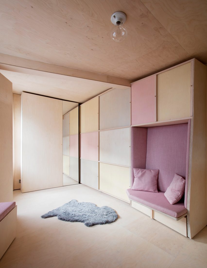
13 Square Metre House, UK, by Studiomama
Custom-made plywood furniture fringes this tiny 13-square-metre home set in a former mini cab office, which "might be London's smallest house," according to architect Studiomama.
Beyond providing crucial storage, the light wooden elements help to create a cohesive interior, while functional zones such as integrated sliding doors are highlighted in swatches of soft yellow, pink and blue.
Find out more about 13 Square Metre House ›
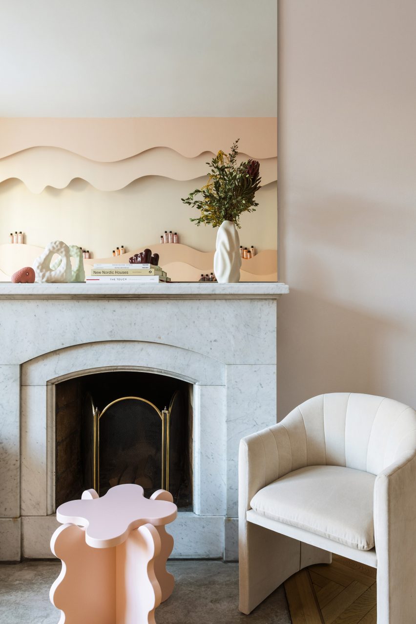
Maria Nila salon, Sweden, by ASKA
Undulating shelves of hair products wind their way around the perimeter of this salon by Swedish haircare brand Maria Nila in Stockholm to evoke dripping shampoo.
The storage is rendered in pastel gradient colours informed by the brand's packaging, which fade from ballet-slipper pink to a pale coffee colour and finally a washed-out yellow.
Find out more about the Maria Nila salon ›
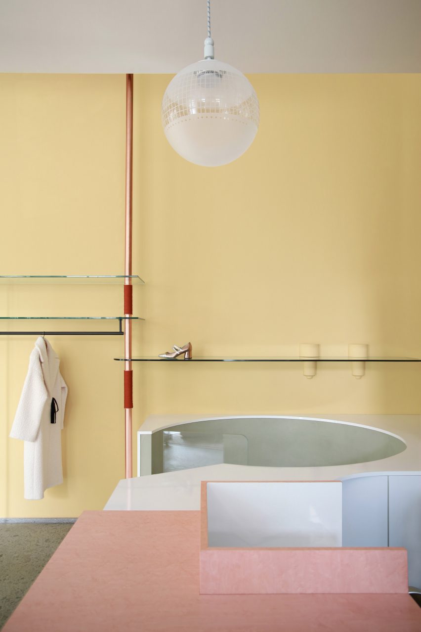
Imarika boutique, Italy, by Marcante-Testa
Another interior that showcases the perfect match between yellow and pink is this boutique in Milan, designed by Italian studio Marcante-Testa.
Here, an understated daffodil-colour covers the walls, while pink clay was used to render partitions and rose-gold rails hold up the glass shelves displaying accessories.
Find out more about Imarika boutique ›
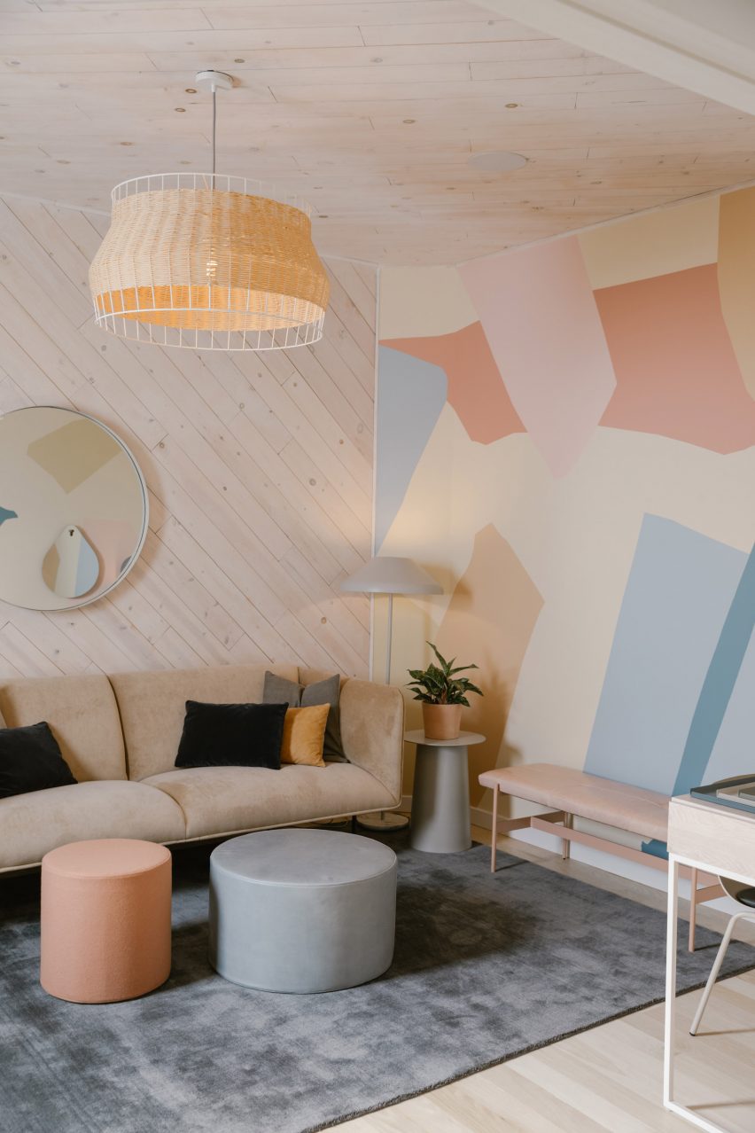
The Ruby Street, USA, by Francesca de la Fuente and Working Holiday Studio
An abstract wall mural by Los Angeles artist Dakota Solt ties together the baby blue, pink and tan furnishings in this co-working space with the pale yellow of the wood-panelled walls and the rattan pendant light.
Called The Ruby Street, the shared office and events space is set in a former church in the city's Highland Park neighbourhood, whose stained-glass windows were retained and paired with simple, contemporary furnishings.
Find out more about The Ruby Street ›
This is the latest in our series of lookbooks providing curated visual inspiration from Dezeen's image archive. For more inspiration see previous lookbooks showcasing residential atriums, floating staircases and kitchens with polished granite surfaces.