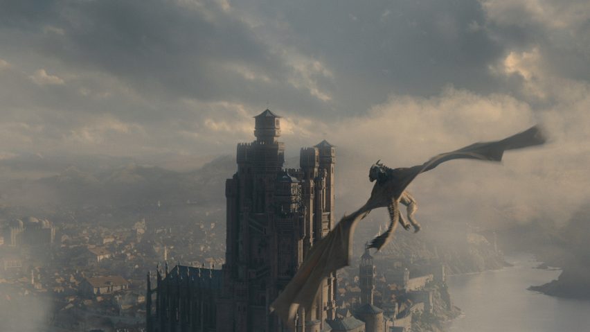
Jim Clay's set design aims to create the right "psychological climate" for House of the Dragon
Production designer Jim Clay created a dragon skull that "could appear in the Natural History Museum" for the set design of TV series House of the Dragon, which also draws on the Wolf Hall trilogy to give the interiors a "Machiavellian feel".
"The main thing about House of the Dragon is that we wanted it to be a believable and plausible world, we wanted it to be rooted in reality," Clay told Dezeen on a video call from the Warner Bros studios in London, where the interior scenes for the series were shot.
Clay, who has a background working in film, has previously created the production design for films such as the Kenneth Branagh-directed Belfast and Death on the Nile, as well as Love Actually.
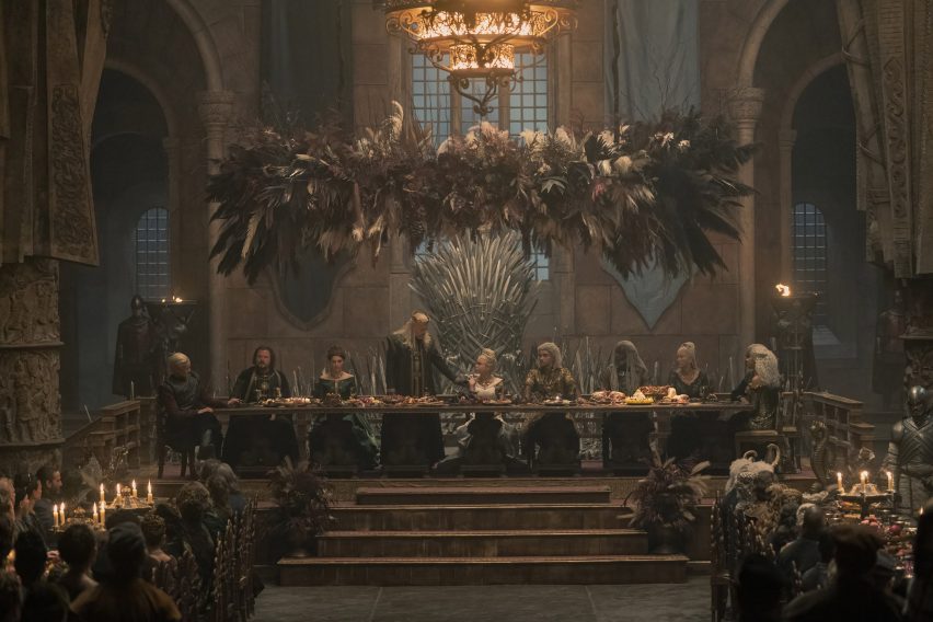
The designer had to have a "crash course" in the lore behind House of the Dragon, television company HBO's prequel to the television series Game of Thrones, before beginning to create the fantasy world.
"I have to admit I hadn't actually seen Game of Thrones, I must have been the only person in the world who had not – I had to have a crash course," he said.
The aim of the set design for House of the Dragon was to "embrace and expand" what had come before, with Clay drawing on his film design experience to create the large sets.
"The joy of this was that although it's TV, it's very much set up like a feature film – it's just that you're doing 10 feature films with four different directors, all at the same time," he said.
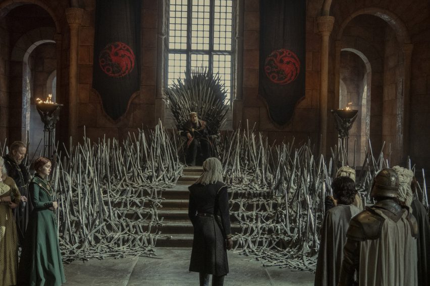
To create the overall feel of the series, Clay looked to earlier architectural influences than those used for Game of Thrones, which is set centuries later.
"Game of Thrones was essentially the European medieval sensibility; we're trying to push it further back to Roman and Byzantines times so we're varying the palette," he explained.
"The pure medieval is quite a familiar genre now in television, so we're trying to push it just a little bit," he added. "With the Red Keep castle, we tried to introduce a bit of very early Spanish architecture."
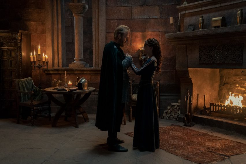
A well-known work depicting a later time period also had a prominent influence on the House of the Dragon set design.
To give the right feel to the interiors of the Red Keep castle, where much of the first season takes place, Clay drew on the Wolf Hall trilogy by the late British author Hilary Mantel. Set in the early 1500s, the trilogy depicts the rise and fall of king Henry VIII's advisor Thomas Cromwell.
"I took a lot from that – it is such a wonderful piece of writing, the way she captured the intrigue and the Machiavellian quality of the court of Henry VIII," Clay explained.
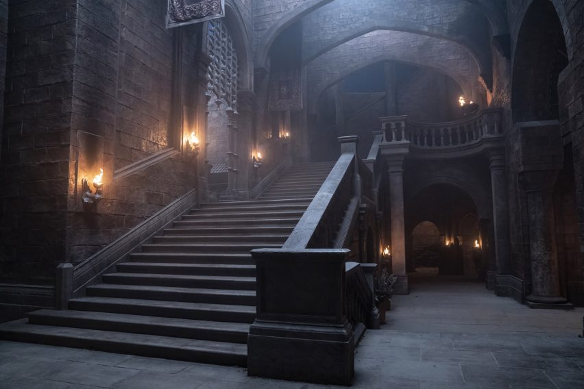
"It stuck in my mind a great deal while I was thinking of the Red Keep," he added.
"We introduced a big staircase, observation points, windows and corridors where, for example, the Hand of the King, Otto Hightower, was always able to observe who was talking to who, who was walking down the corridor with who – this constant sense of keeping an eye on potential threats," he continued.
"I kept thinking of Otto Hightower as Thomas Cromwell," he said.
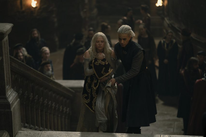
To add to the sense of being watched and illustrate the intrigue going on at the court, the production design team also built a set that would enable actors to be seen moving from one room to another.
"Rather than creating individual sets for the [Red Keep] bedroom, the chamber and the corridor, we built one big composite set so we could take real-term journeys from one room to another, and that helped give that sort of Machiavellian feel to it," Clay said.
"I think the production designer's role is to create a psychological climate for the story and the narrative, so that's very much top of my mind when I'm working on a script," he added.
The double-height set, which measures 2,500 square meters on each of its two levels and reached 14 meters at its highest point, took a crew of 300 workers four and a half months to build. Like Clay's other sets, it was designed to look as realistic as possible.
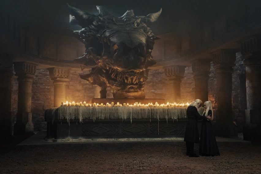
However, part of the production design also involved creating realistic-looking depictions of fantasy creatures, including a large dragon skull kept above an altar in the Red Keep.
Made from polystyrene, the team made a number of maquettes to get the design right before settling on the final piece.
"It was sculpted in polystyrene and covered in plaster and it's a magnificent piece – it could appear in the Natural History Museum and no one would know it was polystyrene," Clay said.
"We felt that perhaps in Game of Thrones, the dragons' skulls and remains had not been so revered," he added.
"So we wanted to really make it a full altar with all the candles and the due reverence to the skull."
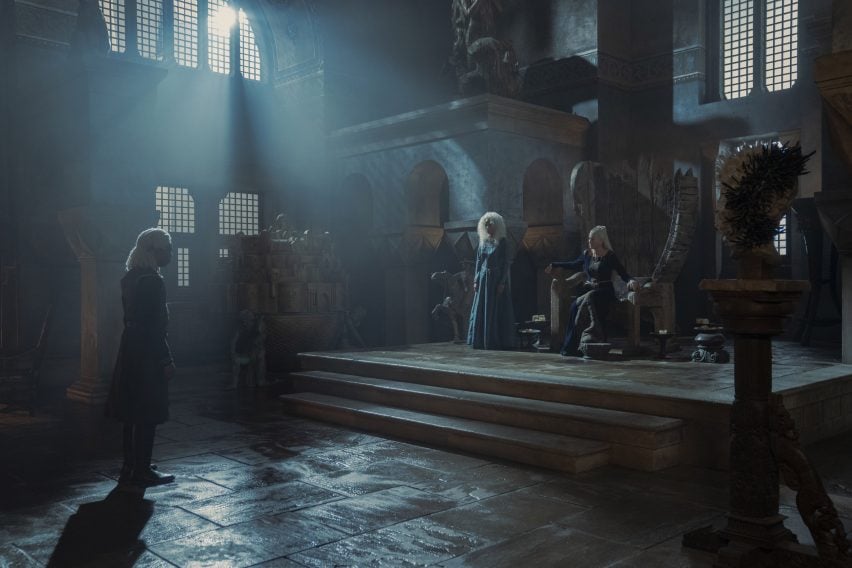
The first season of House of the Dragon focuses on three different houses, and the designer tried to give each of those sets a different feel.
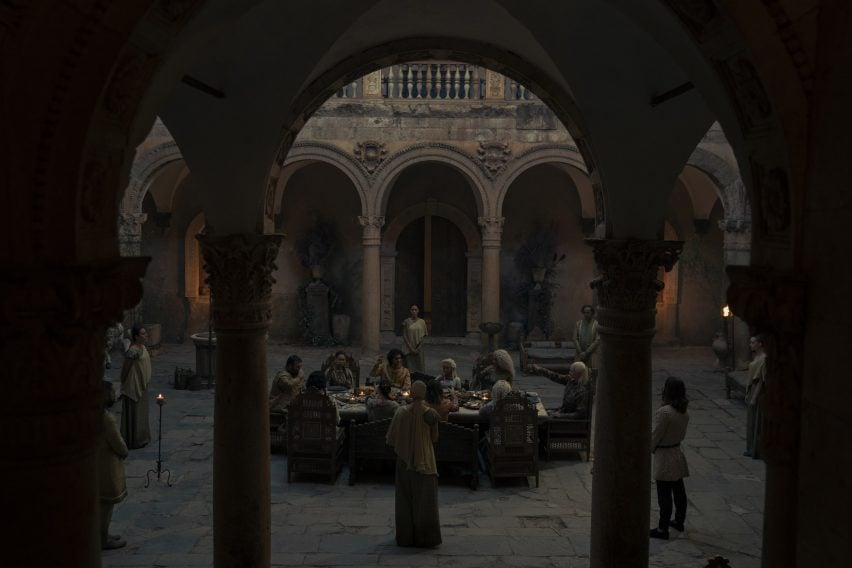
"We've tried to draw a slightly different vernacular for the three houses – High Tide is a little bit more Byzantine in its feel with its windows, arches and decoration, while Red Keep was closer to the original medieval feel," Clay said.
"Dragonstone has a different feel. We recreated the whole of the Painted Table [a carved table depicting the world in which the show is set] and we're developing that into a whole new composite set to accommodate the new scripts," he added.
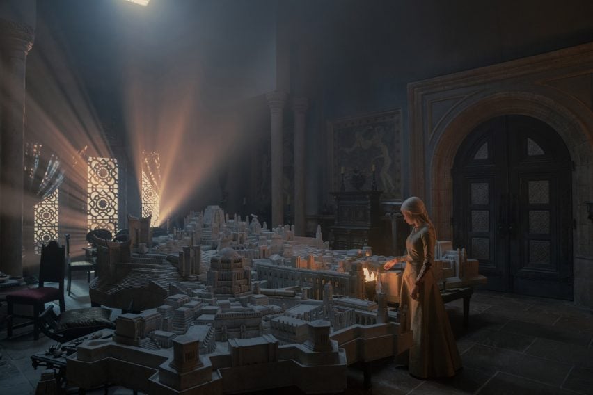
As well as the large sets, the production design also featured more subtle design details, including "pornographic" frescoes.
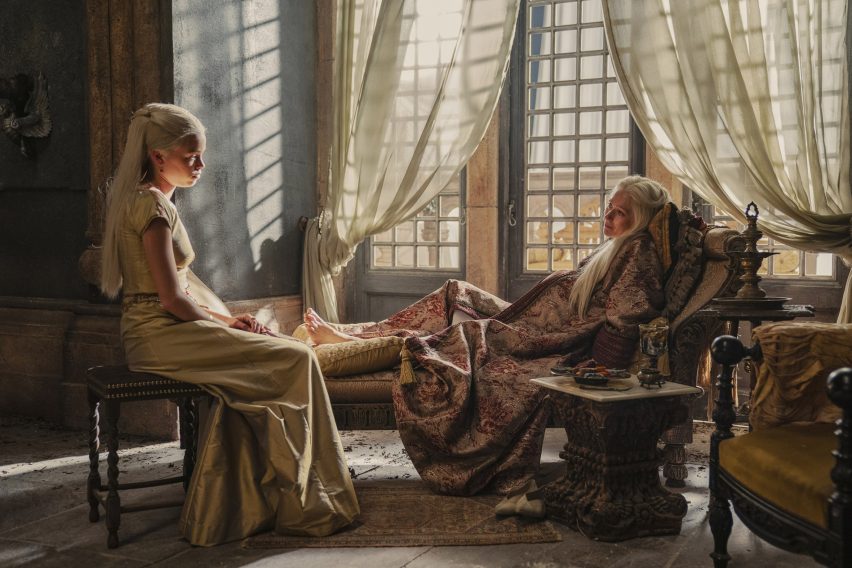
"Part of the brief for the Red Keep was that they were living through this age of decadence," Clay said. "I didn't want to go down the normal tapestry route. So we had these big frescoes painted on the walls, which were taken from the spirit of Pompeii and essentially pornographic."
"We had to shoot that carefully and subtly so that it wasn't entirely prominent, but it was there as a suggestion in the background," he added.
This autumn also saw the premiere of another fantasy prequel, The Rings of Power, which looked at events before JRR Tolkien's Lord of the Rings trilogy, with the two shows potentially competing for many of the same viewers.
"We were very conscious that this would be one of our main competitors," Clay said. "We've been gratified that the audience has responded to our world so well, and I think the television and film world is a big world. There's space for all of these things."
"You just concentrate on the world that you're creating," he added.
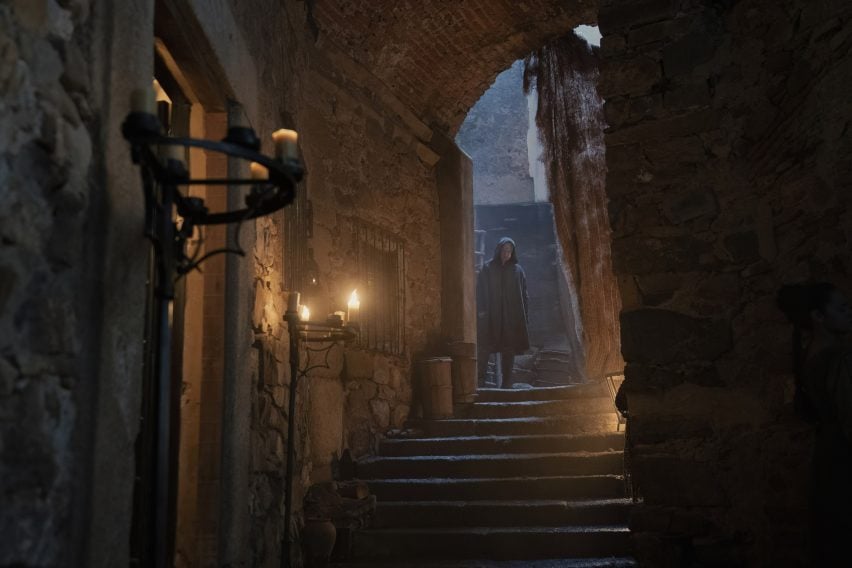
While initially finding the prospect of taking on the design of a world that was well-known after Game of Thrones daunting, Clay said he ended up enjoying the project's "sense of freedom".
"It's certainly more exciting for a designer than something set in 2022, where you're often forced on to real locations and your contribution is a little bit limited to the palate of the real world, whereas this is just fabulous," he concluded.
Other TV series with notable set designs include Squid Games and Ratched, which features an asylum designed to look like "a beautiful person with a really dark secret".
The photography is courtesy of HBO.