Bukiya by Archiee
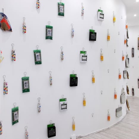
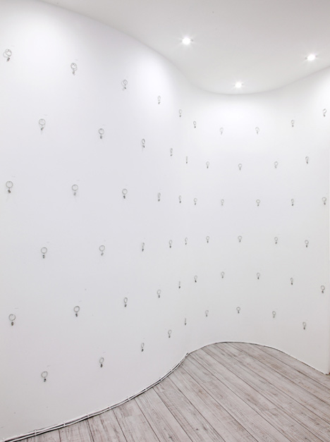
The display system at this Japanese souvenir shop in Paris is just key rings hung on screws in the walls.
Japanese architects Archiee, who are based in the French capital, designed the Bukiya shop.
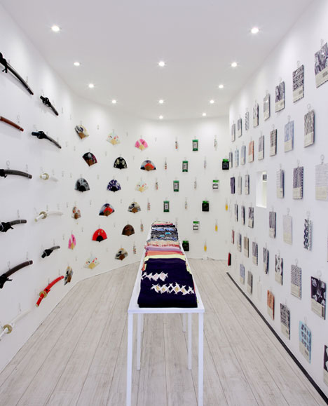
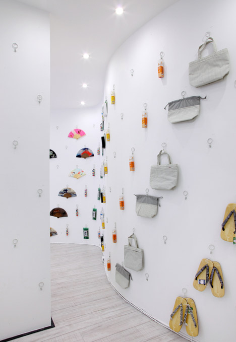
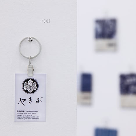
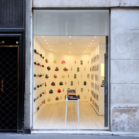
Key rings are clipped onto each product so that they can be hung from the undulating walls in vertical or diagonal rows.
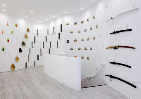
Each of the 377 screws is numbered for reference.
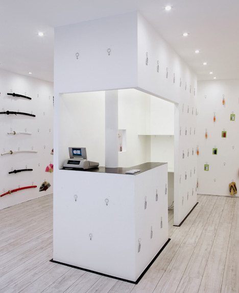
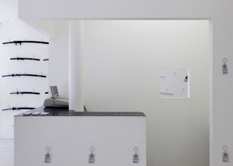
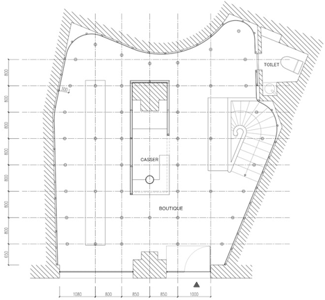
The counter is located within a rectangular room at the shop’s centre, which also conceals two structural columns.
If you like this project, you might also be interested in a bicycle shop where recycled paper tubes display products.
Photography is by Ryo Suzuki.
Here's a little more explanation from Archiee:
Continuous-discrete (Japanese Souvenir Shop)
This is the renovation project for a boutique, located in Paris, that displays and sells traditional Japanese products.
Simple grid
The project is based on a simple grid of Phillips screws that form the system for displaying the merchandise. There are a total of 377 screws, each having been individually screwed by hand in its allocated point. Each screw is accompanied by a simple clip, which allows the merchandise to be hung to the wall.
Flexibility of the layout
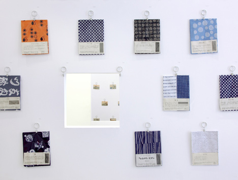
The grid enables the boutique great flexibility with regard to the display of the merchandise. Depending on the scale of the object to be displayed, a single screw or a cluster of screws can be utilized. The products are to be displayed in specific, yet fluid, categories in order to convey a narrative to the customer.
Composition of the space
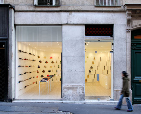
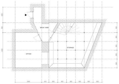
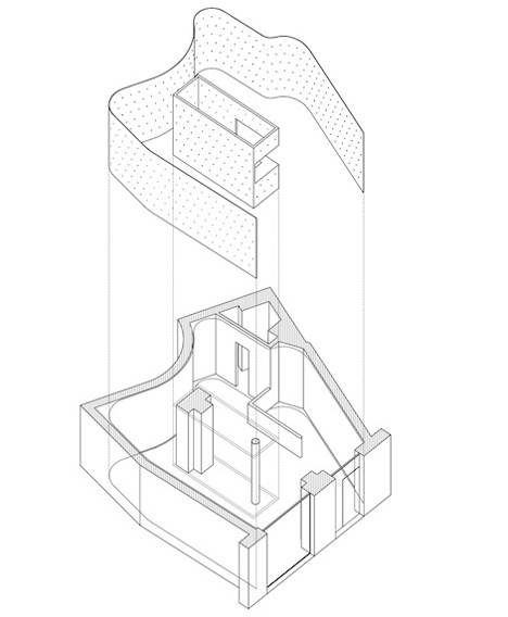
In order to fulfill the grid, the project comprises of expansive and continuous wall surfaces. There are twodiscernible surfaces. The first surface is a smooth undulating surface that, being placed over the strange existing shape of the boutique, plays two fundamental roles, that of creating a minimal internal surface and that of directing the customer around the space. The second surface is a planar intervention that covers an existing concrete column and a steel column which are awkwardly close to each other. This makes use of what would otherwise be wasted space and also simplifies and facilitates the circulation around the boutique. To maximize space further, the cash register for the boutique is found within this planar intervention.
Facade
The façade of the boutique has been kept as minimal as possible in order to create a dialogue between the interior and exterior space. As such, the facade becomes the initial boundary of the continuous undulating surface.
Merchandise control
In order to identify the merchandise on display, each screw has a unique identification number printed next to it. This allows the boutique to keep track of the display, stocking, and selling of each item of merchandise. This identification number is purposefully kept visible on the wall as delicate decoration.
Date: 2011
Area: 60m²
Type: interior
Programme: shop
Architects: Yusuke Kinoshita and Daisuke Sekine (Archiee)