Fanta rebrands with "truly playful" global identity
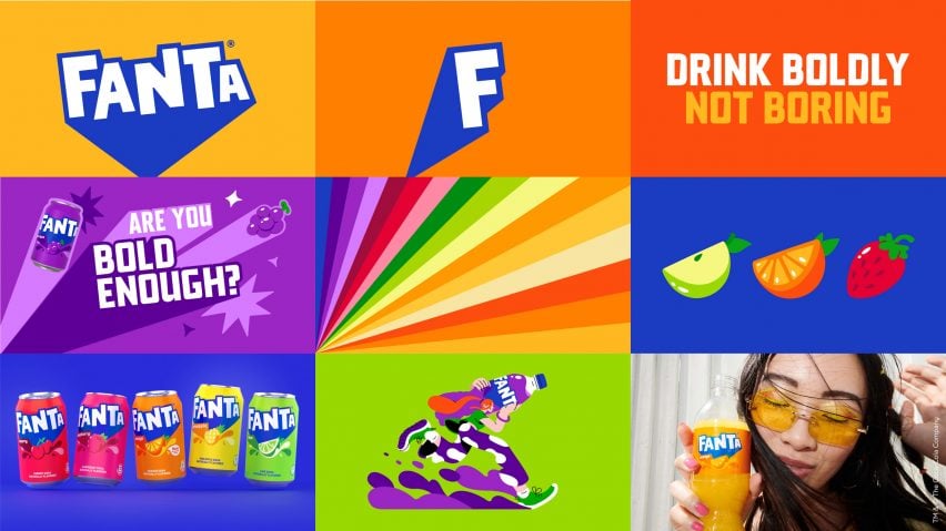
Coca-Cola's design team and creative agency Jones Knowles Ritchie have overhauled drink brand Fanta's logo to give it a unified global identity based on fun.
The rebrand, led by the design team at drinks brand Fanta's owner The Coca-Cola Company in collaboration with Jones Knowles Ritchie, aimed to give the brand a playful image that appealed to all ages.
"Fanta is one of the most playful brands we have in our portfolio, however, it was clear that the brand needed some TLC," said global vice president of design at The Coca-Cola Company Rapha Abreu.
"The identity was too contained and didn't portray playfulness," Abreu told Dezeen.
"At the same time, it felt geared towards a younger audience – our audience is anyone that is playful at heart, and it was important that we brought the idea of fun and play to an older audience," he continued.
"At the end of the day, a playful brand needs to be truly playful."
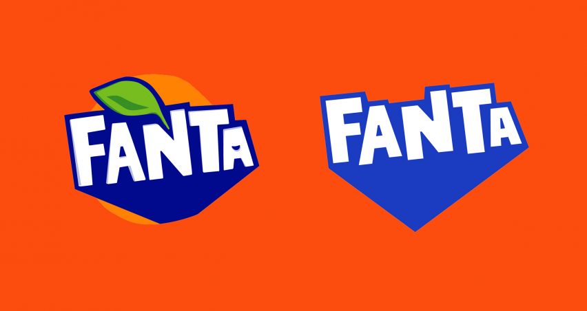
The rebrand simplifies the previous branding to create a stripped-back flat logo. The lettering has been neatened and shadows removed along with the smile-shaped icon from within the second letter A.
A lighter shade of blue was used for the thick shadow, which was extended downwards to form a point.
As the logo will be used across all of Fanta's range of flavours, as well as its orange variety, the design team removed the orange roundel and leaf from the logo.
"It was important that the new brand identity was an accurate reflection of the Fanta brand," explained Abreu.
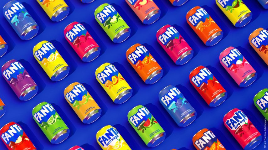
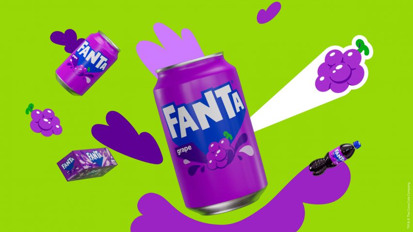
"That meant making sure we were bringing every flavor to life. Take our old logo for example, it was confusing to have an orange in it when we have a range of flavors that go beyond orange," he continued.
"We didn't want the other flavors to be compromised even though we know that orange is the most iconic flavor."
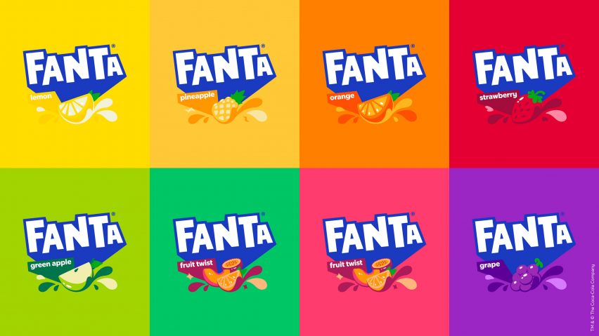
For the first time, Fanta's new logo will be used in all countries, replacing previously separate brand identities in different regions.
"Most of the markets had different identities," said Abreu.
"The US specifically was one that didn't have the same identity, yet was one of our largest markets," he continued.
"We decided to re-define for every market and ensure every team was applying the same elements so that we could truly unify under one global identity."

Abreu hopes that the global rebrand will unify Fanta's identity and stop any more redesigns from happening for a long time.
"Fanta has had many different changes over the years and the biggest challenge was that we wanted to stop that," he said.
"We needed to crystalize it under one identity and stick with it for years to come. However, it was also about evolving what people love and know about Fanta," he continued. "We didn't want to throw away the old identity, we wanted to build upon it."
"The rebrand really captures playful indulgence in my eyes," he added. "Fanta is all about fruity tastes that come in all different flavors, and this is an identity that really brings that to life."
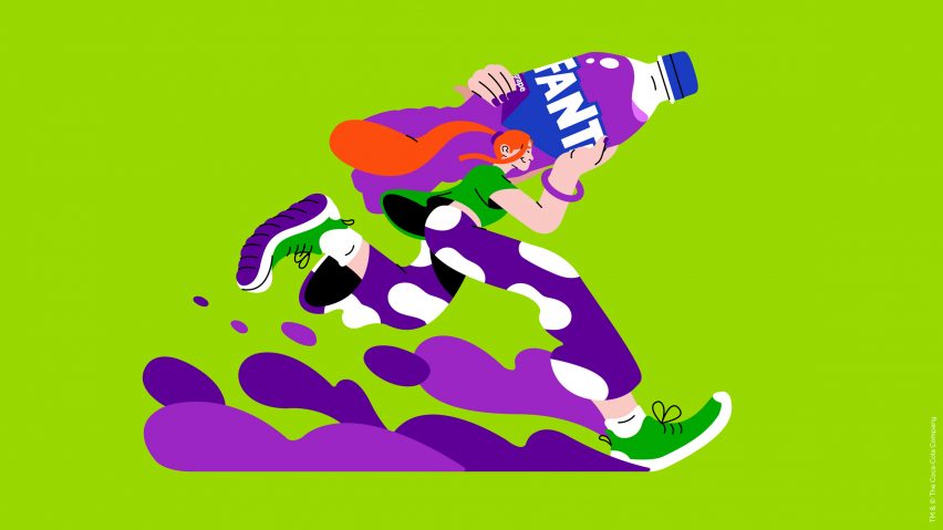
Fanta's rebrand follows the redesign of two other leading drinks brands. Beverage company PepsiCo unveiled branding for soft drink 7Up that aims to reinforce the uplifting nature of the drink and also revealed an "unapologetic" logo focused on brand's heritage for Pepsi.
The photography is by Tim Marsella and Martin Wonnacott.
Project credits:
Design: Coca-Cola Global Design team
Brand identity and packaging: Jones Knowles Ritchie
Packaging guidelines and imagery: Relative
Motion identity: Gretel
Typography: Colophon
Illustrations: Lucas Wakamatsu