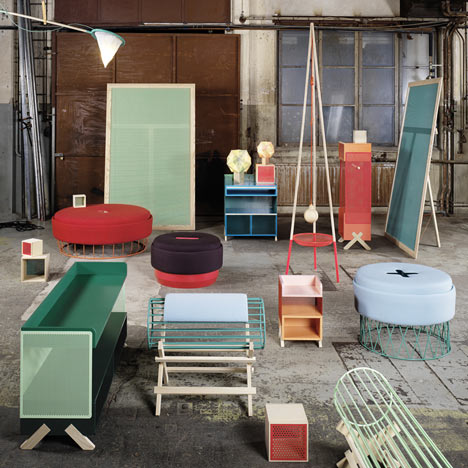
Marginal Notes 2012 by Note Design Studio
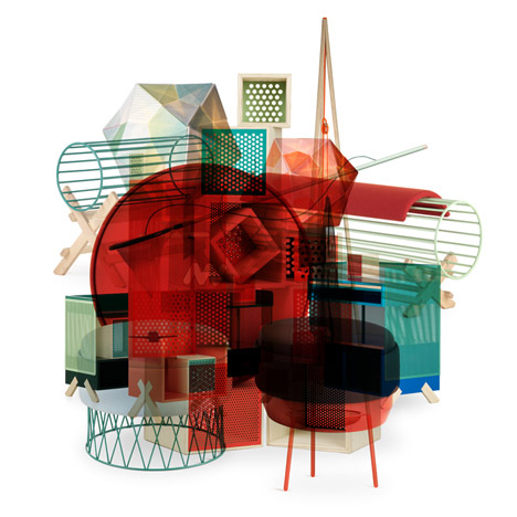
Stockholm 2012: Note Design Studio present a collection of furniture inspired by camping and field trips at Stockholm Design Week this week.
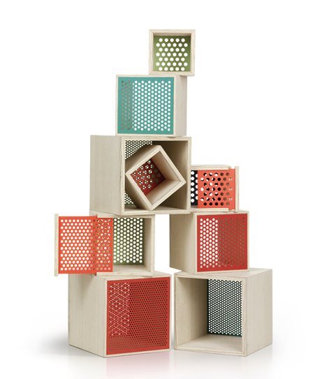
The Marginal Notes series was developed from doodles the team made in the margins of their sketchbooks and notebooks over the year, revisited and worked through to physical objects.
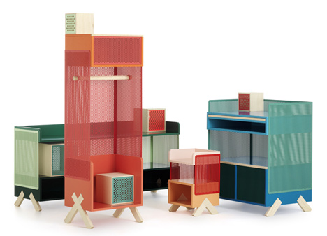
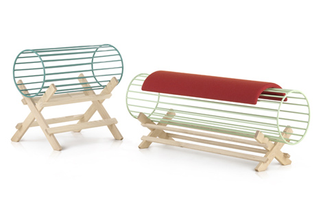
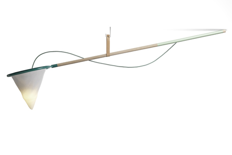
Pieces include benches resempling logs on a sawbuck, a lamp like a butterfly net plus storage boxes and shelves based on cages for trapping specimines.
This is the second Marginal Notes series by Note Design Studio - see last year's here.
Stockholm Design Week continues until 12 February and you can see all our stories about it here.
Photos are by Mathias Nero.
Here are some more details from Note Design Studio:
Marginal Notes 2012 – Collection
In collaboration with Lerch Träinredningar
Stockholm Design Week February 8-10
The Excursion
We went deep into the forest to explore, measure and collect. With warm clothes, good shoes and woolen caps to protect us, we collected samples and took notes. Butterfly nets and soil sifters worked hard to catch the tiniest living things. When all our cages and boxes were filled we went looking for a shaded glade. With tents, mosquito screens, and some logs to sit on we set up a base camp for the night. After a long expedition, we now had plenty to look through back home.
For the second year (over a cup of coffee) we examined our note books in search of the ideas in the margin, those unique sketches that pop out when you look again, the ones you just need to realise.
Many seemed to have a common theme that we simply called "Base Camp"; the simplistic materials and shapes of scientific field expedition tools adapted to stand wear and tear. Screens, filters, cages – to keep things inside, to let things through – were transformed into a few different pieces. Objects that separate, structure and sort Nature (or space) into understandable amounts. Other ideas connected more to the culture of exploration.
After intense discussions, a few eventually left the paper and materialized into the physical world. Just like last year, we ended up with a diverse collection of colours, shapes, materials and expressions; just the way we like it.
A biologic excursion, why did we end up there? We think it may be the inqusitive approach: to explore your surroundings, to find the beauty and detail in them, to find the respect for them, and to find a way to interact in a fair way with them.
Tuck
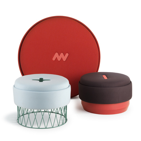
We came across a picture of a bearded man in a choral red tuque (pronounced "tuck") – or burglar beanie hat – and the color caught our attention. The hat became poufs to sit on, and the their edges were folded just like the edges of the hat. It added the function of a pocket for magazines and such, something that made us like the piece even more.
Sifter
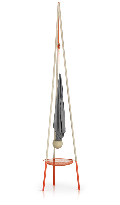
A gigantic sifter in the center of an excavation site, turned out to be a tall and handsome coat-hanger. Well, we discussed for a long while if it should work as a lamp or a clothes-hanger, but the first thing that comes to mind is usually the best. The net in the sifter helps with the catching of your keys falling out of your pockets, or just as a basket for your hats and gloves.
Nour
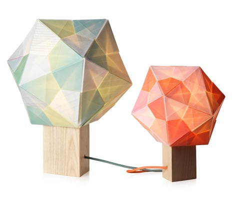
Alexis´ girlfriend Maryam came by the studio, and showed us her fascinating multi-colored origami polyhedra. We thought they would look interesting with a light inside, and a process of finding a paper with the right properties ensued. We gave the many sheets the right play of colours and patterns, and then Maryam put them all together by hand.
Mosquito
We needed backdrops for our exhibition, and with all the time we’ve spent searching for inspiration in the worlds of fieldtrips, excursions and excavations, we had the image of an insect screen in our minds. It is the perfect frame to make things in front of (or behind) it look even better.
Peep
How can boxy storage furniture let more light through? We went for making their walls more transparent. After some material tests, we had a colorful group of characters, each with different sizes and functions. They hold your things, and you can decide what you want to show and what not to. The "Keep" boxes complement the Peeps perfectly.
Keep
A frame for display, like a cage in the zoo. Traps to keep things inside and sometimes let things out of. Simple wooden cube boxes where you decide how much you want to show or not. Some have an open side, others have perforated sliding lids really hard to open from the inside.
Settler
To fell a tree, and to cut it up into useful pieces. A thing of pride for a lumberjack or a settler building their first cabin. The iconic shape of a log on a sawbuck inspired these benches, since a dead tree in the forest is really the best
place for a short rest.
The Catch
Gotcha! A firefly in a butterfly net was the visual cue that led up to this swing-arm lamp. Through its central pivot-point it can be swiveled around the room and shine a light wherever necessary. Also, it really catches the light.
About Note:
To note something, to get noted: we are named after what we try to achieve.
We like to pay attention to our surrounding, and try to create things that make others to do that as well.. By looking at what is unique in every project and emphasizing that, we transform non-material values into tactile objects and spaces. We work within the fields of architecture, interiors, products, graphic design and design management. Maybe we can help you out.
Us: Alexis Holmqvist, Susanna Wåhlin, Johannes Carlström, Kristoffer Fagerström and Cristiano Pigazzini.
A big thanks for the success of this project go to Lerch Träinredningar who have helped us throw the all process with their knowledge for construction and materials.