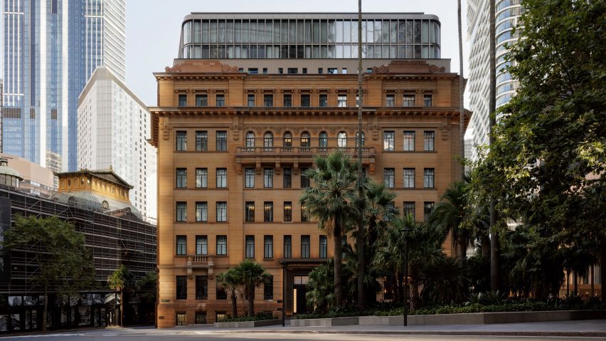
Capella hotel takes over former government building in Sydney
Architecture firm Make and interior design practice BAR Studio have converted Sydney's heritage-listed Department of Education building into the latest outpost from Capella Hotels.
The adaptive reuse project involved adding a modern extension with curved glass corners to the building's roof, set back from its sandstone facade to respect the original Edwardian Baroque architecture.
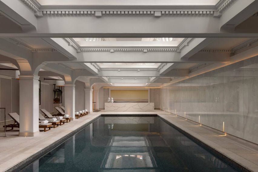
With these four additional floors, the building now measures eleven storeys high and houses 192 guest rooms alongside bars, restaurants and a 20-metre swimming pool that occupies the former sixth-floor gallery.
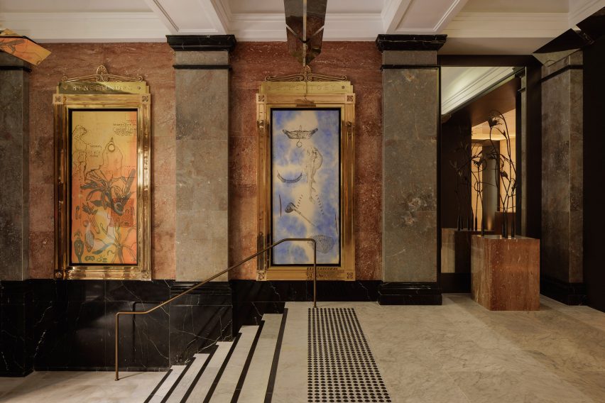
Since the Department of Education was constructed in Sydney's historic Sandstone Precinct in 1912, its interior had been compromised with countless ad-hoc changes, according to Make.
The studio worked to restore the sense of grandeur envisioned by the original architect George McRae, for example by reinstating the internal garden courtyard on the ground floor.
"Stitching together the existing Edwardian Baroque-style structure with a new contemporary layer of architecture is one of many things that makes this landmark project stand out as a hotel," Make designer Michelle Evans told Dezeen.
"Capella Sydney has been a joy to work on, as it builds on our growing portfolio of reusing and adapting existing and heritage buildings," she added.
Picking up the baton from Make, hospitality design firm BAR Studio was tasked with creating luxurious yet contemporary interiors for the hotel that work seamlessly with the history of the building.
"The heritage building that houses Capella Sydney provided us with the underpinning for the interior design," said co-founder Stewart Robertson.
While the building's exterior was largely intact, only a few areas of historical significance remained inside.
Some of these spaces offered incredible opportunities for reinvention, such as the gallery on the former top floor, which has become the Auriga spa and pool.
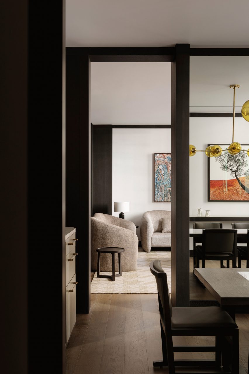
Meanwhile, references to the original steel-framed windows were incorporated into the interiors via a recurring motif of framed forms.
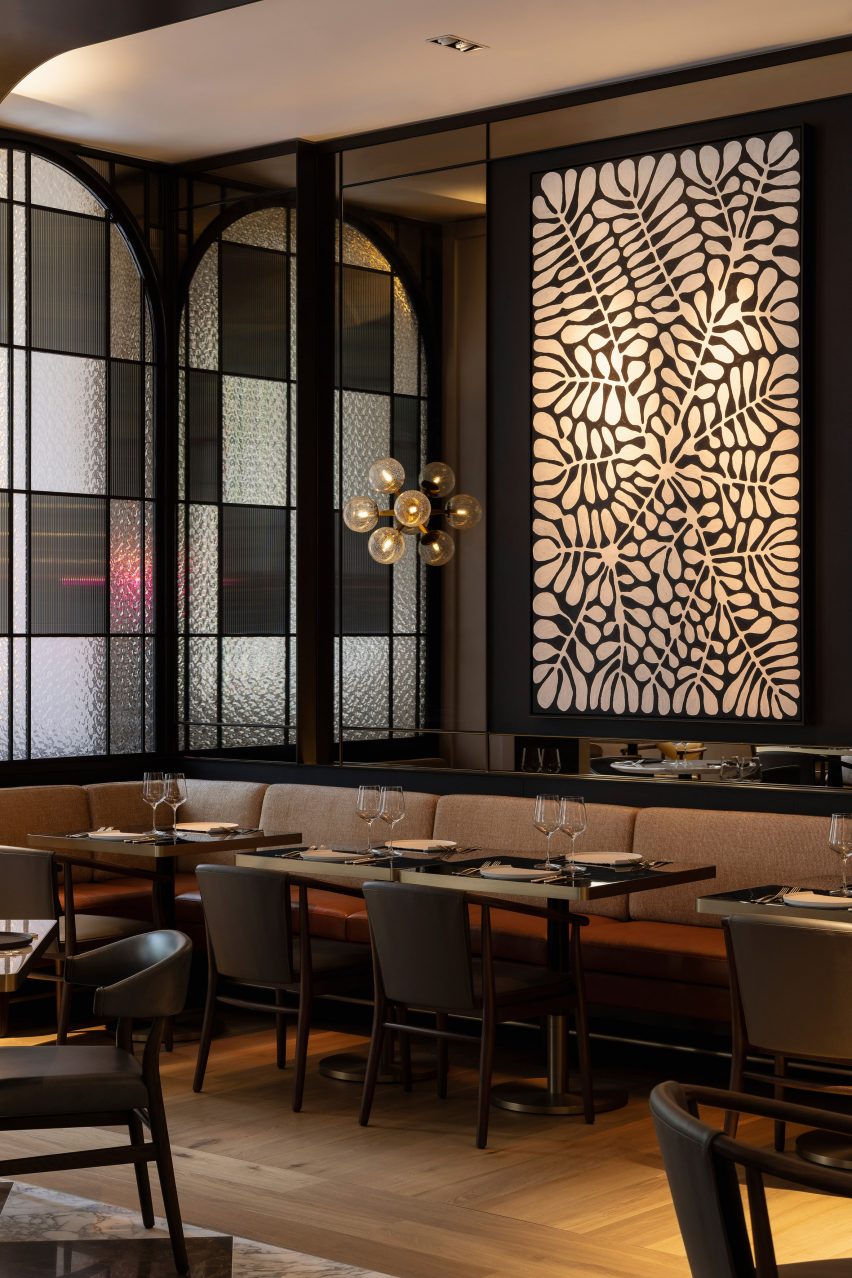
Steel in black and bronze finishes was used throughout the building to frame doors, windows and screens, making a subtle reference to the district's origins in the age of industry.
This serves the practical purpose of delineating and dividing spaces but also brings a restrained form of embellishment, Robertson said.
"We've used framing techniques to create separation but also to build an organic connection between the public spaces," he explained.
"We wanted the colour and finish to feel appropriate to the original era but also for these elements to read as new and sophisticated insertions."
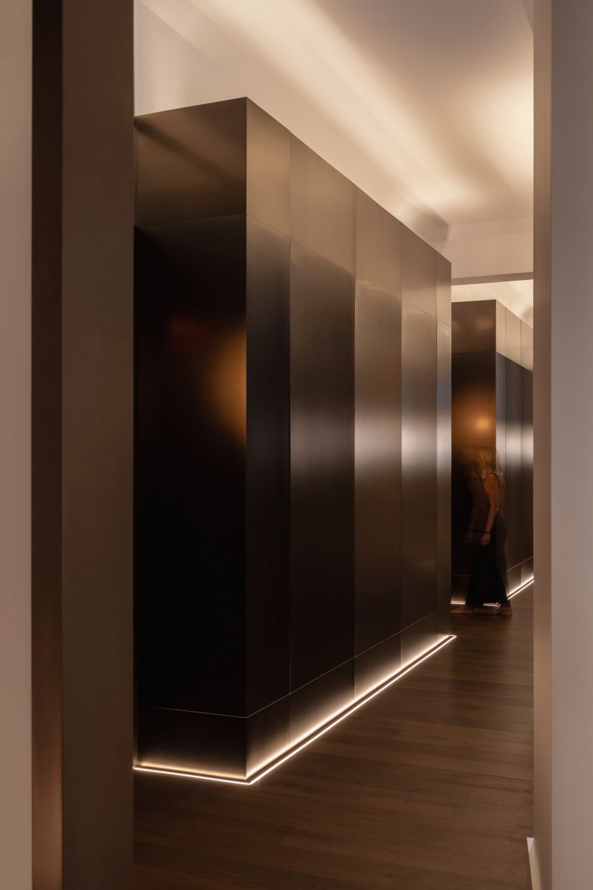
A palette of natural materials brings a sense of subtle luxury to the bedrooms and communal spaces.
Steel was used alongside honed marble, sandblasted travertine, natural wall coverings and light and dark timber.
The colour palette, too, is simple and neutral, taking its cues from the material palette with stone-coloured walls and tan leather upholstery.
This approach enables the heritage features to become the focal point, along with an art collection of Australian ceramics, paintings, murals and textile pieces curated by art consultant The Artling that is displayed through the hotel.
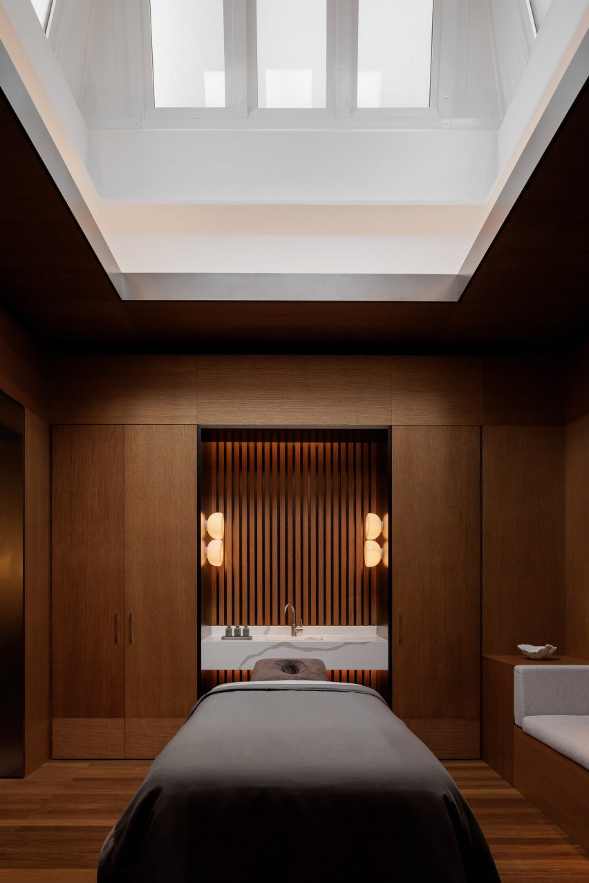
"The neutral base palette of cream stone and dark and light timber integrates with the existing architectural and design elements but sets a warm and soothing mood, creating a real sanctuary from the surrounding city," explained Robertson.
In keeping with the light touch of the new architectural interventions, much of the furniture draws on the concept of campaign furniture – traditionally made for military campaigns and therefore easy to transport.
"These portable and ingenious pieces bring the comforts of home to remote places," said Robertson.
Other Capella hotels include the Norman Foster-designed Capella Resort – set on an island off the coast of Singapore – and the Capella Sanya, which won the 2020 AHEAD Asia award for best landscaping and outdoor spaces.
The photography is by Timothy Kay.