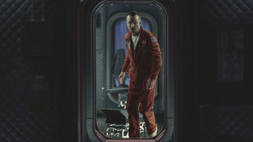
Black Mirror's latest season a "mini film festival" says production designer Udo Kramer
Designer Udo Kramer aimed to give the sets for the sixth season of Netflix series Black Mirror, which include a 1960s spaceship, a "cinematic feel," he tells Dezeen in this interview.
Berlin-based Kramer designed the sets for all five episodes of the latest Black Mirror series, which premieres today on Netflix.
He had previously worked on two other series for the streaming service, Dark and 1899, and says their premises helped him prepare for designing Black Mirror.
"I think working on Dark and 1899 I learned to work on different time levels, different periods – these are things that I'm used to," Kramer said.
"Maybe some people wouldn't, but I like trying to do all the things simultaneously and see how one part [of the series] is influencing the other."
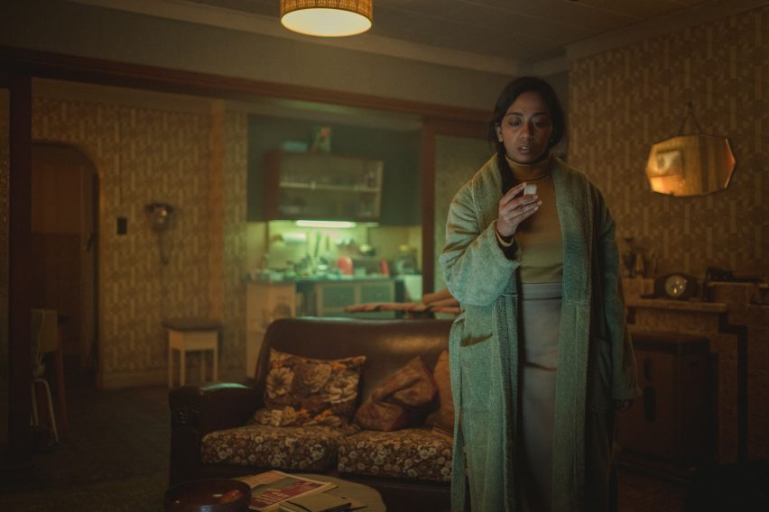
Creating the settings for the Black Mirror episodes, which range from a spaceship to a Scottish house with a dark secret, was made easier by the scriptwriting from series' creator, Charlie Brooker, according to Kramer.
"Charlie's scripts are very cinematic," he said. "When you read them you have an instant feel of what you could visualise, and as they are short and brilliantly written, there is no word too much."
"It's like 'one scene, get the beat, on to the next one'", he added. "These things are so well constructed that you really can't think of other ways to do it."
Episode designed to have a "cinematic" feel
Black Mirror has become known for the sinister way in which it twists everyday situations and envisions a dark, near-future world where technology has often run rampant.
This continues in season six where each episode, though they appear to be somewhat connected, is set in a different place and location. The episodes also each have a different director.
While Kramer tried to make the episodes feel as different from each other as possible, he said that as he designed all of them and worked with the same team they still convey a sense of his taste.
"I think we tried to create something that has a cinematic feel and atmosphere to it," Kramer said.
"And I think we did it as movie fans. People might misinterpret that as 'oh, it's Netflix' big thing and they're showing off,' but it's got nothing to do with that – we're all film enthusiasts."
"Sometimes I felt it was like a mini film festival," he added.
"There are five super cool directors showing their stuff and you enjoy it, one after the other, without this kind of thing that they need to be connected – it's just like okay, that's great, next one."
Designing the sets for five different premises was all about setting an atmosphere, according to the designer.
"I think we are actually creating an atmosphere that is dense and strong enough to hold the story together as a background," Kramer said. "It's not so much about starting with fancy props."
The production design team that worked on Black Mirror aimed to find as many existing locations for the sets as possible, which could then be adapted as needed.
"As you could imagine, they need a lot of adaption as the scripts are kind of specific," Kramer said. "For each episode we also had a few builds on stage, which were made in Twickenham in London."
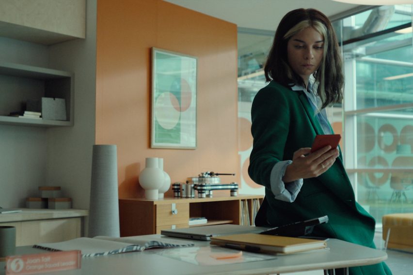
In the season's first episode, a character visits the offices of Streamberry, a streaming service that appears to be a version of Netflix and has stylish, modern interiors.
While it wasn't based on any existing Netflix offices, the interior nonetheless nods to the company's design.
"The Streamberry office is not based on any of Netflix's actual offices," Kramer said. "We wanted the color code white/black/red so it resonates with the Netflix logo design."
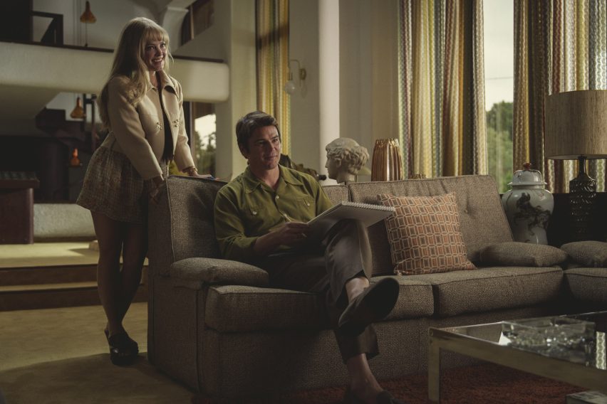
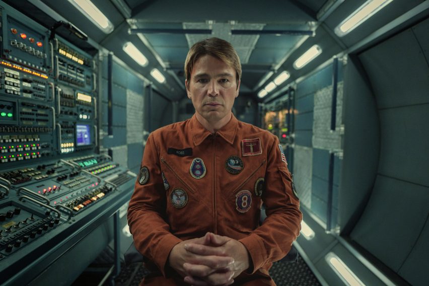
The majority of the episodes this season are set in the past, including Beyond the Sea, which features actors Josh Hartnett and Aaron Paul as astronauts in 1969 and whose sets include a mid-century-modern-style home.
This was an existing property that the team made some changes to.
"The midcentury home is a fascinating house in Spain that literally is built around a giant indoor swimming pool," Kramer said.
"It has a lot of period details remaining. We added walls to change that layout and did a period design makeover including furniture, fabrics and carpets."
"You need to be very serious so that the drama pays off"
Creating sets for a storyline set in the 1960s brought its own challenges, as the design needed to feel true to the era in which it was set.
"It needs to be serious and believable in a way that you don't make fun of it," Kramer explained.
"Many people just design things they saw in other movies and thought were funny or looked cool, and these parametres don't work on the Black Mirror show."
"I think you need to be very serious so that the drama pays off," he added. "If the show is set in 1969, it's not for the benefit of showing off period sets – it's more about trying to imagine what people in that time would have done if they had made a movie from their present time."
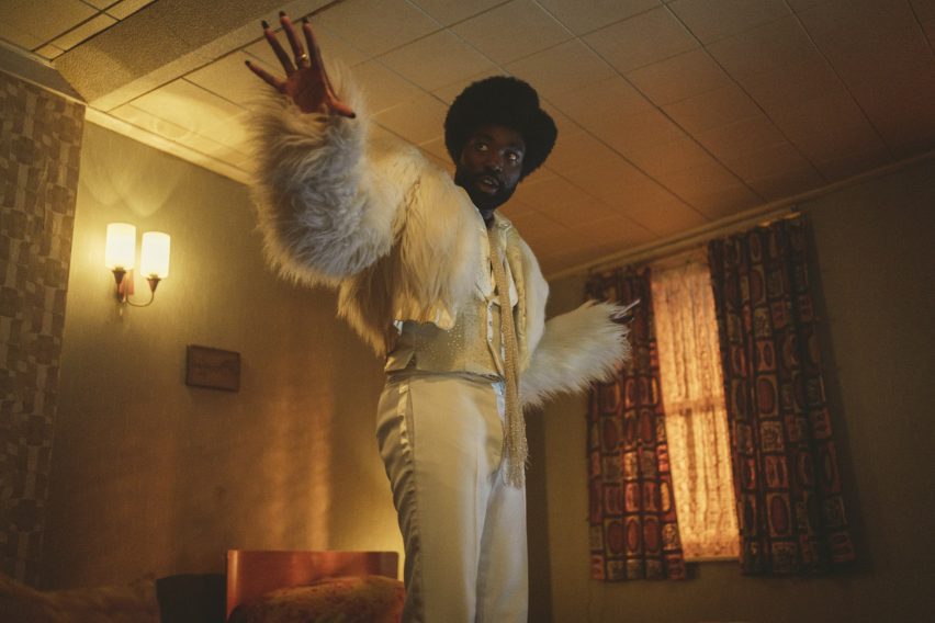
Demon 79, the last episode of the series, takes place in 1979 and saw the designer create a number of locations in Tipley, a fictional British town where the National Front is on the surge and Margaret Thatcher is about to come into power.
Among the settings are a traditional pub and a department store decked in 1970s-style orange and yellow hues.
"We did a lot of research to find out how these department stores looked and felt in the 1970s," Kramer said.
"Following our research we then chose period colors, wallpaper, carpets, and so on according to our color palette. All the furniture, fixtures and fittings were purposely made from scratch to create the environment."
The aim was to always keep it realistic, adding to Black Mirror's atmosphere that makes viewers feel that these events could have taken place.
"Of course, we could do it better today [than when the episodes were set] and you can go wild on VFX work, but that wouldn't support the idea of how this whole thing should feel," Kramer concluded.
Other Netflix shows with striking set designs include Inventing Anna, where the sets reflect different social classes, and Squid Game, which was designed to "trigger nostalgia".
Dezeen in Depth
If you enjoy reading Dezeen's interviews, opinions and features, subscribe to Dezeen In Depth. Sent on the last Friday of each month, this newsletter provides a single place to read about the design and architecture stories behind the headlines.