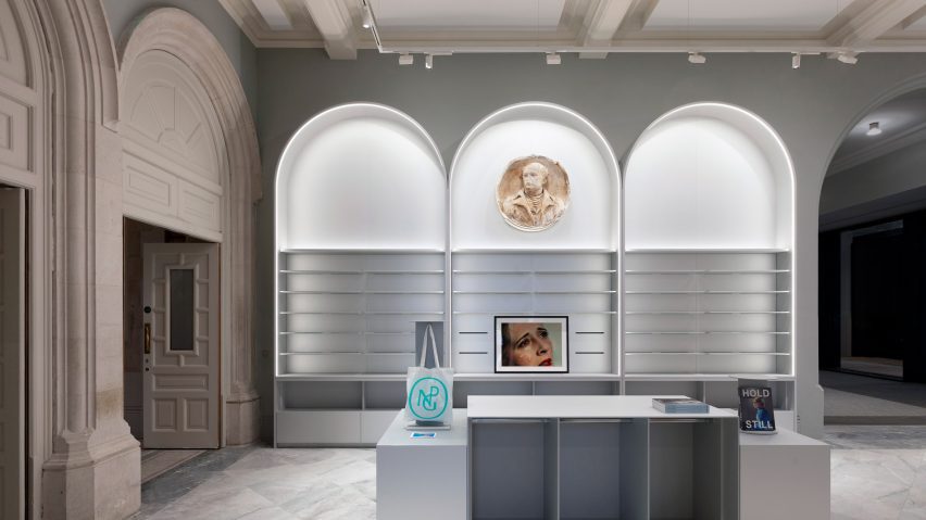
Alex Cochrane Architects designs shops to "embrace the elegant proportions" of National Portrait Gallery
London studio Alex Cochrane Architects has created a trio of museum shops at the recently revamped National Portrait Gallery in London.
Completed as part of a wider three-year refurbishment of the Victorian Grade I-listed building by Jamie Fobert Architects and Purcell, the retail outlets had to be respectful and, where possible, non-intrusive.
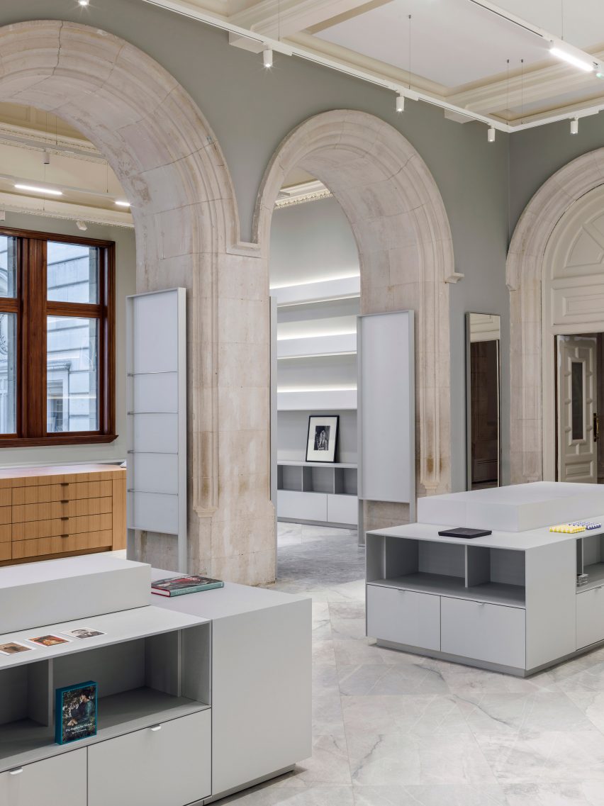
Alex Cochrane Architects worked closely with the lead studios to create a main shop next to the museum's new entrance, and two further shops that service temporary exhibition spaces, that each "brought together the monumental and the intimate".
"The challenge with this project was to design hard-working retail spaces that would provide an inspiring shopping experience while delivering a design that embraced the elegant proportions of the Grade I building," Alex Cochrane Architects founder Alex Cochrane told Dezeen.
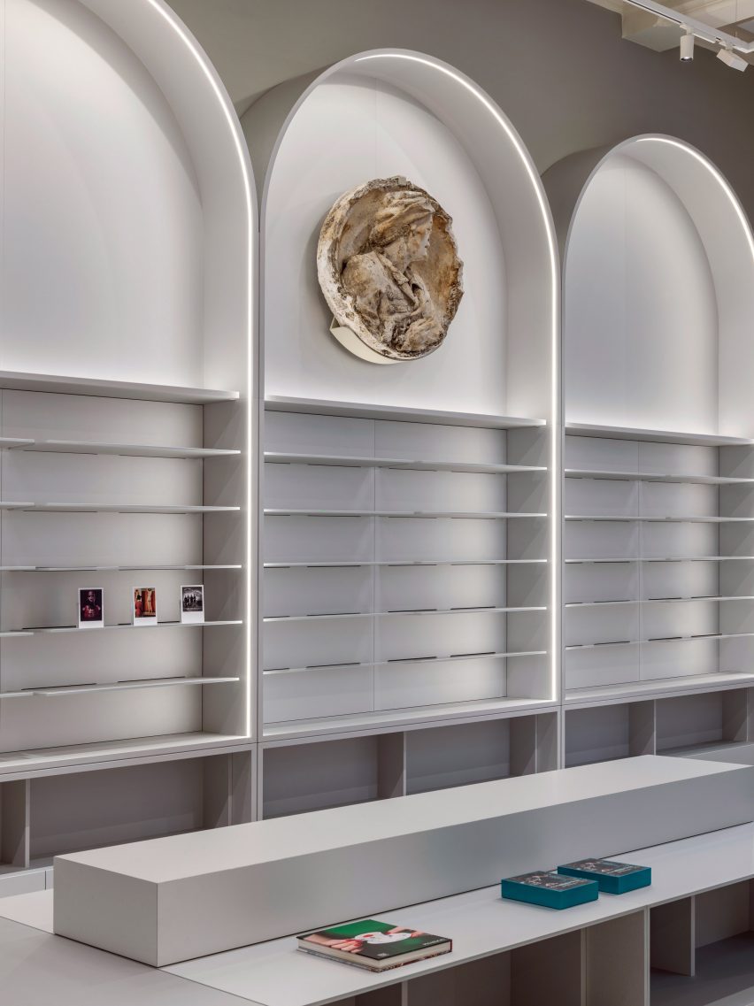
The main shop's two adjoining rooms have impressive ceiling heights of between six and 7.5 metres and Cochrane designed the space to emphasise verticality.
"The best way to celebrate these magnificent heights was for our retail architecture to reach tall and stop respectfully short of the period cornicing," said Cochrane.
"There's an obvious vertical accent to our designs that allows you to look up and appreciate the vast heights and period detailing."
Mindful that their display framework would need to be taller than conventional retail furniture, they have made it deliberately architectural in scale.
"We wanted to celebrate the heights of these two rooms," he said. "We wanted the visitor to look up, as well as ahead. And of course, we wanted visibility from the street."
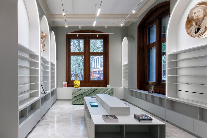
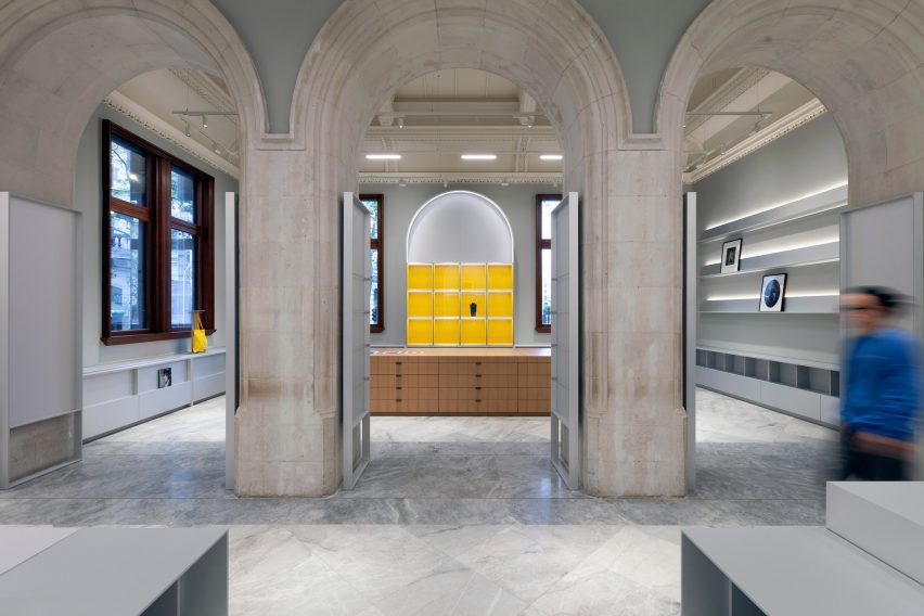
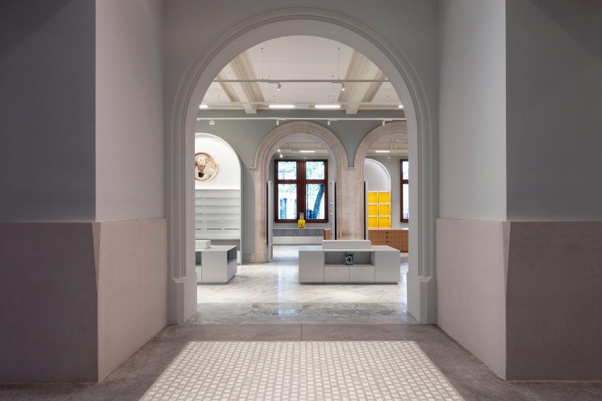
The practice used arched forms in their design, taking their cues from the historical door and room openings within the space and in the wider gallery.
"We repeated the shape of these soaring arches around the room creating a rhythm so all the arches, both old and new, became of a singular and familiar language," Cochrane said.
To bring definition to the space without the need for further structural intervention, he used thin "halos" of light to outline the arches, as well to highlight the large plaster-cast busts that hang within the display arches, increasing the shop's visibility from the street.
The plaster casts, representing the artists Holbein, Chantry and Roubillac, were discovered in the gallery's attic during the refurbishment and are prototypes for the stone versions seen on the rear elevations of the building.
"We love how they are framed in the arches," said Cochrane. "They have a roughness, a texture that compares well with our metallic finishes."
Similarly, an original lantern light in the roof, which had been boarded up for many years, now takes centre stage, amplifying the impressiveness of the space.
Several factors shaped the pared-back material palette of the project.
"The materials needed to be complimentary to those of the period finishes, but also remain easily distinguishable," said Cochrane.
"And we chose our materials in consideration of their low-impact environmental credentials. Local, reusable, recycled, second-hand and certified materials were prioritised, while materials with high embodied carbon and VOCs were avoided."
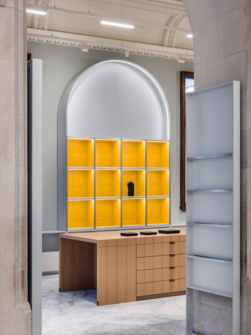
The stone was sourced within Europe, while the signature material of choice was brushed metal, "which is neutral in both tone and colour."
Mindful of the carbon footprint of steel and other metals, Cochrane chose Arper for the metallic furniture because of their innovative and "low-impact" manufacturing processes.
"We favoured matt finishes over polished ones, as they reflect less light ensuring the products remain the focus," he said.
For the first-floor exhibition shop, much of the furniture was constructed in Richlite. Durable and sustainable, it's an FSC-certified material made using post-consumer recycled paper.
For the ground floor exhibition shop the mid-floor furniture was constructed in Linoleum, made from 97 per cent natural materials, that are 30 per cent recycled and 100 per cent recyclable and compostable.
The practice sampled numerous paint colours, settling on Farrow & Ball's 'Lamp Room Gray' for the walls, with 'School House White' on the ceilings.
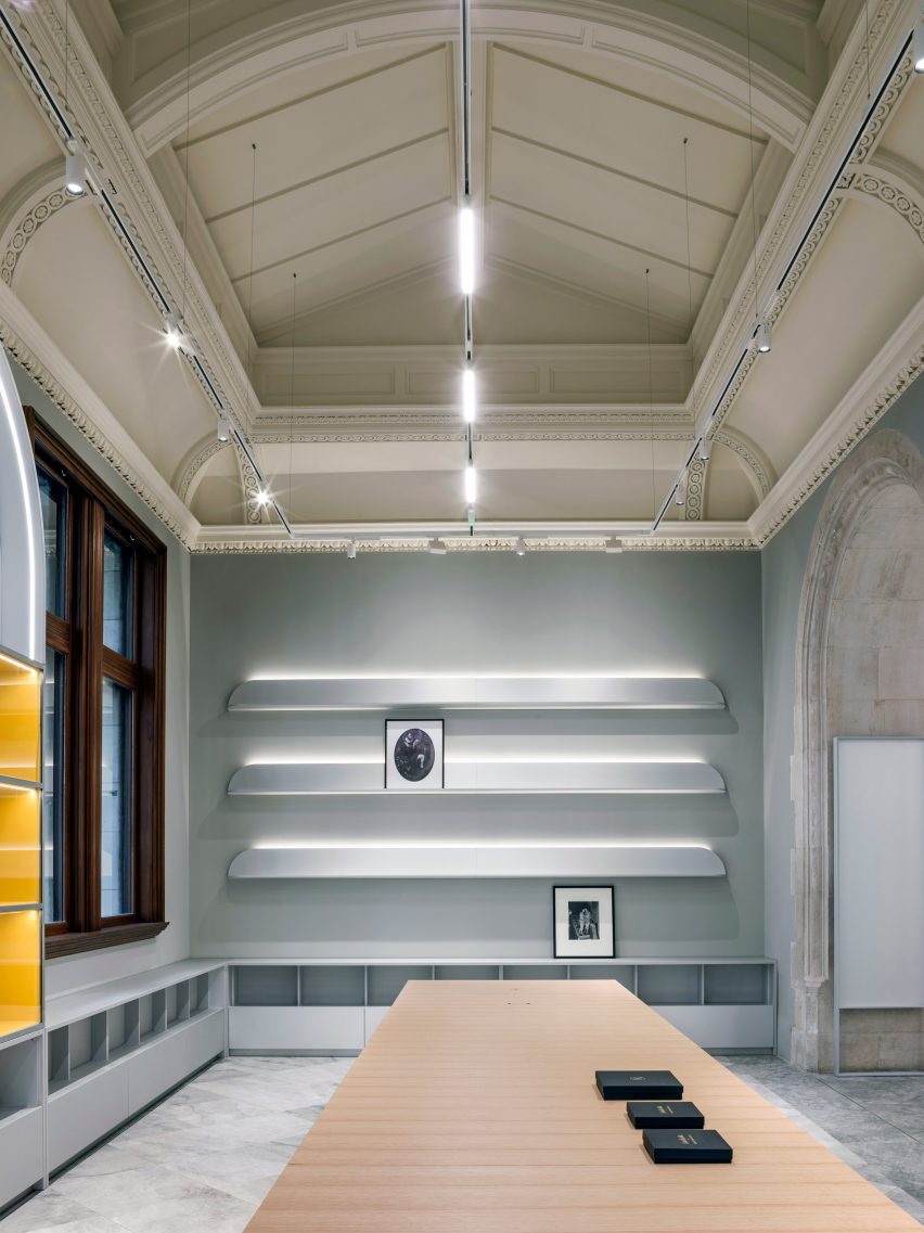
"These colours follow on well from those in the adjacent entrance hall and the east staircase and contrast subtly with our own metallic finishes."
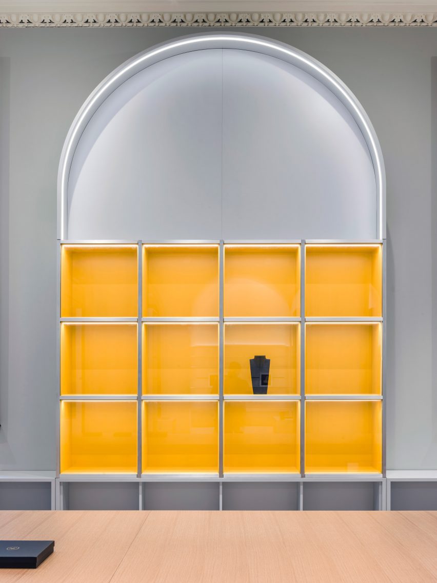
"We wanted to be strategic about using strong colours, as we were conscious that the merchandise would also have a considerable amount of colour."
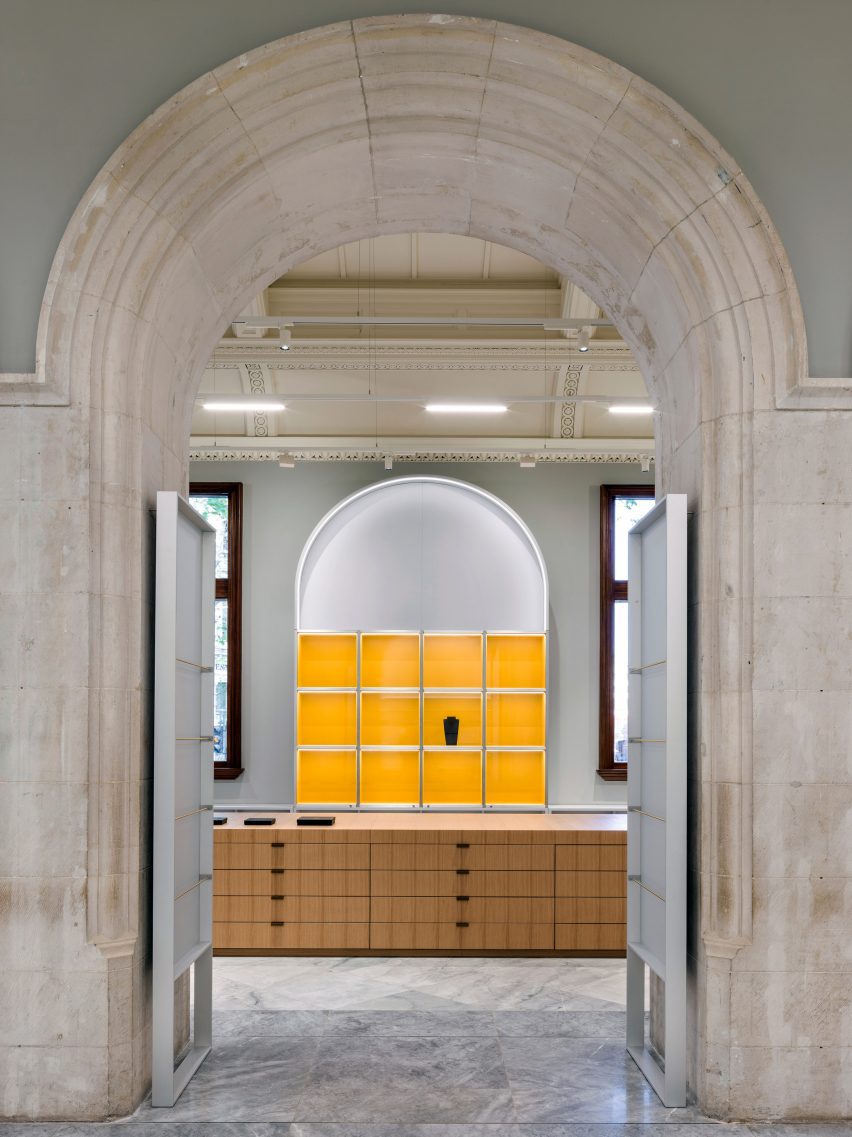
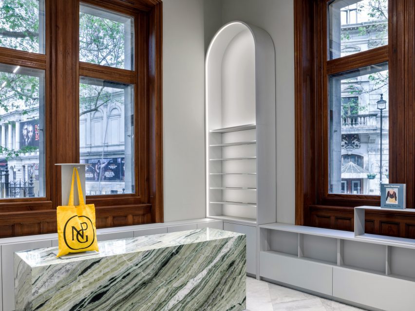
The practice opted to use a vivid colour for the stand-alone jewellery cabinet, centred between the two monumental teak-framed windows, "that could really catch the eye of the passer-by with an invigorating colour".
"We explored different colours, settling on a punchy yellow that we called 'Starling's Yellow' due to the commercial director's love for this colour."
Likewise, Cochrane wanted the payment counter to be eye-catching and used a highly patterned green marble to draw the customer to this end of the space, where there are views out over the newly re-landscaped forecourt and Charing Cross Road beyond.
"As a practice, we are minimalists, with a love for bold colour. We feel colour can really invigorate a room," said Cochrane.
The National Portrait Gallery reopens its doors for the first time this week, following its renovation as well as a wider rebrand. Earlier this year, the museum unveiled an overhaul of its logo by illustrator Peter Horridge based on a sketch by the gallery's first director.
The photography is by Alex Cochrane Architects and Andrew Meredith.