Office S&M uses colour and geometry to create Graphic House in London
Graphic shapes and bold hues define the living spaces of this mid-terrace Edwardian home in east London, overhauled by architecture studio Office S&M.
Aptly named Graphic House, the playful renovation in Hackney makes use of colour and art deco forms that reflect the tastes of its graphic-designer owners.
Office S&M has used the variety of colours to define key moments throughout the house and to highlight the old and the new elements.
The project was recently shortlisted in this year's Don't Move, Improve! awards.
"In this project colours and shapes have been used to help define key moments throughout the house and tell a story about the building's function and history," said Office S&M co-founder Catrina Stewart.
"We drew upon the client's belief in the power of graphics and love of art deco forms, using distinct shapes to connect spaces and bright colours to enhance every room," she told Dezeen.
According to the studio, the house was in poor condition when the owners purchased it, meaning a substantial part of the build budget went towards repairing leaks, removing mould, and fixing holes in the roof.
The studio also made upgrades to the house's external fabric to improve energy performance and reconfigured its internal layout.
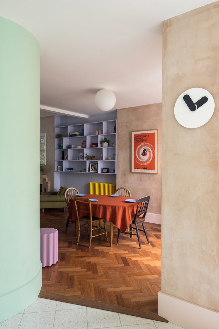
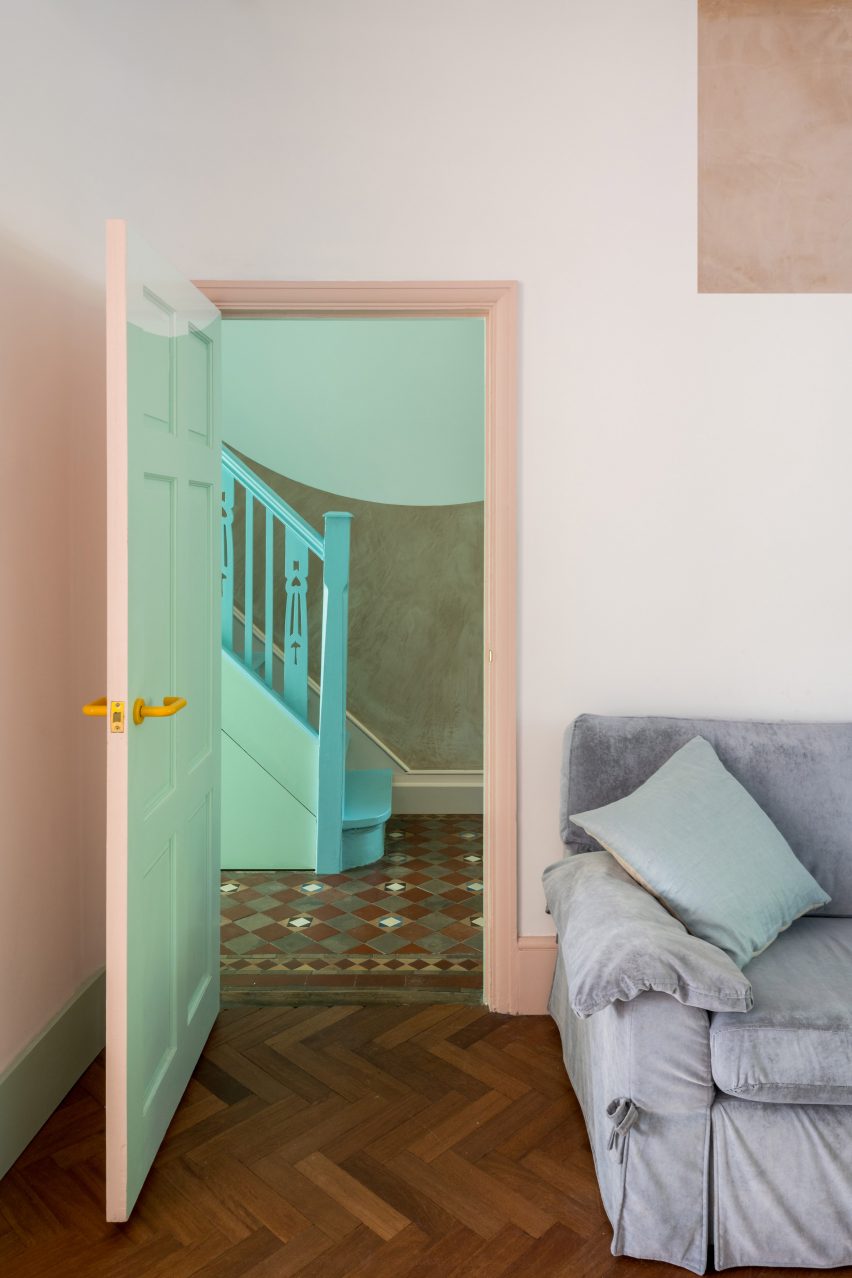
On entering Graphic House, a hallway featuring pink plaster and refurbished ceramic tiles leads to the open-plan living and dining room, which is accented with lilac shelving and bright yellow radiators.
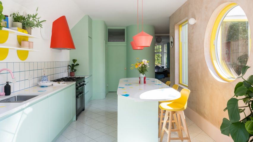
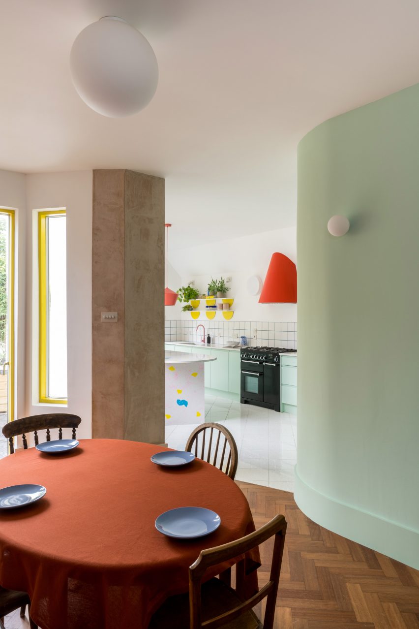
A mint green hue highlights several new elements on the ground floor, such as the curved walls of the bathroom, the cabinetry in the kitchen and the rear garden wall.
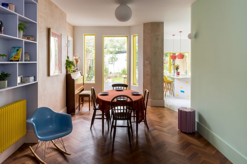
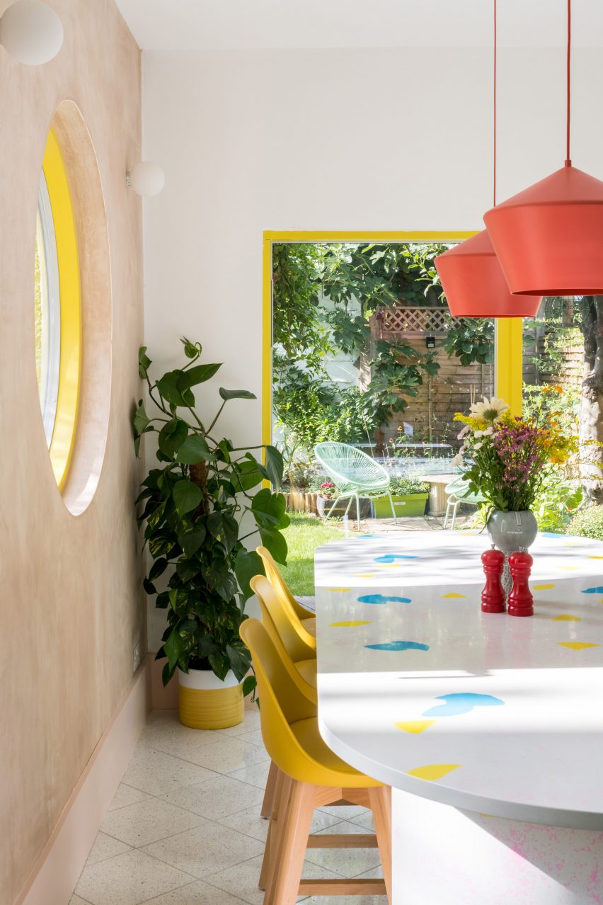
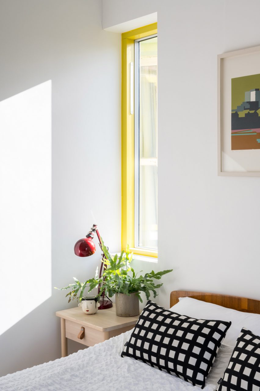
Existing walls that have been restored are left bare, with their pink plaster giving a nod to the house's past and bringing warmth to the space. Meanwhile, a bright yellow is used to mark new window and door frames.
The art deco fireplace has been retained at the request of the owners, who also wanted to see its geometry reflected in the design of the house.
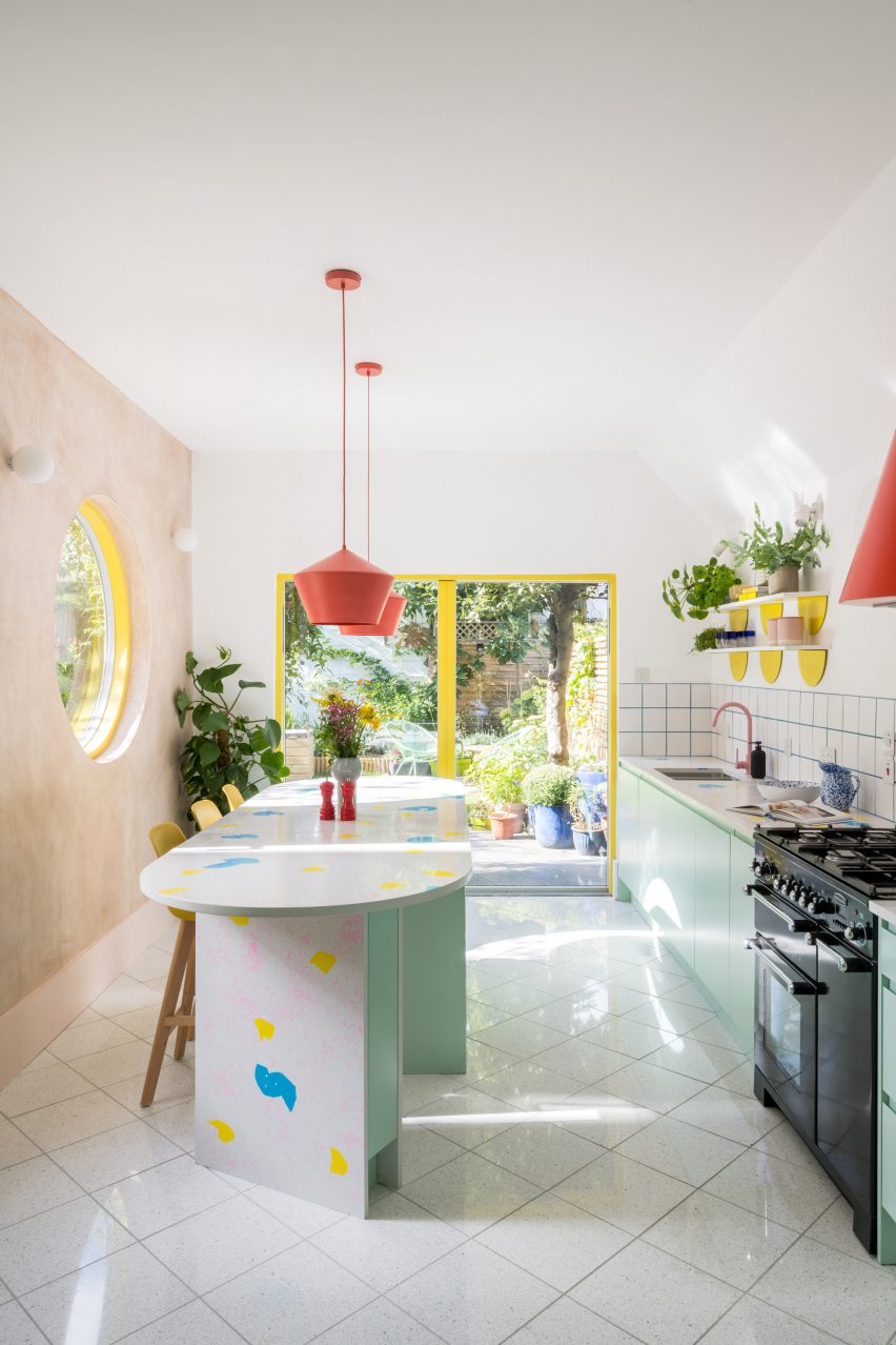
The curved features of the fireplace are echoed in the gentle sweep of the rounded kitchen island and the walls of the downstairs toilet, as well as in the large yellow-framed kitchen window overlooking the garden.
"The kitchen window also acts as a time marker, like the oculus in the dome of the Pantheon in Rome," said Stewart.
"The circle of sunlight will track across the space, recording the passing of time and the seasons," she continued. "When the circle first appears, it announces the beginning of spring, and its disappearance marks the start of winter."
The kitchen at the rear of the house has worktops made from recycled plastic cutlery melted down to form a terrazzo-like finish.
Here, further pops of colour are introduced with furnishings, providing contrast to the mint green and plaster pink walls. This includes a curved red extractor hood and pendant lights.
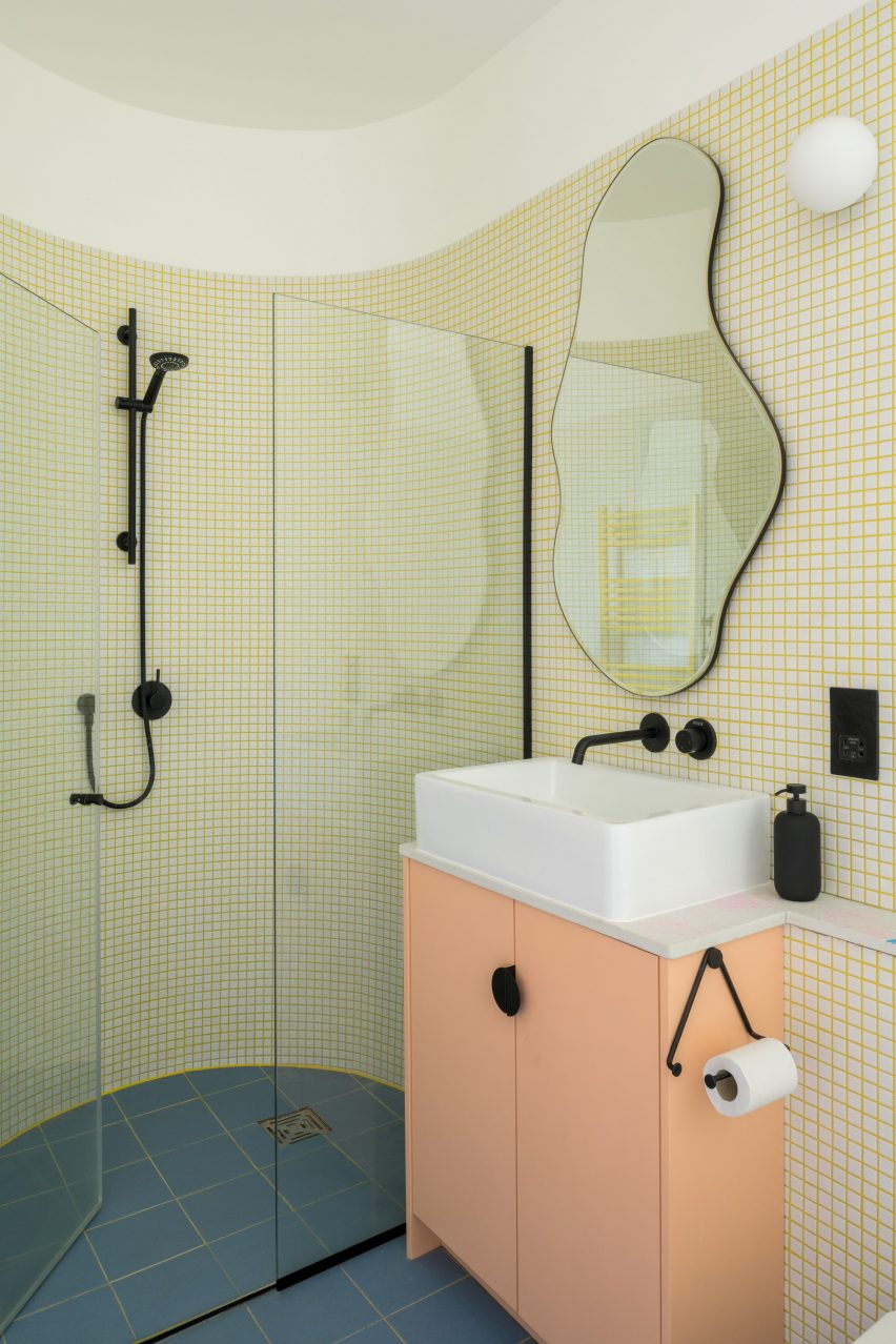
On the first floor, the curves and colours continue in the new bathroom, which has a rounded shower enclosure featuring white tiles and yellow grout.
The approach to Graphic House's interior spaces was, in part, informed by the work of artist Nathalie Du Pasquier, and the way in which she plays with colour and scale, said Office S&M.
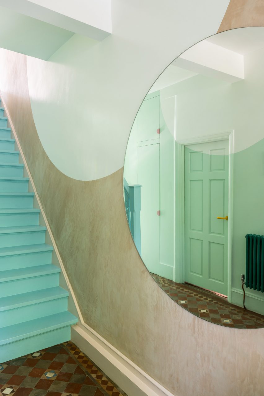
This approach is reflected in the stairwell, where an oversized stair and large white-painted circles contrast with the pale blue and yellow staircase. Large circular mirrors reflect light from the skylight at the top of the stairwell.
"This merging of graphics and architecture, allows us to play with scale and depth in spaces, aimed at encouraging intrigue and discovery," Stewart explained.
Office S&M is a London studio founded by Stewart and Hugh McEwen in 2013. It is known for its experimentation with colour and materials, as shown in its own own office, which features a plastic-bottle wall.
Previous projects include a millennial pink and mint-green house extension and a colourful renovation of a Georgian townhouse in Islington.
The photography is by French + Tye.