Sarah Greenwood and Katie Spencer design "absurd" set for Barbie film
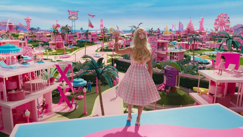
Waterless swimming pools, fridges with 2D food and hand-painted sunsets feature in the set of the Barbie film, production designer Sarah Greenwood and set decorator Katie Spencer tell Dezeen in this interview.
Longtime collaborators Greenwood and Spencer, who have worked together on projects including Joe Wright's 2012 film Anna Karenina, created the set to display an "authentic artificiality".
"Even though it is completely artificial and absurd, it has to be real. You have to believe it," said Spencer via a video call.
"Greta [Gerwig, director and co-writer of Barbie] wanted a world-building film, and that's what we do," she added.
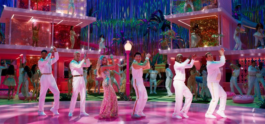
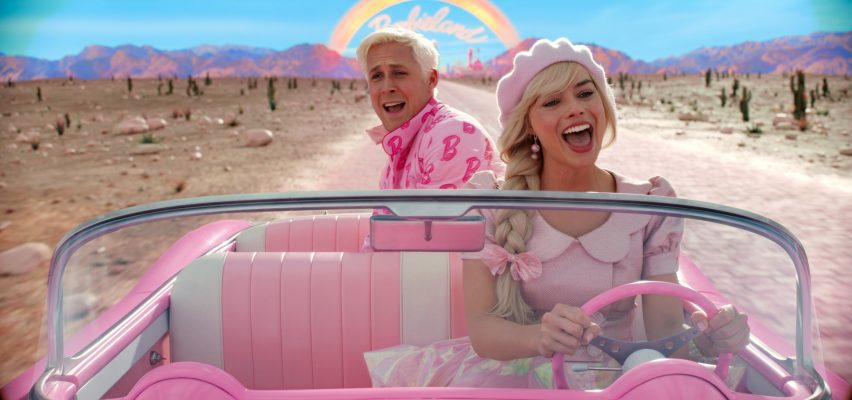
Released in cinemas tomorrow, the highly anticipated Barbie is a live-action depiction of the iconic 1959 Mattel-designed toy doll starring Margot Robbie as Barbie and Ryan Gosling as her boyfriend Ken.
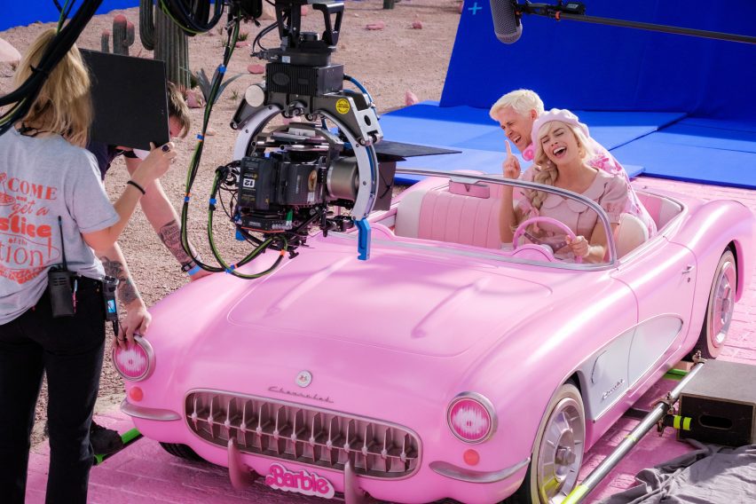
Greenwood and Spencer built the set for Barbieland, which plays a key role in the story, at Warner Bros Studios, Watford, in the UK.
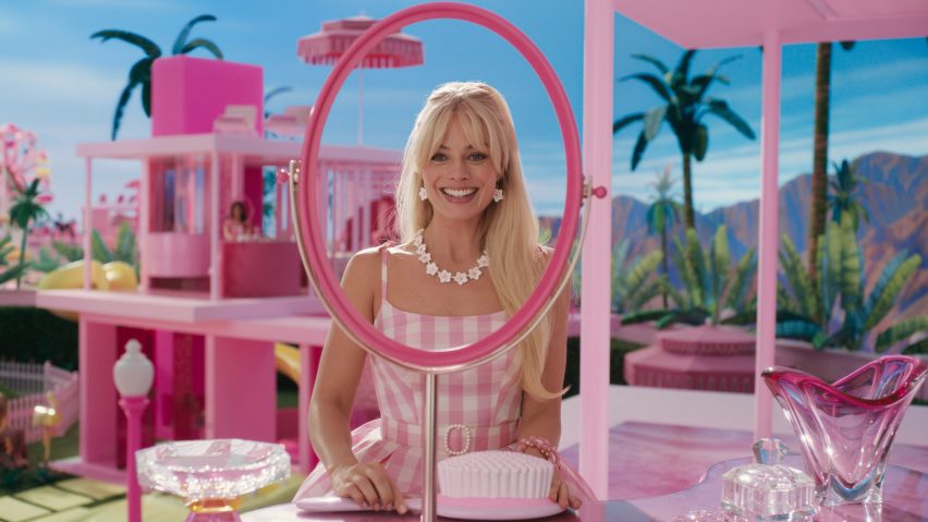
On-screen, Robbie's character lives in a fuchsia-pink house with no external walls that was based on the original 1960s Barbie Dreamhouse as well as architect Richard Neutra's modernist Kaufmann House, built in 1946 in Palm Springs, California.
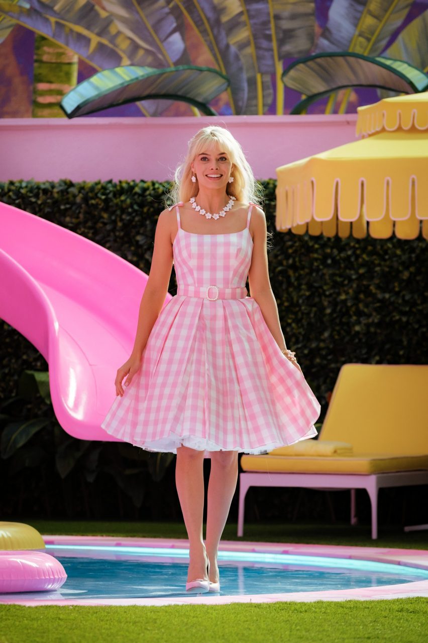
Among the house's design details is a striking spiral slide that leads from the roof to a flat blue swimming pool with no water in it, akin to a toy pool.
"What looks simple was not simple," quipped Greenwood, who explained that everything in Barbieland was made to be 23 per cent smaller in relation to the human actors to mimic the way in which a real-life Barbie doll is always "much bigger than her house even though it's built for her".
Continuing this theme, the designers combined 3D household objects such as oversized hair- and toothbrushes with decal stickers depicting playfully flat food containers stacked in Barbie's pink kitchen fridge.
"It was to try and get to the [idea of] what is it that's 'toy'? What makes it 'toy'?" explained Greenwood.
"If you actually scaled a lipstick to the size of Barbie's hand, kids would lose it," added Spencer.
The duo created various other design elements to reflect the fact that Barbieland is "a world with no air, water or electricity".
Barbie's house features a jacuzzi frothing with static pale pink bubbles made from materials including polystyrene that Spencer and her team suspended on wires to look as if they were frozen in the air.
Hand-painted skies, mountains and palm trees also provided the backdrop for the set, which becomes "two-dimensional" the further back you go, according to Greenwood.
"It's kind of artificially authenticated," she added.
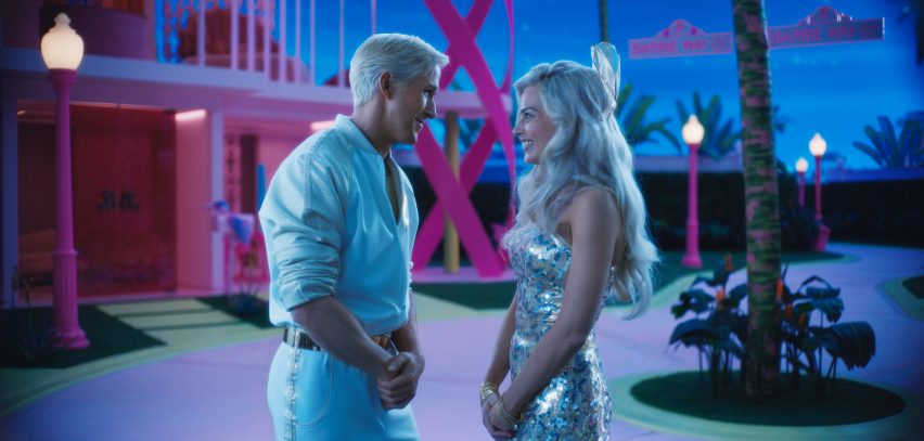
"It was interesting to the eye, watching when Greta came on [set], and the actors – you did feel that they were in a toy world and it was like you were actually in the box," explained Spencer.
"It was like having a bath in colour," she continued, referring to the bright lighting used to illuminate Barbieland. "It was just the most stunning, you know, in the middle of the Watford winter – it was just amazing to be in that world."
Having never owned Barbies as children themselves, Greenwood and Spencer bought a Dreamhouse to examine before building their set, which also features a number of similar houses that belong to the other characters.
When creating blocky, geometric furniture for each dwelling, the duo took cues from the "classic, mid-century, strong shapes" of 20th-century designers such as Verner Panton.
"When you look at the classic shapes, they lend themselves to the silhouette, so when you're looking through the houses and you don't have walls and you've got this landscape beyond, you need a very strong shape that's going to say, 'table' – you don't need any kind of fuzziness about it," continued Spencer.
"And also because there's no electricity in Barbieland, the lamps – particularly his [Panton's] lamps – are so beautiful because they are like toys or sweets," she added. "It has to be appealing. The lamps have to stand alone as shapes, not sources of light."
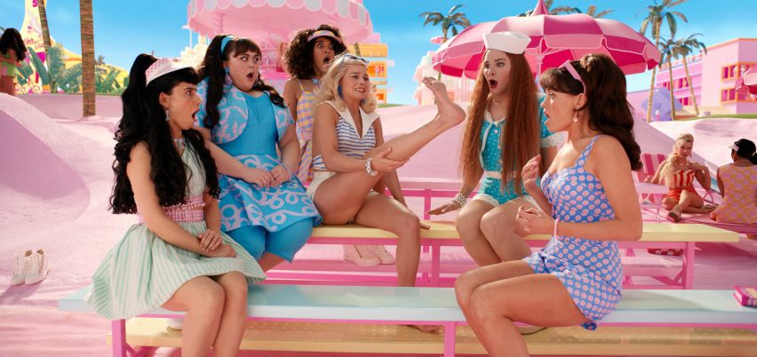
Another playful touch was Barbie's wardrobe of meticulously arranged outfits in the form of a large box with a plastic covering that references toy packaging in a shop.
According to Greenwood and Spencer, their teams worked closely with the wider Barbie crew to unify the film's aesthetic – from costume designer Jacqueline Durran, who created the characters' vibrant garments, to hair and makeup artist Ivana Primorac, who was responsible for Barbie's wide-ranging beauty looks.
"You're making a statement with everything. Everything was doubly considered," reflected Spencer.
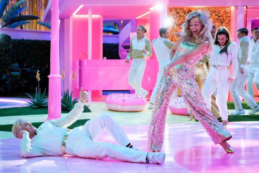
Considering the portrayal of gender dynamics in the film, the duo acknowledged the significance of the Barbie Dreamhouse being released in 1962, during a time when women's financial rights were still heavily restricted in the UK and the USA.
"She had more rights than any woman in Britain or America. She could own her own house, she could have her own car – she didn't need a man to sign anything," said Spencer.
"I was never aware of all that. I only knew the Barbie on the difficult journey we all know about," she added.
"I think the other thing that I never did that this film might do is maybe make it more acceptable to like Barbie, or to like pink, which we spent a lot of time not doing – particularly my generation was very scornful of Barbie in those days," considered Greenwood.
"What's fantastic about the film is that there's nothing nasty in it," she added. "There's a lot of goodness in the film, and without being preachy or anything, it's not twee, but it's great – there are no baddies in the film."
"I suppose the moral of [the film] is that you should be whatever you want to be," concluded Spencer.
"And don't be judged. If you like Barbie, great. And if you don't like Barbie, then great."
In the run-up to the film's release, rental website Airbnb unveiled a lifesize Malibu Dreamhouse in California with an outdoor disco and an infinity pool, while one of our latest lookbooks featured eight Barbiecore-style interior designs.
The images are courtesy of Warner Bros. Additional reporting is by Jennifer Hahn.
Dezeen In Depth
If you enjoy reading Dezeen's interviews, opinions and features, subscribe to Dezeen In Depth. Sent on the last Friday of each month, this newsletter provides a single place to read about the design and architecture stories behind the headlines.