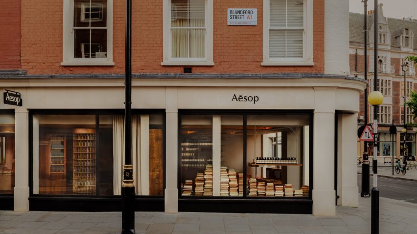
Piles of green-hued books characterise London Aesop store
The interior of London's most recent Aesop store in Marylebone was organised to reference a bookshop and features bespoke timber cabinetry by furniture designer Sebastian Cox.
Skincare brand Aesop's in-house design team created the concept for the Marylebone store, which recently relocated from its original home in the London neighbourhood to Marylebone High Street.
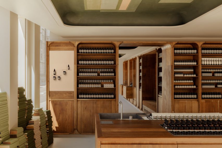
The team took "material references" from the British Library on Euston Road and attempted to emulate the layout of traditional bookshops by choosing warm timbers and towering piles of pale green books to decorate the interior.
Divided into a main shop and an area for personal skin consultations, the L-shaped store features handmade cabinetry by Cox throughout.
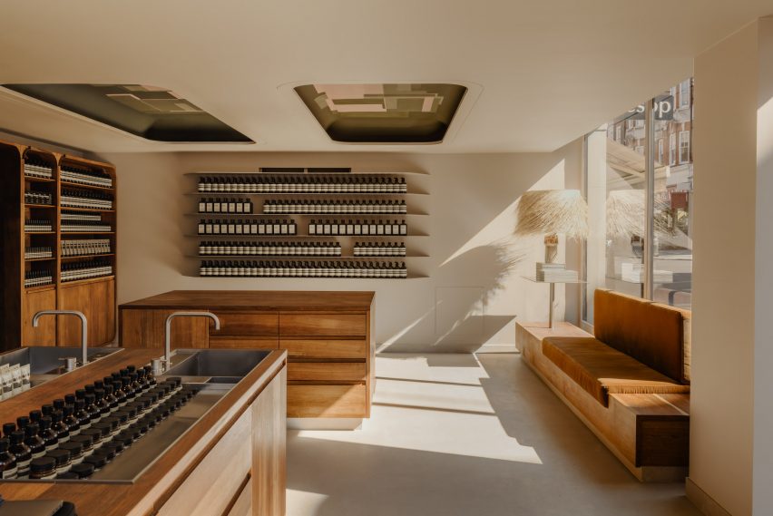
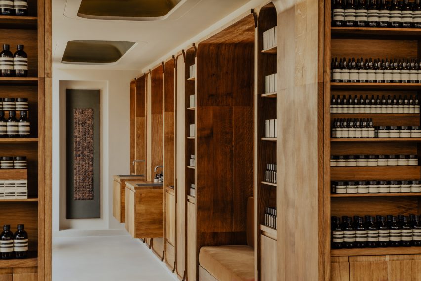
The shelving is defined by gently rounded edges, which Cox crafted from lime-washed oak and stained with linseed oil to enhance the timber's warm appearance.
He designed the cabinetry with flexible joinery that would allow the furniture to be disassembled and transferred elsewhere if needed.
Oversized rattan lampshades were also chosen for the main shop area, which displays uniform rows of Aesop products and includes large, metallic communal sinks built into the timber cabinetry.
The store's also features ceiling troughs with custom-made geometric frescos by artist Olivier Cousy.
Cousy was informed by Marylebone's many green squares when painting the designs, which are geometric arrangements of autumnal colours – compositions that take cues from expressionist artist Paul Klee's 1922 work Tower in Orange and Green.
"Architecturally, our design method is to connect to the context of the locale, weaving ourselves into its fabric," said Aesop chief customer officer Suzanne Santos.
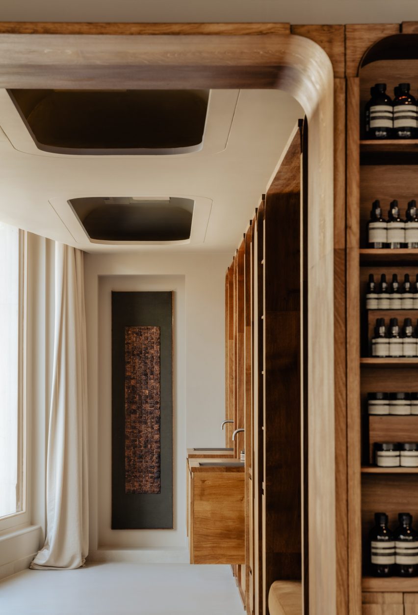
In the skin consultation area, a sandy-hued, floor-to-ceiling curtain can be pulled to give customers privacy while geometric timber sinks were built into the space's cabinetry.
Known for its array of stores that pay homage to their individual locations, Aesop's other outlets include a branch in London's Piccadilly Arcade with marble fixtures that filmmaker Luca Guadagnino designed to reference the area's jewellery boutiques, and a Cambridge store by British studio JamesPlumb with hemp and bulrush accents that nod to the nearby River Cam.
The photography is by Alixe Lay.