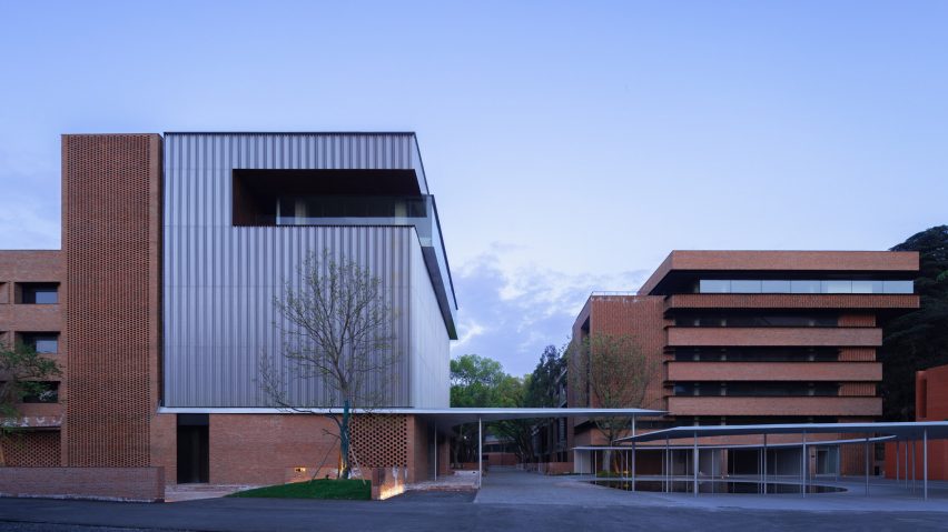
Mix Architecture refreshes Nanjing Combat Machinery Factory with red brick extensions
Chinese studio Mix Architecture has turned a disused 1950s factory into an updated office and public park in Nanjing, China.
Named Nanjing Combat Machinery Factory, the new development builds upon a 1950s factory in the north of the city.
The building was abandoned by its occupants, a machinery manufacturing company, towards the end of the century.
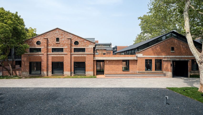
Aiming to honour the site's industrial heritage and enhance the presence of nature across the site, Mix Architecture paired a series of new brick buildings with the existing factory structures, adding a curving canopy and areas of planting to the outdoor spaces to bring new life to the site.
"The site is the marginal zone between the city and nature, and is not known by people in the city," studio co-founder Ziye Wu told Dezeen.
"We hope to regain its impression in this city and try to balance the relationship between the city, nature, and historical relics as much as possible."
Mix Architecture's development follows a series of previous attempts to revitalise the factory, including a 2006 intervention that stripped the building of its industrial character.
"In 2006, attempts were made to renew the factory, hoping to reopen it as a creative industrial centre, but the building failed to attract attention," said the studio.
"After the reconstruction, new walls were built, bricks were paved, and the whole building was painted, thus covering up its industrial memory."
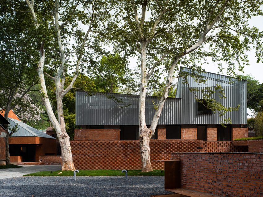
To bring life back to the site, the studio aimed to update the Nanjing Combat Machinery Factory by exposing the original brickwork.
It also created a local park with an office at the centre to house the headquarters of the building's owners, Nanjing Construction Machinery Works.
As well as highlighting the site's industrial past, the studio preserved existing elements, including the trees across the site and parts of the seventeen existing factory buildings.
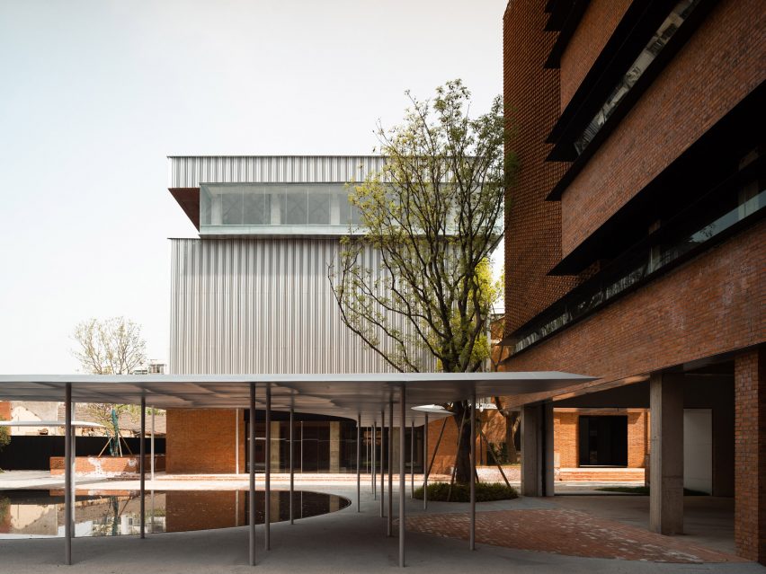
"There are seventeen buildings in the factory area, all of which had different preservation conditions," said Wu. "We have undergone varying degrees of reinforcement and renovation, with a small amount of demolition and structural replacement carried out."
The existing red brick buildings informed the design of the new elements on the site, which range from short brick walls to extensions characterised by unique patterns of brickwork.
"For the building itself, only a small portion was expanded and added," said Wu. "Most of the new elements are derived from the old space, and the colour red emerged as a theme of the renovation and a primary characteristic of the factory. "
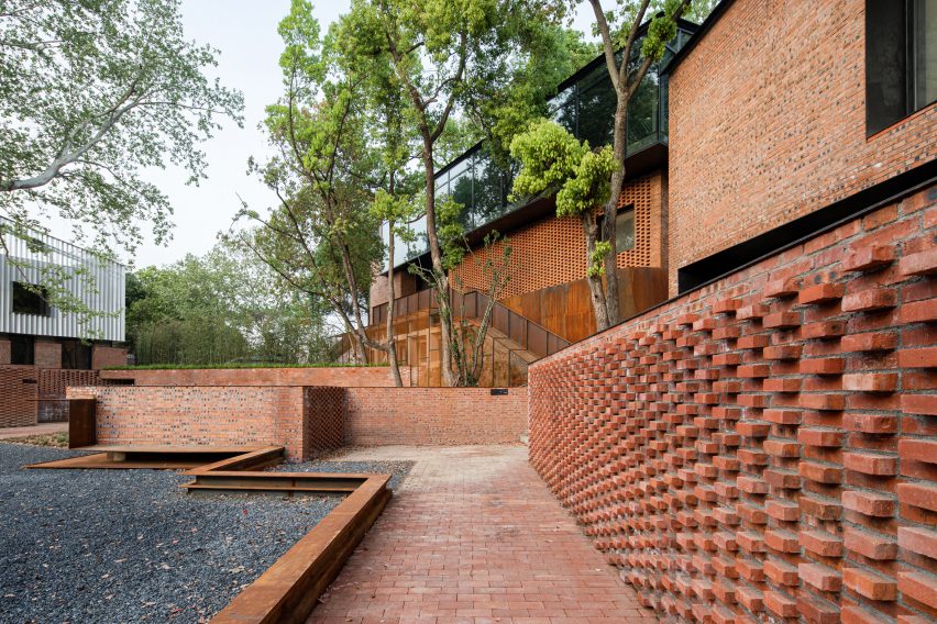
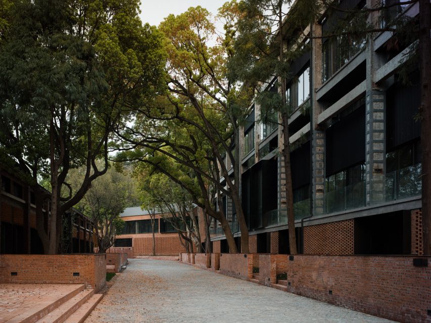
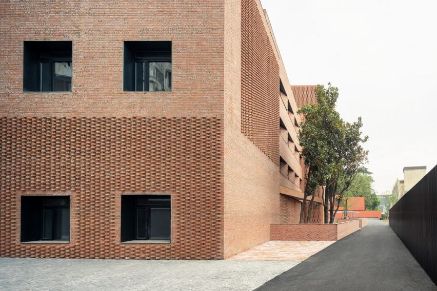
Decorative patterns formed from red bricks have been added to the courtyard walls and the facades of the buildings, with the studio leaving voids between bricks or mingling old and new materials to add a unique quality to each of the buildings.
"The initial source of the pattern of bricks was the most basic construction requirements, such as the need for gaps between bricks because there are opening fans with fire and smoke exhaust requirements behind them," said Wu.
"The fish-scale-shaped bricks have a significant impact on the facade's appearance due to the significant difference between the new and old bricks, allowing us to balance them in a unique way."
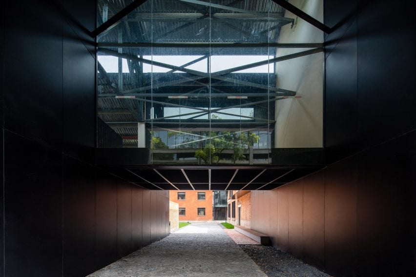
Other additions add a more modern touch to the site, including a boxy glass extension that sits on top of an existing brick building, and a black box that connects two brick volumes.
Across the landscape, walls and steps made from red bricks border courtyard areas around each of the buildings, while areas of brick-lined paving help nod to the industrial heritage of the site.
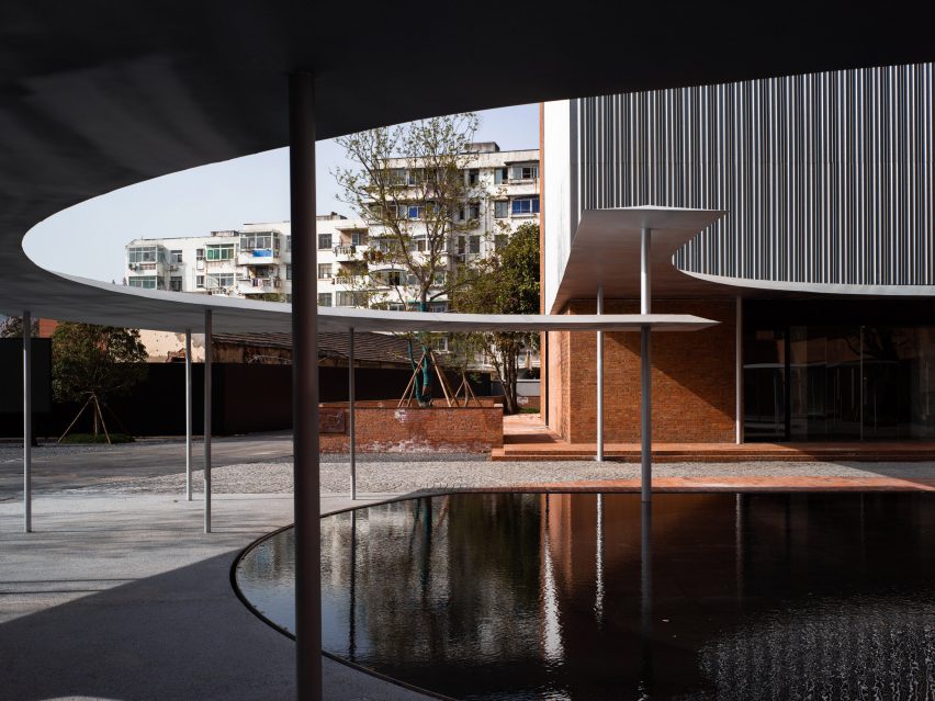
At the entrance of the Nanjing Combat Machinery Factory, a sweeping metal canopy extends from one building and wraps around a central pool.
Supported on a series of columns, the canopy was designed to invite the public into a park-like space on the site and is formed from two curving elements set at different heights.
"The curved canopy breaks the overly tall and oppressive volume of the entrance building, allowing people to unify and experience the site on a smaller scale," said Wu.
"At the same time, the contrast between the lightweight columns and the thick red brick walls also showcases the evolution of the factory building from the thick history to the light future."
Other factory renovations recently featured on Dezeen include an office built within an existing biscuit factory and a Copenhagen exhibition hall added to a woodwork factory.
The photography is by Haiting Sun, Xiaobin Lv and Arch-Exist.