Le Cube by Yves Béhar
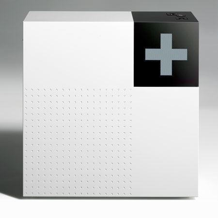
Designer Yves Béhar of Fuseproject has unveiled Le Cube, a TV receiver, remote control and graphic interface for French broadcaster CANAL +.
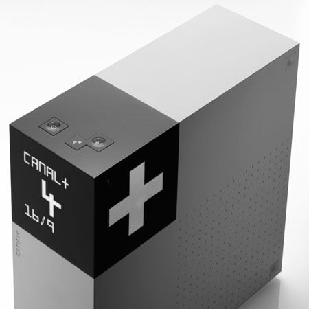
Designed , Le Cube's design and user interface is designed to make consuming its services easier and more enjoyable.
See a movie about Le Cube here.
The following is from Yves Béhar:
--
DESIGN STATEMENT
This game-changing TV experience project is a rare feat of innovation in an industry content with sameness. From the very start, CANAL+ chose to challenge the status-quo: as my team and I at fuseproject were completing the One Laptop Per Child, CANAL+ came all the way to San Francisco to work with us on something that had to be very useful and innovative.
These are the very projects my fuseproject studio is specialized in: exploring new technologies and designing them into a humanistic experience that is relevant for today.
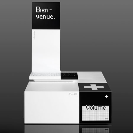
LE CUBE, was a chance to make the typical “dumb” receiver, smart and beautiful at the same time. In order to do so we had to conceive of the receiver box, the remote, and the CANAL+ TV graphic interface at the same time: the integrated system brings information, personal preferences and communication to the living room before one has turned-on the TV.
LE CUBE is the first step in bringing the new capabilities we have come to expect from cell-phones, computers and the Internet, to the way we interact with our television.
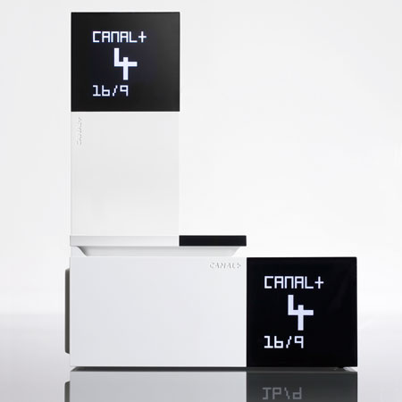
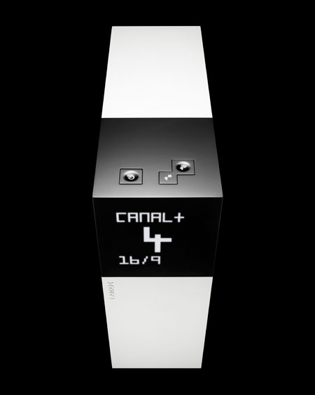
Le Cube functions beyond just entertainment, the backlit graphic can display a show, recording and other useful daily information without turning-on the TV.
Typically, TV receiving boxes are devoid on easily understandable function, and are “in the way” of the actual television experience. This is the paradigm CANAL+ and the designers at fuseproject want to change: for LE CUBE, well integrated technologies AND design are converging the experience, a true departure. CANAL+ programs are watched by millions of French and European TV viewers, with a strong emphasis on quality and intelligent programming. I grew-up in francophone Switzerland, so for me to be able to create a new experience that is both visual and tactile for such a large and familiar audience is a dream realized.
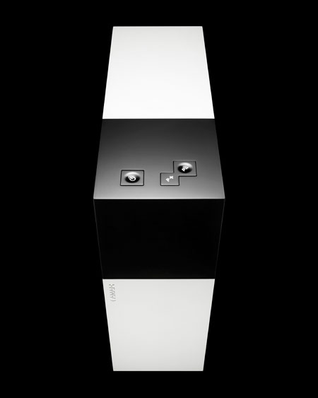
THE DESIGN DELIVERS A NEW INTERACTIVE EXPERIENCE:
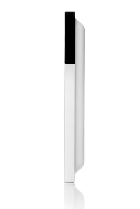
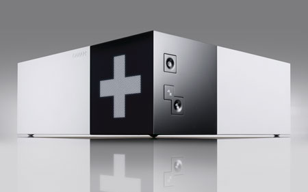
The design of the black square interactive area was not a style exercise, but actually is a precise 128x128 pixels LCD display allowing unique animations and an automatic brightness adjustment to the environment. The decoder is designed to be used in either a horizontal or vertical position; this was done through the implementation of a gyroscopic sensor to automatically orientate the information displayed in the appropriate position.This satellite decoder with Ethernet connection allows innovative “rst to be launched in France” services such as Video On Demand, Catch’up TV, and an Advanced Electronic Program Guide that will automatically match viewer preferences.
LE CUBE DESIGN LANGUAGE IS INTEGRATED WITH THE NEW TV USER-INTERFACE:
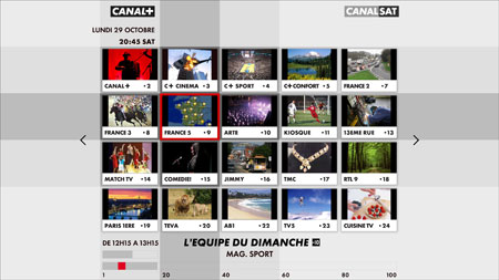
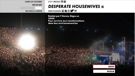
The Le Cube design consistency is carefully applied on the digital user interface. It is a rare feat for both the hardware design, and the on-screen UI to be designed from the same point of view: White, black and translucent graphic blocks highlight different information hierarchy, while the principle of “information zoning” is the heart of the design. The top left zone is always the main header, while the bottom right zone is always the navigation window. This easy to understand logic of zoning is constant through the 600+ pages of user interface.
From a graphical standpoint, the Canal+'s signature typography is used throughout in bold types, making the UI easy to read from a distance. The translucency element helps navigation while still showing TV shows in the background.
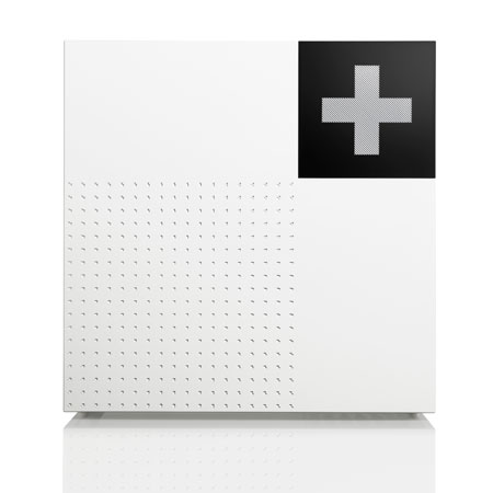
UNIQUE & WELL INTERGRATED DESIGN FOR HOME
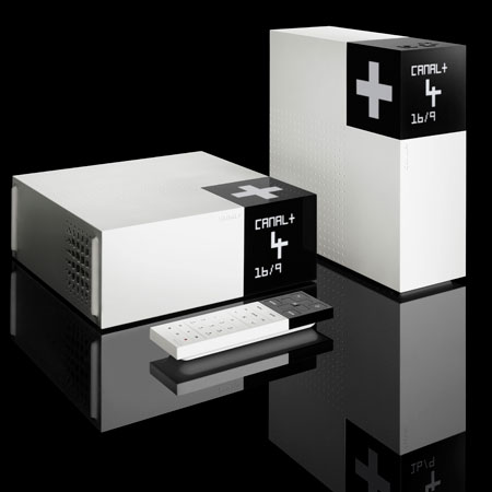
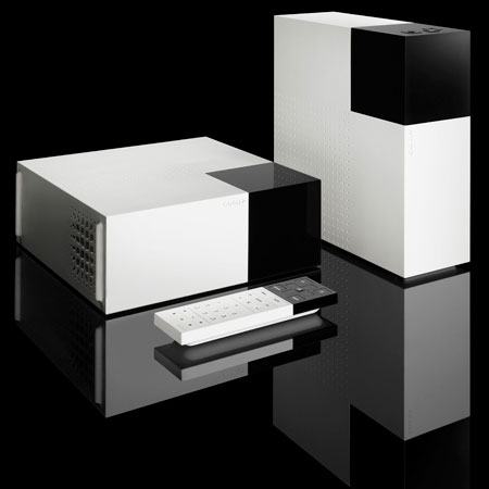
How do you design something different to refltthe unique identity of CANAL+, and yet build a contemporary visual simplicity that ts in our homes? Le Cube from Canal+ is designed from every angle; the details are tuned down to the smallest texture and vent holes. Its’ versatile horizontal and vertical orientations allow the unit to neatly t in any environment. In particular the vertical orientation is the most space efcient with a smaller footprint: it leaves more room on your shelf for other things.
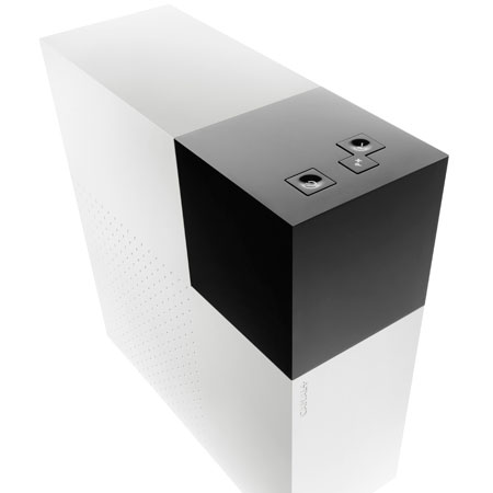
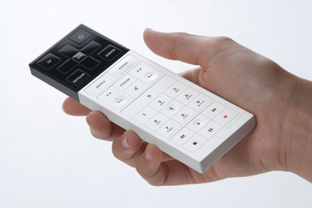
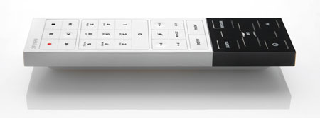
The receiver is designed for utmost simplicity: monolithic from a few feet away, yet highly detailed with aesthetic and functional surprises upon closer inspection. The finish was considered for both its beauty and durability. Le Cube STB and its Remote Controller are designed as a family, high contrast palettes along with strong clean geometry. The remote has a soft sculpted back surface for comfort. On a functional level, the soft back surface also "levitates" the remote from the ground, making grabbing the remote very easy. The key layout is divided into two zones, the Navigation zone is located in the black gloss area and the Control zone is located in the satin white area. And with its high contrast finding your remote is easy. The Le Cube is designed to be aesthetically pleasing and to encourage the user to leave it out for display rather than hide it in a cabinet.
THE DESIGN IS ENVIRONMENTALLY RESPONSIBLE:
Le Cube is specially designed and engineered for re-use by CANAL+, as to serve more than one customer: it is disassembled and refurbished after it’s first use, the exterior can be repainted, and the internal components can be upgraded before it is shipped to the next TV viewer. This green re-use approach to the product has tremendous environmental benefits.
