LMN Architects connects learning centre with aluminium walkways
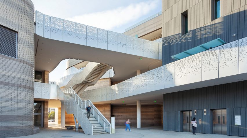
Seattle-based studio LMN Architects has created a university building in Santa Barbara, California, with two separate volumes connected by a series of walkways clad in perforated aluminium.
Called the Interactive Learning Pavilion, it is the first classroom building to be built on the University of California Santa Barbara's campus in more than 50 years.
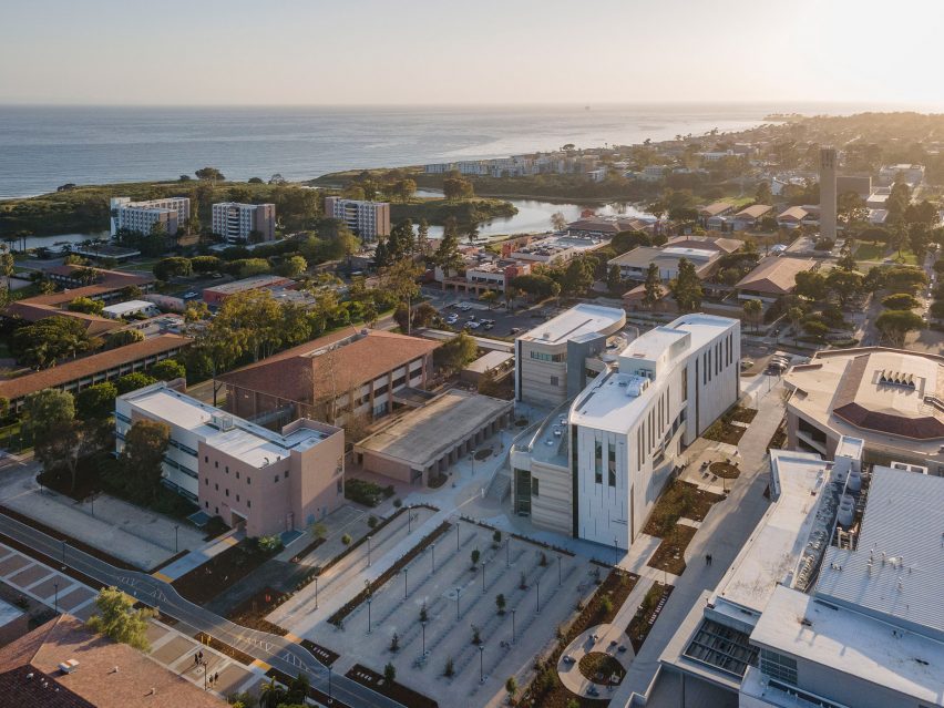
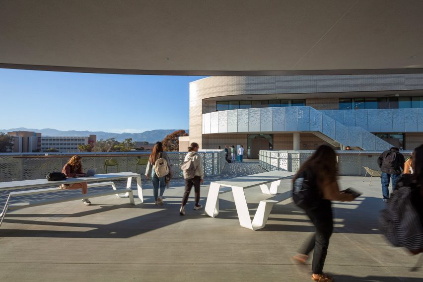
The structure consists of two buildings facing one another to create an open-air breezeway or "paseo", lined on either side with ramps and terraces.
According to LMN partner Stephen Van Dyck, the pavilion was created to be a connector between different parts of the campus, in line with the Long Range Development Plan.
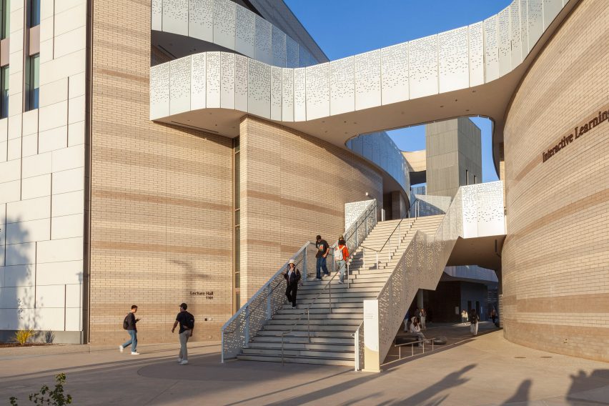
"The site, configuration, and design of the building represent a major step forward towards the goals of the University's Long Range Development Plan, anticipating the eventual extension of Library Mall to the south and realizing the eastward extension of Pardall Mall," said Van Dyck.
"The building represents both an advancement of this master plan vision as well as a contemporary reimagination of vernacular courtyards, terraces, and paseos."
The facades of the building were informed by the geology of the area, specifically the "Southern California seaside context" according to LMN.
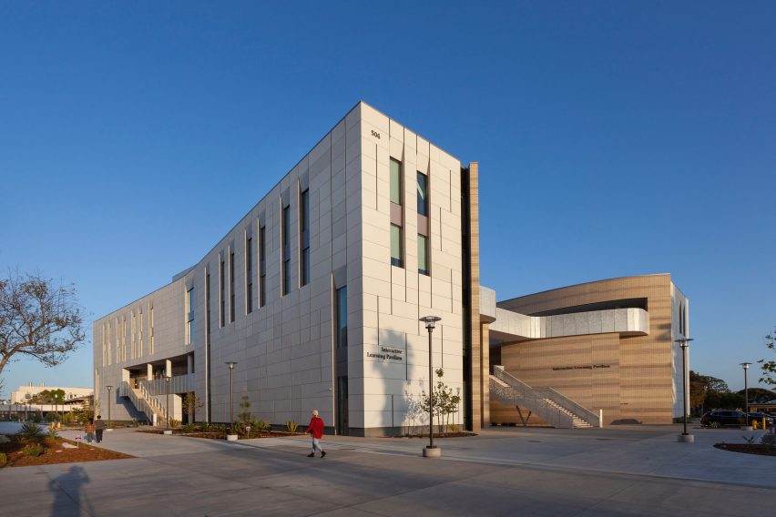
This geologic approach resulted in two very different facade characteristics. The outward-facing facade is covered in smooth grey concrete panels and windows that create a "taut" effect, while the inward-facing facades have a "loose, organic formal language".
Layers of different shades of brick line the four-story structure's two volumes, with curving walls, bridges, ramps and terraces, creating a canyon-like effect.
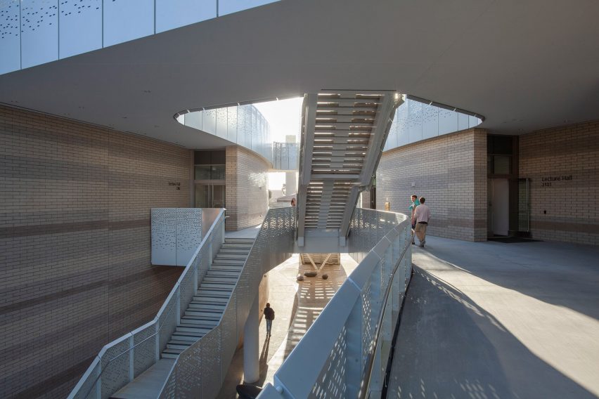
"The resulting formal and material qualities of these spaces take inspiration from the local vernacular architecture and the adjacent seaside cliffs, recalling the sedimentary sandstone in its curvilinear, polished concrete block walls," said the studio.
However, according to the studio, the structure's organicism was also informed by the need for efficient classroom layouts.
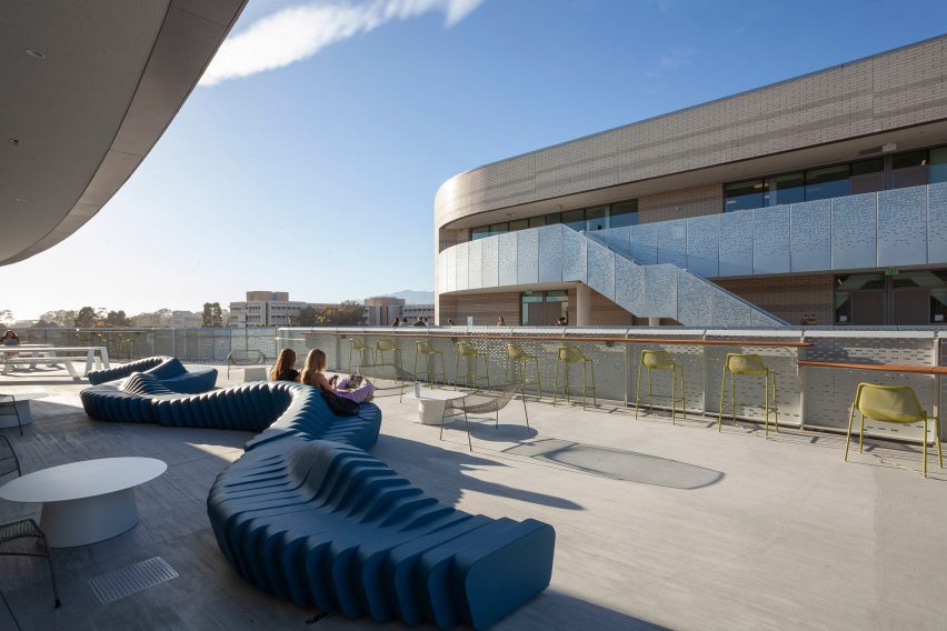
The open-air interior causeway and stratified facade allow for generous light in the educational spaces and provide for the easy outdoor and indoor circulation of students between the spaces.
The program includes three lecture halls distributed across the ground floor and two lecture halls located on the second.
The remainder of the second- and third-storey spaces were filled with study halls and smaller classrooms.
Interior colour palates for the classrooms were also informed by geography, with the pigments of the Channel Islands replicated in colour blocks of the otherwise neutral interiors.
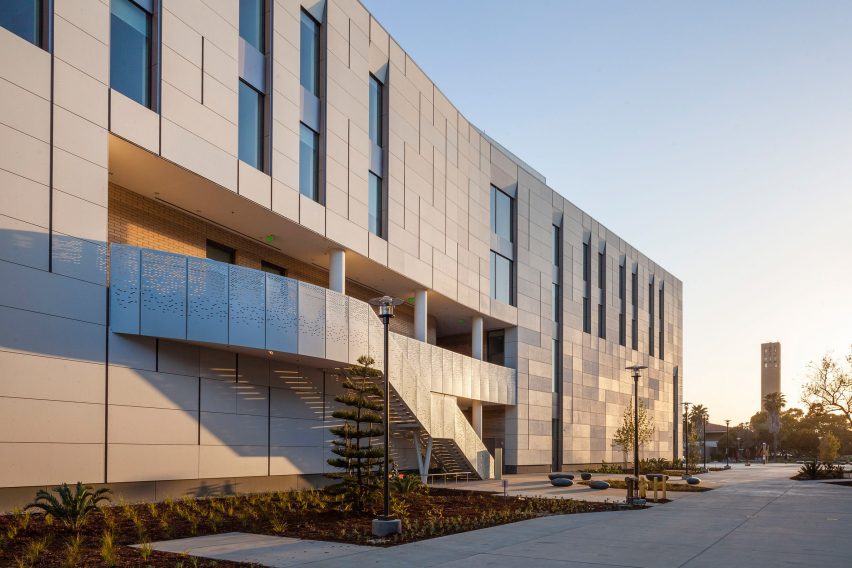
"We integrated natural light into every classroom and the upper floors offer contemporary learning environments with expansive views of the lagoon and ocean," said LMN principal Jennifer Milliron.
"The result is a building that we believe captures the essence of the campus and its surroundings."
LMN Architects was founded in Seattle in 1979. The studio recently completed a convention centre in Downtown Seattle as well as an extension to an Asian art museum.
The photography is by Patrick Price.
Project credits:
Architect: LMN Architects
Consultant: UCSB Design & Construction Services
Project contractor: C.W. Driver
Structural: Saiful Bouquet
Civil engineer: Stantec Consulting Services
Landscape architect: Arcadia Studio
MEP, lighting & sustainability: Integral Group
Acoustic, AV & IT: Arup
Environmental graphics: Entro
Wind: RWDI