Delve Architects designs "nurturing but playful" nursery in east London
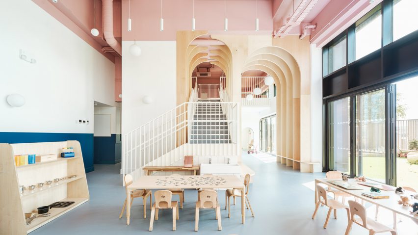
English practice Delve Architects has used joyful colours and natural, tactile materials to outfit a newly established kindergarten by the River Thames in east London that can be accessed via boat.
The Nest daycare centre is part of a wider housing development in the Royal Wharf area, occupying a commercial unit at the base of a 19-storey housing block.
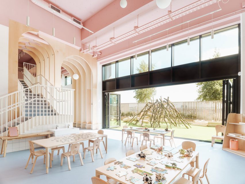
As a result, the primary challenge was to bring the towering newbuild space down to child scale and make it feel more homely while forging a greater connection to the riverfront.
"We wanted to create a calm, nurturing but playful space that reflected the values of the nursery," Delve Architects co-founder Alex Raher told Dezeen.
"Their ethos is for children to have a positive learning experience through a healthy relationship with the environment around them and a connection to the outdoors."
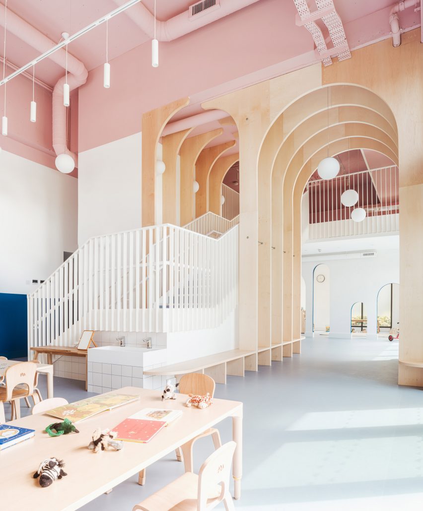
To boost the internal floor are, the studio installed a new mezzanine with a bespoke, powder-coated metal staircase that rises through a double-height space defined by a series of arched timber fins.
These maple-veneered arches – each around 4.5 metres tall – were conceived by Delve Architects to subdivide the space, creating zones without physical barriers.
"We wanted to connect the spaces visually and physically between the mezzanine and lower level, and to soften the hardened edges of the space," said Raher.
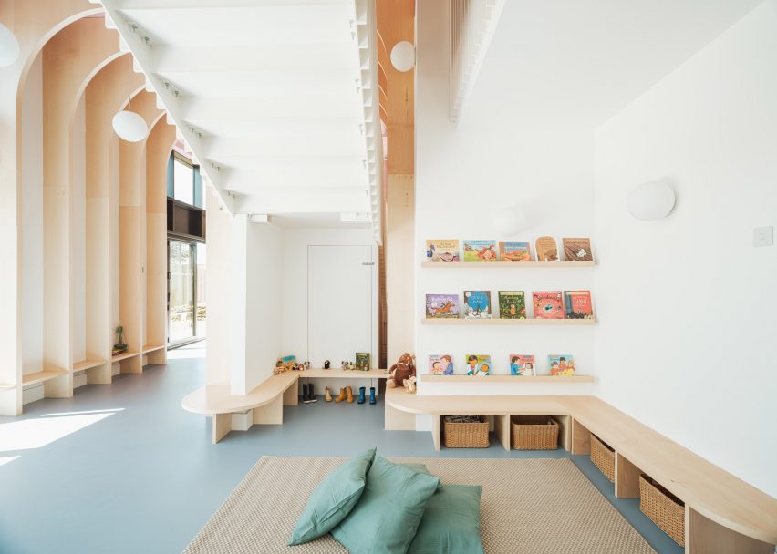
The arches are formed from a series of fins that merge into benches and individual seating as they approach the ground.
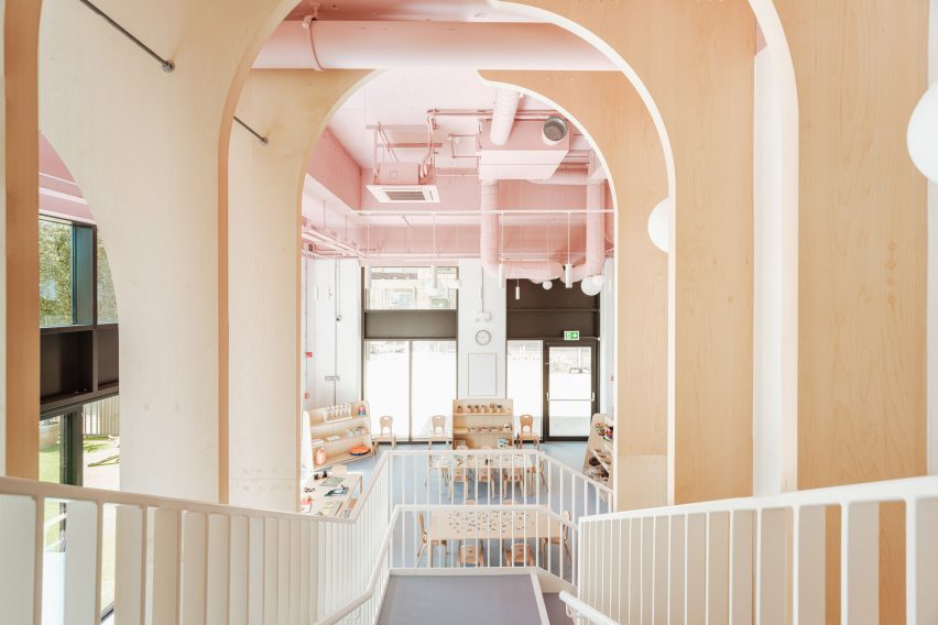
"The grand scale of the arches for a small child could feel overwhelming, so we brought this down into child-height seating, benches and joinery to play with the scale and make it more familiar to them," said Raher.
"The material flows seamlessly between the two levels and creates a natural material palette that the children could recognise and read through different heights and spaces."
The arches also span over the main staircase, where Raher says they suggest a canopy of trees.
"We wanted it to be a centrepiece that was exciting, functional and exploratory, almost like a meandering joinery up to a treehouse-style level on the mezzanine, through a network of arches and branches on the way," the architect explained.
"One of the first concepts we explored was the treehouse idea, developing ideas around the nursery name The Nest and how we could bring a playful part of nature into the design."
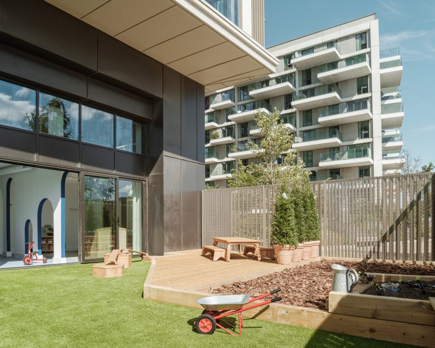
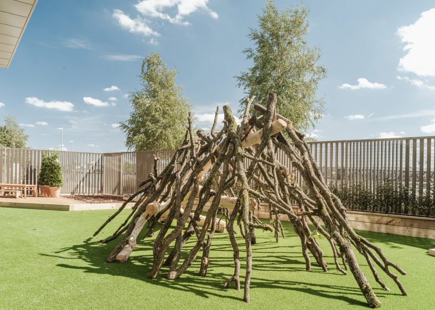
Given its inner-city location, the nursery is fortunate to have a large garden overlooking the riverfront, which is connected to the nursery via a double set of six bi-folding doors.
The external fencing was designed by Delve Architects "to merge with the rhythm of the existing tower's balconies" and powder-coated in a matching colour.
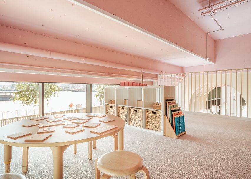
"We wanted to celebrate the connection to the outside space, the riverfront location and the child-height views from the mezzanine to the water, as it was unique to the space and to the nursery setting," said Raher.
"Children can arrive and parents can commute using the river boat directly outside the nursery. The new pier designed by Nex Architecture is a beautiful backdrop to the site."
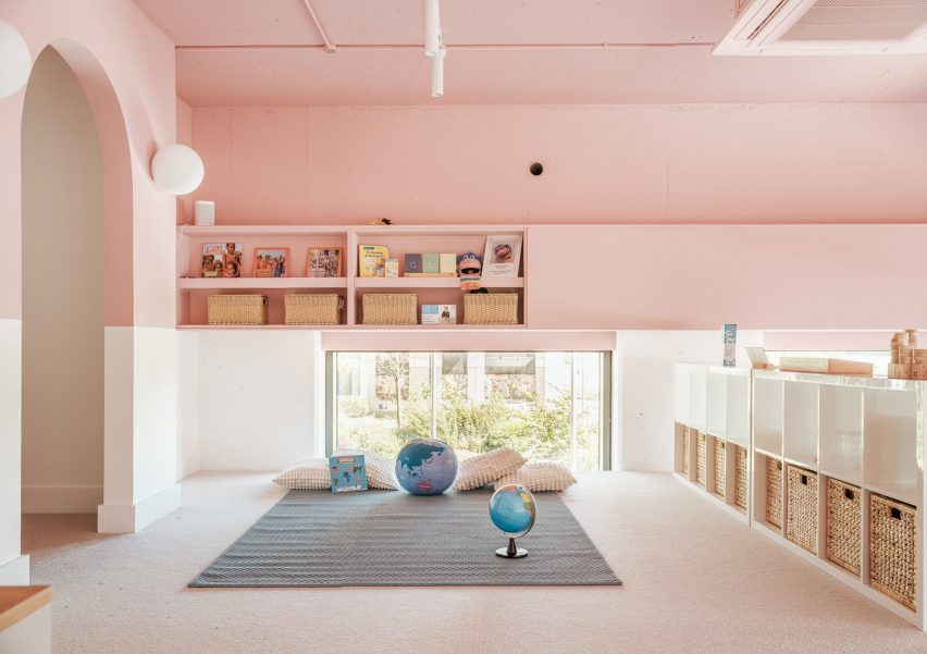
To cope with the demands of a nursery setting, materials and finishes are resilient as well as being natural and tactile. Among them is recycled and recyclable Marmoleum flooring, maple-veneered joinery and low VOC paint.
A colour palette of soft muted shades helps to create a homely atmosphere inside The Nest.
"This palette works better than bolder primary colours, as these create too much visual noise for younger children," Raher said.
A panel of dark teal blue creates a datum line around the walls, designed to be "resilient to little fingers" while making the tall spaces feel more relatable to children.
"We always try to design from a child's perspective, putting ourselves at that level, quite literally in some cases," Raher said.
The soft blue of the flooring gels with the tones of the pale maple veneer and the matt pink that wraps around the ceiling and upper walls, covering almost the entire mezzanine.
"It both draws your eye upwards but also manages to change the scale of the space," said Raher. "In some areas there is a five-metre ceiling height, so we wanted to break this up visually."
"The services for heating, cooling and ventilation were also left exposed, giving a little insight for children to explore and imagine what they could be – a network of intriguing forms and geometry running through the nursery."
Other kindergartens that hope to forge a greater connection to nature include this English nursery by Feilden Clegg Bradley, which makes use of natural materials to reflect the surrounding woodland, and a timber kindergarten extension in Austria by Bernardo Bader Architekten.
The photography is by Fred Howarth.