Thomas Heatherwick selects 10 "humanised" buildings for Dezeen
British designer Thomas Heatherwick has recently launched a book, radio series and campaign calling for more "humanised" architecture. Here he picks 10 buildings that are "givers rather than takers".
In his book named Humanise, along with the Radio 4 series and recently launched initiative, Heatherwick takes aim at boring buildings.
The publication aims to promote the creation of more interesting buildings that are designed to engage passers-by and consider "emotion as a core function".
"It's important that our buildings have sufficient perceivable complexity"
"The outsides of buildings with humanised qualities are able to hold your attention for the time it takes to pass by them," he told Dezeen.
"Science is showing us that there's a necessary amount of visual complexity that our brains need in order to be nourished – rather than starved – by the world around us," he continued.
"So it's important that our buildings have sufficient perceivable complexity, to be engaging from the three distances at which we experience them – at city distance, street distance and door distance."
The book has been released to encourage a conversation about the current state of architecture and it has drawn a great deal of attention, with critics branding it "simplistic" and "dangerously misguided".
To explain further what he deems to be "humanised" architecture, Heatherwick has selected 10 buildings that demonstrate the qualities he admires.
"The buildings in this selection are givers rather than takers," he said. "They're generous to the passers-by who will probably never go inside them."
"They provide the daily users of their insides with the necessary services and facilities, but they do more than that," he continued.
"They offer everyone passing them an experience – one of curiosity, and in some cases joy. And, in forming elements of the backdrop for society's public life, they lift the spirits and invite emotional responses."
"We need to stop giving ourselves excuses"
Although the buildings share the qualities Heatherwick associates with humanised buildings, they range greatly in style and geographic location and even include one designed by Le Corbusier, who Heatherwick recently blamed for architecture's "global blandemic".
"The selection cuts across many different building types and geographies, and shows that 'human' buildings aren't just reserved for particular places, people, styles or budgets," Heatherwick explained.
"There's no reason not to build them anywhere. We need to stop giving ourselves excuses for not making them happen."
Read on for Heatherwick's selection of humanised buildings:
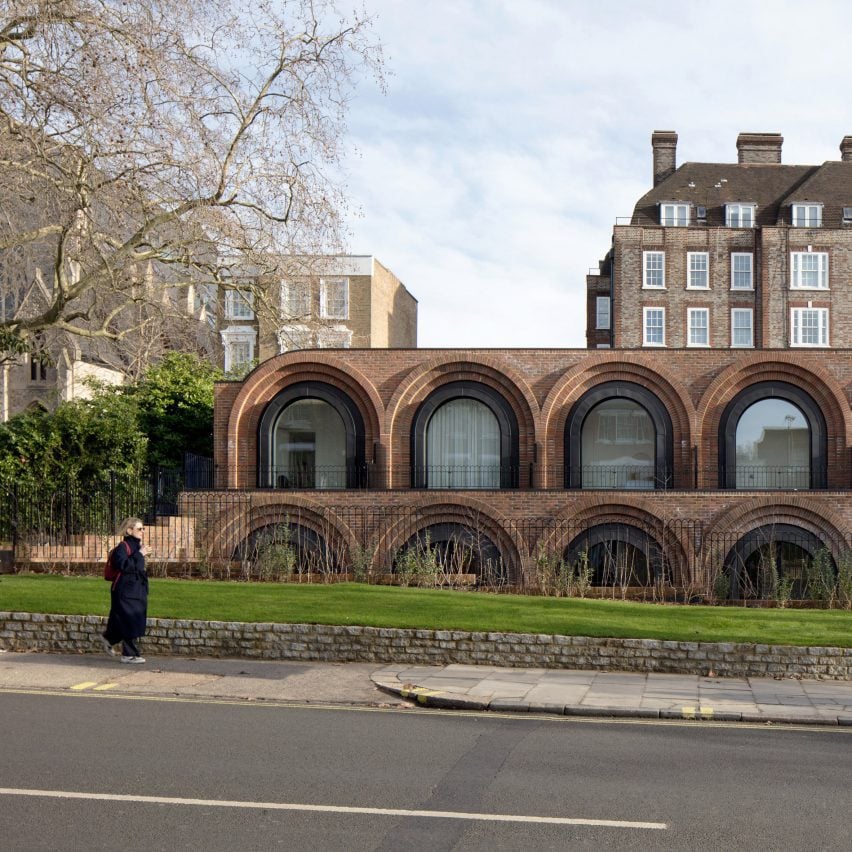
"Both timeless and futuristic" – The Arches, London, UK, by The DHaus Company, 2023
"This terrace of six houses was built on the site of an old petrol station that I'd gone past since I was small. Each brick-clad arch isn't just made from one simplistic two-dimensional curve, but instead steps backward in decreasing radii to add detail and soften the edges.
"The overall effect of the curved houses is to remind you of the Victorian railway arches you see all over London, converted into workshops, storage spaces, cafes and bars. This small commercial development takes everyday familiarity and twists it, creating cost-effective, repeating homes that feel both timeless and futuristic.
"The repeated curves also contrast brilliantly with the other repeated rectangular Georgian terraces behind it."
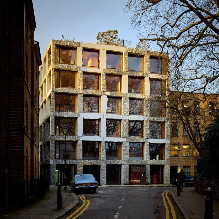
"Extraordinary emotional power" – 15 Clerkenwell Close, London, UK by Groupwork, 2017
"15 Clerkenwell Close has an extraordinary emotional power for a passer-by because of its surprisingly raw limestone facade. New buildings are normally flat and smooth. And even if they have stone on the outside it's a thin layer stuck onto another structural wall underneath.
"As building designers, we expect to be told that truly natural materials are too unpredictable to make buildings from. How can an engineer make calculations when a material is this irregular and inconsistent?
"We're also made to think that such large solid pieces of stone will be far too expensive. So it's all the more remarkable that Amin Taha and his team have managed to take large, inexpensive offcuts of stone, and pile them up to make an affordable building frame, decorated only by the rough natural edges of the waste stone pieces themselves.
"In some places the square stone frame looks like wild rough cliff face, and in others it's polished smooth. And when you're right up close, at door distance, you suddenly notice the toppled form of a traditional ionic column with fossilised coral and ammonite shells, available for any passer-by to examine and enjoy.
"The building is bold and futuristic and must be wonderful for the few people inside. But most of all it's generous, accessible and unserious for the thousands more people who will go past it every week."
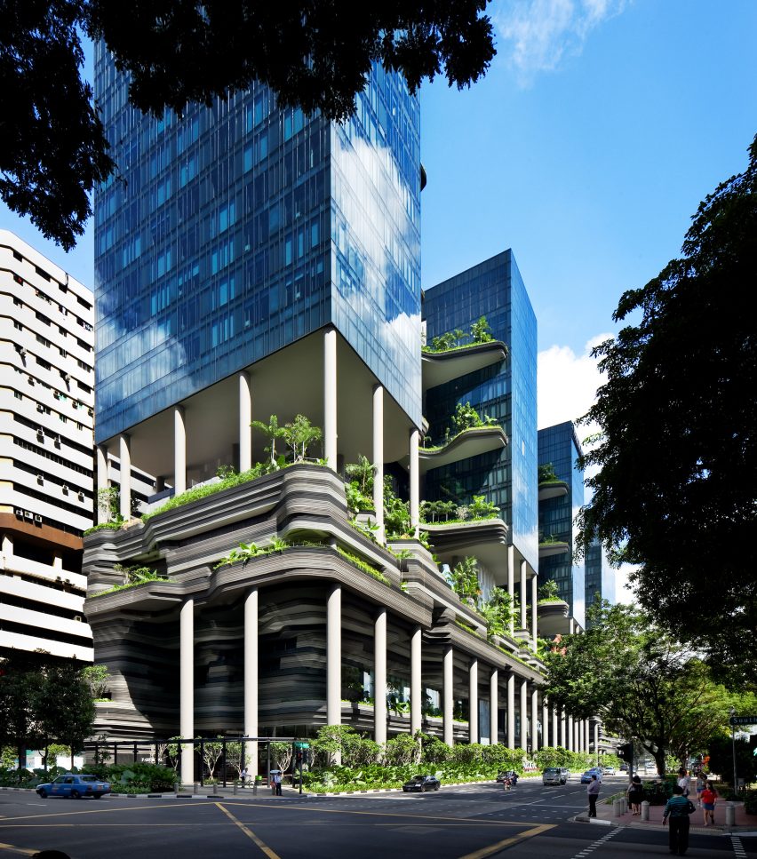
"Generous to passers-by" – The Parkroyal Collection hotel, Singapore, by WOHA, 2013
"Even though WOHA's Parkroyal Collection hotel in Singapore is a luxury hotel, it's a great example of a human building that's generous to passers-by and not just the people inside. It's interesting from all three distances that the public experience it: from city distance, from street distance and from door distance.
"By themselves, its dark glass blocks raised on thin columns could be too plain. But instead, they're brought alive by raised tropical gardens that fuse them together. Then, as you get closer, you realise that most of the building's interestingness is concentrated at its lower floors.
"Instead of straight, flat panels, the sections beneath the raised hotel-room blocks are made of ribbons of different tones that move in unpredictable curves, playing with light and shade. And then as you walk up close to the building, more interesting details reveal themselves, such as a water feature that stretches the entire length of the building at two different heights, lined with trees. And a special pavement alongside the road made of different, inexpensive coloured paving materials, with edges that move unpredictably in and out."
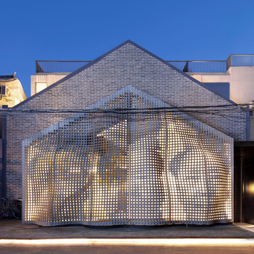
"Surprising and unconventional forms" – MaoHaus, Beijing, China, by AntiStatics Architecture, 2017
"MaoHaus is a good example of an otherwise simple building making the extra effort to give an interesting experience to passers-by.
"With its ingenious use of a common, inexpensive material to make surprising and unconventional forms, its concrete facade creates a perforated mesh that billows and ripples to delight anyone going past. Then at night, illuminated from behind, the pattern of holes transform into an unusual visual tryptich of China's former communist leader.
"This sense of place also comes from the way MaoHaus is located in an old alley in central Beijing, next to a historic workshop that originally printed millions of the Chairman's now iconic images."
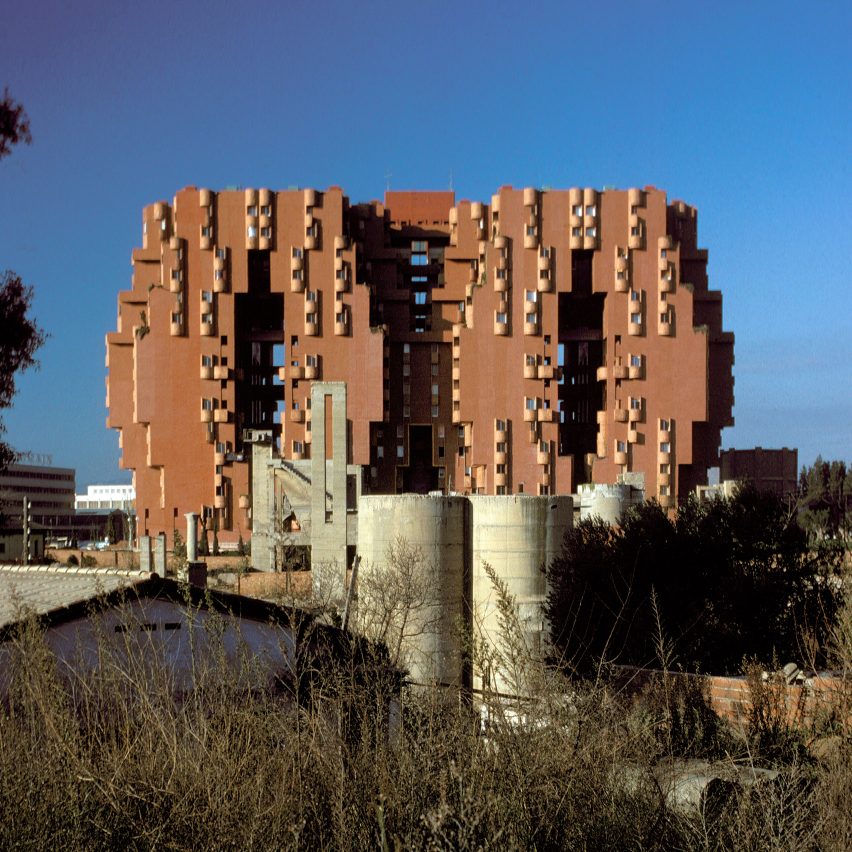
"Makes you stop and look in wonder" – Walden 7, Sant Just Desvern, Spain, by Ricardo Bofill Taller de Arquitectura, 1975
"Costing the city less than other similar projects at the time, Walden 7 is a 14-storey, subsidised housing complex built in 1975. Coloured a deep terracotta red with an unusual silhouette and Moorish sense of place, this is a building that makes you stop and look in wonder.
"The entrance isn't mean and small, like so many recent housing projects. Instead, it's grand and pierced dramatically by shadows and vivid blue tiles. Walden 7 isn't an expensive structure made from expensive materials for expensive people. And yet the huge amount of care put into its design hasn't just brought joy to the life of its residents but also to the millions of people on the busy streets who've passed by it for almost half a century."
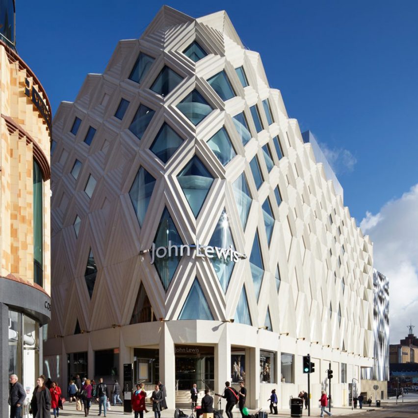
"A surprising amount of personality" – John Lewis, Leeds, UK , by ACME, 2016
"Typically, new department stores are windowless, flat, dull and boxy on their outsides and give a terrible experience for passers-by. With the main selling happening on the insides, why put much effort into the outside?
"But this one has had a surprising amount of personality and detail given to it, which means that the finished project genuinely gives something back to society in the city centre, whether anyone is interested in shopping or not.
"Approaching from a distance, the glimpses of its facade made from sculptural, layered terracotta, make you smile. And as you get closer you see more details influenced by Leeds' history of textile manufacturing. The outcome is a building that's unafraid of texture and pattern, and endlessly plays with light and shadow throughout the day, and also in the city lights at night."
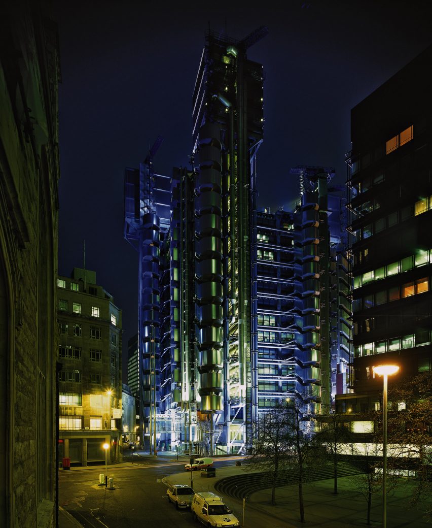
"The Lloyds Building is still one of the best buildings I've ever seen. I first saw it as a teenager, cycling late at night through the deserted city of London. Witnessing this structure illuminated by blue light, I felt like I'd entered my own science-fiction film.
"With most new buildings, once you've briefly looked at them, there's nothing more to look at and engage your mind. But this building is so complex and interesting you could keep looking at it forever.
"And what's astonishing to me is that it's not an arts centre, museum or opera house, where such an effort is normally expected to be made. Instead it's a private place of work for thousands of people.
"The value it brings to broader society is what it offers on the outside. And this generous building takes that responsibility seriously."
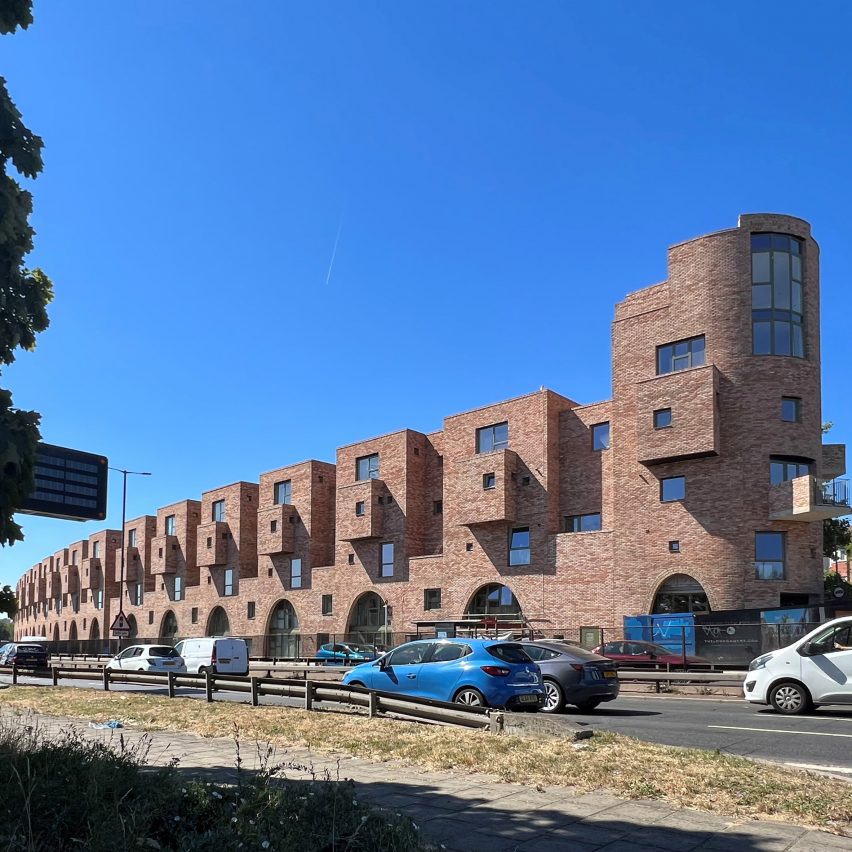
"Dramatic and interesting" – Edgewood Mews, London, UK, by Peter Barber Architects, 2022
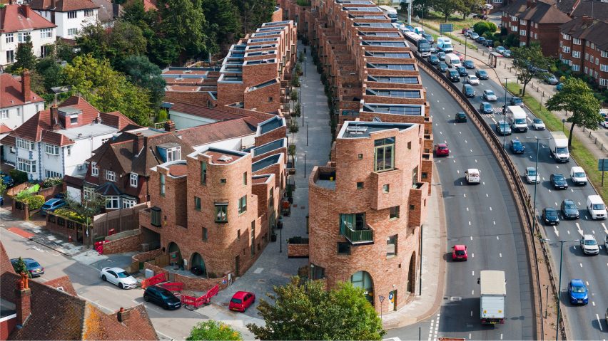
"This is an inspiring example of how everyday affordable housing can be generous to its inhabitants, its neighbours and the passers-by. Rather than being built in the most basic box shape, its outline moves up and down in a way that's dramatic and interesting and tells you that, even from far away, this development is offering more than the minimum to the world.
"As you get closer, curving brick arches frame front doors and windows align unusually with each other. But then, at the smallest scale, the bricks that make up the outside surfaces of the development look older and reclaimed, even though they might not be. And flat surfaces that might otherwise be too plain are humanised with inset patches of brick laid in different directions, similar to the blank, filled-in windows from Georgian times, when the window tax still existed."
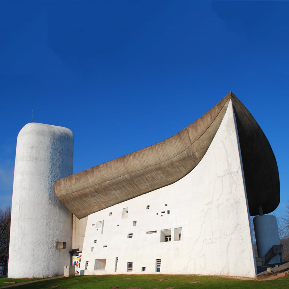
"Breathtaking" – Notre-Dame du Haut, Ronchamp, France, by Le Corbusier, 1955
"Le Corbusier is the big paradox of architecture. His hugely influential writings helped to encourage an age of plain, flat, often inhuman buildings. But his own buildings are frequently amazing. And none more special than his chapel at Ronchamp in France.
"Built at a modest scale, with everyday affordable materials, it doesn't look like a machine part from a production line, as he advocated buildings to look like in his books. Instead, it balances order and complexity, using curved and leaning walls, combined with a constellation of windows of different sizes and colours, and a stunning dark bending roof. The outcome is breathtaking."
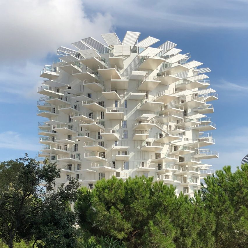
"Amazingly textured" – L'arbre Blanc, Montpellier, France, by Sou Fujimoto, 2019
"Sou Fujimoto's amazingly textured apartment block in Montpellier is as un-flat as a block of flats can get. The multitude of white balconies don't just provide each apartment with substantial outdoor space, their shapes and positions encourage interaction between the residents of different flats.
"And the design isn't just unusual to look at, the overhanging balconies break up the wind coming off the sea and act environmentally as a protective veil for the facade, shading the building from the hot southern European sun."