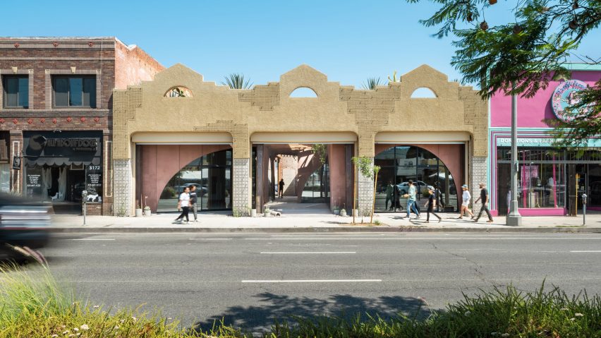
Formation Association fills revamped Los Angeles retail space with pink plaster
Local studio Formation Association has completed a renovation project in Los Angeles, placing asymmetrical volumes clad in plaster in the shell of a masonry building to create a dramatic "canyon-like" interior passage.
Formation Association renovated the building, located in the city's Atwater Village neighbourhood, on a street lined with shops and restaurants.
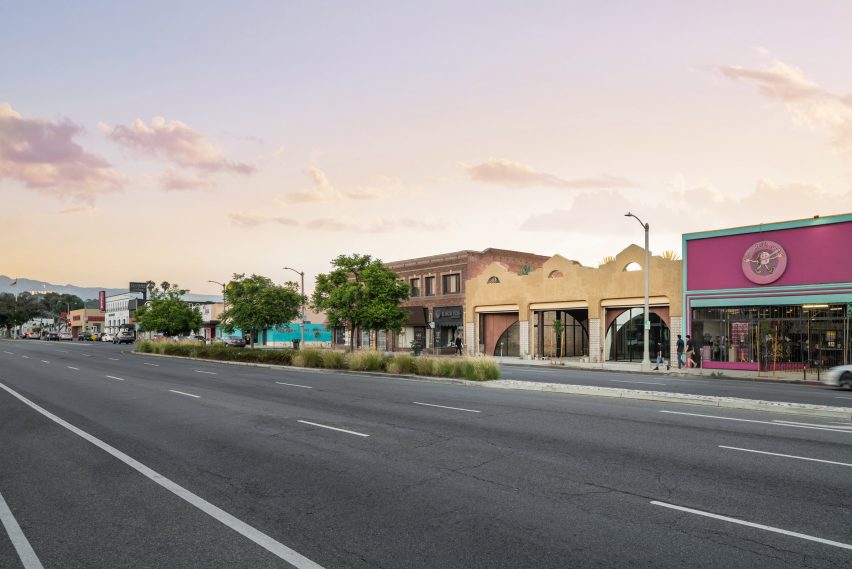
Called Atwater Canyon, the renovated building was originally erected in the 1920s and had an arched facade that had been covered up significantly through a series of past renovations.
"Importantly, at the street elevation, when the existing standard height storefront glazing system was removed, along with layers of subsequent remodeling, large openings were revealed, which now comprise a key characteristic for the accessibility and porosity of the updated elevation," Formation Association founder John Chan told Dezeen.
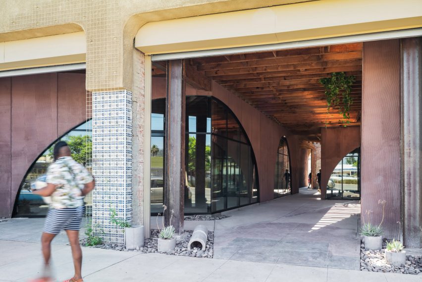
After foregoing the option to demolish and rebuild, the team decided to retain and restore the freestanding masonry structure, which features expressive crown decorations.
The studio opted to place a new program within the shell, reinforcing it in sections to meet the strict seismic codes in Los Angeles.
Trellises were added to the facade, which will be planted with California Morning Glory.
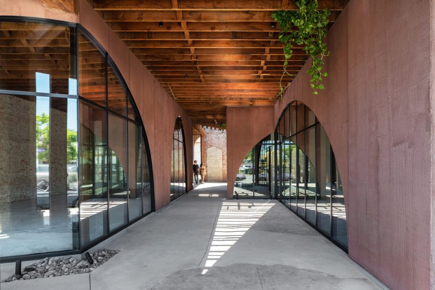
The new storefronts are pushed back from the street elevation so that a gap was created between the facade and the beginning of the new build.
Three primary retail spaces were placed into the side, divided by a long "canyon". Glass was placed in arches facing the street and on the sides of this passageway, while the new walls were covered in pink trowelled plaster with a textured pattern.
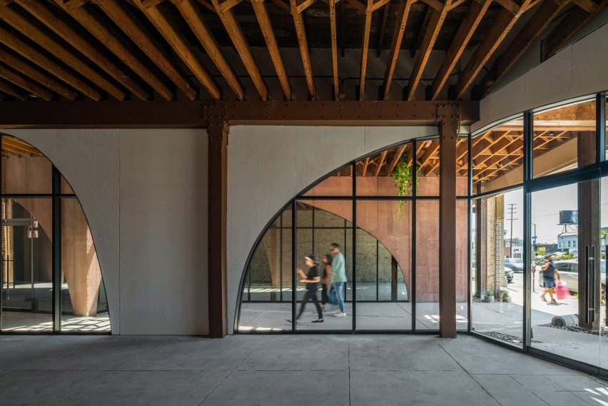
"Minimal instructions were given regarding the directionality of the raked pattern," said Chan.
"The hand of the applicator is expressed in the patterned texture of the walls, pointing to the craft and labor contributing to the work."
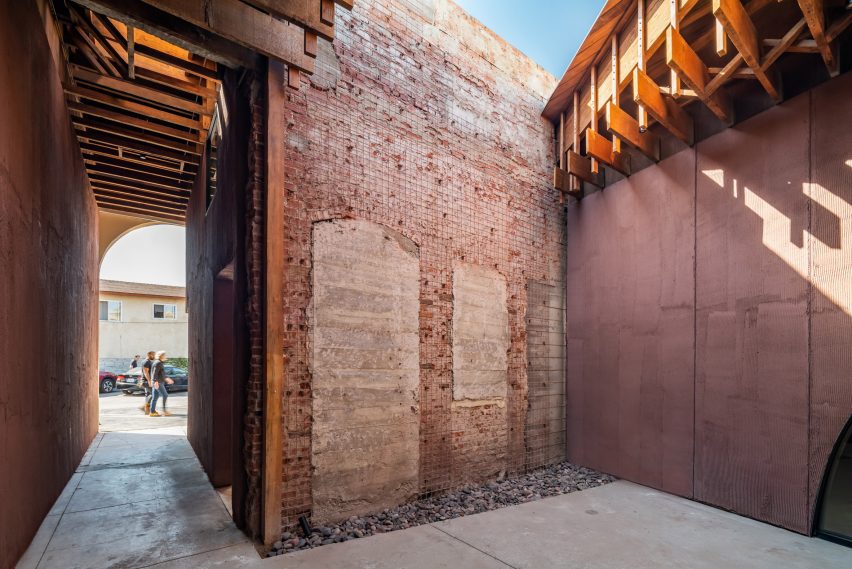
Exposed ceiling joists run the width of the building, and skylights were placed over the internal passageway to bring light into the middle of the structure.
All of the previous renovations had created a slight slope from the front to the back of the structure, which was mitigated in the redesign.
An open-air courtyard was placed at the end of the passageway. A roughly triangular section was removed from the ceiling, while the wooden joists at the remainder of the ceiling on both sides terminate at an exposed masonry wall.
This courtyard space holds the entry to the building's gender-neutral washrooms, and at the rear of a space is a smaller passageway that leads to parking lots, allowing visitors to enter through both sides.
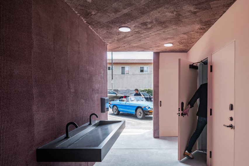
Most of the mechanical systems were outdated, according to the studio. Based on the newly placed interior spaces, new split-system heat pumps were installed.
Formation Association also used plaster and skylights over joists in combining a series of older buildings into the new home of the Phillips auction house in the city.
Elsewhere in the city, Kadre Architects used bright paint to renovate a 1980s motel into a homeless shelter.
The photography is by Here and Now Agency.
Project credits:
Architects: Formation Association
Consultants: Structural, Nous Engineering
Landscape: Terremoto
Signage: Still Room
MEP: Mars Engineering